[Beginner series] Trading with a pitchfork – Part 1

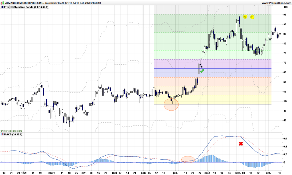
We begin a series of posts dedicated to newbies in trading. I wrote a few times, there would be no such posts, but of course I will take radically different approaches from other web sites. Again, I only target methods of trading that makes sense for those with small portfolio, so there is no need to spend too much time on candlestick theory other than a few key information.

Trading with a pitchfork sounds weird, but it is one of easiest and most reliable and profitable method… providing you know what you are doing. The second part of the sentence is exactly what is missed on some popular sites! Pitchfork trading is usually compared to channel trading, which it can be, but that is very poor usage of this wonderful tool!

Before we introduce the tool, you need to first major in peak and troughs analysis. Don’t go away just yet, it is pretty straightforward with a little practice. Peaks are … peaks and troughs are … just troughs! The major ones are usually easy to identify!

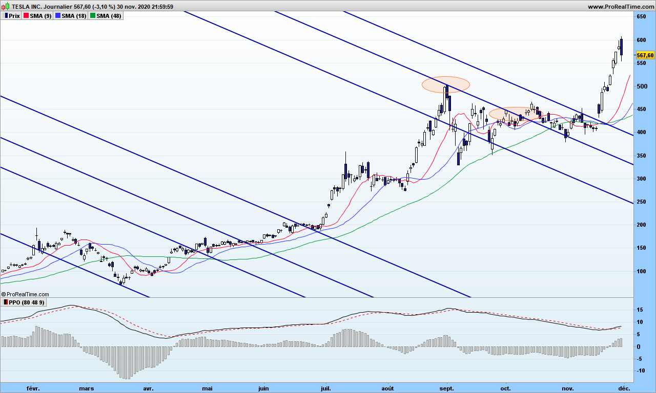
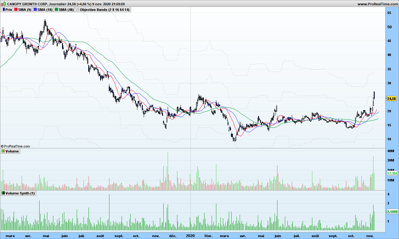
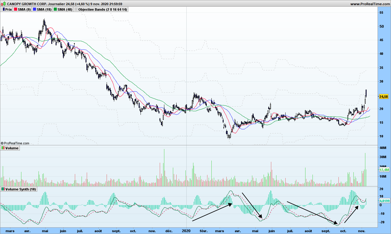
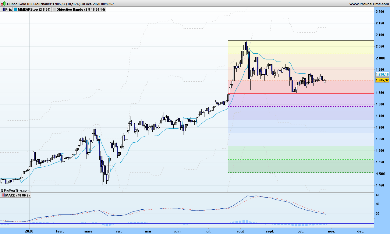
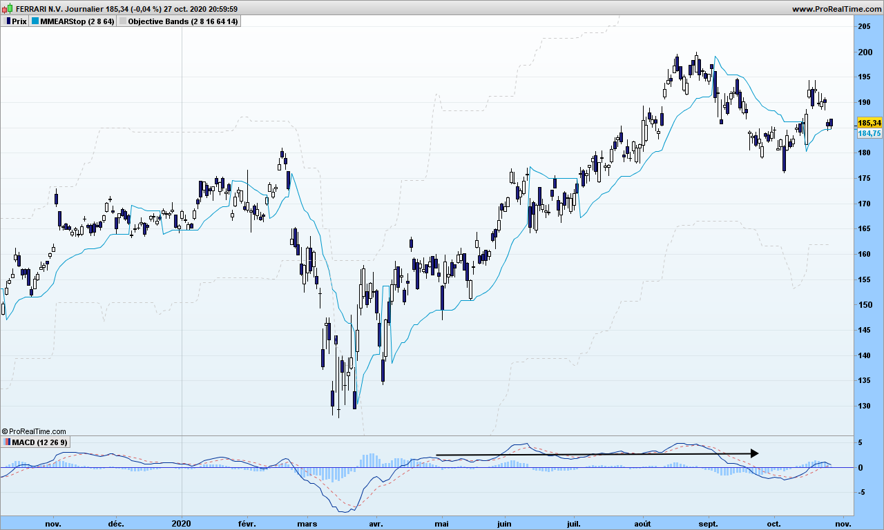
Let’s start immediately with an exercise. Can you point peaks and troughs on this Netflix chart?

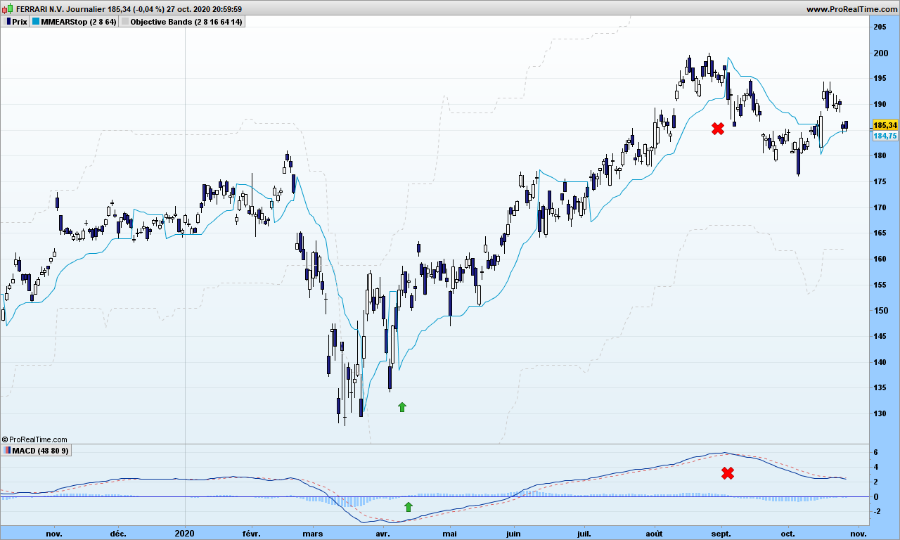
Maybe you ended up with this, peaks with green ‘P’s and troughs with yellow ‘T’s

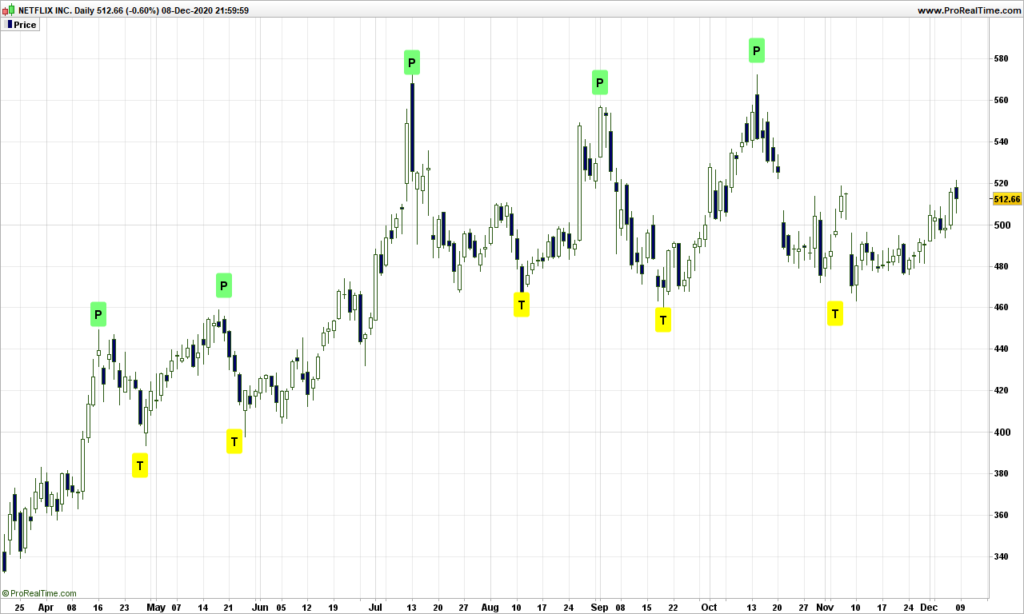
If you did not end up with same collection of peaks and troughs, that is fine. We are working with random system, you are allowed some deviations!

There is one important rule is that peaks and troughs must alternate: P – T – P – T – ….

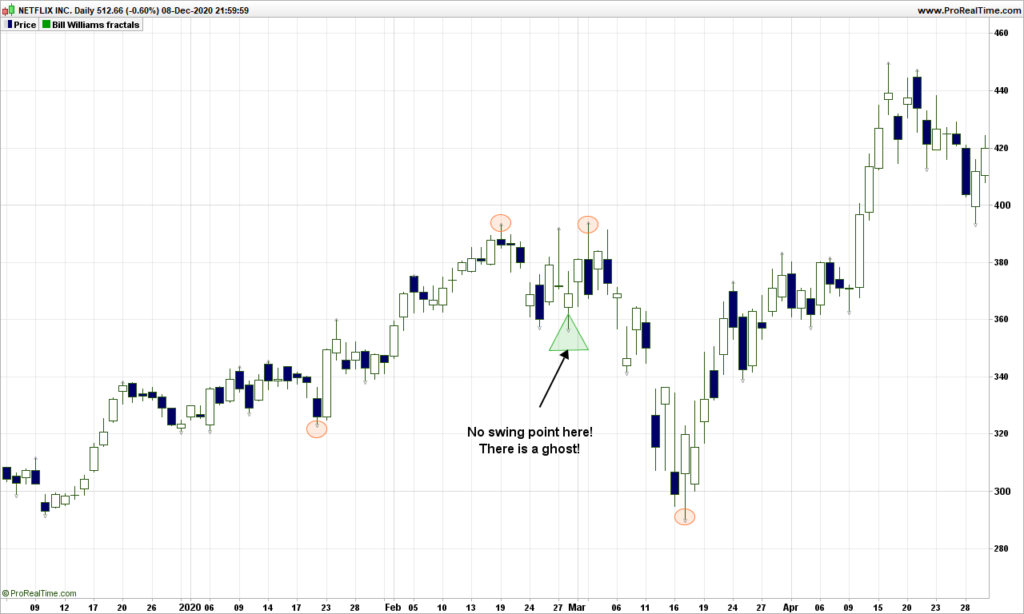
Is there any way to automate the discovery of peaks and troughs? Answer is yes, and there exists more than one. But in order to respect previous rule, you will sooner or later meet some ghosts!

One way to to identify a trough (same for peak) is by using a two steps approach, first one can be automated easily, second one is more complex!

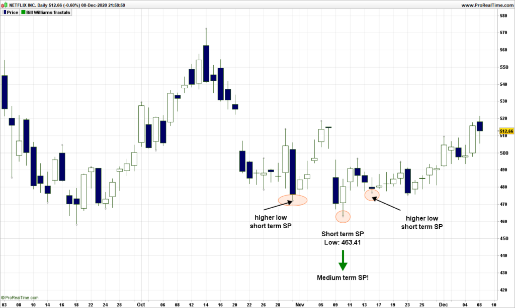
First step is to identify short term ‘swing’ points (SP), generic term for peak or trough. A swing point for a trough is simply a day where the low of the day is surrounded by two higher lows on each side. Example:

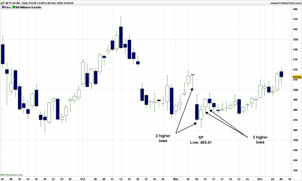
A medium term trough swing point is surrounded by one higher low short term swing point on each side:

Easy, isn’t it?

The medium term swing points will be the first ones of interest when playing with pitchforks.

Before I let you think on your own, remember the rule above, swing points must alternate tops and bottoms. But sometime, you will be missing a medium term swing point with the proposed method, so you know there is a ghost swing point!

Next time, we will look at how to anchor pitchforks to swing points

That’s it for this post! Comments are welcome!

The boring market report – December 1st2020

Sideways markets are the ones that hurt most traders because trend indicators fail miserably, stop are too far or too close, and those playing with highs and lows are punished when prices go out of the horizontal channel. As I warned in last post, those wanting to short Tesla had absolutely no chance going downwards. So it went up!

Bitcoin has also continued its rally towards new highs, the 2020 performance is now close to 200%! With such performance, you can trade only a small line of BTC and keep your money in safe harbor!

Speaking of safe harbor, Gold is now on the lips of many value investors because of dollars, euros, … printed by tons. Gold has been going down recently, stopped 8 steps from the stop, then went through… If it stops in 3 steps (1680$), we will have a nice hidden divergence, which will likely push Gold towards new highs!

Indexes like Nasdaq are still moving sideways. Volatility is pretty much like Tesla, quite high. So the northbound exit option must be privileged.

Last but not least, cannabis is waking up at last. Look at that beautiful Aurora Cannabis chart:

That’s it! I will start a new series of posts for beginners or almost. We will start by taking a fresh look at Andrew’s pitchfork. Until next time, trade safely!

The boring market report – November 19th 2020

Crazy times since last report. Look at that beautiful Bitcoin chart!

If you read this blog quite often, you know I entered at about 6000$, then again at 9500$ and again at 11000$ in October. The profit is substantial for the year, why bother trading stocks and all the related work about finding when are next quarterly results, announcement, or FDA validation for biotechs, … And of course, all stock market indexes are beaten! Same is true with many other cryptos….

Those of you interested in Tesla, I wrote that I would short Tesla at some point when the conditions are there. True enough Ferrari has fared better than Tesla recently but not a chance to short TSLA. Why not? Because the volatility is too high, it works like air balloon and protects from the crash. The volatility must be small or even tiny, so it can go up in a downfall. Volatility on Tesla is still very high (30%+, personal scale) so waiting mode!

The MACD has actually taken a down slope, but the green average is up, kind of hidden divergence. So Tesla stays up in the air. It has even gone above the down-sloping last reaction line and may still go up now, along with billions of dollars printed by the Fed.

Nasdaq is also floating mid-air, not knowing where to go. I would not be surprise if the index blows off the 12500 level and then continues up into next year (the famous short squeeze!)

That’s it. Until next time, trade safely!

Relative Strength Index: weaknesses exposed

Today we will take a quick look at most popular, most used indicator, but I have never understood why traders give it such value! Let me give you some tips to make it interesting. We are going to use Facebook for our study!

On the graph, you can see RSI indicator at the bottom, just below our customized MACD. It looks very noisy especially with default parameter 14, but since it is an oscillator (as opposed to trend indicator that MACD is), you may spot better synchronization with market tops and bottoms. If you can’t see, move your seat away from your screen, a bit more, even more… can see now? Good… The blue lines indicate the overbought and oversold levels, which, as you can see, are not reached very often!

So what’s wrong? The problem lies in RSI formula:

RSI = U / (U + D) where U is average of up moves in last n days, and D average of down moves over same period.

As I have previously demonstrated, market is a random and existence of trends is the proof of its randomness. So where is the link between this formula and random nature of market? The calculation could give similar results whether all the up days are consecutive or not, so with totally different market configurations. So, yes, it may work if you are very short term trader (a few days at most) and work out the divergences, market tops and bottoms, and decide what to do about it.

Could we modify it for more interesting usage? Of course! We can even use it for trend trading. Just replace delta between today’s and yesterday’s close by the delta measurement on your favorite moving average!

Now look at this new indicator. Buy signal is generated when improved RSI (iRSI) crosses above 50. You will notice it goes straight to 100 and stays then there until exit time. Easy, isn’t it?

As usual, use a stop to secure your gains. You may also define overbought and oversold areas at +30 and +70 if you want to stay with the trend as long as possible. False signal do exist of course, and there are 2 on the graph; the moving averages tell you not to go!

That’s it. Until next time, trade safely!

The boring market report – November 10th 2020

In last report, I was bearish for the short term, all indicators pointing in same direction: south! Now there were the US elections, and then yesterday the possibility of the existence of an efficient vaccine. Please note that Joe Biden is not formally elected and the vaccine testing is not formally finished! But anyway, markets have decided to turn back north after 2 steps to the south. This happens from time to time, stops are there to save us from disastrous situations.

Let’s look at Semi-conductor index first. The divergence on MACD should have driven the index towards the South. However volumes (see previous post) did not increase on that scenario, so it was a dead end.

Where are we going next? I need to show the steps in the opposite direction!

The first objective has been reached already and attempt to go beyond has failed yesterday. Short term traders may short this situation but the long term is up so you may want to stay on board for now, going to 3000. 5G should push in this direction!

Same situation for other word indexes, no additional comments.

Bitcoin has reached and gone beyond initial objective, hope you are part of the trip! (See other comments on previous post)

That’s it for today. Until next time, trade safely!

The light secret volatility of volumes

I have talked many times how the volume of information (fake or real) continuously unloaded onto media (social or not) is actually misleading (or trying to) your trading activity, just as using those brackets in the text! Trading the mathematical way just helps you with information overload.

You may have noticed I have not talked the actual volume data so far, one reason being that it is not freely available for all the supports we want to trade with. I am going to show you how to simulate this information, and how to more easily analyze volume information.

Let’s play with CGC – Canopy Growth Corp, a company involved in Cannabis business (just to attract search engines!). Volume is usually display in form of histogram at the bottom of your graph, with up days in green color and down days in red color.

There seems to be some outstanding spikes here and there, these are usually linked to specific events, could be quarterly results, and dividends payments, or law changes, or market important information. These can be some good entry points in a trend, especially if you missed the beginning.

Before we jump to more detailed analysis, if you consider Bitcoin or even some sector index, you may not get this information easily, or you may need to pay for it. So it would be good to simulate it, even if we would be missing the actual scale information, i.e. the real volume information.

I have already mentioned in WAD2.0 post that Williams Accumulation Distribution can be calculated without volume information

1. Calculate True High (TRH) and True Low (TRL)
TRH = Current bar high or precious bar close, whatever is higher
TRL = Current bar low or previous close, whatever is lower

2. Calculate current bar Accumulation/Distribution:
if Current close is above previous close then
AD = Current Close – TRL
if current close is below previous close
AD = Current close -TRH
if current close = previous close then
AD = 0

The absolute value of AD is the simulated volume. Let’s look at it:

You can see the spikes in volumes are located at the same place, more or less. So now we can use this calculation to get volumes sort of information for Bitcoin or Gold or whatever… Good, one problem fixed! On top of that, I can even make it smoother with synthetic bars as explained in same post mentioned above!

Now you would like to know if volume is really going up or down in more accurate way, maybe something you can even automate. As a reminder, this is linked to your observation period, you will to consider parameters that make sense to you. The solution is straightforward, let’s apply the good old MACD to volume.

Whaouh, we can see things now! Note I used the 10-days synthetic volume here to smooth things out and a MACD with 40-80-9 parameters. Volume does not tell you the trend but you know a trend is starting or getting stronger if volume is going up! On the right side, you see the recent rally is helped by strong volume increase, just get in the market and then use stop or objective or whatever strategy to get out. Volume will indeed go down when the trend cools down, and then volumes will go up again but it might trend continuation or trend reversal (see first arrow!)

Now look at this Bitcoin chart:

See? Each rally is preceded by a signal cross over MACD. Confirmation by the moving averages. Easy, isn’t it?

That’s it! Until next time, trade safely!

The boring market report – October 28th 2020

Looks like the markets do not welcome this second coronavirus wave, not the wave itself, but rather the bad and worst decisions made by politicians! You should never panic because of sudden but announced meltdown, and again stick to our sound models!

S&P500: this will be the last time I am using these reaction lines (drawn end of March!), as the accuracy for top prediction is now failing. No big deal. Always double checking what the random walk model is telling me.

Following previous post, you see the MACD has been under its signal for a while, indicating downside pressure. First objective is 3094, due after the US elections, so another 10% to go. If might go further down, pending on lock-down conditions, as they say. The truth is that the market will go up if there are buyers, lock-down or not! If investors think all the GAFAM will be at bargain price when S&P500 reaches 3100, then market will resume up trend.

The SOX (or Semi-conductor Index) usually anticipates what’s coming up. No light to expect for now, as there is a divergence with MACD.

Speaking of Apple, the kagi graph is showing interesting things. A 3-buddhas top appeared by mid-September but because of strong uptrend, I deferred my idea of shorting Apple. Then a double window bottom has formed, a strong indication of further uptrend. Markets may be in bad mood for next few days but quarterly results may bring back confidence! Remember that the recent growth of Apple is before all due to buyback, a gift for shareholders who don’t get too much dividends otherwise. You might be bullish because of the upcoming 5G trend on smartphones, but this stock is overvalued somehow. The question is compared to what? There is no absolute reference!

Gold has reached its downward objective end of October but may still go down some more, which is very good opportunity to buy. Rationale: as countries are printing more money by tons, the value of money goes down, and Gold which is limited in quantity can only go up!

I wrote two weeks ago you should look at Bitcoin. It has gone up almost 20% already. On the way to 100k$!

That’s it! Until next time, trade carefully!

Undistorting investing reality at the speed of light!

I am sure you are wondering what I am going to talk about with such a post title! But let me start by asking a question: Can you tell me what is speed of light with good accuracy? I will be back after this break:

Whatever answer you give me (ideally should be: 299792458 meters per second), what I did is just awake part of your brain that deals with math, physics, … or intelligence to summarize. It is very important for next question:

Why do you invest your money for?

  1. To save planet from crazy climate evolution
  2. To help companies being more socially responsible
  3. To make as much money as possible
  4. To help out spot aliens if case they come to vicinity of earth

See you can not lie any more to me or to yourself, the only possible answer is number 3. Your brain orders you to take that answer.

Now think about you last meeting with your banker (didn’t I write bankster?). You were surely told how we need to build a safer and green planet, how it is difficult to have profitable investments…

Had your banker started by asking you my initial question, the meeting would have much more complicated for him, you would most likely have told him “give me 10%, I know you can do it!”

Can he really do it? Not in straightforward manner but short answer is yes. The theory is simple. All the countries will need pay for the money they have printed for the pandemics, and the way they will do it is by applying deep negative rates to accounts, maybe down to -5% or -6%. Whaouh! <Add more interjections here!> It will go slowly for acceptance by people but it will happen. But wait, here we are discussing treasury bonds! When interest rates go down, the price of bonds goes up. When the rate is down by 1%, bonds prices go up by 6% or more!

See that one graph below (US treasuries bonds futures). While your bankster now charges you negative rate, he invested your money in treasury bond, yielding a cool 29% over the last 2 years, 9% for 2020 YTD. Ouch, that hurts!

Now go and see your banker, ask him to put treasury bonds in your portfolio (of course, consider there is some risk level involved here), keep as little cash as needed if you get negative rates. Enjoy the face that your banker will make! Especially if rates go down, deep down, very deep down, …

The same goes for trading. You are told to use indicators with preset parameters recommended usually by the guy who created it. I have explained many times the fraud that the Gaussian distribution is, it actually causes distortions of reality. Indicators are the same: they let you see the reality through a specific prism, and if they are not based on sound mathematical principles, they will mislead your investment decisions. The popular MACD falls into such category (I will let you look at the formula), though it might be efficient when used in specific market conditions but also with right parameters. See Ferrari below, MACD with default parameters is flat for most of the growth this year:

As mentioned many times, an investing or trading action must be linked to an ‘observation’ period. You want to earn x% over the next y months. The parameters should be set in such a way that you can follow your trade easily : entry point, target price, exit time. Say I want to capture most of the up trend over several months, I change the default parameters to 48 and 80. Look at MACD now, close to perfect!

It does not take too much intelligence to uncover a trading strategy that works. Just wake up your brain by wondering what is the speed of light!

That’s it! Until next time, trade safely!

The boring market report – October 15th 2020

Amid sad jobless figures and coronavirus new travel restrictions in Europe, markets may be in a strange mood but money flows by billions in stock market because bonds have ridiculous or negative yield. Interesting? No. This is noise. All this does not explain why you, as an investor, will pull the trigger to buy Apple or Tesla stock. Those so-called correlations between news and market are complete non sense!

Let’s go back to our sound mathematics based trading!

S&P after crossing reaction line in now back up, see how good those reactions lines to find bottoms (which you can’t play of course!). As explained in yesterday’s post, new 3-months objective is 3672, we are already 6-steps from the bottom, which is quite good. Indeed the tail winds may push prices horizontal for a few days, but next reaction line is far away, do not expect a reversal in the short term. No need to say you need a stop anyway, this is trading, not betting on the wind direction!

Tesla, after hitting twice the reaction, has gone through. Next one is very close, so better be careful!

Bitcoin: does anyone care about Bitcoin anymore? Maybe you should! Next objective is 13230$, which means the gain for 2020 could be close to 100%, compared to current 10% on S&P500, before the US election…

That’s it. Until next time, trade safely!

To trend or not to trend, that is the question

Today we are going to study how trends transition to more or less flat markets and how to position ourselves for the best!

I am sure most of you are already familiar with indicators which supposedly indicate when a market is trending, and when you would be better off sleeping and out of the market.

Moving averages are close to be one of best indicator for that purpose. See that graph of Microsoft with Alligator indicator. Note ADX indicator at the bottom does not indicate too much!

The truth is investors are either having the same opinion at the same time and there will be a trend or investors disagree and market ends up being choppy and overall very flat. So any time that you see what could be the end of a trend, switch to drunkard mode and start counting the steps! If you need background information, please refer to this blog post.

Sure enough you could wait for prices to cross Alligator lines and then that colors are in the right order, … then you may have lost 50% or more the big next move! You need think differently. Don’t worry, I will skip the action-reaction lines for today!

First step if course to detect the end of an existing trend (at least 2-3 weeks long), you can use MACD crossing over its signal for this purpose. See this example with AMD:

What the heck am I supposed to do here? We are obviously leaving a short down trend and we don’t know where market is going to go. Nobody does unless you can dig into the brains of all investors at the same time!

Again we assume the most recent bottom is a lamp post, from where our drunk guy is going to walk northwards, maybe in trending manner or in random hesitating steps. But we know about the objective he can reach within the next period of observation. This is the first dotted line above the candles. In this example, it is 8 steps away and we are going to draw lines every 2 steps.

Now we are ready, the 3-months objective is roughly 55$, you need to use a convenient stop to protect and dimension your trade. See this post for instance. Let’s accelerate the time now!

2 weeks later, objective is reached (8 steps), the drunkard makes it even to the 10th step. From there, market reverses, a new long trend does not really pick, so you can do the exercise in opposite direction:

This time the drunkard does not go beyond 4-steps and after 3 months, you need to give up your short play. Then MACD goes again above signal

We reach first objective within 3 weeks, but this time the trend continues reaching 20 steps. You have successfully mixed together trending and random action!

That’s it. It does not need to be complicated. Don’t forget to choose stocks or indexes that have the capability to trend. Until next time, trade safely!