
Trading with a pitchfork requires selecting three consecutive swing points (trough, peak, trough or the opposite) and then draw the pitchfork and validate it by checking it describes accurately price action in the past, in order to guess price action in the future (aka reaction).
Starting from market structures (see previous post), there are some recommended pitchforks to be used, but sometimes unfortunately the warning lines do not confirm the validity of the pitchfork. There exist hybrid pitchforks which we will study in an other post. For now, we are going to discover the action and reaction lines.
In theory, any price action in the past has a symmetric price reaction in the future, the mirror being the called the center line. Center line can of course be the pitchfork median line you have just drawn, it can be also a high-to-low line (see previous post) or it can be a multi-pivot line, i.e. a straight line that contacts at least 3 swing points (peaks, troughs…), what traders call a slant support or resistance line. Horizontal lines are a non sense for this study, since they only deal with price, and vertical lines also as they only deal with time, but studies show this is not (or no longer) relevant to today’s markets.
Theory continues by saying that any swing point in the past could have its image in the future. To be accurate, the action line passing through a swing point (peak or trough) in the past can be mirrored in the future, and there is a strong chance that a new swing points will sit on this line.
Let’s stop the theory and study an example. We are going to trade RNDR crypto for this example in the 1h time frame.
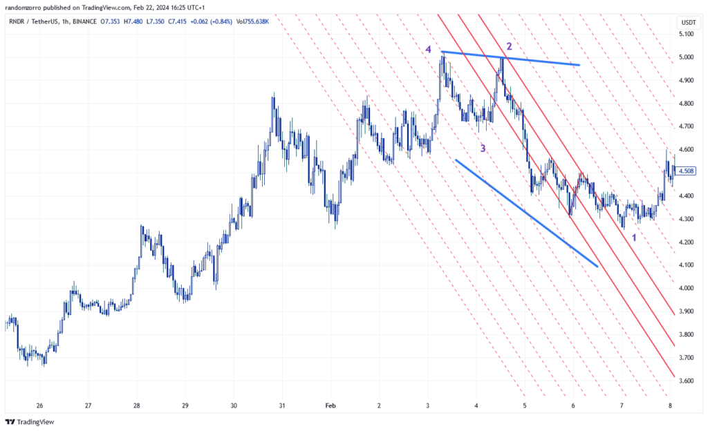
At this point in time, we have identifed market has bottomed out after a strong downtrend structure. As recommended I have drawn a mini pitchfork of which slope does not make you very comfortable buying this market. I will keep only the median line and will start drawing parallel lines to this median.
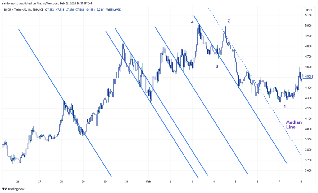
The median line is now represented with dotted line and I have drawn parallel to the median that go through peaks and troughs. You have to try, it is very easy! Doesn’t it start looking like a pitchfork with teeths separated in uneven way?
Next exercise is simple. We need to note the distance between the action line and center line (the mini pitchfork median line) and draw the symmetric lines on the opposite side of the median at the same distance!
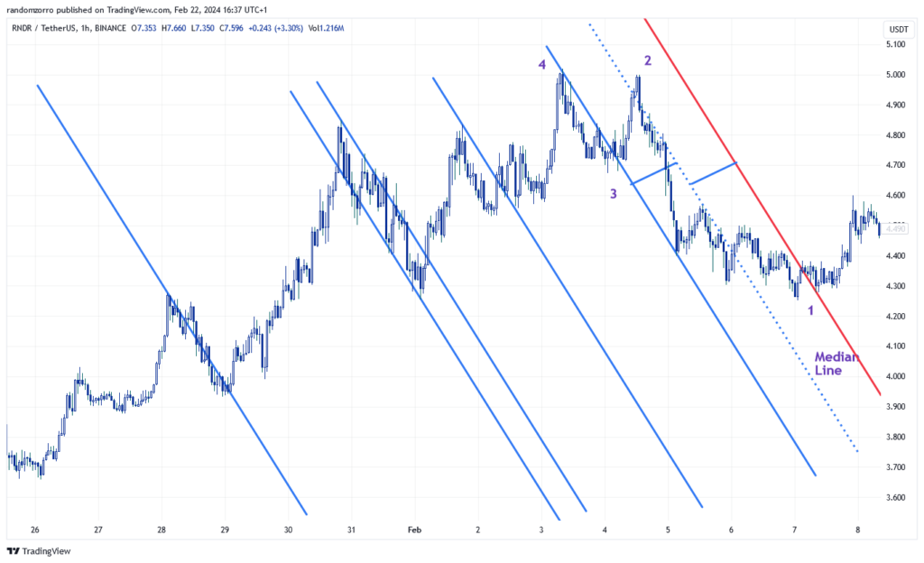
I have drawn the first reaction line in red color. You will want help by drawing a segment to measure distance and move it or duplicate it to get the right distance to reaction line. Notice that trough 1 is now inside the new ‘pitchfork’ and it is a better looking buy signal. Notice also how this line is perfectly re-tested by the market after going above, which gives validity to this drawing.
We need to the same with other reaction lines! There you go:
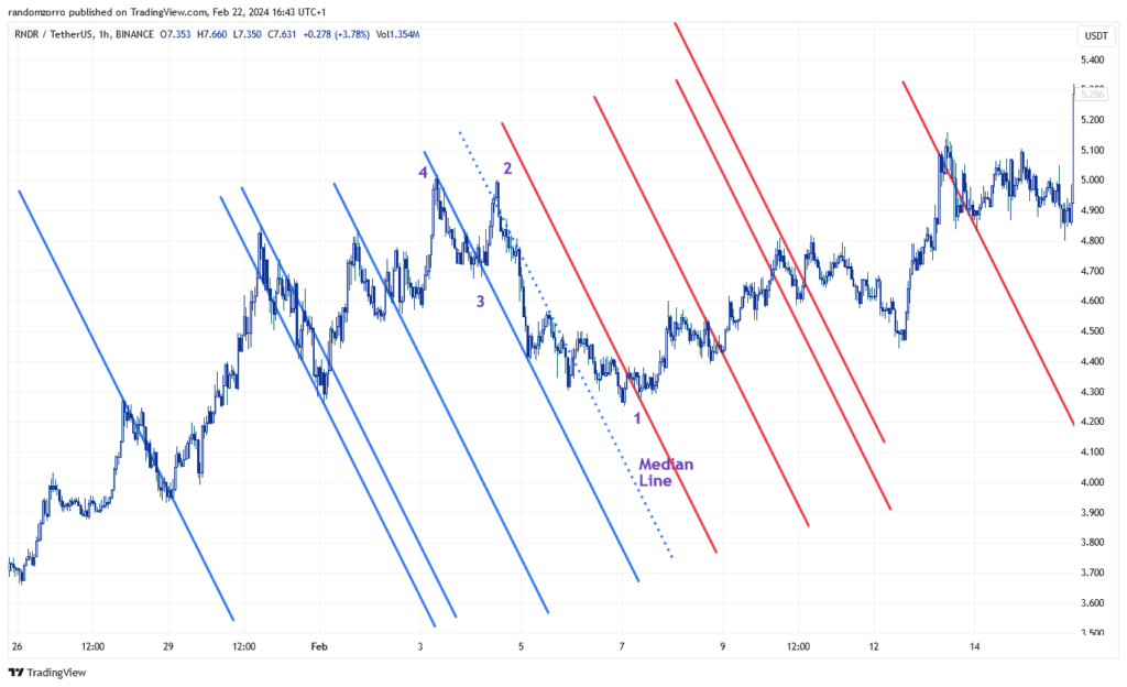
Now let’s look at peaks and troughs
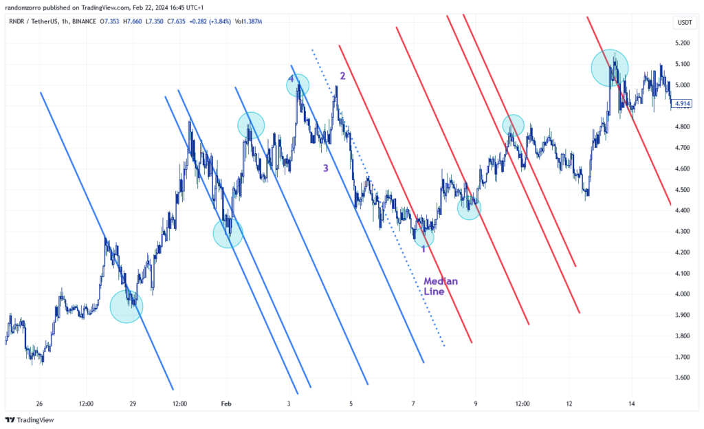
I have selected this chart at random, trading it on the fly, I had no assurance this would be a nice example! Look again! Peaks in the past have yielded reaction troughs on the reaction lines, troughs in the past have yielded reaction peaks on the mirroring reaction lines. True enough there are new peaks and troughs that were not anticipated, but remember markets have fractal structure, you could probably have found them by analyzing other time frames!
Please not ealso the accuracy of reaction lines decreases after a dozen re-actions lines. When you have identified a new market structure, better draw a new center and re-do the exercise!
Starting from last 2 center lines, we should have up-sloping and down-sloping action and reaction lines, of which the intersect can yield the exact position of a peak or trough in the future. Which we will see in an other post.
Until then, trade safely!