The light secret volatility of volumes

I have talked many times how the volume of information (fake or real) continuously unloaded onto media (social or not) is actually misleading (or trying to) your trading activity, just as using those brackets in the text! Trading the mathematical way just helps you with information overload.

You may have noticed I have not talked the actual volume data so far, one reason being that it is not freely available for all the supports we want to trade with. I am going to show you how to simulate this information, and how to more easily analyze volume information.

Let’s play with CGC – Canopy Growth Corp, a company involved in Cannabis business (just to attract search engines!). Volume is usually display in form of histogram at the bottom of your graph, with up days in green color and down days in red color.

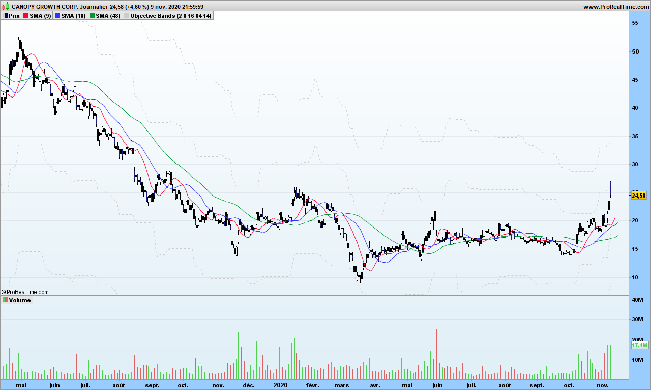
There seems to be some outstanding spikes here and there, these are usually linked to specific events, could be quarterly results, and dividends payments, or law changes, or market important information. These can be some good entry points in a trend, especially if you missed the beginning.

Before we jump to more detailed analysis, if you consider Bitcoin or even some sector index, you may not get this information easily, or you may need to pay for it. So it would be good to simulate it, even if we would be missing the actual scale information, i.e. the real volume information.

I have already mentioned in WAD2.0 post that Williams Accumulation Distribution can be calculated without volume information

1. Calculate True High (TRH) and True Low (TRL)
TRH = Current bar high or precious bar close, whatever is higher
TRL = Current bar low or previous close, whatever is lower

2. Calculate current bar Accumulation/Distribution:
if Current close is above previous close then
AD = Current Close – TRL
if current close is below previous close
AD = Current close -TRH
if current close = previous close then
AD = 0

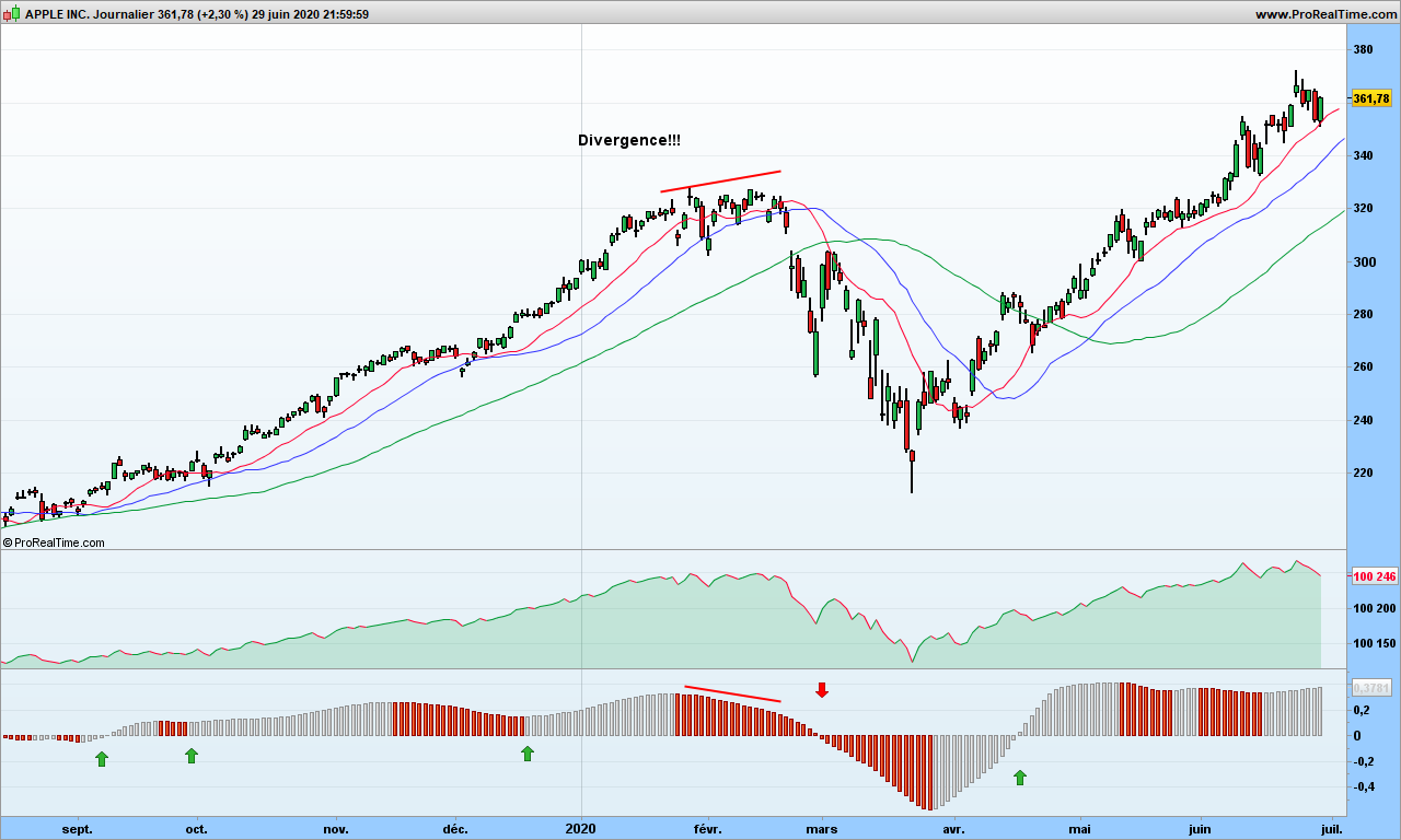
The absolute value of AD is the simulated volume. Let’s look at it:

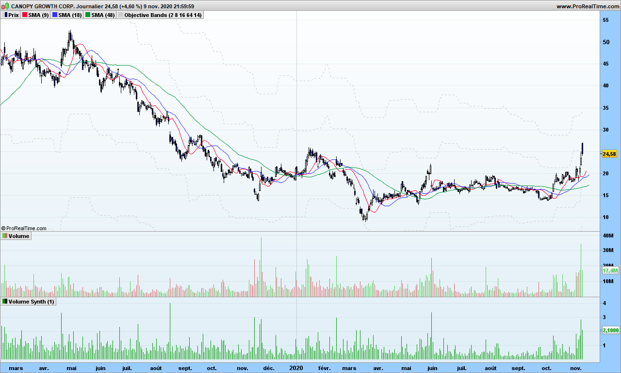
You can see the spikes in volumes are located at the same place, more or less. So now we can use this calculation to get volumes sort of information for Bitcoin or Gold or whatever… Good, one problem fixed! On top of that, I can even make it smoother with synthetic bars as explained in same post mentioned above!

Now you would like to know if volume is really going up or down in more accurate way, maybe something you can even automate. As a reminder, this is linked to your observation period, you will to consider parameters that make sense to you. The solution is straightforward, let’s apply the good old MACD to volume.

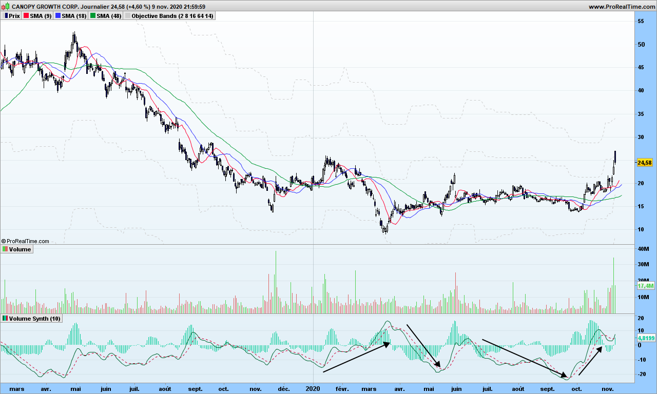
Whaouh, we can see things now! Note I used the 10-days synthetic volume here to smooth things out and a MACD with 40-80-9 parameters. Volume does not tell you the trend but you know a trend is starting or getting stronger if volume is going up! On the right side, you see the recent rally is helped by strong volume increase, just get in the market and then use stop or objective or whatever strategy to get out. Volume will indeed go down when the trend cools down, and then volumes will go up again but it might trend continuation or trend reversal (see first arrow!)

Now look at this Bitcoin chart:

See? Each rally is preceded by a signal cross over MACD. Confirmation by the moving averages. Easy, isn’t it?

That’s it! Until next time, trade safely!

How to refresh an old indicator and extract its essence?

Now that most of you have read all the blog, your neurons are ready for experimenting new sensations! The indicators from the old world, such as RSI or MACD, have plenty of issues but are nonetheless used by professional traders, because if you can trade with candlesticks, RSI and 2 simple moving averages, then indeed it requires lots of training and experience to become profitable. They call it price action analysis!

If you don’t have 10 years to dedicate to training, then consider any old indicator and how it could be improved to give you less false signals! That’s it!

Let’s take the example of Williams Accumulation Distribution. It is supposed to be traded with divergences, but those do not appear quite often. Let’s have a look at formula:

This is the original formula defined by L. Williams. It contains volume information. First problem is that volume information is not always available (e.g. for cryptos) and second one is that many transactions take place outside the stock market, so we get only a partial view!

Steve Achelis improved this formula with this adaptation:

1. Calculate True High (TRH) and True Low (TRL)
TRH = Current bar high or precious bar close, whatever is higher
TRL = Current bar low or previous close, whatever is lower

2. Calculate current bar Accumulation/Distribution:
if Current close is above previous close then
AD = Current Close – TRL
if current close is below previous close
AD = Current close -TRH
if current close = previous close then
AD = 0

3. Calculate Williams Accumulation Distribution which is calculated as cumulative total sum of AD values
WAD = Previous WAD + AD

Here is how it looks:

Without divergences, the indicator is useless, or is it?

The point is that most indicators stop to work when too many people are using it. Market likes to play with your nerves! And if you want to program the ups and downs in automatic trading, well, good luck!

There are surely multiple ways to improve this and here is one!

First thing is to smooth this indicator, but not with an average! C. Kase (see here) has introduced the concept of synthetic weekly indicator. The change in the formula above is straightforward and we are going to use n days instead of just 5 days as implied by the word ‘weekly’

Just make the following changes:

  • Close is unchanged
  • Open is the opening price of n days ago
  • High is the highest of last n days
  • Low is the lowest of last n days

See how much smoother it is? You don’t have to worry about using 5 or 8 days as in the graph above, because indicator is evaluated every day! On a 8-days chart, you would have to wait 8 days to get a new candlestick, but here you might get a signal as early as there is something significant!

OK sir, but we still see no divergence? That’s right so let’s go one step further and calculate the smoothed ROC of synthetic n-days WAD!

The smoothed ROC is simply the Rate of Change applied to an average instead of raw indicator. I have considered a 10-day EMA of the WAD and 21-days ROC. Here is the fabulous totally refreshed indicator:

I colored the SROCSynthNWAD (or more simply WAD2.0) in grey when going up, and red when going down. As you can see, indicator is above 0 when trend is up, you have additional entry point by color change if needed and (some) divergences appear from time to time! It is so smooth that you can program it easily in automatic trading system!

Your task is of course to evaluate it over many stocks or securities, over long periods of time, over multiple time frames, ….

This is of course just one way to do it. Maybe you can work out an RSI2.0?

That’s it for today. During next 2 months, I will only post markets commentaries from time to time. Enjoy summer time and stay away from harmful viruses!

Until next time, trade safely!