The boring market report – December 14th 2020

The invention of fire

Anaximander of Miletus, a Greek philosopher who lived in the 500s B.C.E. speculated that humans must have descended from some other type of creature, most likely fishes. This idea became later a scientific theory when Darwin wrote about it. But it still is a theory, because these days, no new species arise on earth, maybe man will change into superhuman with exoskeleton and additional processing power, but still is a man, form fit and and function wise! A counter theory is that at some point in time, a disruption occurred, allowing for instance more radiation from the Sun or stars on brain cells, that allow the monkey to become a different specie: the man! Don’t tell anyone I told you about this one ;-))

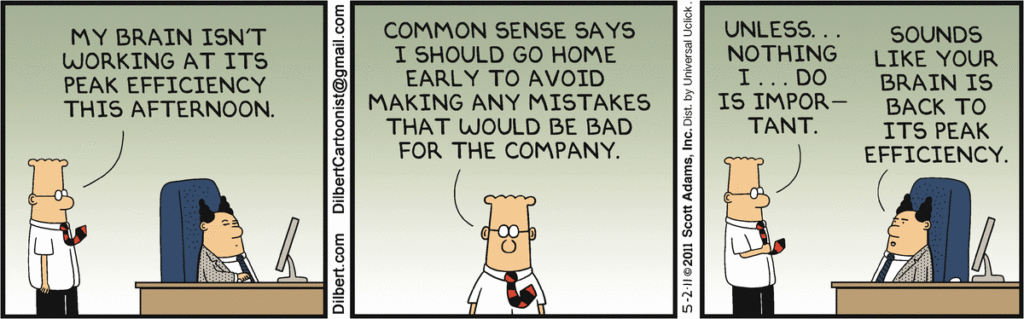
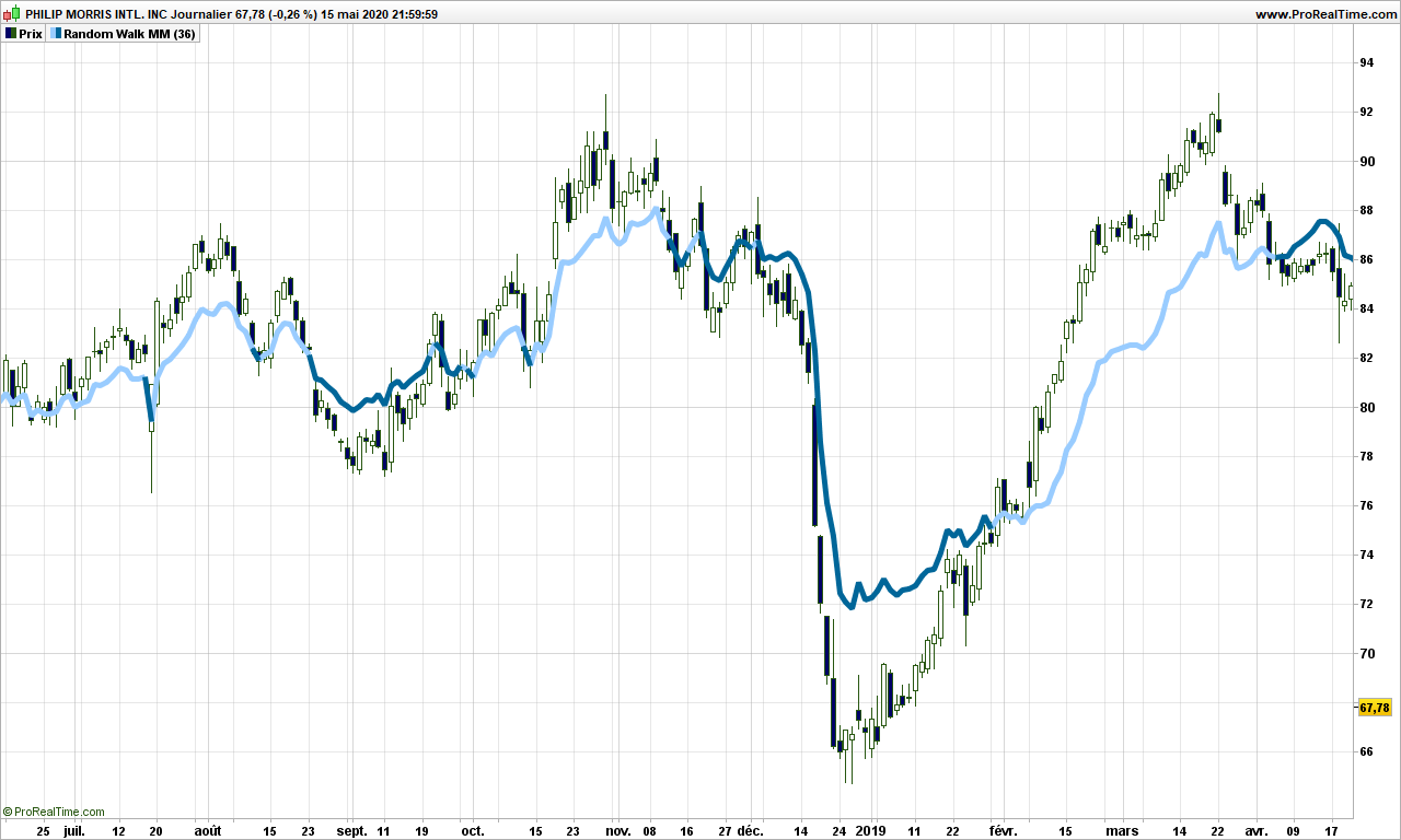
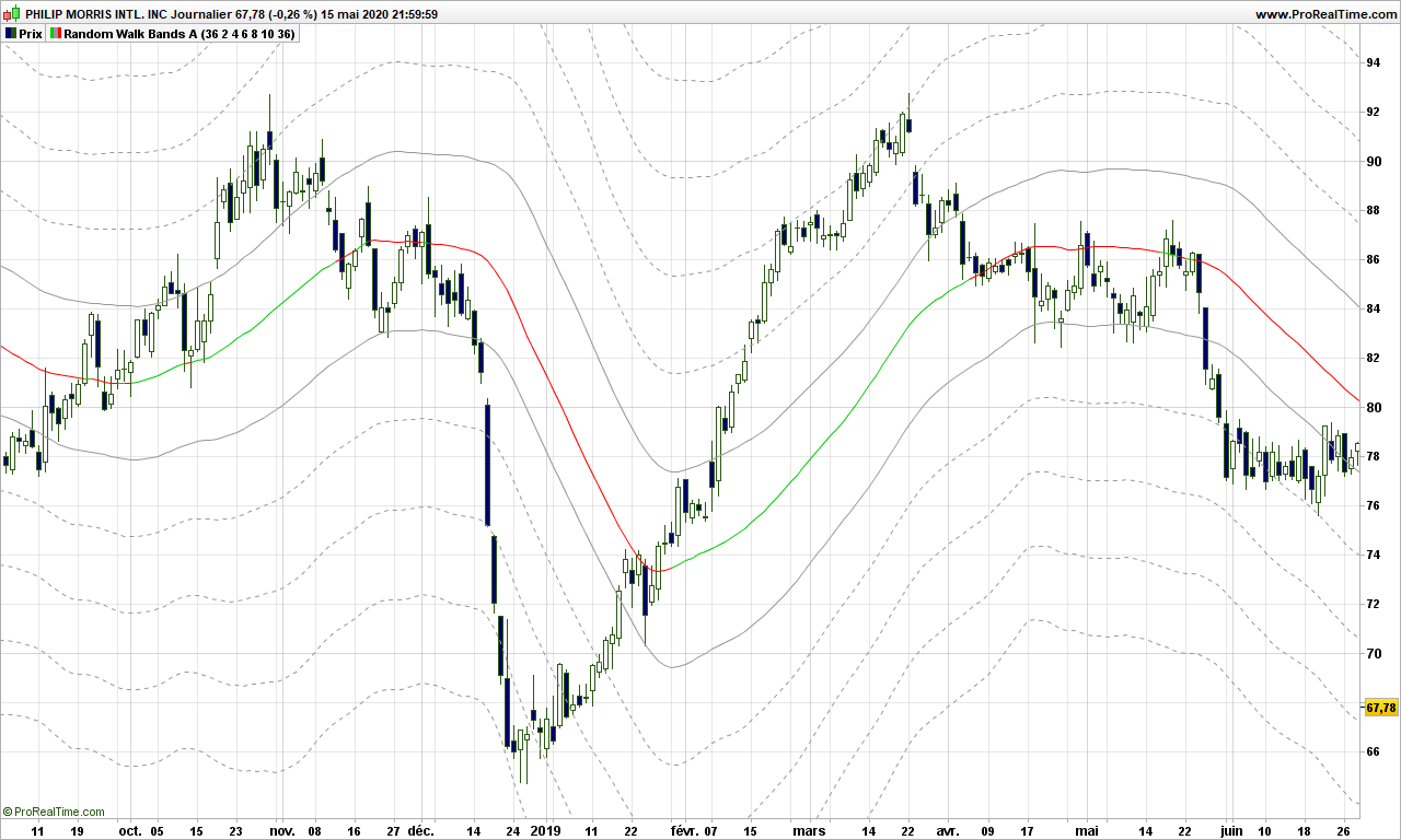
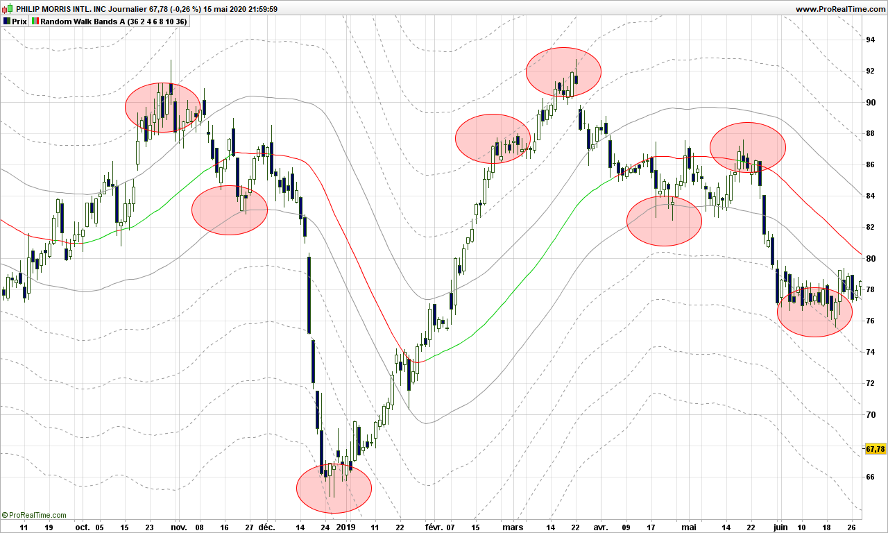
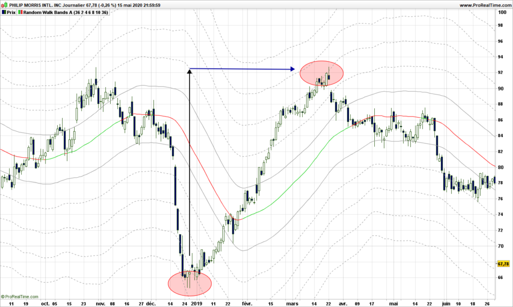
When a company changes so that it is not the same as before, because it has been eaten by a bigger one, or they invented a disruptive technology, it is not usually a smooth process. The new company may not have children (or clones) on its own because the market timing was missed. Or it may thrive in unusual manner and explode, what we call bubbles. This is exactly what we can observe and measure on our charts. Well, seems I have demonstrated life on earth is actually the output of a random process!

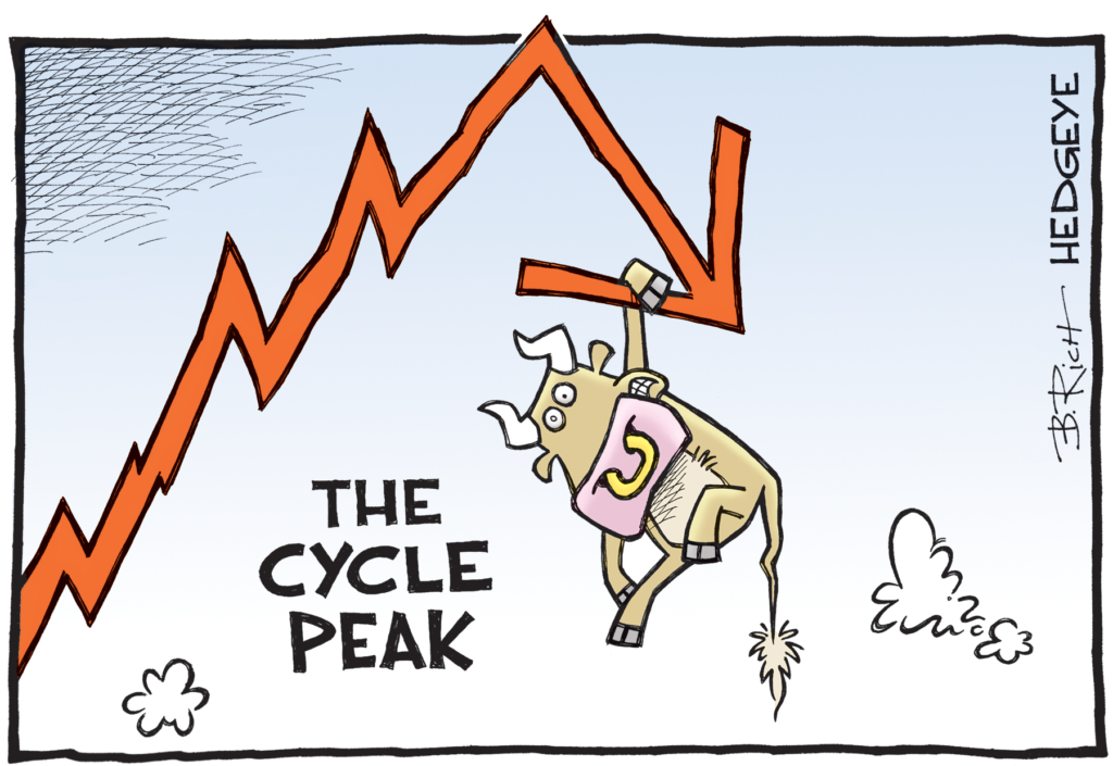
If you want to make money with trading (I did not say investing which is an other subject), you need board a ship that is willing to go northern direction. A disruptive technology is the right vector to use. Because, when something has the potential to disrupt, then it is attracting attention of big money, and you need to follow this track. If you are sticking to old business, then your gains may not outweigh your losses.

While I am it, instead of complaining of inefficiency of government in managing virus crisis, take time to think about disrupting something in a gently way. Become expert in one domain, then explode it with new concept, and sell you concept to make big money!

Now let’s look at the market and their disruption potential!

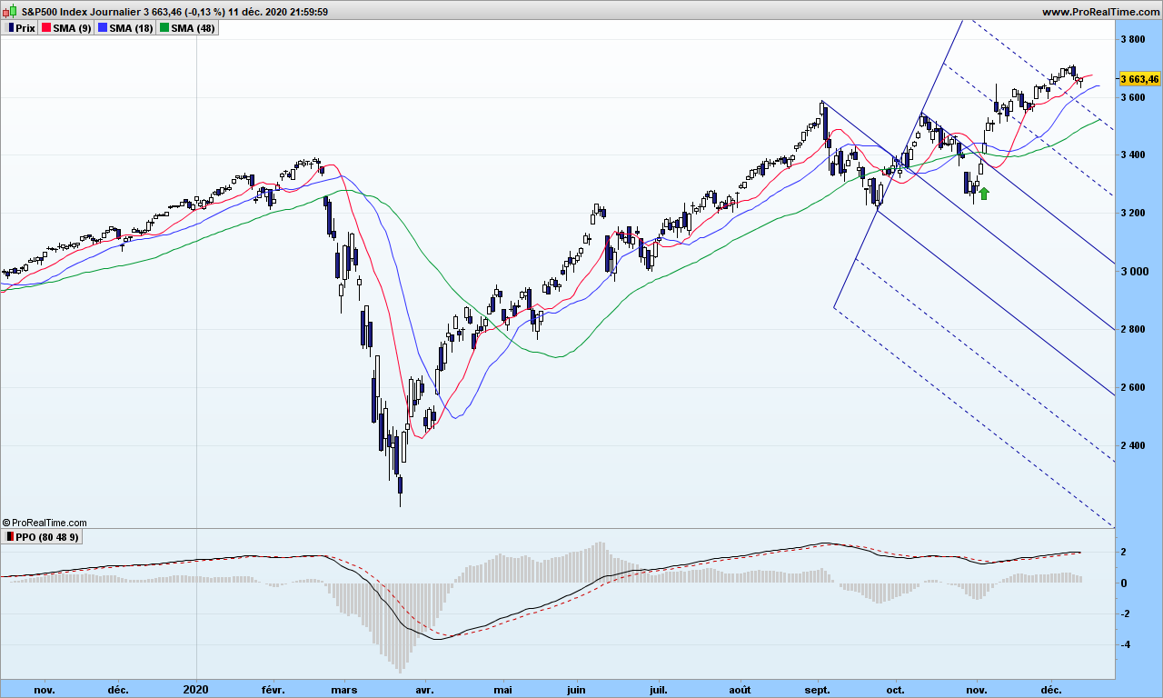
I will explain in future post about the usage of pitchforks. When you master many trading tools, you should change from time to time to avoid analysis being a boring task. So S&P500 escaped from a down trending pitchfork, thereby generating a buy signal. The MACD at the bottom being in positive area, and price being above moving averages, this was a good signal to check whether index was waking up from the horizontal move. Which it did! The slope looks good, we can stick with the market. Careful about any divergence with MACD… nothing to fear for now!

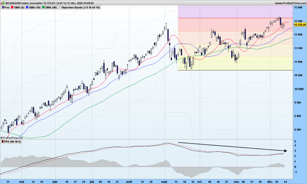
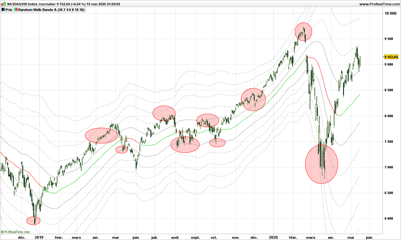
I am more concerned with Nasdaq. I is right on the 3-months objective and MACD is now lower than beginning of September. This is a divergence! Should you hold major index contributors, like Apple or Facebook, would be good to watch closer to market behavior and secure some gains!

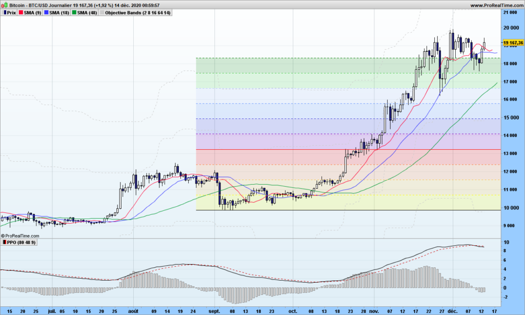
Bitcoin is still pleasantly flying in the 10R area, 10R means it is 10 times the Risk I took when I entered beginning of October (stop under yellow zone). I have taken partial gain and will come back to it later. As long as MACD is positive, I am keeping a small line so I won’t miss out the beginning of next rally (the famous FOMO) and then I will add more to the line when the rally is confirmed!

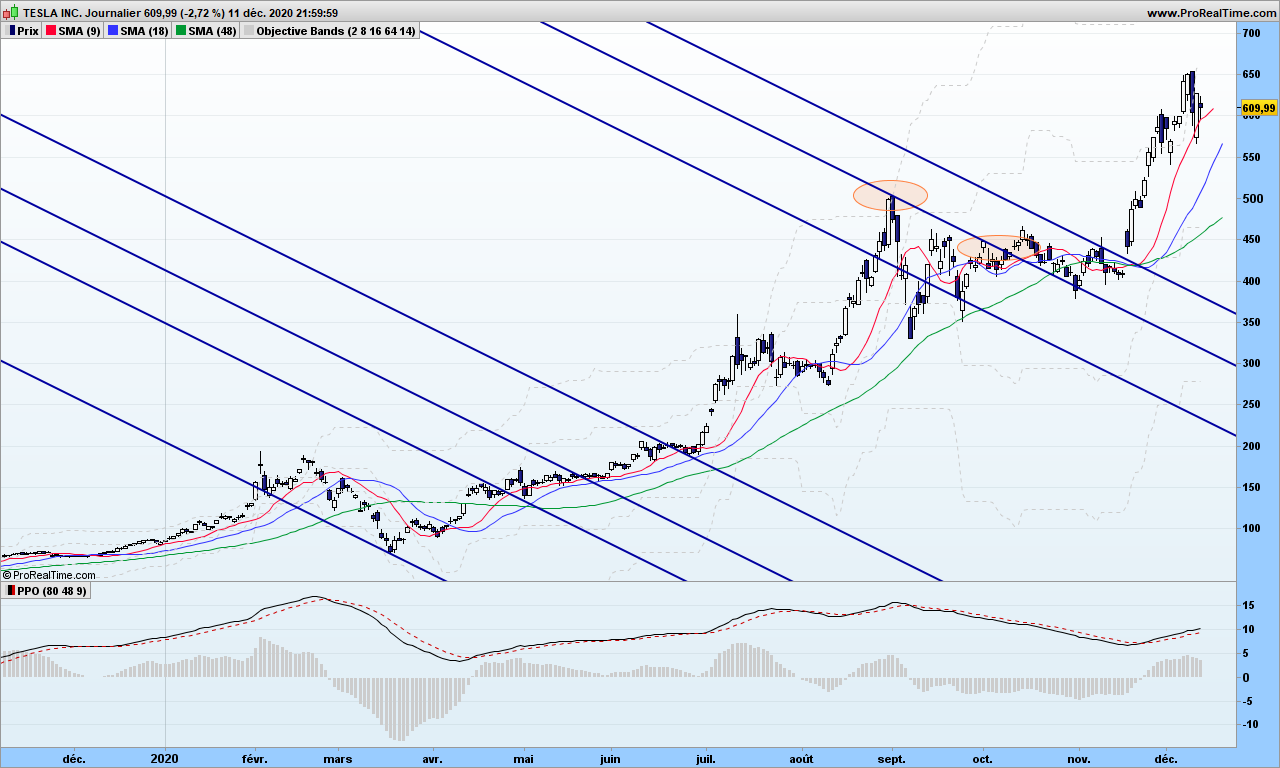
Telsa has landed (pun intended after Starship issue!) me a cool 40% of gains without leverage. Same divergence as Nasdaq. I will wait lower!

That’s it! Until next time, trade disruptively but safely!

[Beginner series] Trading with a pitchfork – Part 1

We begin a series of posts dedicated to newbies in trading. I wrote a few times, there would be no such posts, but of course I will take radically different approaches from other web sites. Again, I only target methods of trading that makes sense for those with small portfolio, so there is no need to spend too much time on candlestick theory other than a few key information.

Trading with a pitchfork sounds weird, but it is one of easiest and most reliable and profitable method… providing you know what you are doing. The second part of the sentence is exactly what is missed on some popular sites! Pitchfork trading is usually compared to channel trading, which it can be, but that is very poor usage of this wonderful tool!

Before we introduce the tool, you need to first major in peak and troughs analysis. Don’t go away just yet, it is pretty straightforward with a little practice. Peaks are … peaks and troughs are … just troughs! The major ones are usually easy to identify!

Let’s start immediately with an exercise. Can you point peaks and troughs on this Netflix chart?

Maybe you ended up with this, peaks with green ‘P’s and troughs with yellow ‘T’s

If you did not end up with same collection of peaks and troughs, that is fine. We are working with random system, you are allowed some deviations!

There is one important rule is that peaks and troughs must alternate: P – T – P – T – ….

Is there any way to automate the discovery of peaks and troughs? Answer is yes, and there exists more than one. But in order to respect previous rule, you will sooner or later meet some ghosts!

One way to to identify a trough (same for peak) is by using a two steps approach, first one can be automated easily, second one is more complex!

First step is to identify short term ‘swing’ points (SP), generic term for peak or trough. A swing point for a trough is simply a day where the low of the day is surrounded by two higher lows on each side. Example:

A medium term trough swing point is surrounded by one higher low short term swing point on each side:

Easy, isn’t it?

The medium term swing points will be the first ones of interest when playing with pitchforks.

Before I let you think on your own, remember the rule above, swing points must alternate tops and bottoms. But sometime, you will be missing a medium term swing point with the proposed method, so you know there is a ghost swing point!

Next time, we will look at how to anchor pitchforks to swing points

That’s it for this post! Comments are welcome!

Spotting and trading the Random Walk path!

After discussing raw volatility, standard deviations, no way we don’t have a discussion about ATR aka the Average True Range. This post will definitely blow you mind, I am going to demonstrate that markets are REALLY following a random walk path, pushing from one side to the other in a precise manner.

For introduction, please read again my previous post about drunkard’s walk.

Let’s consider an observation period of n days. The Highest High (HH) and Lowest Low (LL) may be considered as lamp post from which our drunken guy is walking. We know that on average we should be able to find him at a location situated at square root of n multiplied by average stride length or the Average True Range over n days to use financial wording.

Here is how it looks:

The red line is where Bulls expect price to be, whereas the Bears are waiting for the prices to reach the green lines. These are all average expectations of course, and these objective can be reached any time during the observation period. Please remember that down markets are usually twice faster that up markets.

What if we consider the middle price between these 2 expectations??

Let’s do a bit of maths:

  • Today’s high (H) is expected at LL + 2 * √n * ATR(n)
  • Today’s low (L) is expected at HH – + 2 * √n * ATR(n)

So the middle point can be defined as:

MP = .5 * ((H+L)/2 +(HH + LL)/2)

Of course price will not be there, X does NOT mark the spot, but it is a fair expectation about where prices should be, if there were no other information.

Let’s display it on a real chart!

We are going to use n = 36 in this post, you can use anything between 4 and 100, but make sure the square root is an integer for what will be following.

Ouch! It hurts the eyes. But you need to think of it differently. It is not a simple moving average, it is always using the most significant average of the day, between 1 and 36. Anyway you can already see that, when prices are above the path (light blue color),then trend is up. The path leaves a chance to prices to retrace and tends to be closer to them before a reversal.

Let’s not stop there and use a standard average of this path to smooth things out. Now follow my reasoning!

If the random walk theory holds, then the path we have spotted may very well be a lamp post so the actual prices should hover at exactly a number of strides from the lamp post, not 3.7 strides, 4 really! Let’s do it and display some lines at exactly every 2 steps (2 ATR’s) from the middle path.

Whaouh!!!!!!!!

The red/green line is the smoothed out path. Prices are pushing along the lines, see only a few examples highlighted in red circles here:

Just amazing.

One way to see it is to consider the middle path as the median line if you were using an Andrew pitchfork, first lines above and below are the MLH (median line high) and the other lines are warning lines!

Even better, if you are looking for warning lines above a major bottom, each represent a price objective. In the case below, the price identified on first warning line is reached a the top second red circle within .30$! (97.70 vs 97.42!)

Trading strategies are quite straightforward from then on:

  • From a warning line far below median path, play return to the path
  • From middle path that is going, play the trend and put a stop on a visible line below the price
  • If price is ‘in the central pitchfork’, most likely there is no trend!

Now, you will tell, this is an example, sure it does not work with last market conditions? Yes it does!

Here is Nasdaq recent price action, stopped on a warning line!

Or McDonald. Doing quite well!

Final thoughts: Market is moved by demand and offer. Behind these are drivers are humans or robots programmed by humans who can change their mind any time, giving the market a random outlook. This post would be worth many more investigations. Dr Andrew and his pitchfork really had a hint, but without computer, it was definitely more difficult for him. This is maybe the first explanation why Andrew Pitchfork are working and why it is so difficult to identify the right pivots to draw the pitchforks! Anyway, the random walk proves to a very good model, again because we are not trying to fit the data into a specific model or data distribution!

Feel free to comment or send email.

Until next time, trade safely!