This is going to be an important lesson for your perusal. Please take time to read it carefully, it contains essential information to increase your trading efficiency.
We want to discuss today how to trade with pitchforks in multi-time frame (MTF) environment. But before all, one must understand why we are doing it. It is not a matter of confirmation higher / lower time frame, it is not a matter of being more comfortable pending on your personal constraints, it is about decreasing risk and increasing profitability!
Before we dive into the pitchfork trading, let’s understand MTF risk reduction strategy and how we can decrease the risk by scaling DOWN and increase profitability by scaling UP !
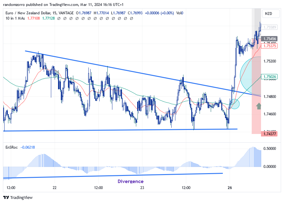
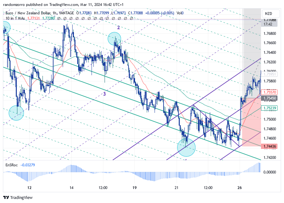
For this lesson, we are going to trade EURNZD. Let’s look at this recent price action on the 1-hour graph:
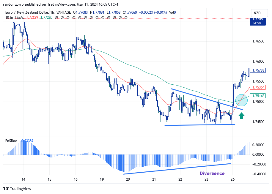
We have two moving averages, 25 and 100 EMA’s, and a smooth ROC indicator which does not care too much about which EMA you enter as a parameter. You have of course noticed a divergence with the ROC. You have even have drawn a kind of triangle of which escape yields a buy signal. However the red short term EMA is lower than the long one, so you may want to wait for a last confirmation with the crossing. Then you enter a trade, stop loss (SL) below recent low and target a 2.5 risk reward ratio (for instance):
Your risk is 1.75456 (entry price) – 1.74377 (SL) = 0.01079 NZD
Can we do better?
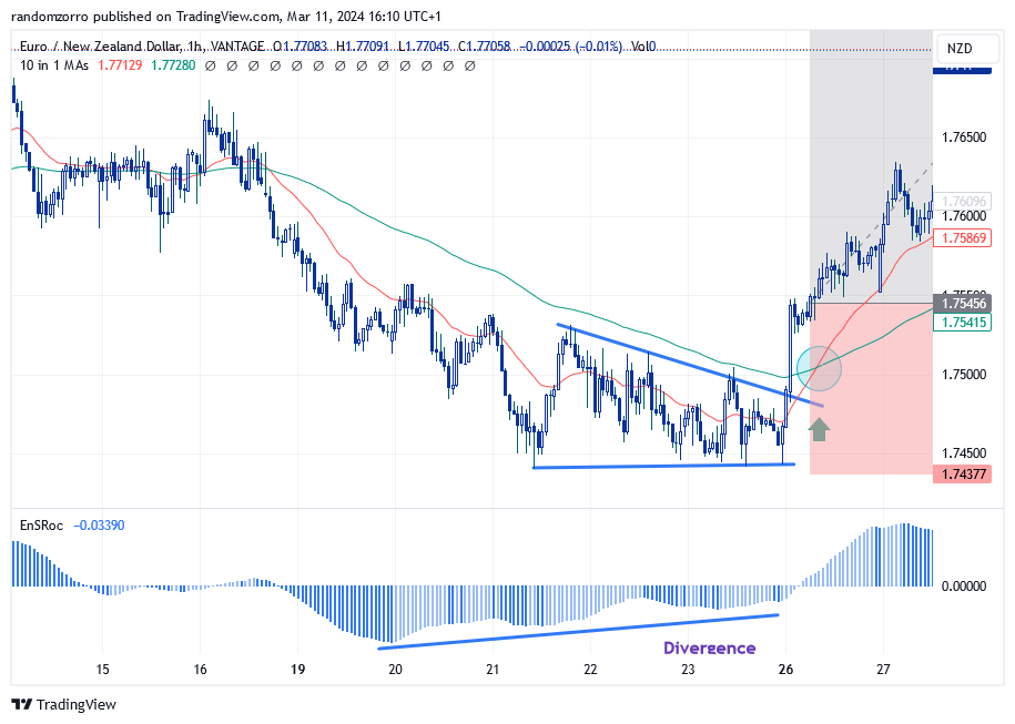
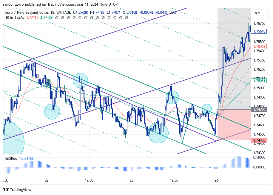
Let’s scale down to 15 min, meaning we switch the time frame of our trading software to 15 minutes. Same triangle but of course the moving averages have changed and the crossing is done when we exit the triangle! Momentum is positive and increasing. So nice!
So I can place an order on this time frame.
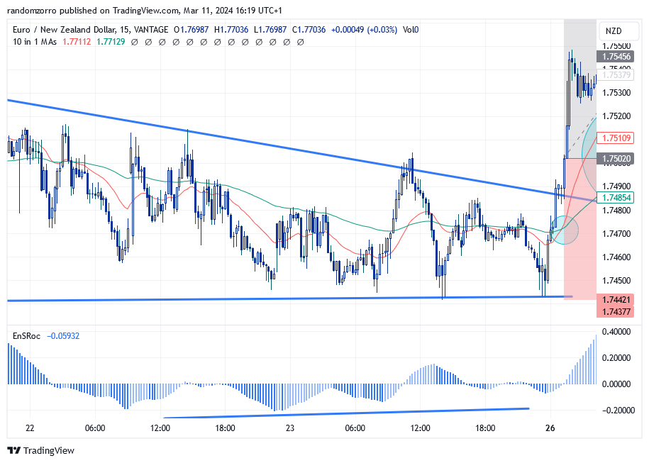
I keep the same target price and stop as before, but I have managed to enter at a much better price, and my RR is enhanced from 2.5 to 5.22! For 10$ risk, I might earn 52.20$ instead of 25$, more than double my profitability.
What about risk? Risk is now 1.75020 (entry price) – 1.74377 (SL) = 0.00643NZD, therefore a 41% risk decrease!!!!!
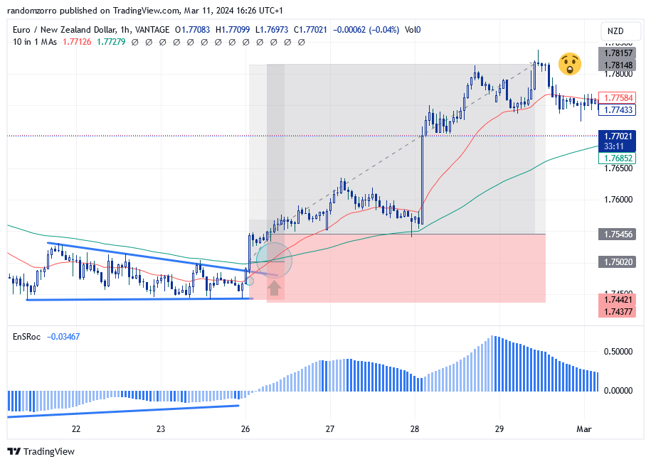
How did the trade go? Perfectly!
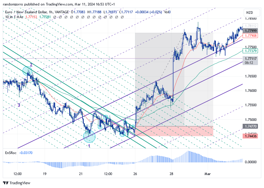
How does this relate to pitchfork trading? As you may remember, pitchfork gives us some sweat as we need to identify market structure, take the pitchfork, which may work or not during validation. So we don’t want to draw it on 1 minute charts! For the trade above, let’s see what can be done
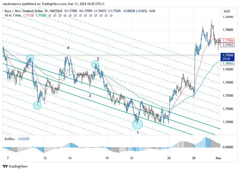
Market structure is obviously a down trending one, but the mini-pitchfork did not make me comfortable so I had to hybrid it (more on that in future posts). Now I have multiple contacts with warning lines. I feel better and I see prices exiting the pitchfork at the same timing, more or less.
Now you can draw a new pitchfork as SP1 is fully confirm to be a local trough, and a SL can be placed below the lower MLH:
You can of course move your SL along the lower MLH to make a trailing stop!
Your risk is 1.75450 – 1.74436 = 0.01014 NZD
Can we improve?
Well yes! We can keep the purple pitchfork but on 15 minutes, you need to find a new trigger pitchfork (green one) with new market structure at that level:
Place buy order on top of the exit candle. Now your RR has hiked from 2.5 to 9.57!!!!
Your new risk is 1.74770 – 1.74436 = 0.00334 NZD so a 77% risk reduction.
Of course same trade turned out the same
Whatever trading system you use, you can get the same benefit from scaling down.
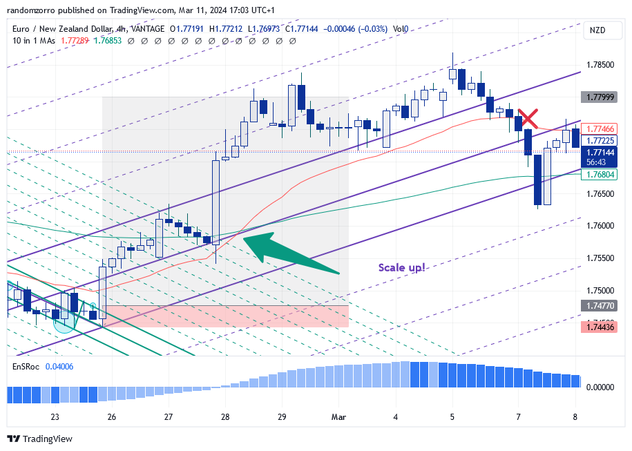
Now let’s look benefit of scaling up:
On the 4h time frame, once we get a similar golden cross between the short and long EMA’s, we are allowed to scale up:
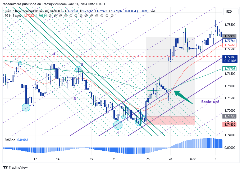
After the golden cross, your trade is hugely profitable, so you want to secure some profit. For the remaining of the line, you may want to target extra profits. Place your trailing stop below the red average for instance and let your profits run for as long as the market wants.
In this particular case, it did not work but my RR was around 8.
That’s it for today. The example was with forex today but it is of possible to use this strategy on 5min/1min time frame or on crypto and you could get huge RR’s (>30) from time to time. Enjoy.
And until next time, trade safely!