Pitchfork trading: market structure and pitchfork selection

I hope you have gone through previous post and especially its exercise!

The solution to this exercise will lead us to market structure definition and will pave the way to selecting the right pitchfork for the right market configuration.

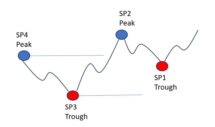
Exercise reminder: We consider the last 4 swing points, start with a peak SP4. SP3 being a trough is below SP4. SP2 is above SP3 and SP1 is below SP2. Easy?

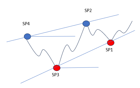
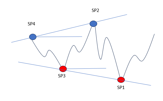
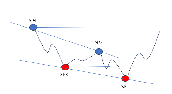
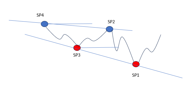
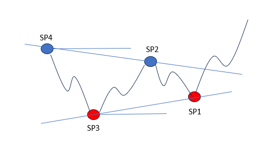
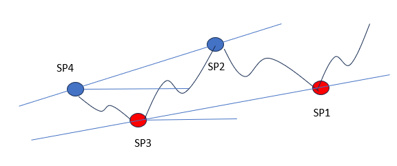
Now if I am looking from the outside, how many figures can these make? That was the question!!! Try it by yourself on a piece of paper. SP2 can be above or below SP4. SP1 can be above or below SP3. Figures are obtained by linking SP4 and SP2 by a straight line, SP3 and SP1 by an other line. Eventually we can only make SIX different geometrical figures!!! Think and draw a bit more!!!

Here they are:

Figure 1 – Bubbling market
Figure 2 – Unstable market
Figure 3 – Reversal market
Figure 4 – Counter trend market
Figure 5 – Flat market
Figure 6 – Strong trending market

That is all there is to market structure. Channel with parallel lines are exceptions, as they comply to 2 of these figures. Note you get exactly same figures in the bearish case. You don’t need to remember hundreds of figures :-)))

I recommend that you give names to these figures, whatever they can make you think of, so you can refer to them more easily.

Exercise!!!! Now that you know all possible structure, can you draw a diagram of transition between figures? E.g. starting from figure 2, which I usually call unstable market, what are the possible next ones?

The knowledge of question just above is important. Because we all hate flat markets (figure 5) but as you will figure out easily, flat market can consolidate even more (figure 5 can transistion to another figure 5) while an unstable market (figure 2) will always lead to directional market (check it out!!)

Now here revealed exclusively to readers of this blog are the pitchforks you need to select for each market structure to get buy signal as explained in previous posts.

What are those mini pitchforks? How do we draw them? Plenty of open questions which we will see in next lessons with plenty of illustrations!

In the meantime, trade safely!

Bitcoin: when is the story going to end?

Sorry I have been away for a few weeks to attend other businesses. I was also working on the future eBook which is not as easy as writing for a blog. There must balanced information, not too much to avoid overwhelm reader but enough anyway to kick curiosity and critical thinking! So should I write about inverted Laplace transform? Well answer is yes, but I need to make it simple for casual reader out there!

For this return I am going to talk only about Bitcoin, which has gone again over the roof. You may see everywhere Bitcoin is a gigantic bubble that will explode maybe tomorrow morning, leaving all of those with fortunes in Bitcoins … broke! Nothing can be further from truth, because as long as some countries tolerate Bitcoin as a concurrent to local currency somehow, those who forbid are also getting late on its technology and all the improvements it can bring in terms of security, cryptography, …

The ‘problem’ with Bitcoin lays probably with the price paid to miners which is halved every 4 years, and so Bitcoin price has to go up or the mining can not be profitable over the long term. That being said, price has only one direction over the long term: it is UP! Until it is pushed out forcefully by a better bitcoin….

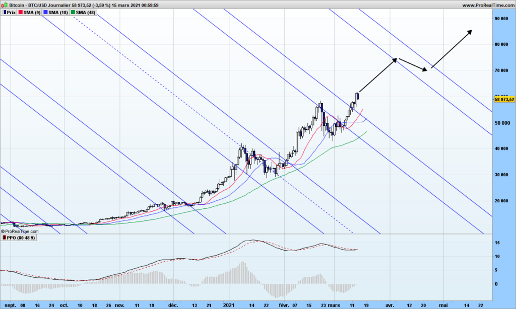
Let’s look at the chart:

I have drawn the action-reaction lines, which is the only way to predict when and where the next top might take place. There is hidden symmetry in the market which you can see clearly, Bitcoin has been stopped by down slopping reaction line then wen through when many weak hands thought Bitcoin was going down back to 10k$.

There is almost zero resistance now until beginning of April. I expect the trend will be a bit slower. From exponential, coming back to parabolic more sustainable move is all we want!

That’s it! From now on, I will post some trading opportunities on some selected Nasdaq stocks with action-reactions line for your reading pleasure.

Until next time, trade safely!

[Beginner series] Trading with a pitchfork – Part 2

In part 1, you have learned how to identify key market turning points, which we have called Swing Point, shortened to SP. Swing points follow peaks and troughs in alternative way. Then we looked at short term and medium term SP’s. The last one are the ones we are interested in for drawing pitchforks.

Of course, the first question is why drawing pitchforks? Pitchfork is an interesting tool in the sense that is allows to identify trend in easy and blunt manner, no discussion is needed; then it gives buy and sell signal; it also measures the volatility! In short a dream tool, this is my Christmas gift to readers, but mastering will require some practice!

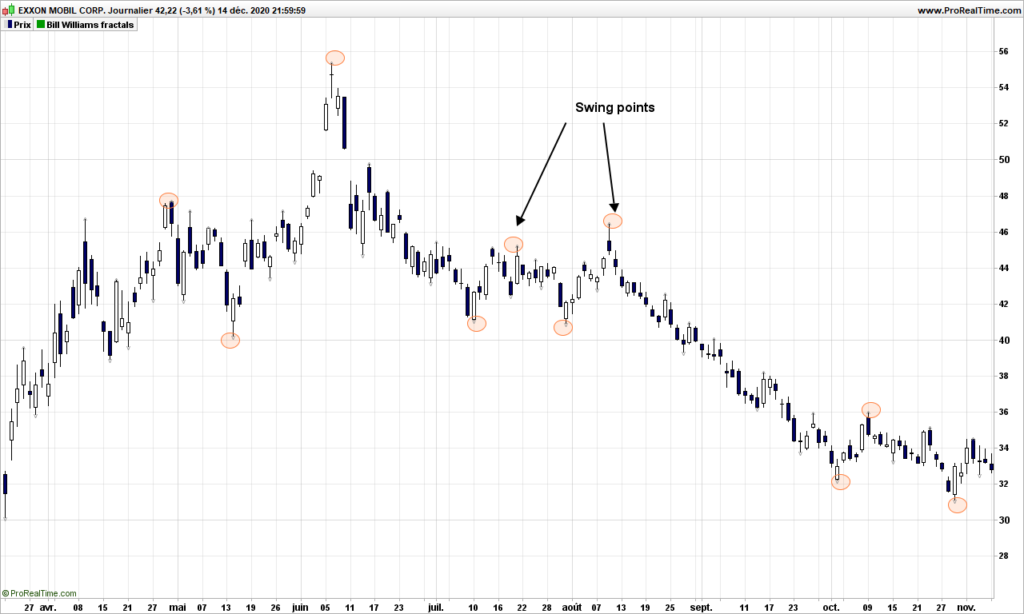
We are going to play with Exxon Mobil today. On the following graph, I have indicated the medium term swing points. Again take time to practice a bit here, because then it becomes (relatively) more difficult.

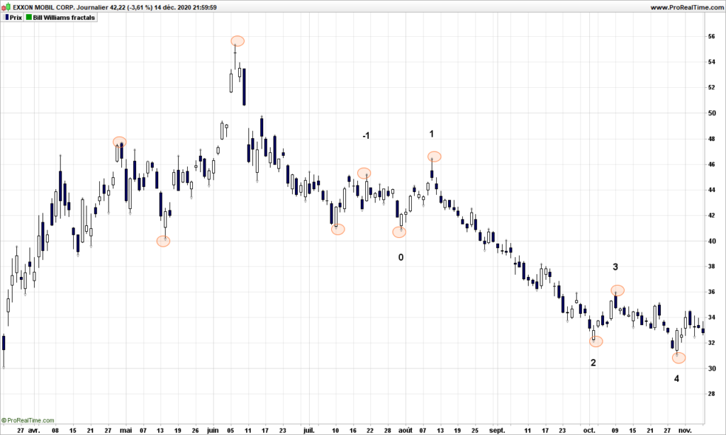
We are going now to number the SP’s, starting from the right of the graph, and in backward direction from 4:

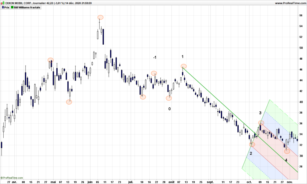
Tough, isn’t it? Then your charting software should have a pitchfork tool. Select it and select the swing pints 1, 2 and 3. You should get something like that:

I am not going to explain the geometry used to draw the pitchfork, there are plenty of sites that do this. Let’s zoom instead on price action:

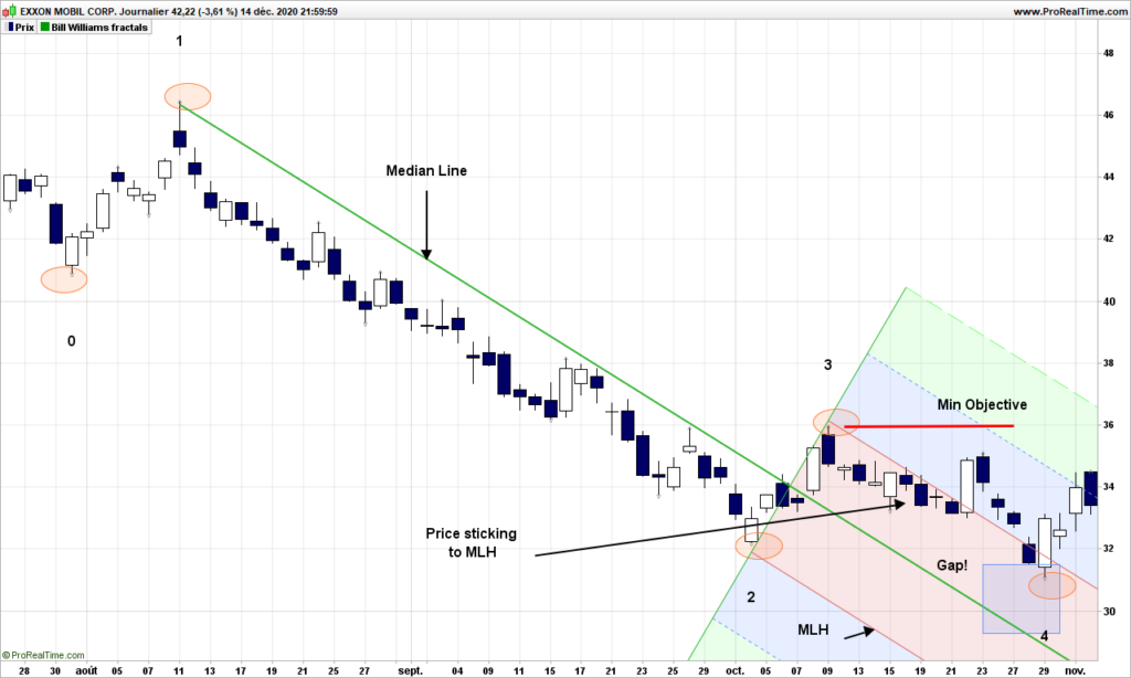
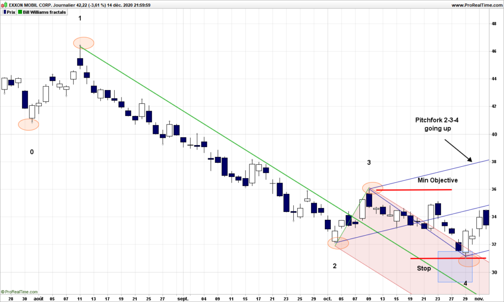
The green light is the median line, the red ones are the MLH (acronyms defined by doctor Andrew), are parallel to median line. After SP3, you notice that prices seem to adhere to the upper MLH, that is a sign of strength! At point 4, you can easily observe that price have not touched the median line, there is a gap between SP4 and median line, this is an other sign of strength and, according to A. Andrew, the minimum price objective for this situation is the price at SP3! The pitchfork is down trending and price have already exited the pitchfork even before SP4: this is the buy signal! We are all set up. We need to verify one last thing, the pitchfork made on SP’s 2, 3 and 4 should be trending up! Let’s draw:

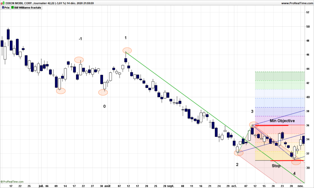
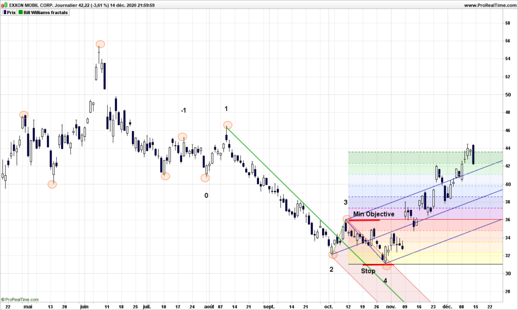
Everything is perfect. We will look in future post the rules and how to find out where prices might be going, but let’s use for now the minimum price objective, so you need to place an order with stop at SP4 and objective at SP3, meeting your gain / risk sensitivity.

How did the trade go?

The min objective was reached only a few days later, then price has gone up since, landing currently a cool 33% at the time of writing!

This was your first pitchfork trade. Next time, we will look at the major rules to use pitchforks in safe and efficient manner.

Until next time, trade safely!

The boring market report – November 10th 2020

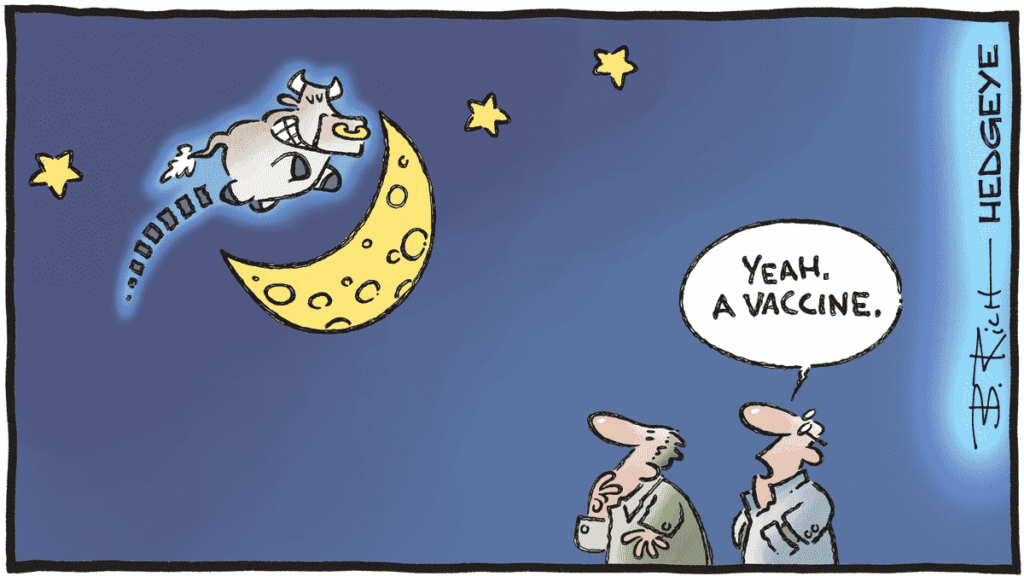
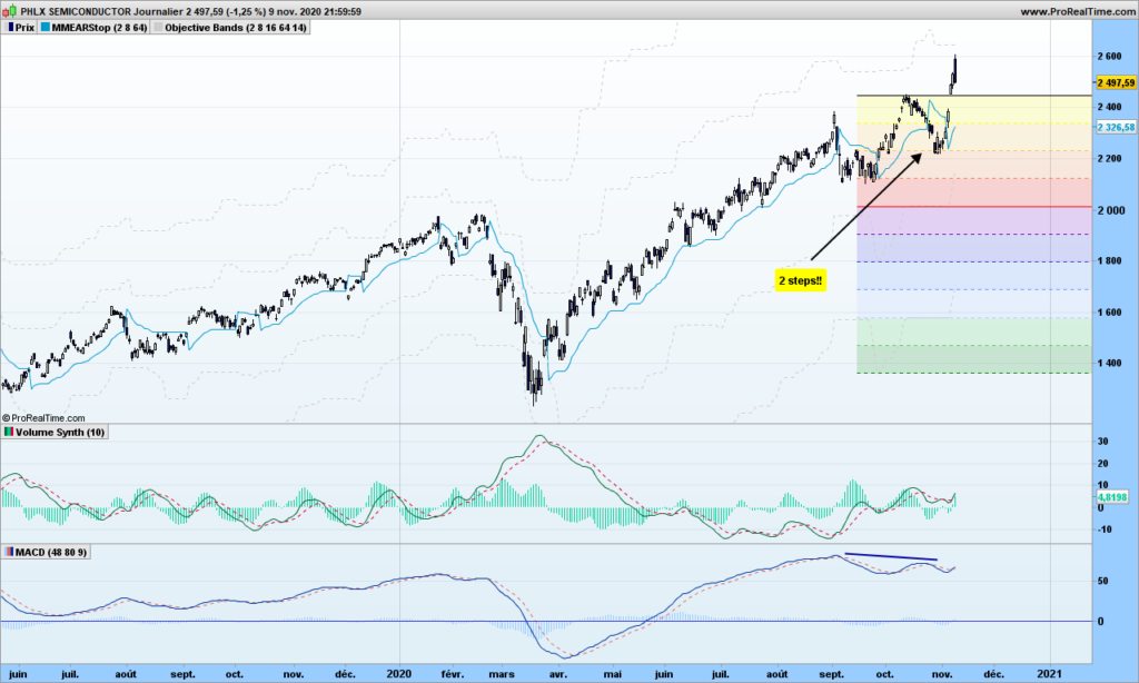
In last report, I was bearish for the short term, all indicators pointing in same direction: south! Now there were the US elections, and then yesterday the possibility of the existence of an efficient vaccine. Please note that Joe Biden is not formally elected and the vaccine testing is not formally finished! But anyway, markets have decided to turn back north after 2 steps to the south. This happens from time to time, stops are there to save us from disastrous situations.

Let’s look at Semi-conductor index first. The divergence on MACD should have driven the index towards the South. However volumes (see previous post) did not increase on that scenario, so it was a dead end.

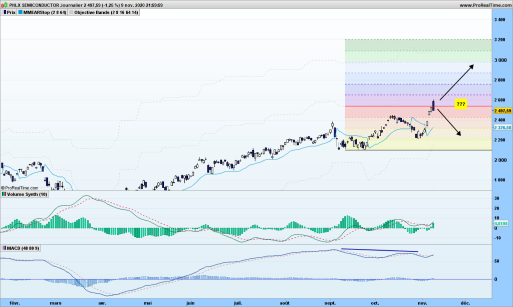
Where are we going next? I need to show the steps in the opposite direction!

The first objective has been reached already and attempt to go beyond has failed yesterday. Short term traders may short this situation but the long term is up so you may want to stay on board for now, going to 3000. 5G should push in this direction!

Same situation for other word indexes, no additional comments.

Bitcoin has reached and gone beyond initial objective, hope you are part of the trip! (See other comments on previous post)

That’s it for today. Until next time, trade safely!

The light secret volatility of volumes

I have talked many times how the volume of information (fake or real) continuously unloaded onto media (social or not) is actually misleading (or trying to) your trading activity, just as using those brackets in the text! Trading the mathematical way just helps you with information overload.

You may have noticed I have not talked the actual volume data so far, one reason being that it is not freely available for all the supports we want to trade with. I am going to show you how to simulate this information, and how to more easily analyze volume information.

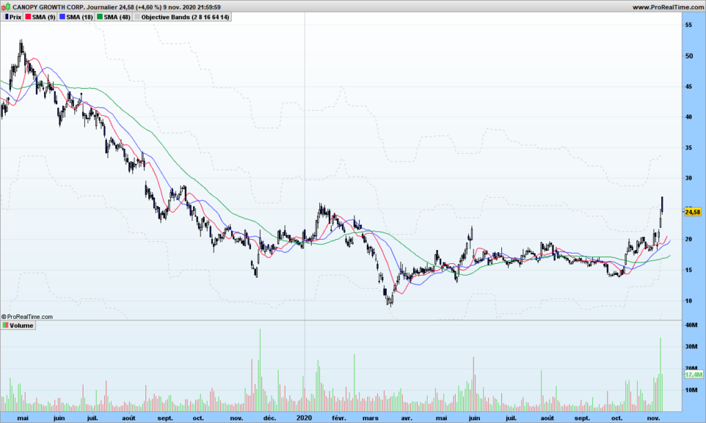
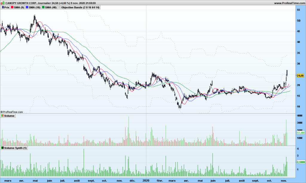
Let’s play with CGC – Canopy Growth Corp, a company involved in Cannabis business (just to attract search engines!). Volume is usually display in form of histogram at the bottom of your graph, with up days in green color and down days in red color.

There seems to be some outstanding spikes here and there, these are usually linked to specific events, could be quarterly results, and dividends payments, or law changes, or market important information. These can be some good entry points in a trend, especially if you missed the beginning.

Before we jump to more detailed analysis, if you consider Bitcoin or even some sector index, you may not get this information easily, or you may need to pay for it. So it would be good to simulate it, even if we would be missing the actual scale information, i.e. the real volume information.

I have already mentioned in WAD2.0 post that Williams Accumulation Distribution can be calculated without volume information

1. Calculate True High (TRH) and True Low (TRL)
TRH = Current bar high or precious bar close, whatever is higher
TRL = Current bar low or previous close, whatever is lower

2. Calculate current bar Accumulation/Distribution:
if Current close is above previous close then
AD = Current Close – TRL
if current close is below previous close
AD = Current close -TRH
if current close = previous close then
AD = 0

The absolute value of AD is the simulated volume. Let’s look at it:

You can see the spikes in volumes are located at the same place, more or less. So now we can use this calculation to get volumes sort of information for Bitcoin or Gold or whatever… Good, one problem fixed! On top of that, I can even make it smoother with synthetic bars as explained in same post mentioned above!

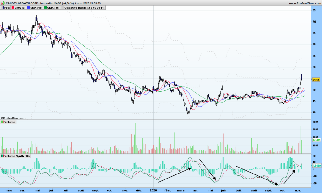
Now you would like to know if volume is really going up or down in more accurate way, maybe something you can even automate. As a reminder, this is linked to your observation period, you will to consider parameters that make sense to you. The solution is straightforward, let’s apply the good old MACD to volume.

Whaouh, we can see things now! Note I used the 10-days synthetic volume here to smooth things out and a MACD with 40-80-9 parameters. Volume does not tell you the trend but you know a trend is starting or getting stronger if volume is going up! On the right side, you see the recent rally is helped by strong volume increase, just get in the market and then use stop or objective or whatever strategy to get out. Volume will indeed go down when the trend cools down, and then volumes will go up again but it might trend continuation or trend reversal (see first arrow!)

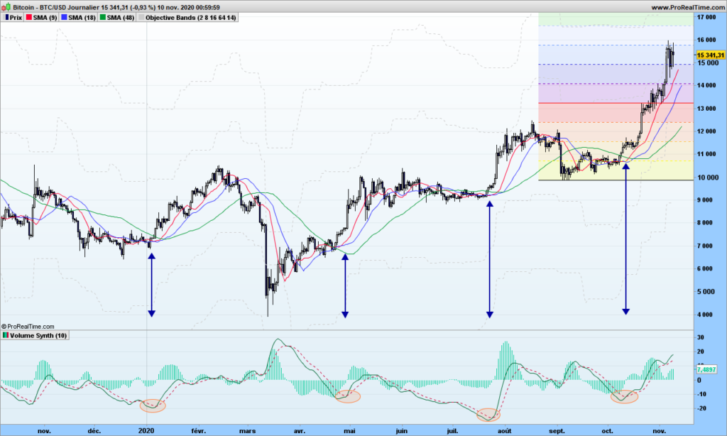
Now look at this Bitcoin chart:

See? Each rally is preceded by a signal cross over MACD. Confirmation by the moving averages. Easy, isn’t it?

That’s it! Until next time, trade safely!

Undistorting investing reality at the speed of light!

I am sure you are wondering what I am going to talk about with such a post title! But let me start by asking a question: Can you tell me what is speed of light with good accuracy? I will be back after this break:

Whatever answer you give me (ideally should be: 299792458 meters per second), what I did is just awake part of your brain that deals with math, physics, … or intelligence to summarize. It is very important for next question:

Why do you invest your money for?

  1. To save planet from crazy climate evolution
  2. To help companies being more socially responsible
  3. To make as much money as possible
  4. To help out spot aliens if case they come to vicinity of earth

See you can not lie any more to me or to yourself, the only possible answer is number 3. Your brain orders you to take that answer.

Now think about you last meeting with your banker (didn’t I write bankster?). You were surely told how we need to build a safer and green planet, how it is difficult to have profitable investments…

Had your banker started by asking you my initial question, the meeting would have much more complicated for him, you would most likely have told him “give me 10%, I know you can do it!”

Can he really do it? Not in straightforward manner but short answer is yes. The theory is simple. All the countries will need pay for the money they have printed for the pandemics, and the way they will do it is by applying deep negative rates to accounts, maybe down to -5% or -6%. Whaouh! <Add more interjections here!> It will go slowly for acceptance by people but it will happen. But wait, here we are discussing treasury bonds! When interest rates go down, the price of bonds goes up. When the rate is down by 1%, bonds prices go up by 6% or more!

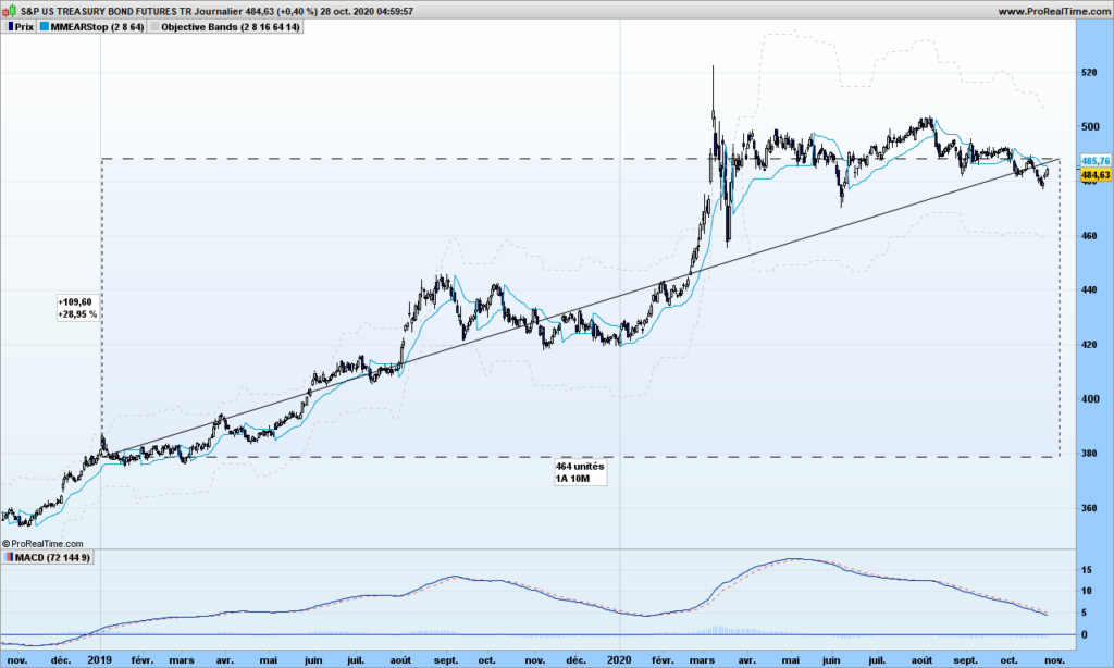
See that one graph below (US treasuries bonds futures). While your bankster now charges you negative rate, he invested your money in treasury bond, yielding a cool 29% over the last 2 years, 9% for 2020 YTD. Ouch, that hurts!

Now go and see your banker, ask him to put treasury bonds in your portfolio (of course, consider there is some risk level involved here), keep as little cash as needed if you get negative rates. Enjoy the face that your banker will make! Especially if rates go down, deep down, very deep down, …

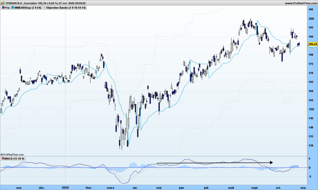
The same goes for trading. You are told to use indicators with preset parameters recommended usually by the guy who created it. I have explained many times the fraud that the Gaussian distribution is, it actually causes distortions of reality. Indicators are the same: they let you see the reality through a specific prism, and if they are not based on sound mathematical principles, they will mislead your investment decisions. The popular MACD falls into such category (I will let you look at the formula), though it might be efficient when used in specific market conditions but also with right parameters. See Ferrari below, MACD with default parameters is flat for most of the growth this year:

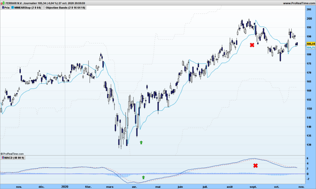
As mentioned many times, an investing or trading action must be linked to an ‘observation’ period. You want to earn x% over the next y months. The parameters should be set in such a way that you can follow your trade easily : entry point, target price, exit time. Say I want to capture most of the up trend over several months, I change the default parameters to 48 and 80. Look at MACD now, close to perfect!

It does not take too much intelligence to uncover a trading strategy that works. Just wake up your brain by wondering what is the speed of light!

That’s it! Until next time, trade safely!

The boring market report – September 23rd 2020

Don’t worry, we are not there yet, only one big drop on Monday when everybody sold what they have, as the little tiny virus does not seem to want to vanish.

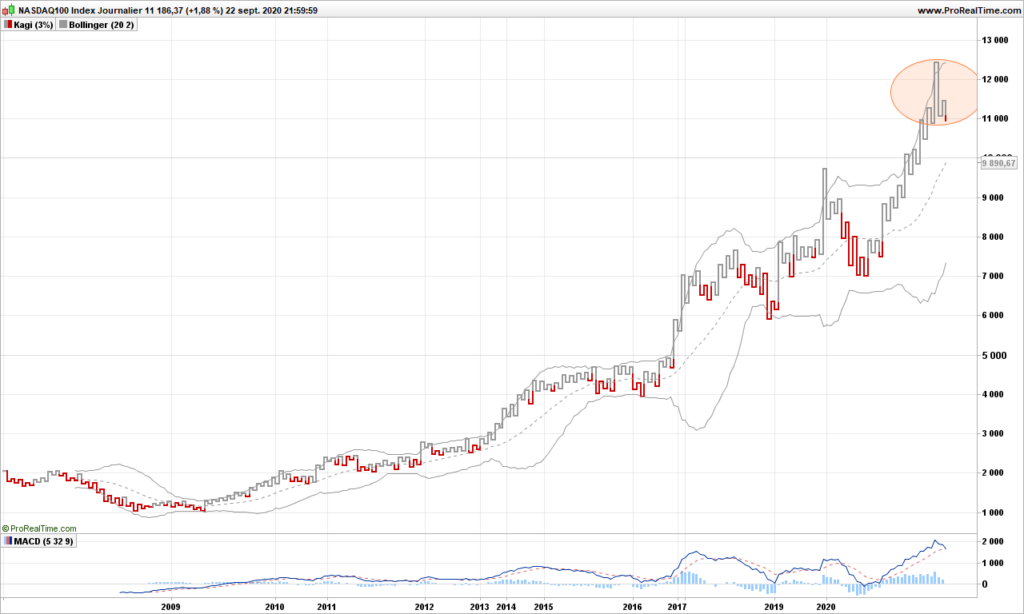
From the long term perspective, always good to look at kagi graph:

A 3-Buddhas top pattern is now obvious, and prices have gone to the ‘yin’ side. As you can see by the average in dotted line, the trend is still very bullish on Nasdaq….

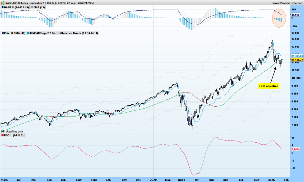
Let’s take a closer look at with candlestick chart:

The first objective is reached!!! So Nasdaq kindly bumps back to north direction. Does not mean it will not go through the floor in next couple of days, that is when you want to go short, but as usual, in intelligent manner, not risking you pants and shirts!

That’s it for today. Busy with other stuff. Until next time, trade safely!

Secret new indicator makes trading easier!

When it comes to teasing potential subscribers for a newsletter, whether free or not, authors always mention a secret new indicator which detects the 10-baggers, stocks that can multiply by 10 in next few months. How disappointing when you find out it is about crossing the 1-year high! Such indicator indeed just does not exist, because stocks prices are moving because people are buying aggressively and not the opposite. We can predict with some accuracy where market has chance to make tops and bottoms in the near future based on volatility but exponential growth predictions can not be relied upon! Be cautious!

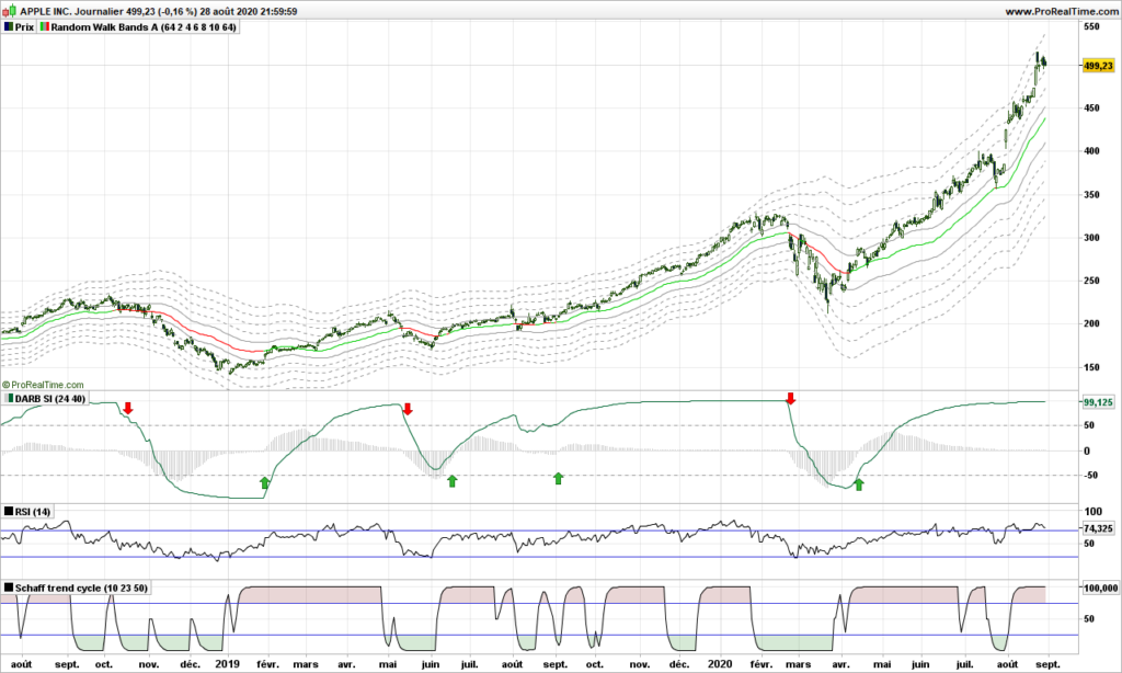
Brought to you by Cozy Dragon Trading Research Labs is a single new indicator that provides a sense of direction and timing never seen so far. It does not have any name so let’s call it Secret Indicator (SI). Let’s take a look at it!

Overlaid on price is our random walk path and just below the SI. If you are looking from the buy arrows, SI goes up keeps going up until the very day of trend reversal. Zero crossings of SI or its histogram can be used to trigger the buy action. There are a few finer rules to make the analysis fully reliable.

Please compare with RSI or STC indicators just below, causing many buy and sells orders because of whipsaws….

We can not disclose the formula behind this indicator. But we will use it in background for our market analysis!

That’s it for this back-from-vacations message. Until next time, trade safely.
S&P500 Market analysis June 30th 2020

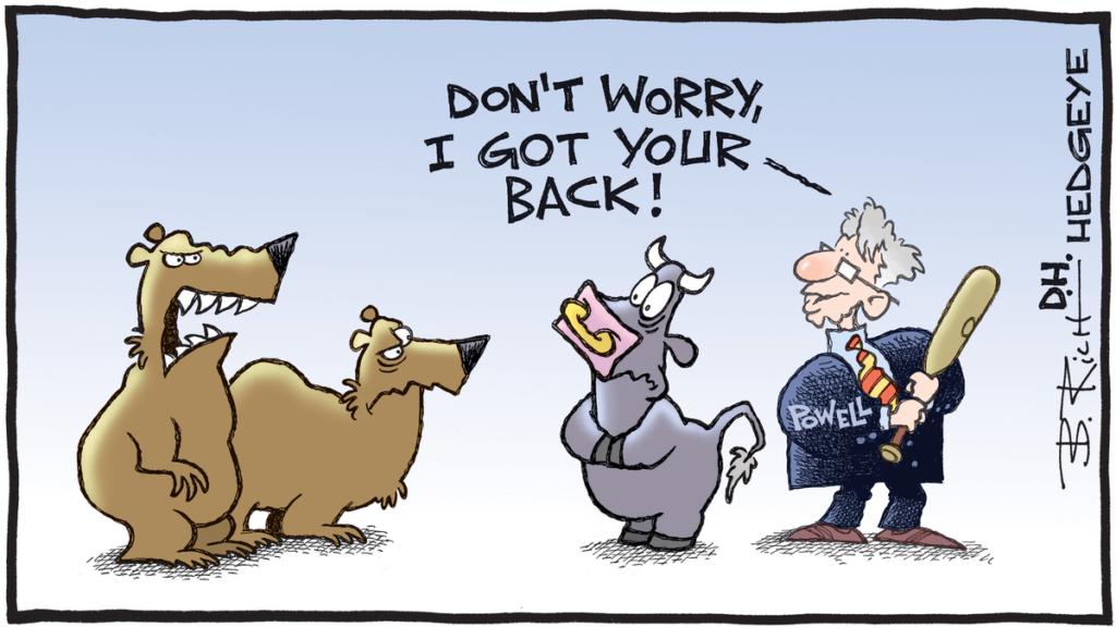
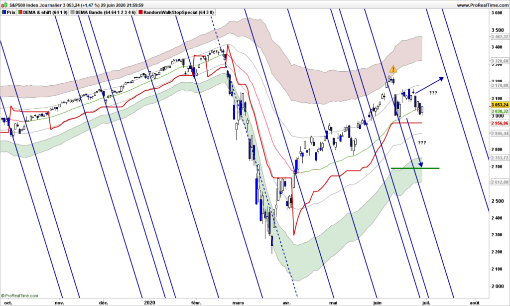
S&P500 is still hesitating where to go, bears are now predicting a new market crash because of a stupid virus that can not be kept under control in the US and bulls are thinking that Fed is standing, ready to do whatever is needed to sustain the markets….

I introduced the Ferrari trading tool in previous post. As you can see, we reached also the red zone. Either you jumped out at that time or… your stop is taking care of securing your profits, especially should the trend continue, you are ready to drive it along!

With a stop positioned at 2956, you can switch off your screen and enjoy the sunshine!

Talk to you later!

Facebook will make you rich. Or not…

In 2012, Facebook IPO price was about 40$. Just 3 months later, it was trading at 18$ but if you bought at that time, then you would be enjoying today about 1000% performance just by holding the stock and not caring what might happen on the stock market. That was a bet at the time, that I have not taken!

I personally hate Facebook because it prevents its users from thinking by themselves, promoting subliminally some herd thinking that is supposed to facilitate your life. And people are so gullible they are buying the invisible marketing message.

Imagine I want to buy this electric car from eMoon Motors. I look on Facebook if any of my friends, real or virtual, have bought any and what they think about it. I have found 5, 1 is very angry because his wife dislikes it very much, 3 are complaining and 1 has no opinion. What happens is that people who are not happy are writing it to let out their bad energy, and others that had a little problem are going to confirm, hugely amplifying that scratch on the door made by a dog passing by. People who are happy don’t take the time to comment. What can you deduce then? Well, nothing!

Who has become rich with Facebook? The founders of course, and stock owners. Any users? No! All users have given for free all their data to a monster that is selling this (free!) data to advertisers – wonderful business case, thereby also preventing serious newspapers with real content from getting advertisement, among other consequences. World would probably be better off without Facebook, users already have many alternatives but ignore them out of convenience or laziness. Of course, if your (potential) customers are all using Facebook, you have to use it!.

Facebook stock is a stock real hard to play, because it tends to gap every once in a while, causing automatic trading algorithms to go nauseous. Don’t let that prevent you from making a trade or two when visibility is fine.

The stock follows a random path, too flat most of the time to make substantial gains, but as you can see, the price wanders along the warning lines, like invisible resistances, then suddenly end of last week, a black Friday!

What is happening? Tier-1 corporations propose to boycott FB through November election if Zuckerberg does not take action to control hate speech, that is everywhere on this media! Companies include Unilever, Verizon, Honda, The North Face, Ben & Jerry’s, Patagonia, Mozilla, Birchbox Dashlane, TalkSpace, LendingClub, and Coca-Cola , just to quote a few. See how good I am also at advertising, but I do it very smoothly, not disturbing the casual reader!

What to do now? At very least, as a trader, you should be out and you can come back later. No, stay with me, I am not finished yet! The indicators at the bottom are the Accumulation/Distribution (A/D) and one derivative. The money during last 2 months was still going in, but not so fast (divergence), and now A/D has also crossed its average indicating money is flowing out of FB. The random walk path is still green (going up), so I do not advice a short position in this time frame. The objective for this down move is 186$ but could be stopped before. Don’t think that Zuckerberg is going to sit around seeing the money vanishing , sure we are going to see some Facebook message stating that situation is under control, and he will invite his announcers to a party (not a virtual one) to celebrate this. If it fails, prepare for a plunge to 130$! Have fun!

That’s it. Until next time, trade safely!