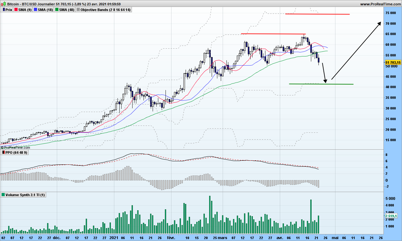
At last!! An expected and welcome correction on Bitcoin.
MACD is still positive so it is not a bearish trend change. Volumes are increasing on this last move, so it is very possible for Bitcoin to reach my random walk objective of 41800$
Once we get there, higher than the November low, we will obviously have an hidden divergence on MACD, Bitcoin should go back up from there. Careful, however, wherever Bitcoin goes afterwards back up, the market will be in unstable configuration, which might bring it down to 20k$, which be of course a huge buying opportunity. We are not there yet!
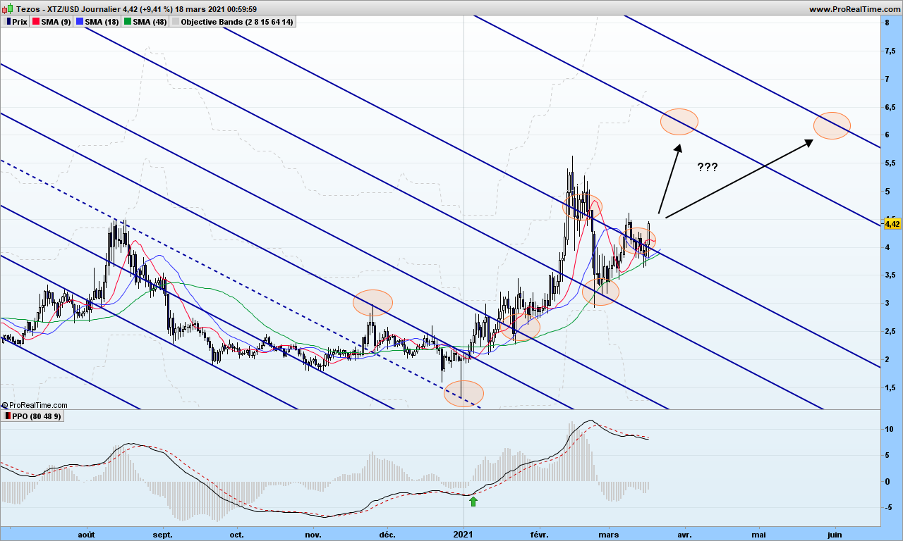
I possibly mentioned Tezos earlier. Maybe I had not drawn the action and reaction lines. As can be seen from graph below, the trend is still up, Tezos has been taking some leisure time around the reaction line and seems to be going up again. You can draw triangles if you wish, but note there is no special scientific theory backing up such figures!
On the downtrend from 5$ to 3$, of course volume was big, it has decreased a lot but stays at high level. This is why we want to stay with the major trend which is up! Divergence between MACD and its histogram also points to same conclusion. The next reaction line is quite far away, objective could be reached by end of March if we are lucky and market is strong enough!
How do I play it?
I already have a position that I bought at 2$ (green arrow) and I halved it at 5$ (objective was 4.57$). New objective is 6.23$, 40% on top of current price with a stop at 3.70$. So I am buying half a position to restore one full line, half a line invested for as long as long term trend is up, the over half is trading to increase profits. The stop applies only to half my position.
That’s it. This is no recommendation of course. Until next time, trade safely.
Anaximander of Miletus, a Greek philosopher who lived in the 500s B.C.E. speculated that humans must have descended from some other type of creature, most likely fishes. This idea became later a scientific theory when Darwin wrote about it. But it still is a theory, because these days, no new species arise on earth, maybe man will change into superhuman with exoskeleton and additional processing power, but still is a man, form fit and and function wise! A counter theory is that at some point in time, a disruption occurred, allowing for instance more radiation from the Sun or stars on brain cells, that allow the monkey to become a different specie: the man! Don’t tell anyone I told you about this one ;-))
When a company changes so that it is not the same as before, because it has been eaten by a bigger one, or they invented a disruptive technology, it is not usually a smooth process. The new company may not have children (or clones) on its own because the market timing was missed. Or it may thrive in unusual manner and explode, what we call bubbles. This is exactly what we can observe and measure on our charts. Well, seems I have demonstrated life on earth is actually the output of a random process!
If you want to make money with trading (I did not say investing which is an other subject), you need board a ship that is willing to go northern direction. A disruptive technology is the right vector to use. Because, when something has the potential to disrupt, then it is attracting attention of big money, and you need to follow this track. If you are sticking to old business, then your gains may not outweigh your losses.
While I am it, instead of complaining of inefficiency of government in managing virus crisis, take time to think about disrupting something in a gently way. Become expert in one domain, then explode it with new concept, and sell you concept to make big money!
Now let’s look at the market and their disruption potential!
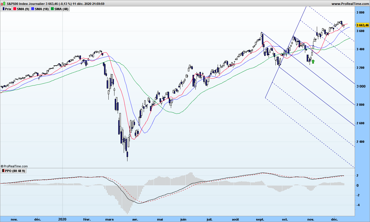
I will explain in future post about the usage of pitchforks. When you master many trading tools, you should change from time to time to avoid analysis being a boring task. So S&P500 escaped from a down trending pitchfork, thereby generating a buy signal. The MACD at the bottom being in positive area, and price being above moving averages, this was a good signal to check whether index was waking up from the horizontal move. Which it did! The slope looks good, we can stick with the market. Careful about any divergence with MACD… nothing to fear for now!
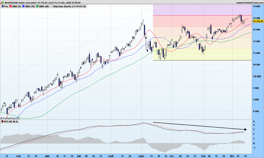
I am more concerned with Nasdaq. I is right on the 3-months objective and MACD is now lower than beginning of September. This is a divergence! Should you hold major index contributors, like Apple or Facebook, would be good to watch closer to market behavior and secure some gains!
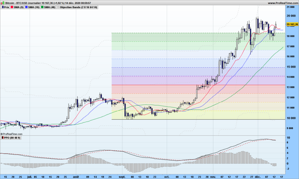
Bitcoin is still pleasantly flying in the 10R area, 10R means it is 10 times the Risk I took when I entered beginning of October (stop under yellow zone). I have taken partial gain and will come back to it later. As long as MACD is positive, I am keeping a small line so I won’t miss out the beginning of next rally (the famous FOMO) and then I will add more to the line when the rally is confirmed!
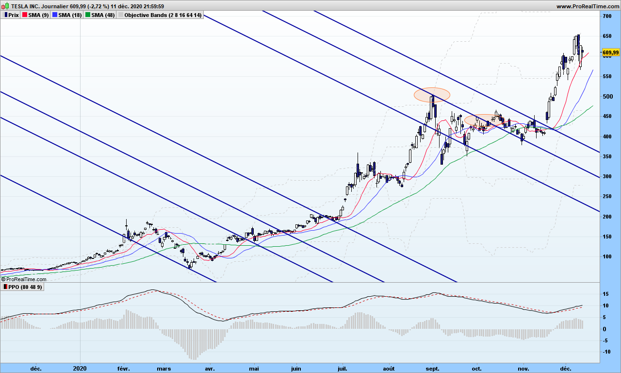
Telsa has landed (pun intended after Starship issue!) me a cool 40% of gains without leverage. Same divergence as Nasdaq. I will wait lower!
That’s it! Until next time, trade disruptively but safely!
I have talked many times how the volume of information (fake or real) continuously unloaded onto media (social or not) is actually misleading (or trying to) your trading activity, just as using those brackets in the text! Trading the mathematical way just helps you with information overload.
You may have noticed I have not talked the actual volume data so far, one reason being that it is not freely available for all the supports we want to trade with. I am going to show you how to simulate this information, and how to more easily analyze volume information.
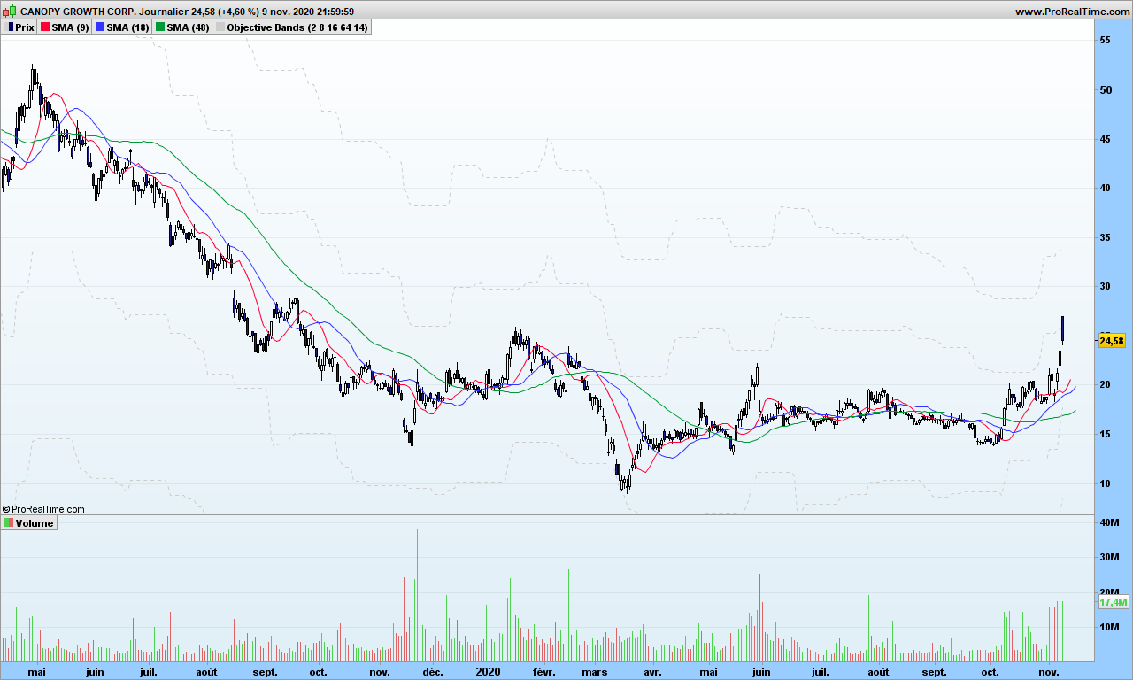
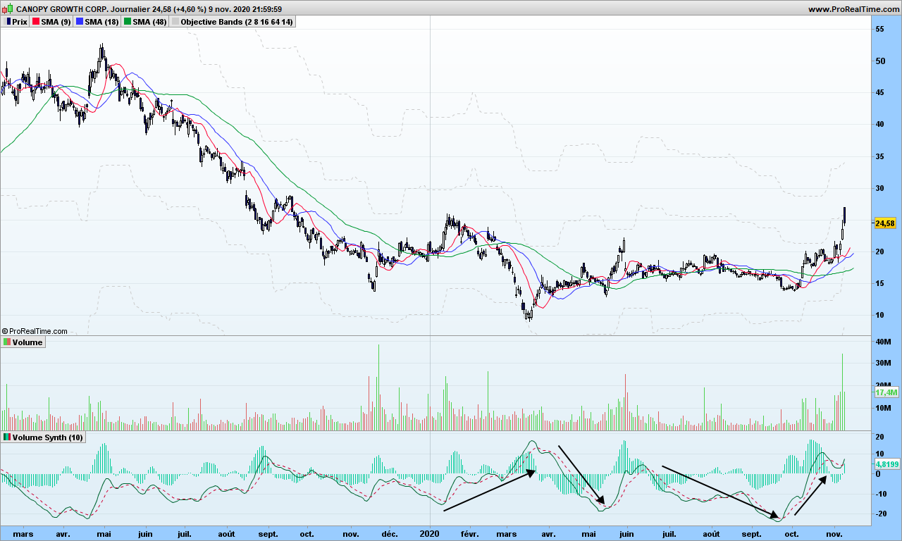
Let’s play with CGC – Canopy Growth Corp, a company involved in Cannabis business (just to attract search engines!). Volume is usually display in form of histogram at the bottom of your graph, with up days in green color and down days in red color.
There seems to be some outstanding spikes here and there, these are usually linked to specific events, could be quarterly results, and dividends payments, or law changes, or market important information. These can be some good entry points in a trend, especially if you missed the beginning.
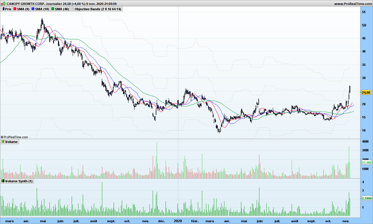
Before we jump to more detailed analysis, if you consider Bitcoin or even some sector index, you may not get this information easily, or you may need to pay for it. So it would be good to simulate it, even if we would be missing the actual scale information, i.e. the real volume information.
I have already mentioned in WAD2.0 post that Williams Accumulation Distribution can be calculated without volume information
1. Calculate True High (TRH) and True Low (TRL)
      TRH = Current bar high or precious bar close, whatever is higher
      TRL = Current bar low or previous close, whatever is lower
2. Calculate current bar Accumulation/Distribution:
if Current close is above previous close then
          AD = Current Close – TRL
      if current close is below previous close
          AD = Current close -TRH
      if current close = previous close then
          AD = 0
The absolute value of AD is the simulated volume. Let’s look at it:
You can see the spikes in volumes are located at the same place, more or less. So now we can use this calculation to get volumes sort of information for Bitcoin or Gold or whatever… Good, one problem fixed! On top of that, I can even make it smoother with synthetic bars as explained in same post mentioned above!
Now you would like to know if volume is really going up or down in more accurate way, maybe something you can even automate. As a reminder, this is linked to your observation period, you will to consider parameters that make sense to you. The solution is straightforward, let’s apply the good old MACD to volume.
Whaouh, we can see things now! Note I used the 10-days synthetic volume here to smooth things out and a MACD with 40-80-9 parameters. Volume does not tell you the trend but you know a trend is starting or getting stronger if volume is going up! On the right side, you see the recent rally is helped by strong volume increase, just get in the market and then use stop or objective or whatever strategy to get out. Volume will indeed go down when the trend cools down, and then volumes will go up again but it might trend continuation or trend reversal (see first arrow!)
Now look at this Bitcoin chart:
See? Each rally is preceded by a signal cross over MACD. Confirmation by the moving averages. Easy, isn’t it?
I am sure you are wondering what I am going to talk about with such a post title! But let me start by asking a question: Can you tell me what is speed of light with good accuracy? I will be back after this break:
Whatever answer you give me (ideally should be: 299792458 meters per second), what I did is just awake part of your brain that deals with math, physics, … or intelligence to summarize. It is very important for next question:
Why do you invest your money for?
To save planet from crazy climate evolution
To help companies being more socially responsible
To make as much money as possible
To help out spot aliens if case they come to vicinity of earth
See you can not lie any more to me or to yourself, the only possible answer is number 3. Your brain orders you to take that answer.
Now think about you last meeting with your banker (didn’t I write bankster?). You were surely told how we need to build a safer and green planet, how it is difficult to have profitable investments…
Had your banker started by asking you my initial question, the meeting would have much more complicated for him, you would most likely have told him “give me 10%, I know you can do it!”
Can he really do it? Not in straightforward manner but short answer is yes. The theory is simple. All the countries will need pay for the money they have printed for the pandemics, and the way they will do it is by applying deep negative rates to accounts, maybe down to -5% or -6%. Whaouh! <Add more interjections here!> It will go slowly for acceptance by people but it will happen. But wait, here we are discussing treasury bonds! When interest rates go down, the price of bonds goes up. When the rate is down by 1%, bonds prices go up by 6% or more!
See that one graph below (US treasuries bonds futures). While your bankster now charges you negative rate, he invested your money in treasury bond, yielding a cool 29% over the last 2 years, 9% for 2020 YTD. Ouch, that hurts!
Now go and see your banker, ask him to put treasury bonds in your portfolio (of course, consider there is some risk level involved here), keep as little cash as needed if you get negative rates. Enjoy the face that your banker will make! Especially if rates go down, deep down, very deep down, …
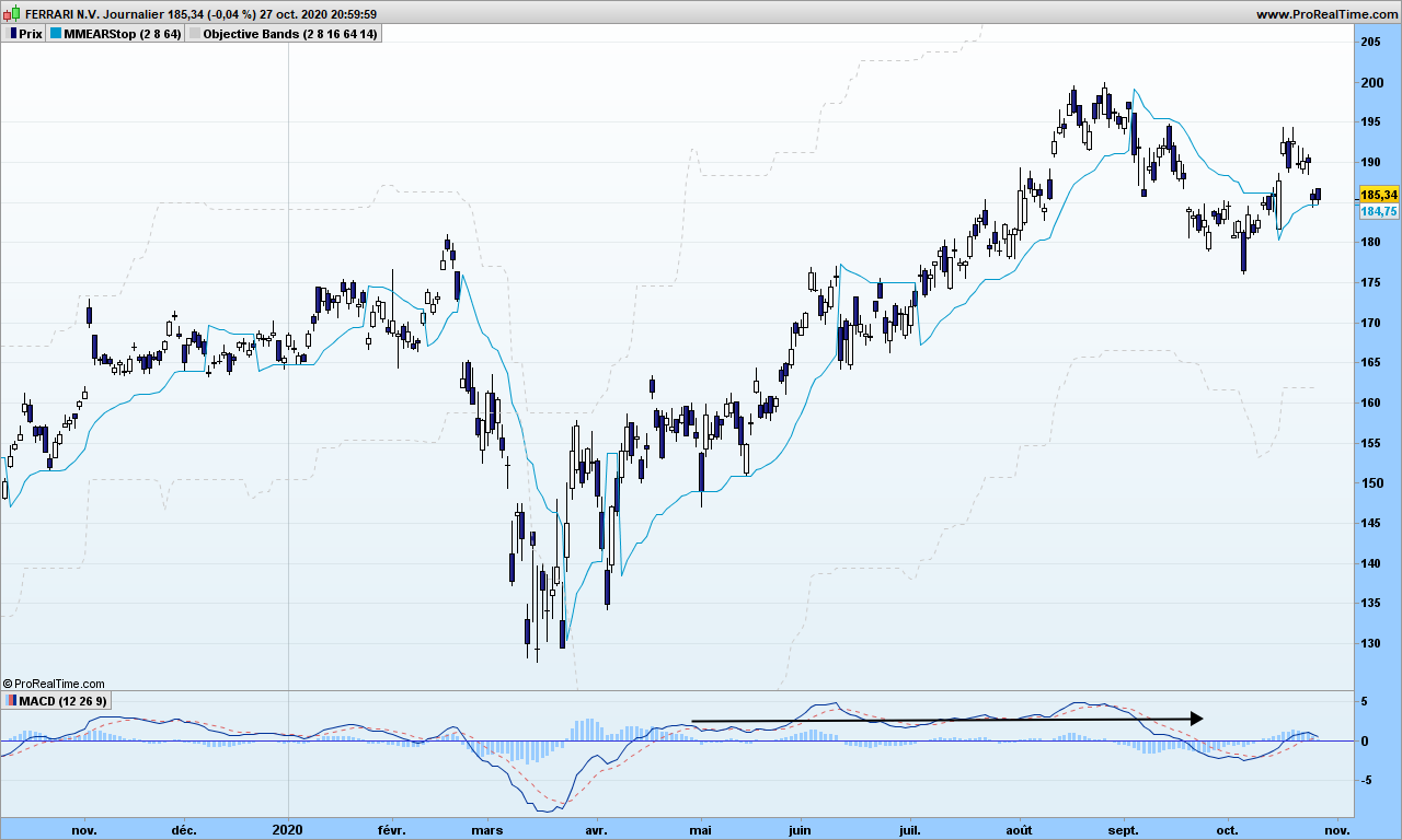
The same goes for trading. You are told to use indicators with preset parameters recommended usually by the guy who created it. I have explained many times the fraud that the Gaussian distribution is, it actually causes distortions of reality. Indicators are the same: they let you see the reality through a specific prism, and if they are not based on sound mathematical principles, they will mislead your investment decisions. The popular MACD falls into such category (I will let you look at the formula), though it might be efficient when used in specific market conditions but also with right parameters. See Ferrari below, MACD with default parameters is flat for most of the growth this year:
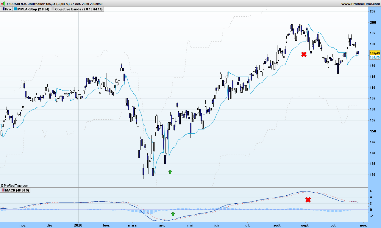
As mentioned many times, an investing or trading action must be linked to an ‘observation’ period. You want to earn x% over the next y months. The parameters should be set in such a way that you can follow your trade easily : entry point, target price, exit time. Say I want to capture most of the up trend over several months, I change the default parameters to 48 and 80. Look at MACD now, close to perfect!
It does not take too much intelligence to uncover a trading strategy that works. Just wake up your brain by wondering what is the speed of light!
Today we are going to study how trends transition to more or less flat markets and how to position ourselves for the best!
I am sure most of you are already familiar with indicators which supposedly indicate when a market is trending, and when you would be better off sleeping and out of the market.
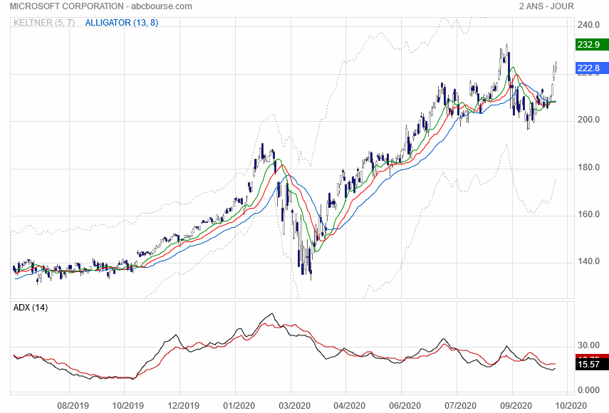
Moving averages are close to be one of best indicator for that purpose. See that graph of Microsoft with Alligator indicator. Note ADX indicator at the bottom does not indicate too much!
The truth is investors are either having the same opinion at the same time and there will be a trend or investors disagree and market ends up being choppy and overall very flat. So any time that you see what could be the end of a trend, switch to drunkard mode and start counting the steps! If you need background information, please refer to this blog post.
Sure enough you could wait for prices to cross Alligator lines and then that colors are in the right order, … then you may have lost 50% or more the big next move! You need think differently. Don’t worry, I will skip the action-reaction lines for today!
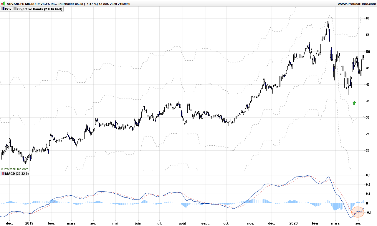
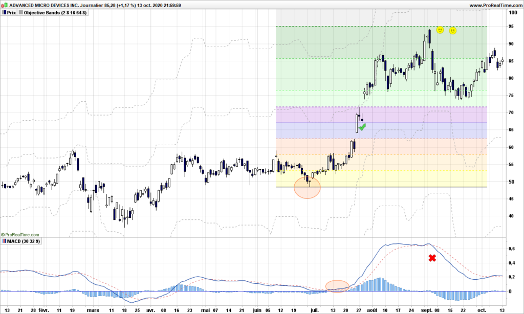
First step if course to detect the end of an existing trend (at least 2-3 weeks long), you can use MACD crossing over its signal for this purpose. See this example with AMD:
What the heck am I supposed to do here? We are obviously leaving a short down trend and we don’t know where market is going to go. Nobody does unless you can dig into the brains of all investors at the same time!
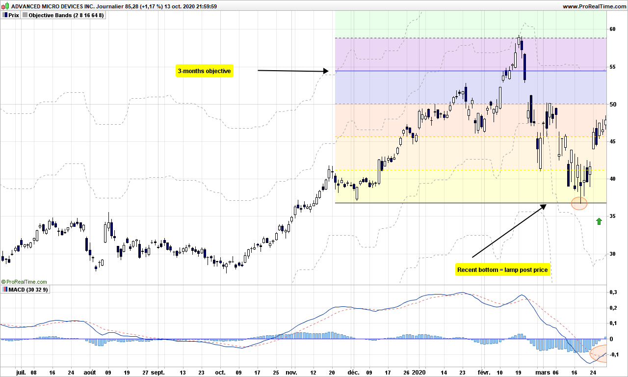
Again we assume the most recent bottom is a lamp post, from where our drunk guy is going to walk northwards, maybe in trending manner or in random hesitating steps. But we know about the objective he can reach within the next period of observation. This is the first dotted line above the candles. In this example, it is 8 steps away and we are going to draw lines every 2 steps.
Now we are ready, the 3-months objective is roughly 55$, you need to use a convenient stop to protect and dimension your trade. See this post for instance. Let’s accelerate the time now!
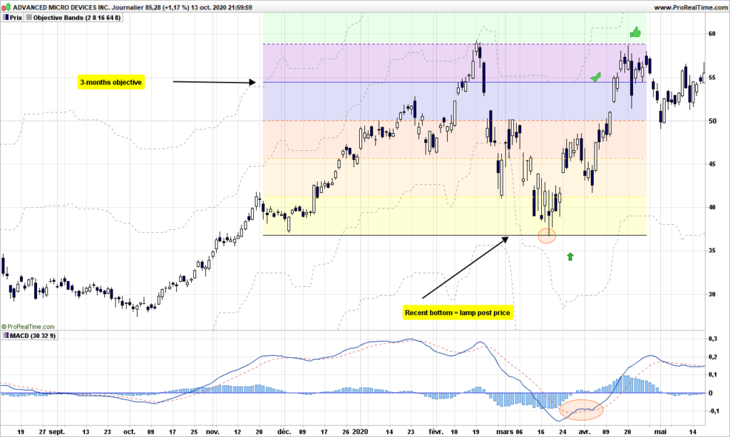
2 weeks later, objective is reached (8 steps), the drunkard makes it even to the 10th step. From there, market reverses, a new long trend does not really pick, so you can do the exercise in opposite direction:
This time the drunkard does not go beyond 4-steps and after 3 months, you need to give up your short play. Then MACD goes again above signal
We reach first objective within 3 weeks, but this time the trend continues reaching 20 steps. You have successfully mixed together trending and random action!
That’s it. It does not need to be complicated. Don’t forget to choose stocks or indexes that have the capability to trend. Until next time, trade safely!
This post is for those of you that want longer term approach, many weeks at least, and don’t mind their portfolio swinging up and down with larges waves. Maybe it will make you appear very clever if you can decipher and explain the chart to someone unaware of this technique!
For an in-depth introduction, please refer to Steve Nison’s book:
I do not agree to use ATR as reversal amount as your chart will change over time, and you will loose track of why you entered the market. Just use the 3% reversal, it will do a perfect job!
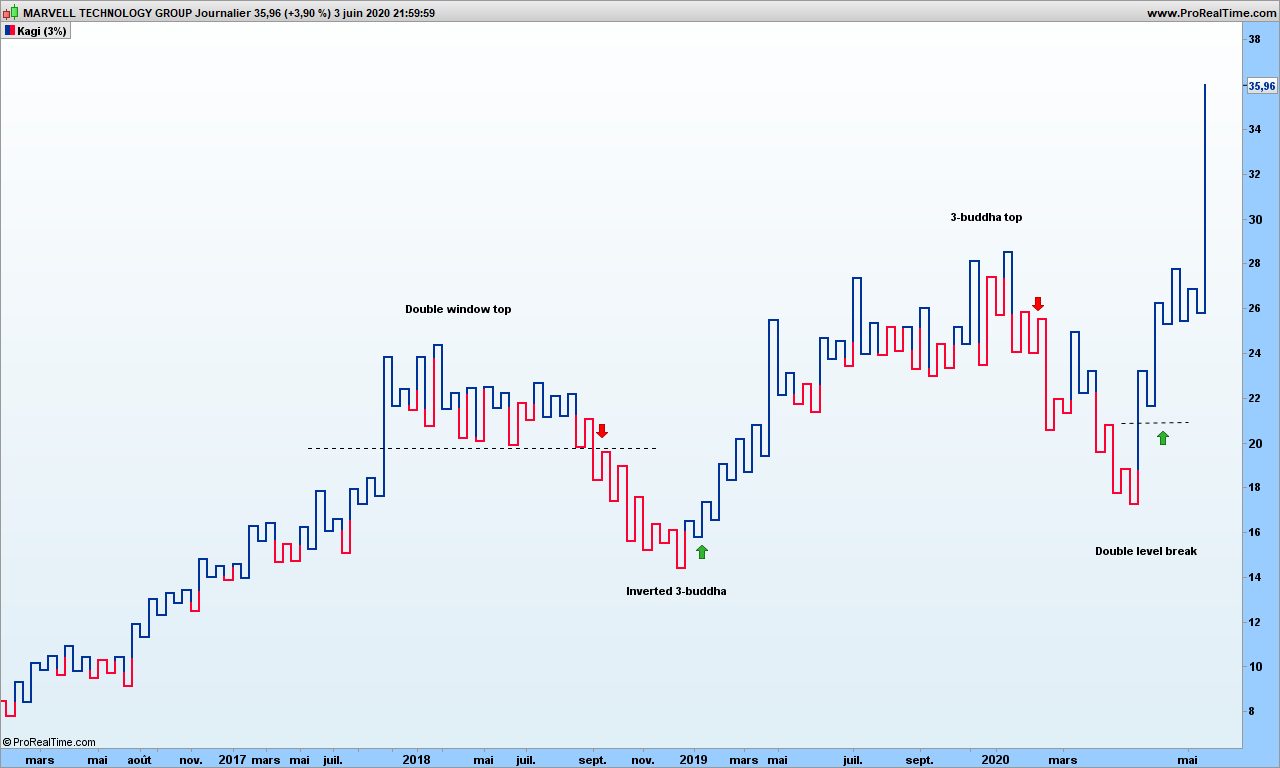
Again, I am assuming you already know about Kagi charts which look like this one for Marvell. See last green arrow shows a positive and undoubted profitable signal!
Kagi charts filter out the daily noise and we are left with raw trend. Remember that people may change opinion at any time, so the charts may look convoluted from time to time.
There are interesting traditional figures mentioned in Steve Nison’s book that do appear from time to time. It does not hurt to pinpoint those patterns!
The basic buy signals, when kagi line goes from red to blue, appear quite often but obviously there are many false signals! Pretty much like the TLB charts (previous post), we need some tools to filter them out.
For each vertical segment, between 2 u-turns, we consider high and low to be top and bottom of each segment, open is the low for up moving lines and close is the top (opposite for down moving lines). Easy, isn’t it?
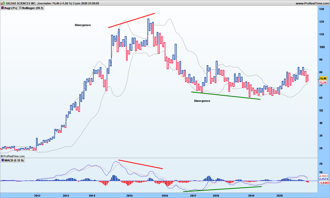
Bollinger bands are again useful, fantastic! Even the good old MACD feels more comfortable with this kind of charts. Let’s look at Gilead chart:
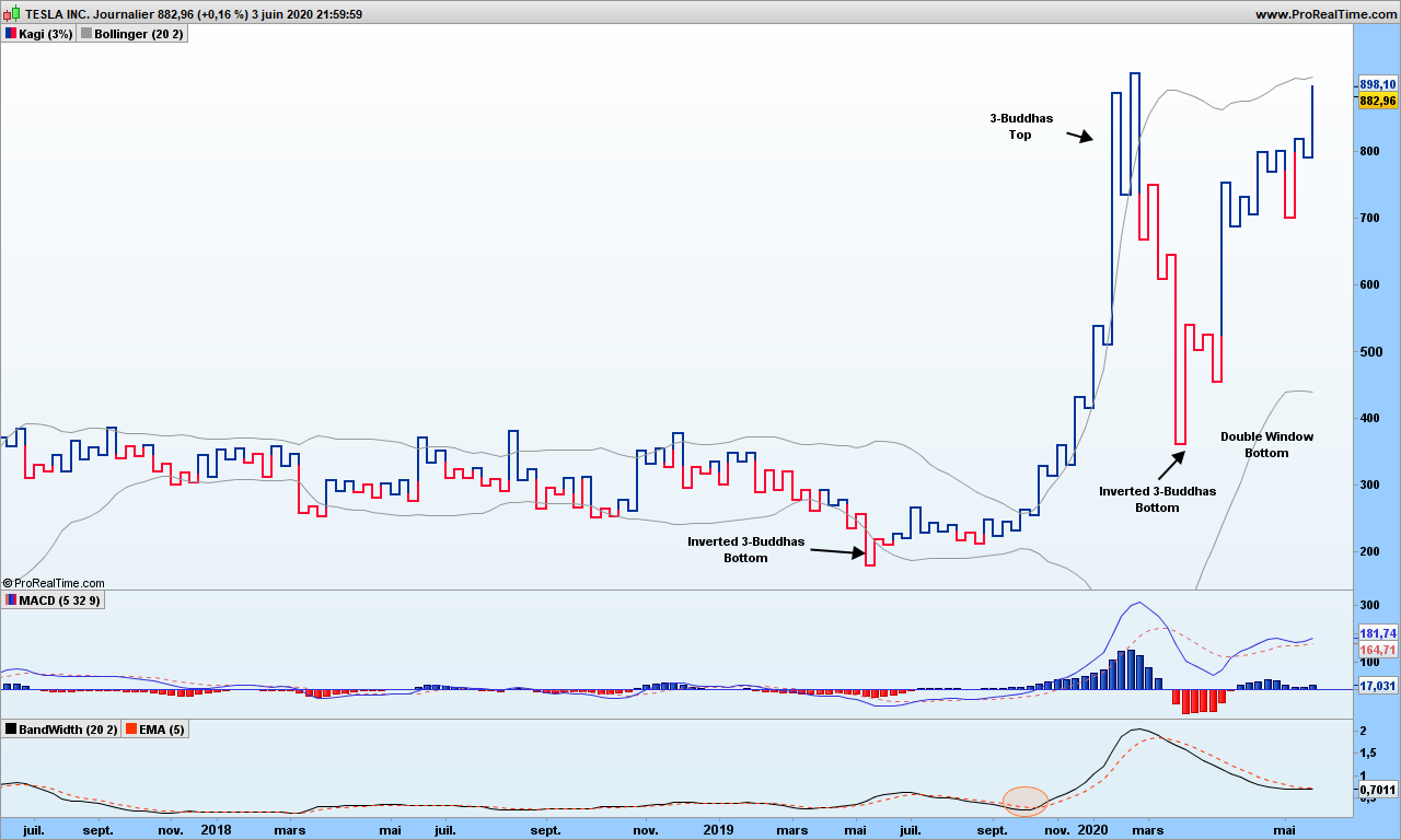
MACD divergences warn you about upcoming changes. Bollinger bands are clearly closing on on prices during consolidation and breakouts are solid confirmations. We can use the %B indicator to tell us when the bands are moving away from each other. Here is Tesla chart:
Tesla
As you can see, in May 2020, an inverted 3-buddha bottom appeared, was soon confirmed my MACD crossover. Then in October, the %B has crossed its signal line (a 5 candles exponential moving average). We are on board! On March 5th, we get a 3-buddha top, we are out with a cool 162% gain. We are not playing the down move from there since the overall trend is still up, and Bollinger bands are contracting. Beginning of April, we are again getting again a buy-signal (2-level break following inverted 3-buddha bottom confirmed by MACD), up to you to play it or not! Note how those Bollinger bands are quite flat from 2017 till end middle of 2019, they tell you not not to play any signal in any direction!
A word of caution must be mentioned here! Back to probabilities!
The probability of a trend change given the fact that you see a reversal patter (double window for instance) AND Bollinger bands expanding AND MACD greater than signal does ONLY mean potential reversal. We are improving the odds in our favor but I can not give you figures because backtesting on those charts in not possible. I tested manually over maybe two hundreds of charts, about 50% of trades should be profitable. The fact is you don’t know how far will the trend go. This is why, should you have time, it is good to revert back to old candlestick charts and draw the fabulous action-reaction lines to find out the potential!
That’s it! Those of you wanting material for week-end perusal, you get it!
Until next time, trade safely!
Note: if you wonder why I am using Bollinger bands here, it is because prices are filtered out of the daily noise. These are ‘trend’ graphics. The bands often prove to be decent prices objectives. This is of course to be taken lightly and cross-checked by more serious methodologies!