Relative Strength Index: weaknesses exposed

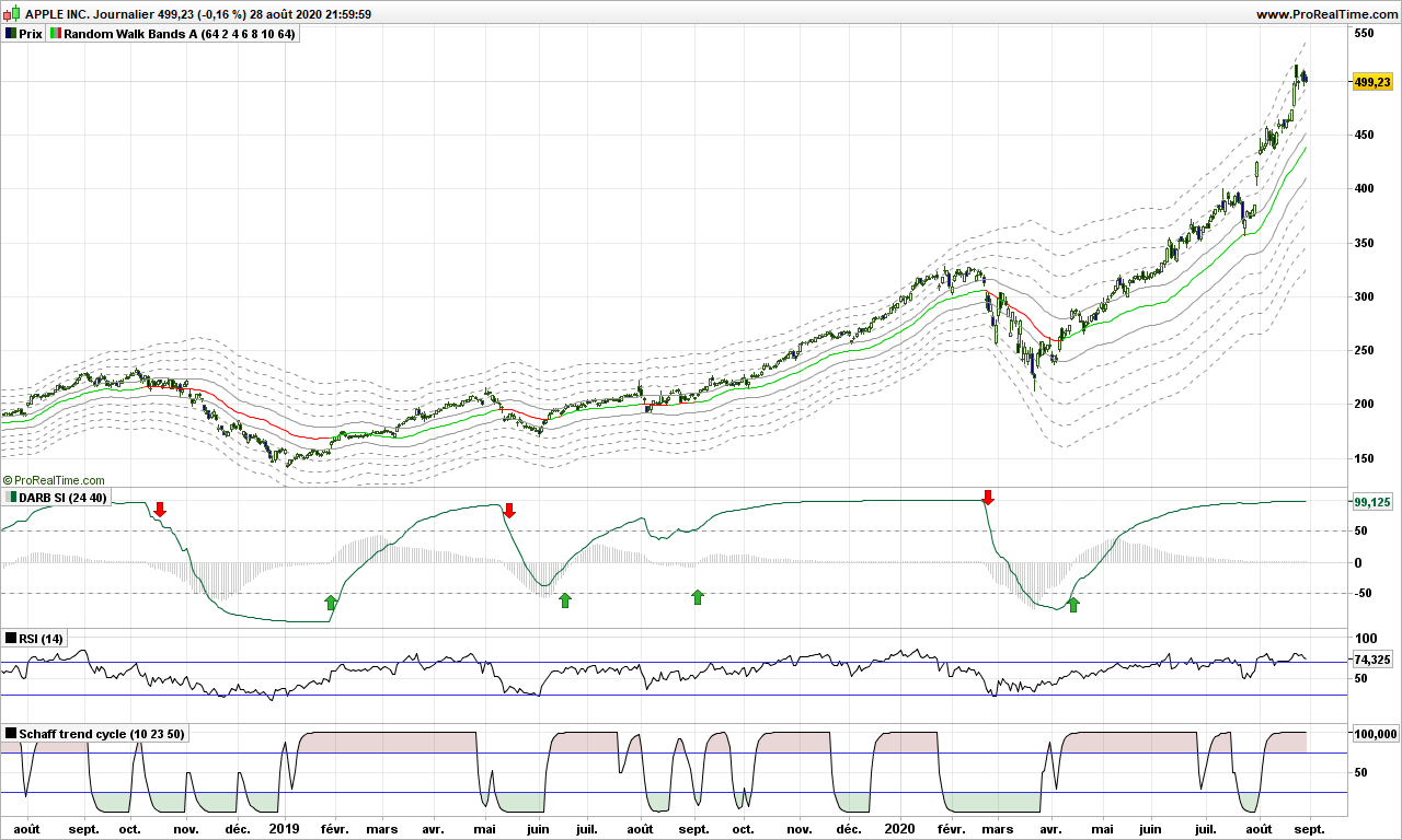
Today we will take a quick look at most popular, most used indicator, but I have never understood why traders give it such value! Let me give you some tips to make it interesting. We are going to use Facebook for our study!

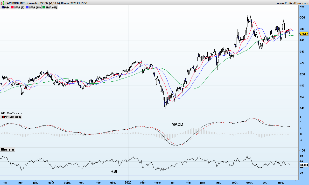
On the graph, you can see RSI indicator at the bottom, just below our customized MACD. It looks very noisy especially with default parameter 14, but since it is an oscillator (as opposed to trend indicator that MACD is), you may spot better synchronization with market tops and bottoms. If you can’t see, move your seat away from your screen, a bit more, even more… can see now? Good… The blue lines indicate the overbought and oversold levels, which, as you can see, are not reached very often!

So what’s wrong? The problem lies in RSI formula:

RSI = U / (U + D) where U is average of up moves in last n days, and D average of down moves over same period.

As I have previously demonstrated, market is a random and existence of trends is the proof of its randomness. So where is the link between this formula and random nature of market? The calculation could give similar results whether all the up days are consecutive or not, so with totally different market configurations. So, yes, it may work if you are very short term trader (a few days at most) and work out the divergences, market tops and bottoms, and decide what to do about it.

Could we modify it for more interesting usage? Of course! We can even use it for trend trading. Just replace delta between today’s and yesterday’s close by the delta measurement on your favorite moving average!

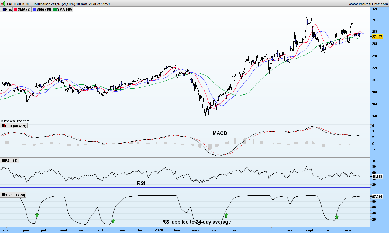
Now look at this new indicator. Buy signal is generated when improved RSI (iRSI) crosses above 50. You will notice it goes straight to 100 and stays then there until exit time. Easy, isn’t it?

As usual, use a stop to secure your gains. You may also define overbought and oversold areas at +30 and +70 if you want to stay with the trend as long as possible. False signal do exist of course, and there are 2 on the graph; the moving averages tell you not to go!

That’s it. Until next time, trade safely!

Secret new indicator makes trading easier!

When it comes to teasing potential subscribers for a newsletter, whether free or not, authors always mention a secret new indicator which detects the 10-baggers, stocks that can multiply by 10 in next few months. How disappointing when you find out it is about crossing the 1-year high! Such indicator indeed just does not exist, because stocks prices are moving because people are buying aggressively and not the opposite. We can predict with some accuracy where market has chance to make tops and bottoms in the near future based on volatility but exponential growth predictions can not be relied upon! Be cautious!

Brought to you by Cozy Dragon Trading Research Labs is a single new indicator that provides a sense of direction and timing never seen so far. It does not have any name so let’s call it Secret Indicator (SI). Let’s take a look at it!

Overlaid on price is our random walk path and just below the SI. If you are looking from the buy arrows, SI goes up keeps going up until the very day of trend reversal. Zero crossings of SI or its histogram can be used to trigger the buy action. There are a few finer rules to make the analysis fully reliable.

Please compare with RSI or STC indicators just below, causing many buy and sells orders because of whipsaws….

We can not disclose the formula behind this indicator. But we will use it in background for our market analysis!

That’s it for this back-from-vacations message. Until next time, trade safely.

The holy grail of indicators

With that title, I am sure you are going to read this post to the end! If you have no time, the summary is: the holy grail just does not exist but it is worth searching for it, for the path is more important than the actual indicator!

If you are looking for the best ever indicator, you can hardly start from a blank page. You need inspiration, you need to get your brain on invention steroids! So, the first thing to do is to consider what is available on trading platforms and make a strength / weakness analysis. you need to get a deep understanding about how the indicator is built, how it behaves under different market conditions, play with parameters and multiple securities like index, stocks, trackers, …

Let’s look at MACD or Moving Averages Convergence /Divergence. I will not explain here the background, but show one graph with 2 different parameter settings.

See? One is smoother than the other. The timing of signals is the same but the eye likes second one much better. Meaning also, if you make it part of trading system fully automated, you will have less noise to manage!

MACD is a trend indicator, therefore it performs quite poorly in horizontal markets. What about a momentum indicator?

This one tells you you are in an uptrend when positive and when it goes green below 0, it may be a counter-trend trade opportunity. It looks good to the eye, not perfect as there are false signal, but looks fairly good. Of course, some back testing would be needed to validate the impressions!

Now if you are looking for the grail of indicators, here is what it should do:

  • It should tell you what is going up in higher time frame (e.g. in weekly for a daily chart). Because it means you have some good move on-going, it is not just noise in current time frame
  • It should be capable to anticipate market turns, through divergences or hidden divergences (in direction of the trend)
  • Signal should be timely, not too early and definitely not too late
  • You should be able to see and professional are doing versus all other market participants
  • It should be smooth and easy to read
  • The number of false signals should be reasonable
  • The signal should be profitable as often as possible. Refer to previous article about winning streaks.
  • Please add here you own requirement: …………………………………………..

A way to look at higher timeframe in a single chart (holy grail surely means only one chart!) is to use synthetic bars. This has been introduced by Cynthia Kase in her book: ‘Trading with the odds’ https://www.amazon.com/Trading-Odds-Probability-Profit-Futures/dp/155738911X

The idea is to to calculate MACD as if on a weekly chart but we do the calculation each day, so we have the information we want before the week is closing. MACD on weekly chart is usually used as one-bar indicator on histogram: when it changes color (goes up after going down in negative territory), it is signal to buy. Just look! Green arrows point to buying opportunities in weekly chart, sometime 3-4 days before end of the week!

There are hundreds of indicators available on the markets. Try to make sense about the most common ones, discards those that are complete nonsense, consider those that work as promised by their author (I have not found any divergence for long time on accumulation/distribution) and continue your trip! It gives food to your mind!

Your next question is of course: did I find the holy grail? I wished! Please remember we are trading prices, not the indicator! My indicator tells me where professionals enter after market bottom (red circles in counter trade), has plenty of divergences, has zero crossings or bumps (smileys) to indicate entries in direction of trend. But it is not perfect, get some false signals from time to time (because the professionals are wrong ;-), jsut kidding of course)

Of course there remains the need for risk analysis (volatility and position sizing, price objectives).

Until next time, trade safely and don’t take useless risks with virus!