Random walk: understand supply and demand

If you have not read yet the post about random walk index, please do so because we are going to dig further on this wonderful random walk space.

As highlighted many times, trading is about YOU. You have some objectives, you have some time you can allocate to trading, you have sensitivity whereby you don’t want to have long series of failures even if at some point you get a 200 RR trade which make you hugely profitable, etc, etc…

To apply random walk, you first need to define for how long you commit your money to market, then change the parameters to capture moves within your sensitivity. Some random parameter testing will help you through this first phase.

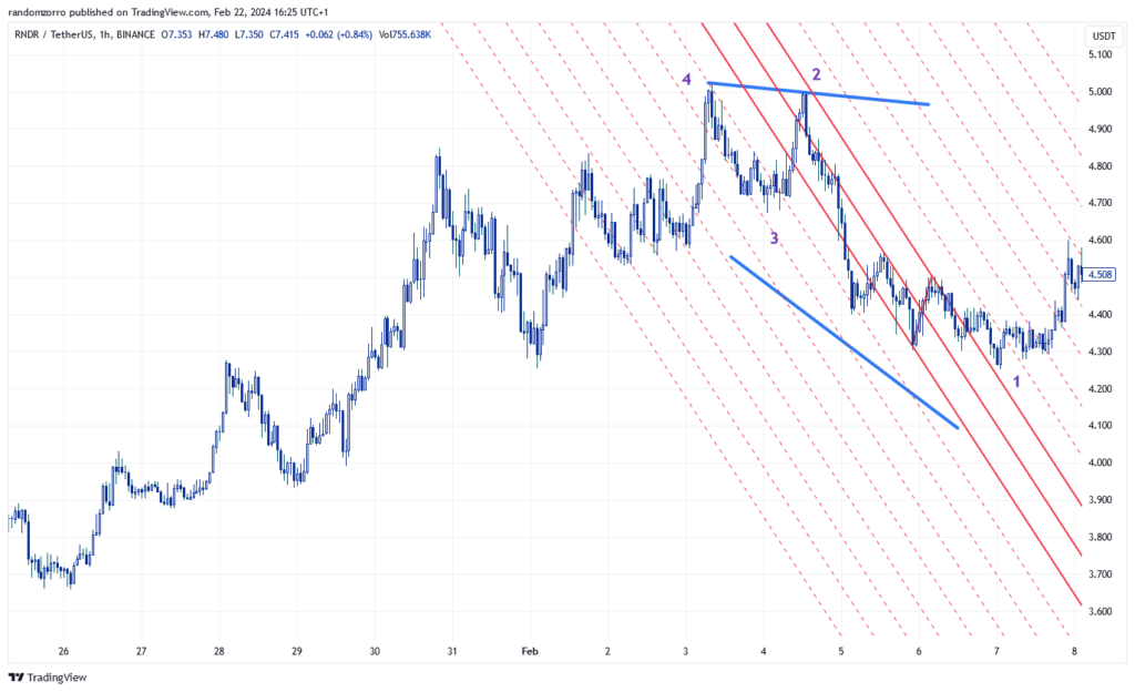
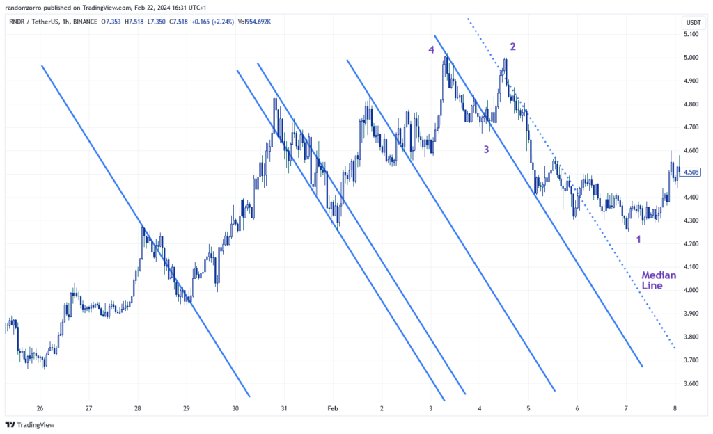
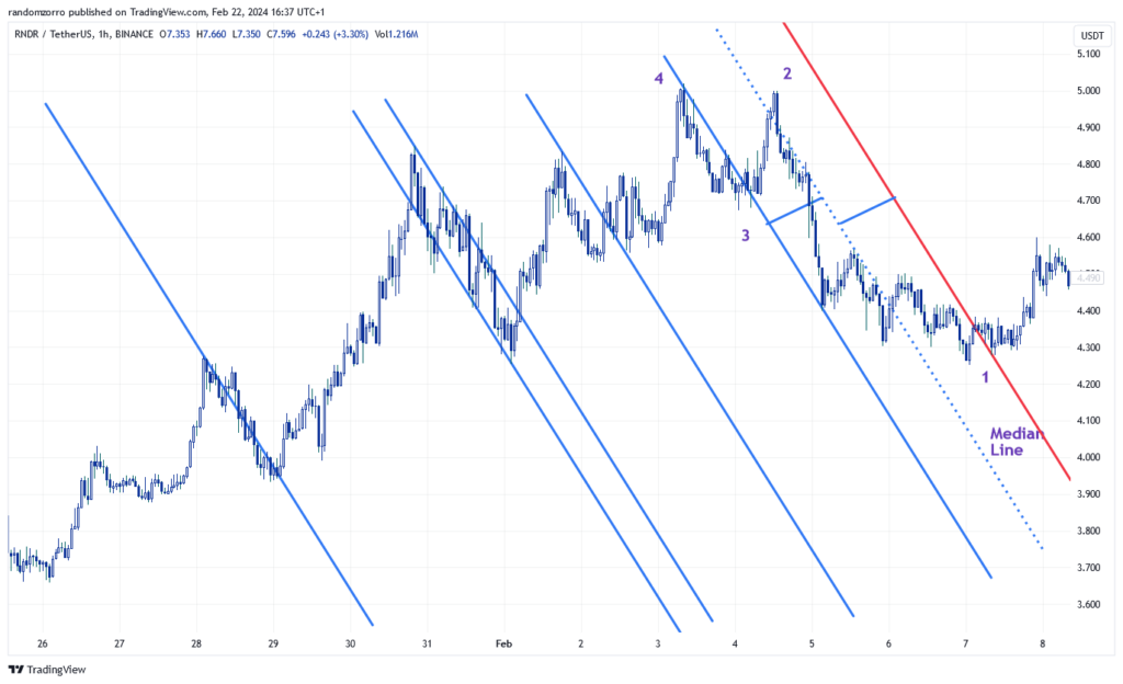
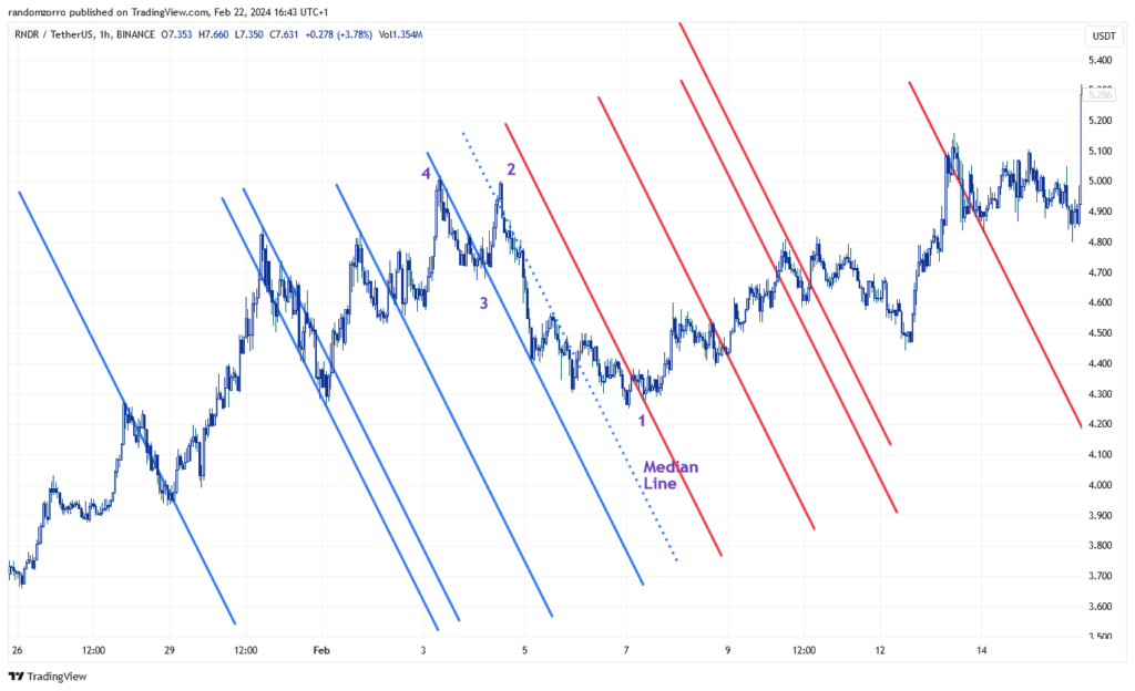
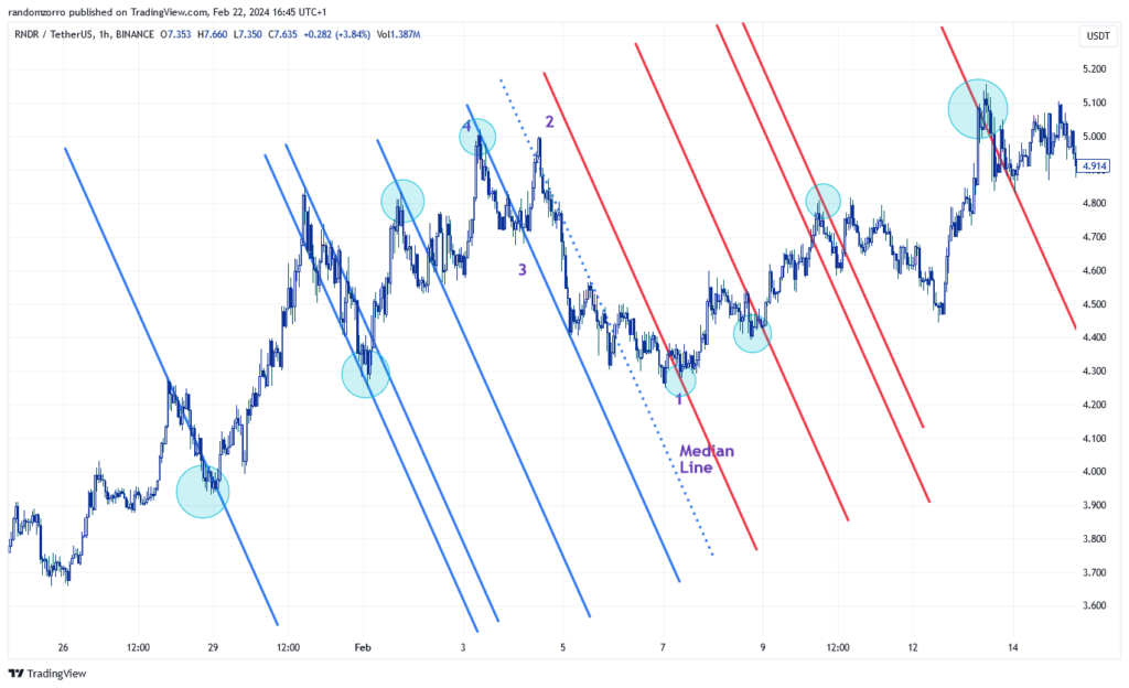
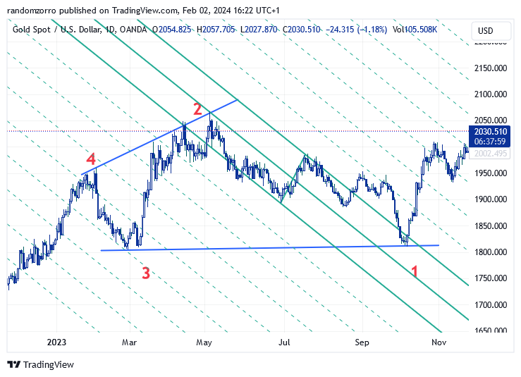
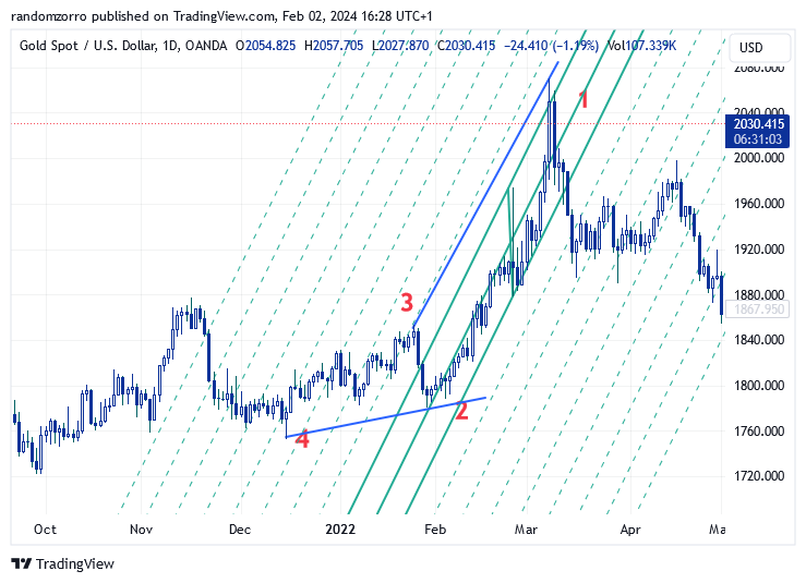
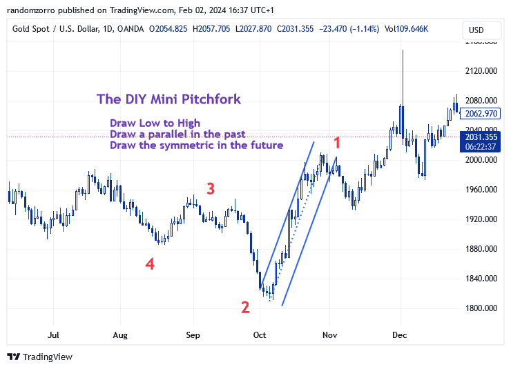
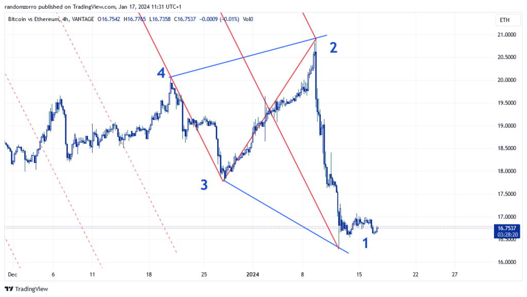
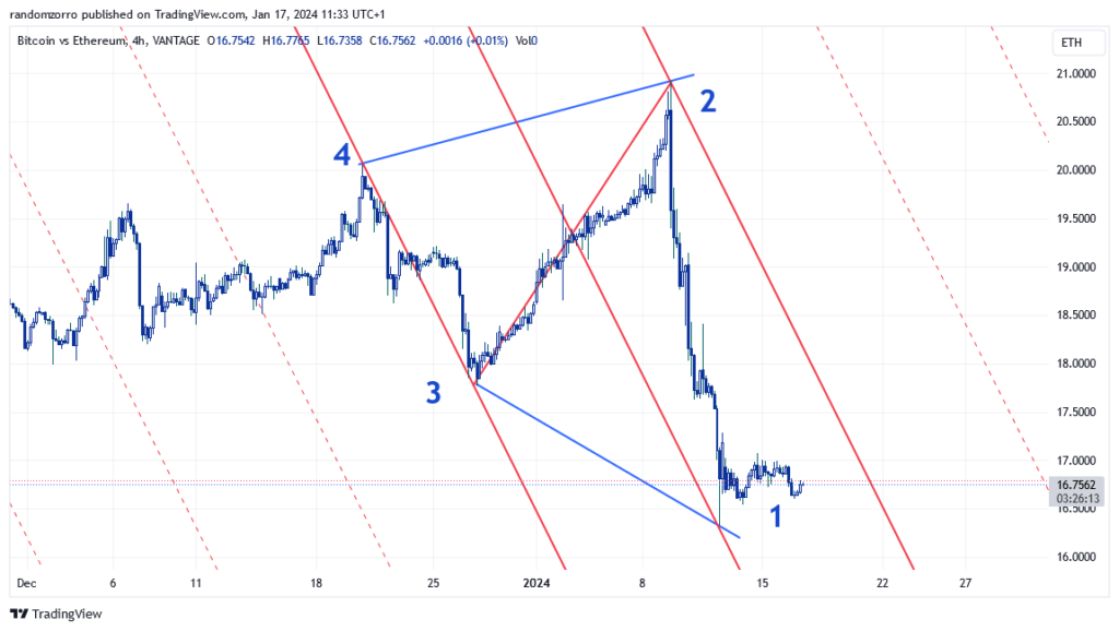
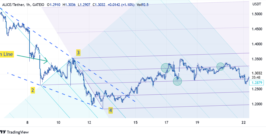
Random walk is indeed about capturing trends as explained in previous post, but it can also show you some supply and demand zones from which you can kick some very good trades. Note that you would be better off of course with an order book analysis, but institutions orders are well hidden and any supply / demand zones displayed on chart are therefore pure conjecture.

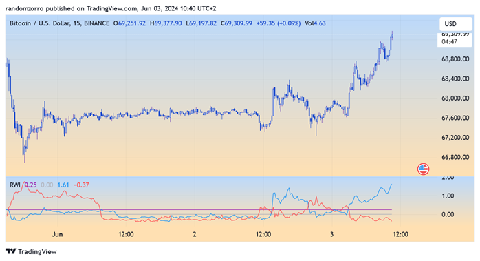
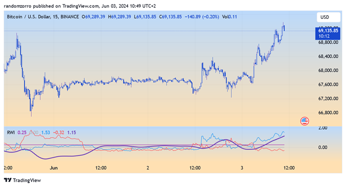
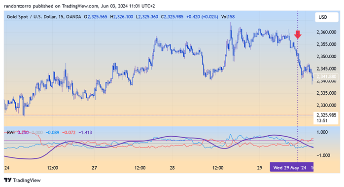
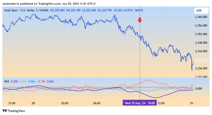
So let’s bring back Random Walk Index on the price chart itself:

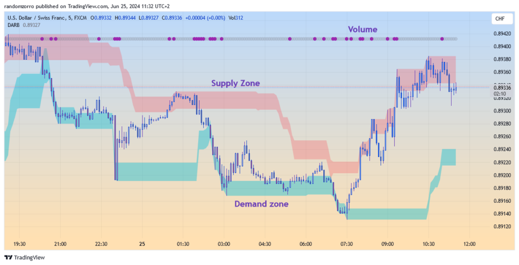
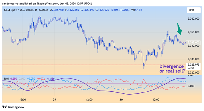
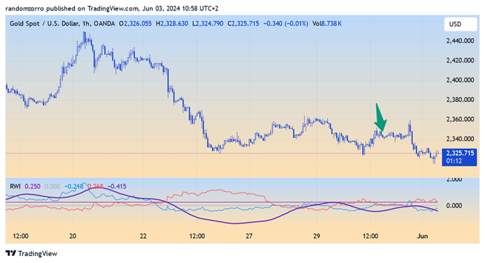
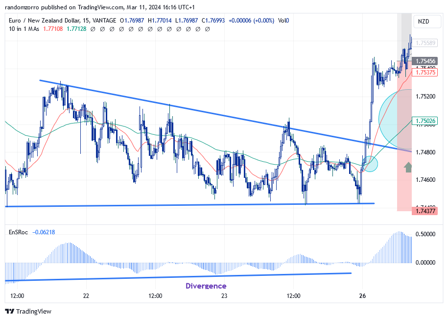
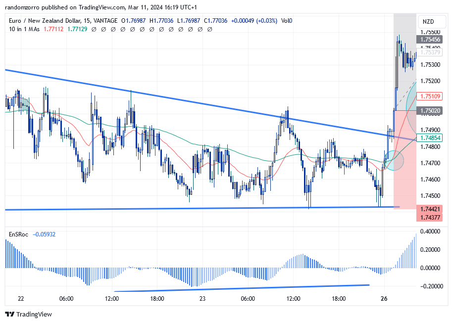
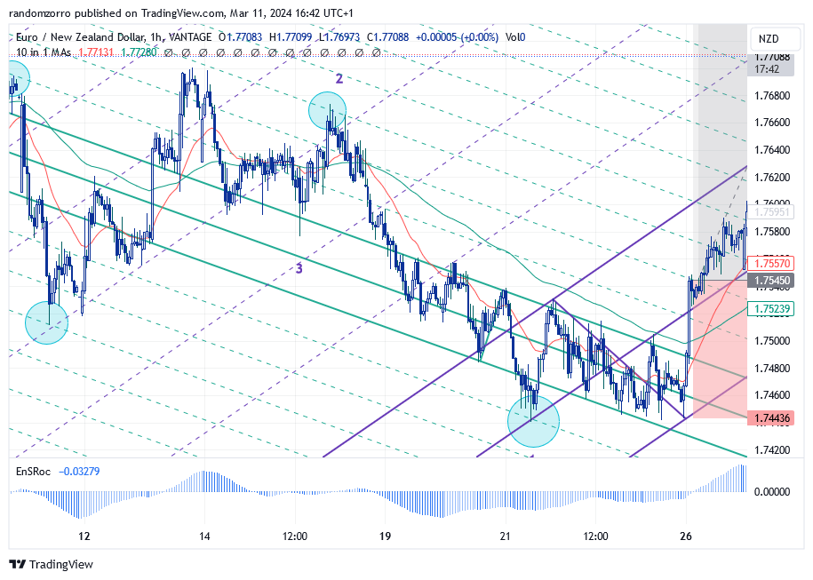
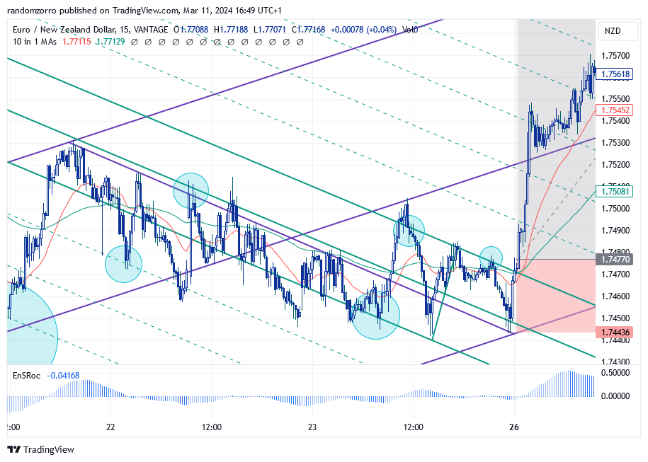
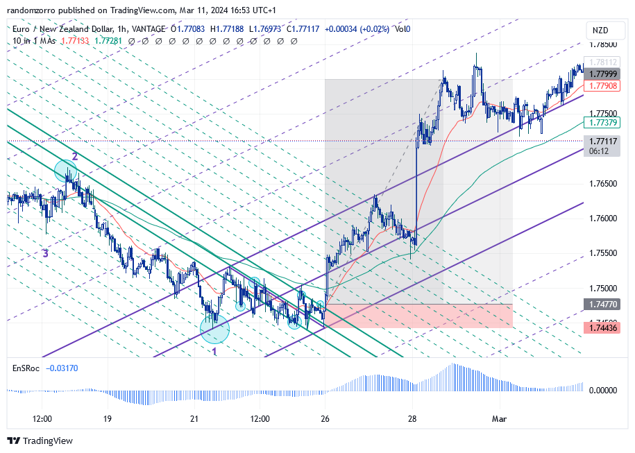
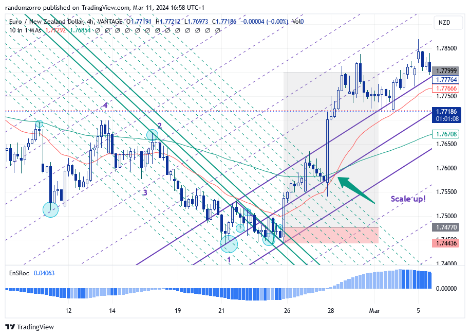
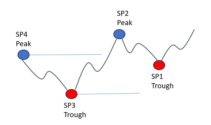
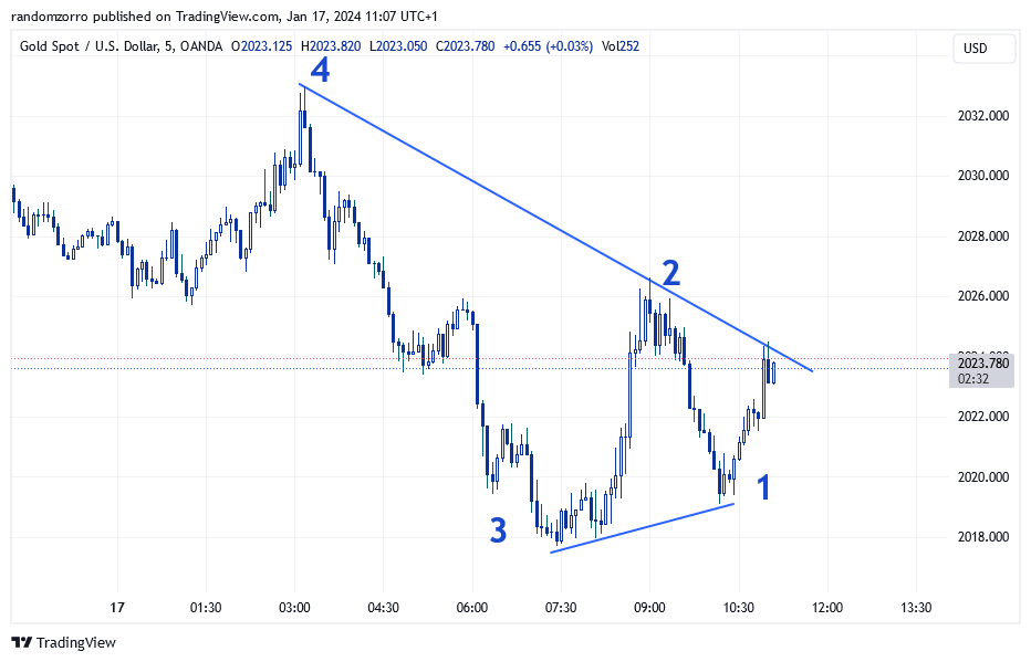
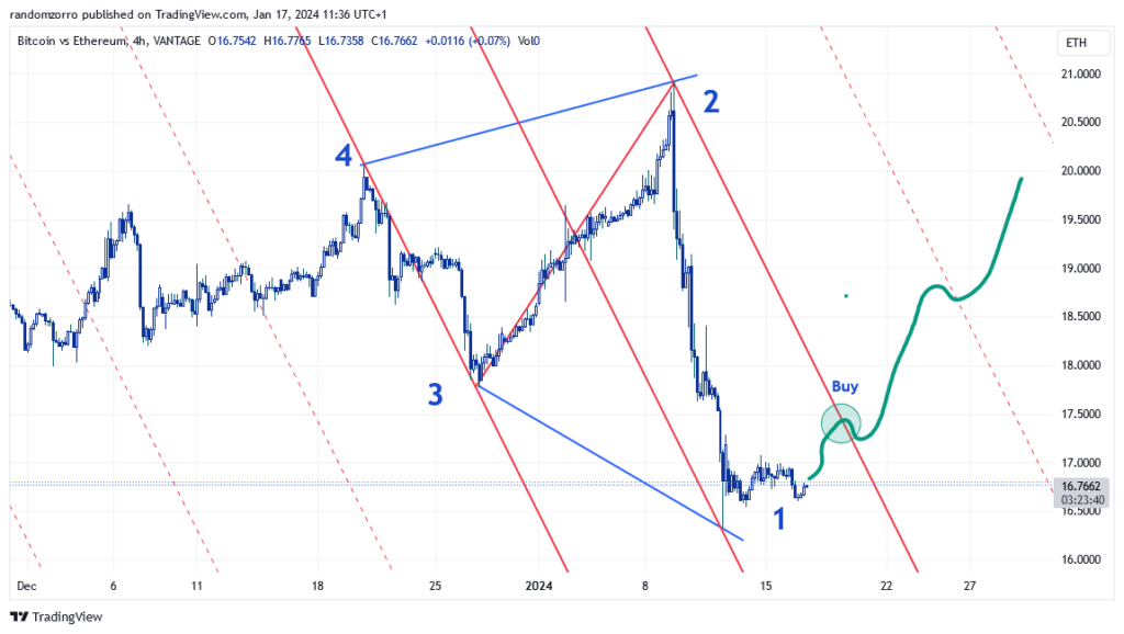
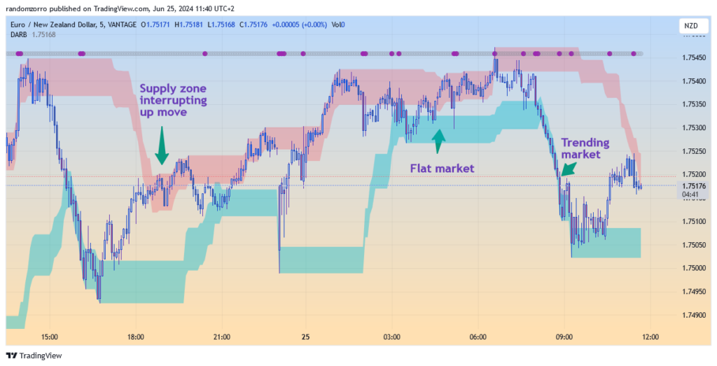
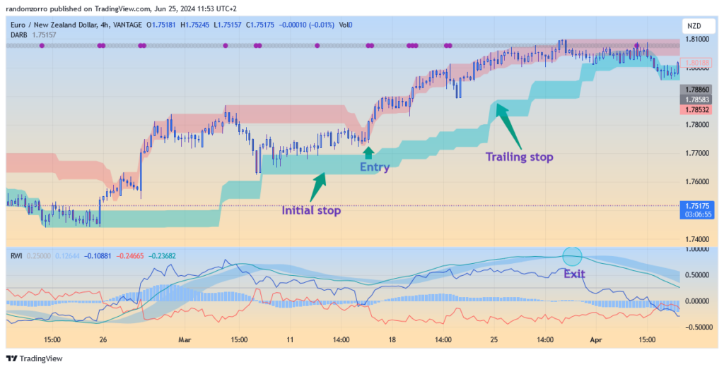
The supply zone is displayed in red colour, the demand in green colour. The outside is purely a Donchian channel and the width is a function of volatility. When prices take off from demand zone, they will go to demand zone. It may be also that demand zone comes to prices and stops the movement. A trend emerges if prices manage to go through the supply zone external band. Easy, isn’t it?

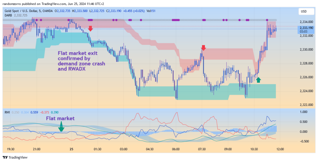
When supply and demand zone are close to each other, prices exit from one zone to fall immediately in the opposite zone, it kills the chance of getting a good trade. This is a flat erractic market.

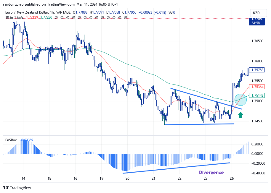
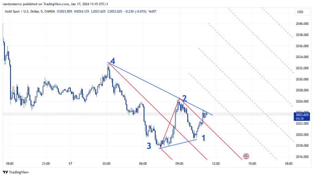
Question: how do I get the buy signal? Come on! Just bring up the random walk index indicator! Crossings of RWI lines or crossing of RWADX with its signal line mark the spot!

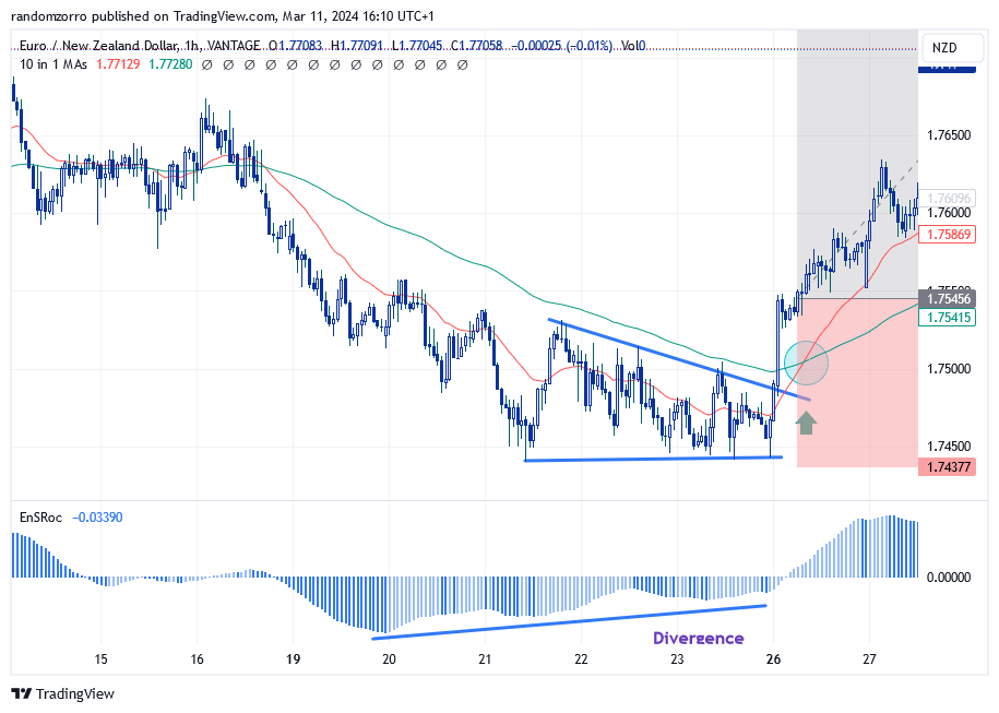
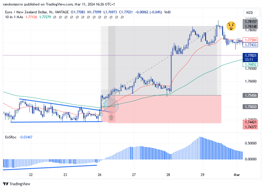
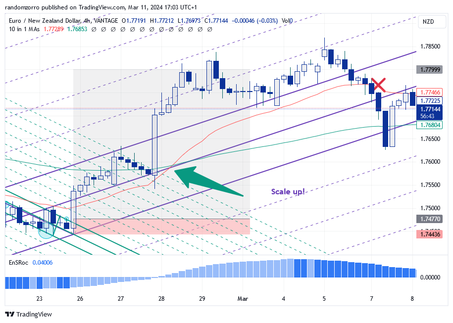
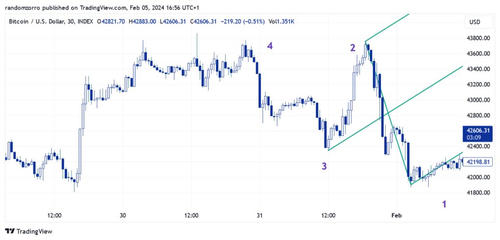
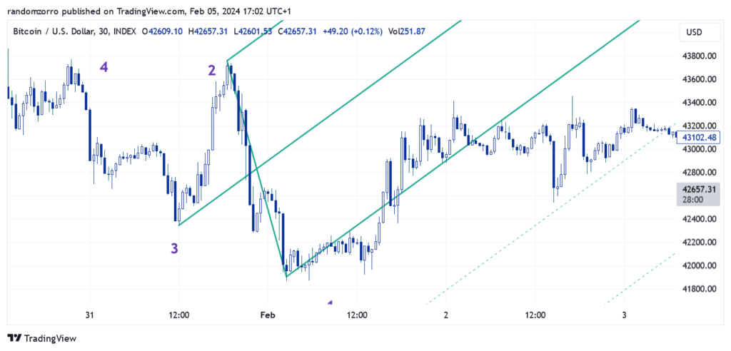
For a buy trade, your initial stop should be positioned slighly below the demand zone. Your first target price should be somewhere in the supply zone. If trend picks up, then a trailing stop just above the demand zone. Take partial profit along the path. Example of perfect trade:

That’s it! As a conclusion, random walk theory helps visualizing supply and demand zones, and therefore facilitates congestion zones indentification. We can trade between the bands or trade the trend when bulls or bears manage to go through. No other indicator is so flexible. Best indicator ever? Maybe 🙂

Until next time, trade safely.

Want to join Cozy Dragon Trading Club?

Cozy Dragon Trading Club is a friendly private telegram group where complete trading systems are shared, everyone is welcome to ask question and assistance. You must be ready to challenge all that you already learnt.

The easiest way to join is sending a few stellars (one stellar is 0.1$!!) to address on the right, just to show you are serious. If you are recommended by a member, no need, you are welcome.

Alternative way is to join one of the following crypto farming applications. Please sure to use these links, so I can benefit from referal. You can contact me afterwards.

That’s it. Talk to you soon

Random Walk Index : best ever indicator?

Random Walk Index is an indicator widely available on all chart platforms, but once you display it, you come up with the immediate conclusion about it uselessness.

Indicator is made of 2 lines, RWIH representing bulls in blue color, and RWIL representing bears in red colour.

There are many problems with the display:

  • The calculation of red line is completely wrong if your refer to the formula and try the calculations in Excel for instance. Why can the same bug be seen on every single trading software????
  • The ATR formula used by the software are NOT a simple moving average. They use RMA or others.

Have this interesting indicator powerful features been concealed? On intent? I will let you devise, this post will attempt to restore its original features, and provide enhancement to make it more readable and useful to lay traders

Same chart as above but with original formula

As you can see, it looks completely different.

The RWI has first recentered to zero and an horizontal line has been set at 0.25 level. When the blue line is above this level, it clearly indicates a bullish trend and the opposite for the red line.

When both lines are below 0.25, and even better below zero, it indicates a flat market. If only below 0.25, it indicates a local congestion zone. In any case, we can think of those as accumulation or distribution zones.

By construction, the RWI takes into account prices (calculated upon highs and lows) and a time window (the input parameter). Inside this window, movement is considered random and you can refer to drunkard walk theory in this post to know more.

This looks like much more a useful indicator, isn’t it?

Let’s not stop here and add an other line, similar to Directional Movement Index (and ADX, ..). It will be differnce between the 2 index lines, smoothed by a SMA.

This RWADX line allows the anticipation of crossings and is another key. It can be of further fitted by a signal line to deliver buy and sell signals.

On top of trading rules already mentioned, we can add these ones to use the RWADX:

  • When RWADX crosses it signal, it may indicate a buy or sell signal. One RWI must be above zero and go up, while the other one must go down and value below zero.
  • When there is a divergence with prices, one must understand the cause as we are working with a time window. A previous peak may not be accounted for any more. The way to check that is looking at upper time frame.
  • When the signal occurs in counter trader (buy signal below zero), one should drill down to lower time frame to run a with the trend trade.

Let’s look at two examples:

Moving up to 1h time frame, we see both RWI ines going below zero, indicating flat market.

Now Let’s look at this short signal

It is countertrend trade, so let’s drill down to 3 minutes chart:

Great, here we have a stong trend, we could have anticipated the entry of course, but still a lot of profit to capture 😊

This is not complete trading system, we would need to have SL’s and TP’s. But even the crossings are extremely nice entry and exit signals.

Conclusion: the RWI has been around for a very long time, has surely been scraped intentionally to hide very powerful features. It goes even further, if you replace RSI by this revised  RWI in other indicators such MCDX, you will get sharper and more accurate signals. You will overall a different understanding of the market, so it can also be used as a confirmation. Its capability to detect flat and congestion markets make it an invaluable tool in your trading strategy.

Pitchfork trading, multi-time frame and the scaling factor

This is going to be an important lesson for your perusal. Please take time to read it carefully, it contains essential information to increase your trading efficiency.

We want to discuss today how to trade with pitchforks in multi-time frame (MTF) environment. But before all, one must understand why we are doing it. It is not a matter of confirmation higher / lower time frame, it is not a matter of being more comfortable pending on your personal constraints, it is about decreasing risk and increasing profitability!

Before we dive into the pitchfork trading, let’s understand MTF risk reduction strategy and how we can decrease the risk by scaling DOWN and increase profitability by scaling UP !

For this lesson, we are going to trade EURNZD. Let’s look at this recent price action on the 1-hour graph:

We have two moving averages, 25 and 100 EMA’s, and a smooth ROC indicator which does not care too much about which EMA you enter as a parameter. You have of course noticed a divergence with the ROC. You have even have drawn a kind of triangle of which escape yields a buy signal. However the red short term EMA is lower than the long one, so you may want to wait for a last confirmation with the crossing. Then you enter a trade, stop loss (SL) below recent low and target a 2.5 risk reward ratio (for instance):

Your risk is 1.75456 (entry price) – 1.74377 (SL) = 0.01079 NZD

Can we do better?

Let’s scale down to 15 min, meaning we switch the time frame of our trading software to 15 minutes. Same triangle but of course the moving averages have changed and the crossing is done when we exit the triangle! Momentum is positive and increasing. So nice!

So I can place an order on this time frame.

I keep the same target price and stop as before, but I have managed to enter at a much better price, and my RR is enhanced from 2.5 to 5.22! For 10$ risk, I might earn 52.20$ instead of 25$, more than double my profitability.

What about risk? Risk is now 1.75020 (entry price) – 1.74377 (SL) = 0.00643NZD, therefore a 41% risk decrease!!!!!

How did the trade go? Perfectly!

How does this relate to pitchfork trading? As you may remember, pitchfork gives us some sweat as we need to identify market structure, take the pitchfork, which may work or not during validation. So we don’t want to draw it on 1 minute charts! For the trade above, let’s see what can be done

Market structure is obviously a down trending one, but the mini-pitchfork did not make me comfortable so I had to hybrid it (more on that in future posts). Now I have multiple contacts with warning lines. I feel better and I see prices exiting the pitchfork at the same timing, more or less.

Now you can draw a new pitchfork as SP1 is fully confirm to be a local trough, and a SL can be placed below the lower MLH:

You can of course move your SL along the lower MLH to make a trailing stop!

Your risk is 1.75450 – 1.74436 = 0.01014 NZD

Can we improve?

Well yes! We can keep the purple pitchfork but on 15 minutes, you need to find a new trigger pitchfork (green one) with new market structure at that level:

Place buy order on top of the exit candle. Now your RR has hiked from 2.5 to 9.57!!!!

Your new risk is 1.74770 – 1.74436 = 0.00334 NZD so a 77% risk reduction.

Of course same trade turned out the same

Whatever trading system you use, you can get the same benefit from scaling down.

Now let’s look benefit of scaling up:

On the 4h time frame, once we get a similar golden cross between the short and long EMA’s, we are allowed to scale up:

After the golden cross, your trade is hugely profitable, so you want to secure some profit. For the remaining of the line, you may want to target extra profits. Place your trailing stop below the red average for instance and let your profits run for as long as the market wants.

In this particular case, it did not work but my RR was around 8.

That’s it for today. The example was with forex today but it is of possible to use this strategy on 5min/1min time frame or on crypto and you could get huge RR’s (>30) from time to time. Enjoy.

And until next time, trade safely!

Pitchfork generalization – introducing the action-reaction lines

Trading with a pitchfork requires selecting three consecutive swing points (trough, peak, trough or the opposite) and then draw the pitchfork and validate it by checking it describes accurately price action in the past, in order to guess price action in the future (aka reaction).

Starting from market structures (see previous post), there are some recommended pitchforks to be used, but sometimes unfortunately the warning lines do not confirm the validity of the pitchfork. There exist hybrid pitchforks which we will study in an other post. For now, we are going to discover the action and reaction lines.

In theory, any price action in the past has a symmetric price reaction in the future, the mirror being the called the center line. Center line can of course be the pitchfork median line you have just drawn, it can be also a high-to-low line (see previous post) or it can be a multi-pivot line, i.e. a straight line that contacts at least 3 swing points (peaks, troughs…), what traders call a slant support or resistance line. Horizontal lines are a non sense for this study, since they only deal with price, and vertical lines also as they only deal with time, but studies show this is not (or no longer) relevant to today’s markets.

Theory continues by saying that any swing point in the past could have its image in the future. To be accurate, the action line passing through a swing point (peak or trough) in the past can be mirrored in the future, and there is a strong chance that a new swing points will sit on this line.

Let’s stop the theory and study an example. We are going to trade RNDR crypto for this example in the 1h time frame.

At this point in time, we have identifed market has bottomed out after a strong downtrend structure. As recommended I have drawn a mini pitchfork of which slope does not make you very comfortable buying this market. I will keep only the median line and will start drawing parallel lines to this median.

The median line is now represented with dotted line and I have drawn parallel to the median that go through peaks and troughs. You have to try, it is very easy! Doesn’t it start looking like a pitchfork with teeths separated in uneven way?

Next exercise is simple. We need to note the distance between the action line and center line (the mini pitchfork median line) and draw the symmetric lines on the opposite side of the median at the same distance!

I have drawn the first reaction line in red color. You will want help by drawing a segment to measure distance and move it or duplicate it to get the right distance to reaction line. Notice that trough 1 is now inside the new ‘pitchfork’ and it is a better looking buy signal. Notice also how this line is perfectly re-tested by the market after going above, which gives validity to this drawing.

We need to the same with other reaction lines! There you go:

Now let’s look at peaks and troughs

I have selected this chart at random, trading it on the fly, I had no assurance this would be a nice example! Look again! Peaks in the past have yielded reaction troughs on the reaction lines, troughs in the past have yielded reaction peaks on the mirroring reaction lines. True enough there are new peaks and troughs that were not anticipated, but remember markets have fractal structure, you could probably have found them by analyzing other time frames!

Please not ealso the accuracy of reaction lines decreases after a dozen re-actions lines. When you have identified a new market structure, better draw a new center and re-do the exercise!

Starting from last 2 center lines, we should have up-sloping and down-sloping action and reaction lines, of which the intersect can yield the exact position of a peak or trough in the future. Which we will see in an other post.

Until then, trade safely!

Pitchfork validation: your most important work before trading!!!

Pitchfork trading is not that tough providing that rules are followed. So far we have covered market structures, how to get a signal from pitchfork, which pitchfork to select based on market structure, and what to expect by knowing about possible market structure that are coming after last pivot or swing point has been confirmed by a signal. Please review previous posts, signal is always given by the exit of a valid pitchfork. But wait… what is a valid pitchfork? This is what we are going to answer in this post.

Let’s start with a story though. When traders say that they trade ‘price action’, it is a non sense, they are trading price reactions. Supports for instance are about price hitting same range of price a few times in the … past! Resistance is the same. A moving average tells you the average price in the timeframe between now and a few days or units of time before. It is expected that prices will bump again or react in the future on these same levels of the past. And why would prices do that?

Reason is self fulfilling prophecy as many traders expect these levels and play accordingly. So they can manage, some with good level of success. But it does not work when market is trending or shows more erratic behavior. Also predictions come in terms of prices, not time, which can be an other issue in flat market. The random walk strategy (see other posts) addresses some of these concerns in adequate manner.

Pitchfork trading takes the problem out of the box. We know there was some market action in the past, which can be shown with market structures. Newton has stated that for each action, there must be a reaction similar and equal. Does this apply to market? Market structures or fractals (by Bill Williams) indicate there is fractal nature or some ‘beauty’ like things in nature. Note that we observe the market in some naive way, not an in the box thinking. Markets are free sort of to move the way they want, but if we push them too much in one direction (pivots), they are likely to revert and move in opposite direction relaxing the energy accumulated in first move. The moves are not (always) equal in price movement, because energy released is based on time, so duration of movement.

Having said that, you will read in many books or other websites you should draw a new pitchfork as soon as you get a new swing point or pivot.

How many of you would draw that pitchfork after, of course validating SP1 with a mini pitchfork and say ‘fine, looks like I can put a Target Price on the median’ maybe at the intersection with some Fibonacci levels???

This pitchfork is just NOT validated!!!! Look, price even gets out of the pitchfork a few candles after your entry (Assume for now you are reasonable and have put a SL below SP1). Let’s see what happened next:

Maybe you managed to take some profits but prices never reached the median. And maybe you are going to short, because prices are supposed to go below SP1 in that case because they did not reach median line? Wrong again:

What happened? A pitchfork is validated if it is tested before going forward (so it fails when prices go below) and pitchfork and its warning lines describe accurately the price action (in the past!)

Here we see some ‘impacts’ but major peaks and troughs are not sitting on pitchfork or warning lines.

Can we improve?

See? I now have major peaks or troughs on the pitchfork itself extended to the past. Pitchfork is now re-tested, and no surprise prices go to median and reverse. There might be other possible or even better solutions. But look at the graph again: price oscillate nicely over either the median or MLH’s, it gives a good feeling you are in sync with the market!

What did I do? I moved the anchor (SP3) of my pitchfork to a previous trough, and I am getting a less sloppy pitchfork, with more trading value. I could even have move the anchor to some unknown price area, thereby entering the realm of hybrid pitchforks. For another time!

Until then, trade safely!

Market structures transitions. Introduction about mini pitchforks

I hope you had some thoughts about the market structures, how they are built and you understand why there is no need to have more figures. Each structure requires the use of specific pitchfork for an efficient trading. But first solution to the proposed exercice. I hope you had fun and did some drawing on a table, result should look like that:

On second thought, there may some transitions missing here. I will let you find out…

There are a few points to remember from this study:

  • When market is is consolidation mode, it can consolidate even more (the circling back for bottom figure)
  • A trending market can move into consolidation without notice
  • Reversal structures don’t end up in flat market

Let’s move now to mini pitchfork subject. On the following gold chart, I selected 4 swing points that describe an unstable market. If you refer to previous post, I can use a mini-pitchfork to get a buy signal.

As you can see, I have selected minor peaks and troughs on the path from SP2 to SP1. I can’t say it is the most relevant choice but if you look at warning lines, prices are indeed stopped or pause before continuing their path.

On the following example, it is not so obvious, but I used the extreme price at the end of wicks to create my pitchfork. An other way to trace it is going down to lower time frame so you get bigger waves….

Sometimes it is not possible to identify minor peaks or troughs, so we work it out manually. You may draw warning or you can attemps using the pitchfork tool to overlay your DIY pitchfork: select first SP on the HL line, take SP2 on upper line, and SP3 on lower line and it should do the trick

The way to use mini pitchfork is similar to other pitchfork. We will see many examples in future posts.

Until then, trade safely.

Pitchfork trading: market structure and pitchfork selection

I hope you have gone through previous post and especially its exercise!

The solution to this exercise will lead us to market structure definition and will pave the way to selecting the right pitchfork for the right market configuration.

Exercise reminder: We consider the last 4 swing points, start with a peak SP4. SP3 being a trough is below SP4. SP2 is above SP3 and SP1 is below SP2. Easy?

Now if I am looking from the outside, how many figures can these make? That was the question!!! Try it by yourself on a piece of paper. SP2 can be above or below SP4. SP1 can be above or below SP3. Figures are obtained by linking SP4 and SP2 by a straight line, SP3 and SP1 by an other line. Eventually we can only make SIX different geometrical figures!!! Think and draw a bit more!!!

Here they are:

Figure 1 – Bubbling market
Figure 2 – Unstable market
Figure 3 – Reversal market
Figure 4 – Counter trend market
Figure 5 – Flat market
Figure 6 – Strong trending market

That is all there is to market structure. Channel with parallel lines are exceptions, as they comply to 2 of these figures. Note you get exactly same figures in the bearish case. You don’t need to remember hundreds of figures :-)))

I recommend that you give names to these figures, whatever they can make you think of, so you can refer to them more easily.

Exercise!!!! Now that you know all possible structure, can you draw a diagram of transition between figures? E.g. starting from figure 2, which I usually call unstable market, what are the possible next ones?

The knowledge of question just above is important. Because we all hate flat markets (figure 5) but as you will figure out easily, flat market can consolidate even more (figure 5 can transistion to another figure 5) while an unstable market (figure 2) will always lead to directional market (check it out!!)

Now here revealed exclusively to readers of this blog are the pitchforks you need to select for each market structure to get buy signal as explained in previous posts.

What are those mini pitchforks? How do we draw them? Plenty of open questions which we will see in next lessons with plenty of illustrations!

In the meantime, trade safely!

Pitchfork trading: selecting the right model!

In previous posts, I have made a quick introduction about all pitchfork models, from the basic to the sporty ones and explained the buy / sell signals and how to spot potential targets in terms of price and time. We will have to dig much further into this, be warned pitchfork trading is not just a tool, it is a special art with long training process!

This post will tell you which pitchfork model to select based on market configuration. Previous post highlighted you need 4 swing points that form a falling wedge to identifiy a buying opportunity. But wait, market does not always show this configuration!!!

Gold in above figure does not show a falling wedge, it is more a horizontal consolidation zone, right?

Exercise!!! Given we are looking at a set of 4 swing points, how many figures can we build?

The answer is 6 but I will let you think about it :-))))

In the case, drawing a basic pitchfork yields this:

This example being chosen randomly, it looks not too bad at first sight. SP1 is not sitting on median line meaning market strength and price exit nicely from the pitchfork to hit the hagopian line. But wait, we missed the falling wedge requirement!!! So the analysis is not valid!

For such configuration, the median slope is usually too high (in absolute value) to be of any trading sense. This is why you should change the configuration to Schiff mode.

The chart now looks like this

See the difference. SP4 has been moved vertically down to middle height between 3 and 4. Now we see that SP1 is below the median, then prices have gone up, hit the MLH and … are most like to revert down to median. I have tested and this scenario is much more likely than the previous one.

Now Let’s look at an other example

Ouch, it hurts. Can’t do anything with pitchfork, right? By the way, this is one of configuration expected from the exercise :-))

Drawing a basic pitchfork won’t give any buy signal before long long time :-))))

So first we draw an original pitchforlk (not Schiffed) but starting from last swing point

Then we extend the lines

SP1 is of course perfectly located on the median line. Now you just need to wait for prices to get out of the pitchfork.

In the next post, I will show the 6 configurations and which pitchfork applies in each case.

In the meantime, trade safely!

Pitchforking as a trading system – The basics

Andrew Pitchforks are not just a ‘channel’ type, they are a very accurate trading and market anticipation technique with no equivalent. I will focus today on the basic usage, laying out a basic pitchfork on a chart, getting a buy or short signal, getting confirmation, placing stops and estimating some target areas. Big agenda, isn’t it?

Let’s start immediately. Open a chart and select the last 4 peaks and troughs that must alternate. If you are not sure, you can use fractals or oscillators that go above and below zero, even average. Your eyes are also a good indicator :-))) Don’t worry about having the ‘right’ pivot points, each set of pivot have a story to say and Dr Andrew never put rules to select these points. We will see in other posts how to validate a pitchfork, that is more advanced discussion.

As a beginner pitchfork trader, make sure you the 4 pivots you selected form a wedge, like this:

ALICEUSDT 1h Chart

Note the numbering. Last pivot is always called for 4.

Now we can draw our first pitchfork by selecting pivots 1, 2 and 3:

ALICEUSDT with Pitchfork

Pitchfork is made median line, 2 median lines high (MLH) parallel to median lines. Line 1-3 is called Hagopian line. Note that both median and Hagopian line are slopping down.

Buy Signal. The basic buy signal is when prices (a full candle) exit the pitchfork. Easy!

Confirmation After exiting the pitchfork, prices usually retest the MLH, which can also be a good entry point.

More secured entry An other possible entry is after breaking the Hagopian line. Note that it can be retested as well before price actually start going up.

Stop Loss – Assume pivot 4 as a good level for stop loss for now

Target Price Case 1. When price don’t reach the median line like in our case, it is expected that prices will go back to pivot 3 level with 80% confidence, and possibly much higher.

Target Prices Case 2. We draw parallel lines to median line. Like this:

Pitchfork with parallel lines

Then we draw a new pitchfork by selecting pivots 2, 3 and 4.

ALICE USDT with 2 pitchforks

That is the trick now! Assuming both pitchfork are valid (more in future post), the intersections of MLH, medians and warning lines are potential target prices, defined with also a timing!!! You can say price should reach this price by this time wiht pretty good accuracy.

Let’s look into the future:

ALICEUSDT – Pitchfork intersections

As you can see, price went up though it did not reach pivot level (80% probability only!). I went beyond the median anyway. Because pivot 4 was not a the median (remember the hybrid pitchfork?), intersections are not accurate here.

That is the basic story. Hope you noted the assumptions. We have to study what to do when pivots do not form a wedge, how to validate a pitchfork, etc, etc…

In the meantime, please trade safely.