Bitcoin: when is the story going to end?

Sorry I have been away for a few weeks to attend other businesses. I was also working on the future eBook which is not as easy as writing for a blog. There must balanced information, not too much to avoid overwhelm reader but enough anyway to kick curiosity and critical thinking! So should I write about inverted Laplace transform? Well answer is yes, but I need to make it simple for casual reader out there!

For this return I am going to talk only about Bitcoin, which has gone again over the roof. You may see everywhere Bitcoin is a gigantic bubble that will explode maybe tomorrow morning, leaving all of those with fortunes in Bitcoins … broke! Nothing can be further from truth, because as long as some countries tolerate Bitcoin as a concurrent to local currency somehow, those who forbid are also getting late on its technology and all the improvements it can bring in terms of security, cryptography, …

The ‘problem’ with Bitcoin lays probably with the price paid to miners which is halved every 4 years, and so Bitcoin price has to go up or the mining can not be profitable over the long term. That being said, price has only one direction over the long term: it is UP! Until it is pushed out forcefully by a better bitcoin….

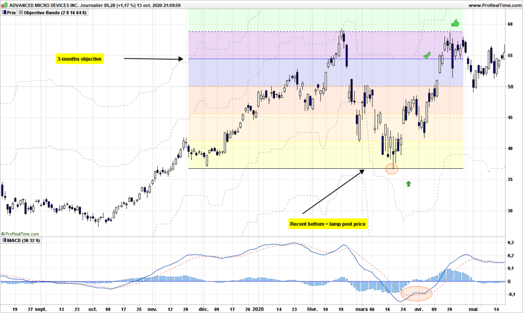
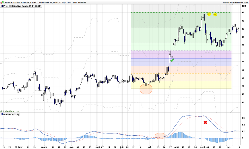
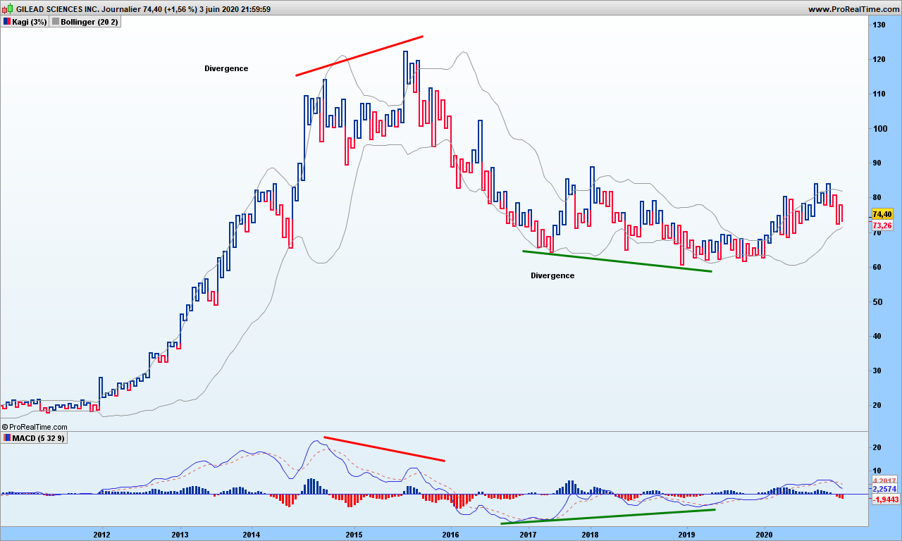
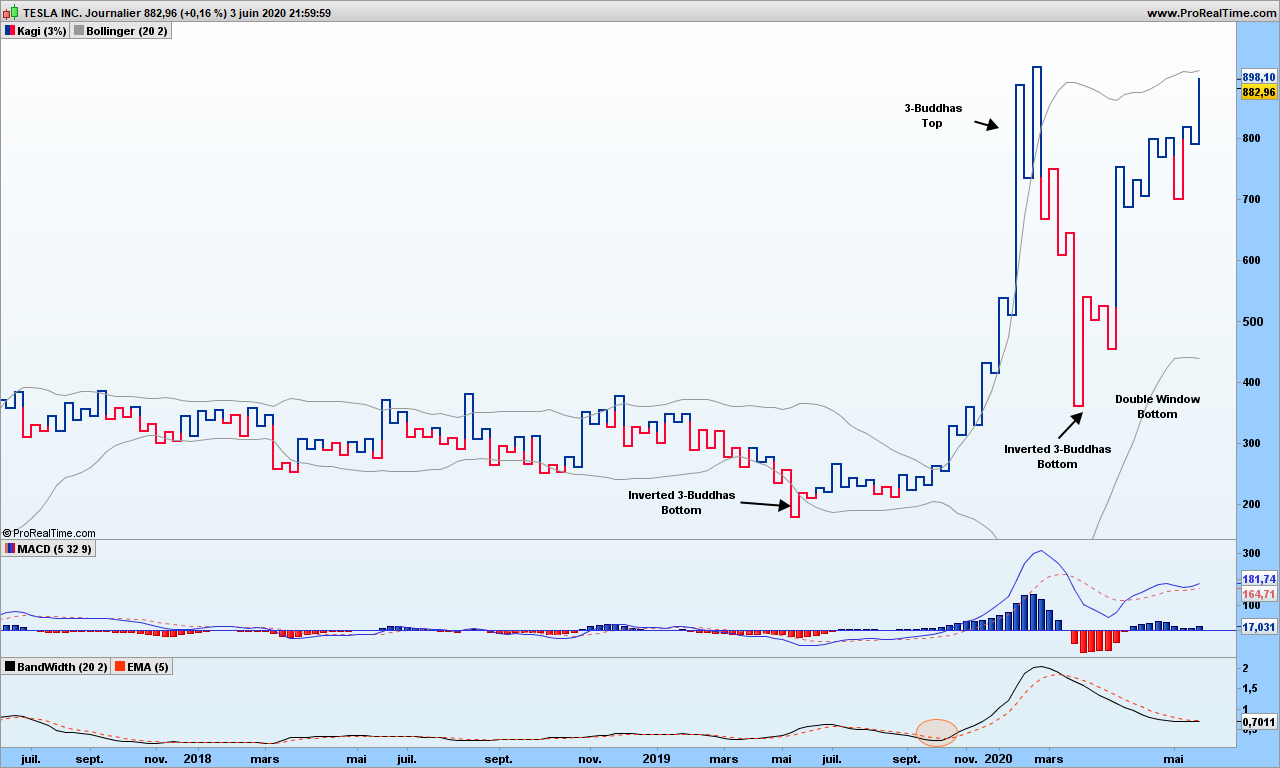
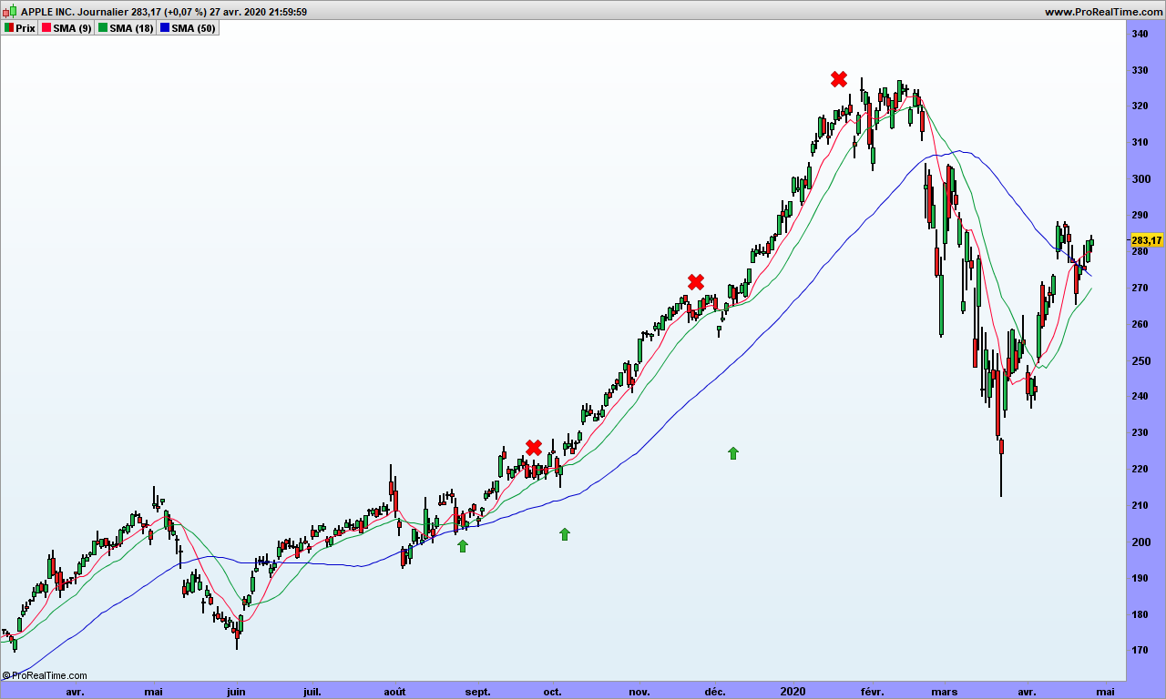
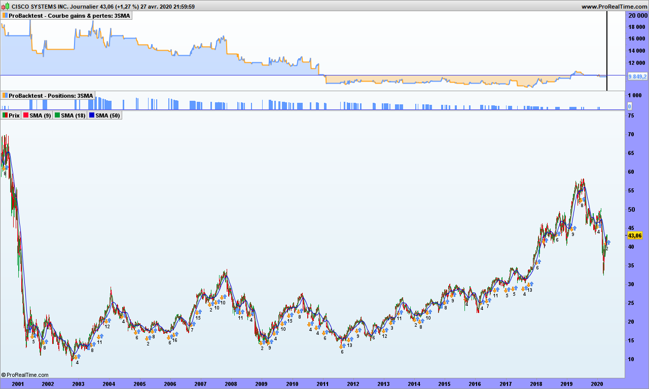
Let’s look at the chart:

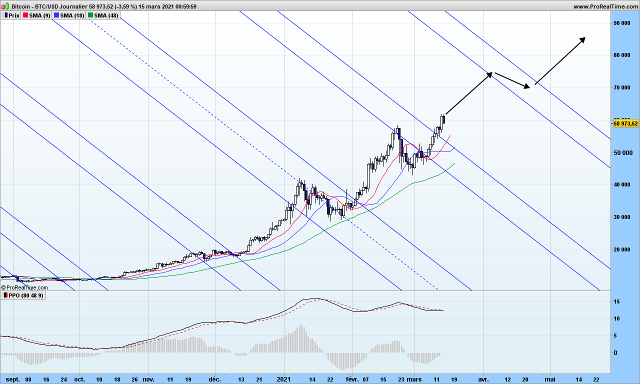
I have drawn the action-reaction lines, which is the only way to predict when and where the next top might take place. There is hidden symmetry in the market which you can see clearly, Bitcoin has been stopped by down slopping reaction line then wen through when many weak hands thought Bitcoin was going down back to 10k$.

There is almost zero resistance now until beginning of April. I expect the trend will be a bit slower. From exponential, coming back to parabolic more sustainable move is all we want!

That’s it! From now on, I will post some trading opportunities on some selected Nasdaq stocks with action-reactions line for your reading pleasure.

Until next time, trade safely!

To trend or not to trend, that is the question

Today we are going to study how trends transition to more or less flat markets and how to position ourselves for the best!

I am sure most of you are already familiar with indicators which supposedly indicate when a market is trending, and when you would be better off sleeping and out of the market.

Moving averages are close to be one of best indicator for that purpose. See that graph of Microsoft with Alligator indicator. Note ADX indicator at the bottom does not indicate too much!

The truth is investors are either having the same opinion at the same time and there will be a trend or investors disagree and market ends up being choppy and overall very flat. So any time that you see what could be the end of a trend, switch to drunkard mode and start counting the steps! If you need background information, please refer to this blog post.

Sure enough you could wait for prices to cross Alligator lines and then that colors are in the right order, … then you may have lost 50% or more the big next move! You need think differently. Don’t worry, I will skip the action-reaction lines for today!

First step if course to detect the end of an existing trend (at least 2-3 weeks long), you can use MACD crossing over its signal for this purpose. See this example with AMD:

What the heck am I supposed to do here? We are obviously leaving a short down trend and we don’t know where market is going to go. Nobody does unless you can dig into the brains of all investors at the same time!

Again we assume the most recent bottom is a lamp post, from where our drunk guy is going to walk northwards, maybe in trending manner or in random hesitating steps. But we know about the objective he can reach within the next period of observation. This is the first dotted line above the candles. In this example, it is 8 steps away and we are going to draw lines every 2 steps.

Now we are ready, the 3-months objective is roughly 55$, you need to use a convenient stop to protect and dimension your trade. See this post for instance. Let’s accelerate the time now!

2 weeks later, objective is reached (8 steps), the drunkard makes it even to the 10th step. From there, market reverses, a new long trend does not really pick, so you can do the exercise in opposite direction:

This time the drunkard does not go beyond 4-steps and after 3 months, you need to give up your short play. Then MACD goes again above signal

We reach first objective within 3 weeks, but this time the trend continues reaching 20 steps. You have successfully mixed together trending and random action!

That’s it. It does not need to be complicated. Don’t forget to choose stocks or indexes that have the capability to trend. Until next time, trade safely!

S&P500 market analysis June 15th 2020

S&P500 seems to continue sliding along reaction line but, as you can see, the 3 moving averages are still up, more or less for the red one.Markets may decide to move up again, we will see. A bit too early to to say markets are resuming the down trend. Objective 2680 unchanged but unlikely for now!

What is happening? It is all about COVID-19 again. The epidemic is more or less, rather less than more, under control. There are still hundreds of new cases in most countries every day, even those who have completely stopped the containment measures. If people wear a mask, of course, odds are in their favor they will not catch it. But what about all these demonstration throughout the world? Nothing is really under control, safe vaccine is long way before being available. It is likely markets are going to jump up and down a few times along pandemic making trends or moving sideways!

Don’t get unduly stopped out by the markets

Here we go for another technical post. Let me start first by answering a question: no, I will not post videos because text and pictures make you think, you can even print them if you wish. Though video can be a very good tool to show something, if you can not write it down with simple words, then you just have no clear idea of what you are talking about. So read, read again, think, confirm and write down your ideas, progress! This is the way this blogs intends to help you, dear readers!

I am going to discuss today trader’s least understood tool: the trailing stops. Because it gives a false sense of security, trading apprentices may loose lots of money, and even go broke if not careful.

There are a few conditions to use a trailing stop:

  • A trend should already exist
  • The stock or selected security should have the capability to trend (refer to history)
  • you know what you are doing!

Let’s look first at the performance of a trailing stop used as standalone tool:

As you can see, the performance over 20 years for Apple is absolutely ridiculous, especially when compared to 3-SMA and volatility system!

Why is that? When the stock is not trending, prices hover over and sink below the stop very fast, causing losses each time. Even a good up move will have hard time to catch up for losses. Even if your stop is carefully engineered, the behavior will be quite bad in flat markets.

Fair enough, how am I supposed to use stops now? You need the WWW stop technology! Don’t worry, you can use this one even on Yahoo finance:

For the example, I used the Moderna stock which became known to public right at the top of the graph!

Now add not one but three ATR trailing stops!

  • The Red one: the Wake-up call (2 ATR’s below price here). As name implies, its goal is to wake you up from time to time and make you think! You have to decide whether you stay and do nothing, stay and increase your line (pyramiding), or take a partial gain or get out. It is YOUR DECISION!
  • The Blue one: the Warning stop! (4 ATR’s below price here) When prices go under this one, you should definitely consider stepping out before it hurts too much!
  • The Green one: the Waouh stop (6 ATR’s below price here). This one has 3 objectives:
    • it tells you about the trend: see how Moderna was above of the stop for most part of the graph
    • you are sizing your line based on this stop
    • It is your hard stop: exit! But your loss might be greater than expected! Enter it in the trading system if you can not monitor the market for some time.

You should always have an exit strategy and the exit is based on a sole parameter: the max pain level you can stand!

Say for instance that your pain threshold is 100$. Just buy a number of stock so that, if the green stop fails, you will loose 100$ (you might need to get a round number of stock). Simple mathematics: say stop is 20$, close is at 25$, so a risk of 5$ per stock, so invest no more than 100/5=20 stocks!

If prices close below the blue stop, you may get a loss but it won’t hurt (too much!) because you will loose less than 100$

Of course, as trend starts picking up, all stops will go up, which will void your risk and you can decide to increase line size, always carefully checking that you can’t loose more than you pain threshold!

Note that you replace the Waouh stop by anything you like, could be the low Bollinger band, the low band of a Keltner channel, … whatever makes you safe and will follow the trend at good enough distance so you are not missing major market moves!

Remember the rules for trailing stops:

  • Size the line according to bearable pain
  • Use stops only when a trend does exist
  • Make sure you get warnings from the market before the stop is hit

That’s it. Until next time, trade safely!

Kagi charts: when time does not matter … too much!

This post is for those of you that want longer term approach, many weeks at least, and don’t mind their portfolio swinging up and down with larges waves. Maybe it will make you appear very clever if you can decipher and explain the chart to someone unaware of this technique!

For an in-depth introduction, please refer to Steve Nison’s book:

You may also refer to these sites: stockcharts or Colibri Trader.

I do not agree to use ATR as reversal amount as your chart will change over time, and you will loose track of why you entered the market. Just use the 3% reversal, it will do a perfect job!

Again, I am assuming you already know about Kagi charts which look like this one for Marvell. See last green arrow shows a positive and undoubted profitable signal!

Kagi charts filter out the daily noise and we are left with raw trend. Remember that people may change opinion at any time, so the charts may look convoluted from time to time.

There are interesting traditional figures mentioned in Steve Nison’s book that do appear from time to time. It does not hurt to pinpoint those patterns!

The basic buy signals, when kagi line goes from red to blue, appear quite often but obviously there are many false signals! Pretty much like the TLB charts (previous post), we need some tools to filter them out.

For each vertical segment, between 2 u-turns, we consider high and low to be top and bottom of each segment, open is the low for up moving lines and close is the top (opposite for down moving lines). Easy, isn’t it?

Bollinger bands are again useful, fantastic! Even the good old MACD feels more comfortable with this kind of charts. Let’s look at Gilead chart:

MACD divergences warn you about upcoming changes. Bollinger bands are clearly closing on on prices during consolidation and breakouts are solid confirmations. We can use the %B indicator to tell us when the bands are moving away from each other. Here is Tesla chart:

Tesla

As you can see, in May 2020, an inverted 3-buddha bottom appeared, was soon confirmed my MACD crossover. Then in October, the %B has crossed its signal line (a 5 candles exponential moving average). We are on board! On March 5th, we get a 3-buddha top, we are out with a cool 162% gain. We are not playing the down move from there since the overall trend is still up, and Bollinger bands are contracting. Beginning of April, we are again getting again a buy-signal (2-level break following inverted 3-buddha bottom confirmed by MACD), up to you to play it or not! Note how those Bollinger bands are quite flat from 2017 till end middle of 2019, they tell you not not to play any signal in any direction!

A word of caution must be mentioned here! Back to probabilities!

The probability of a trend change given the fact that you see a reversal patter (double window for instance) AND Bollinger bands expanding AND MACD greater than signal does ONLY mean potential reversal. We are improving the odds in our favor but I can not give you figures because backtesting on those charts in not possible. I tested manually over maybe two hundreds of charts, about 50% of trades should be profitable. The fact is you don’t know how far will the trend go. This is why, should you have time, it is good to revert back to old candlestick charts and draw the fabulous action-reaction lines to find out the potential!

That’s it! Those of you wanting material for week-end perusal, you get it!

Until next time, trade safely!

Note: if you wonder why I am using Bollinger bands here, it is because prices are filtered out of the daily noise. These are ‘trend’ graphics. The bands often prove to be decent prices objectives. This is of course to be taken lightly and cross-checked by more serious methodologies!

Volatility Trading System superior performance

I wrote in some previous posts that volatility trading improves the performance of any trading system. Is it the case? Really? How better is it?

The goal of volatility analysis is to get rid of loosing trades as much as possible, so if you go from 30% winning rate to 60%, then number of consecutive loosing trades will be narrowed down, the overall profitability will increase.

Let’s start this demonstration with a simple yet very interesting trading system:

  1. Buy when close > SMA(9)(close) > SMA(18)(close) > SMA(50)(close)
  2. Get out of the market when close is crossing under the SMA9

Close is today’s closing price, so you buy at the opening the next day. SMA(x) are x days simple moving averages. I am not taking short positions for this exercice, the rules would be exactly opposite.

Here is the graph of Apple over last few months. The 3 moving averages are shown by red (9 days), green (18 days) and blue (50 days) color. Some entries are shown with green arrows and selling the position by red crosses.

Looks good, doesn’t it? As long as the stock is capable to trend and Apple perfectly fits this criteria, this trend trading system should be ok.

Let’s now run a systematic simulation for a portfolio (10k$) with only one line and re-invest 100% of the profits. Here is the result:

Over 20 years, you multiplied your capital by 8! Great 🙂

But a few considerations are needed:

  • A buy&hold strategy would have yielded much more (x18)
  • you get 35% winning trades, a win/loss ratio of 1.67, biggest gain is 14257$, largest loss is 6226$
  • As expected from calculation in previous post, we can get a series 12 loosing trades in a row

Psychologically it is tough to handle, but could be worse. If you traded Cisco instead of Apple, the result is negative! That is because volatility is not big enough!

Now if you traded Bitcoin with this system, you are a billionaire! See the graph and report just below! Notice an almost 300M$ loosing trade, that is undoubtedly hard on the psychology!

Now I am adding volatility control on Apple, on top of previous one:

See? Now we multiply our initial capital by 41 (started from 100k$), beating by far buy&hold strategy! Now we get 68% winning trades, a win/loss ratio of 3.77, max 7 consecutive loosing trades but 16 long series winning trades 🙂

That’s it for today! Until next time, trade safely!