Would you mind buying yourself a Ferrari?

Even if you are not interested in car business, there is a good chance that you have seen at least once a Ferrari drive by, and because of its specific engine noise and design, you wished to be able to drive it even for a few minutes. I had the chance to drive one for 20 minutes once, it was an incredible experience!

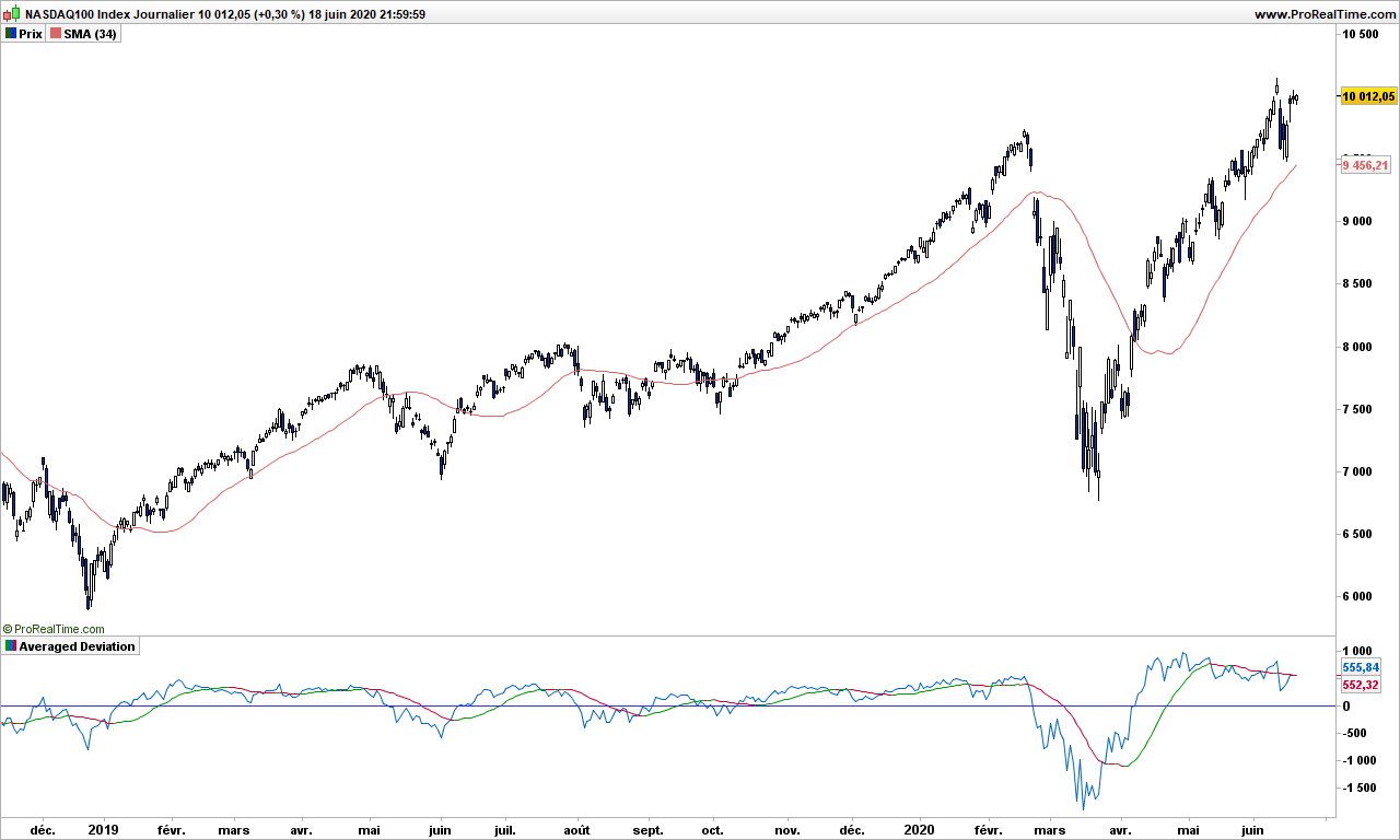
Anyway, let’s go to today’s topic, and see if there is any Ferrari like tool for trading, and to add for the fun, we will look at Ferrari graph! Think about their business: when you order a Ferrari, you will not be delivered before end of 2021 and you need to pay … now! Those interested in fundamentals should be looking on this stock! And so should you… and get a little piece of Ferrari!

Before we continue, remember that a Ferrari works fine in nice long roads, but it will be a painful drive if the road is bumpy with dangerous bends every quarter of mile!

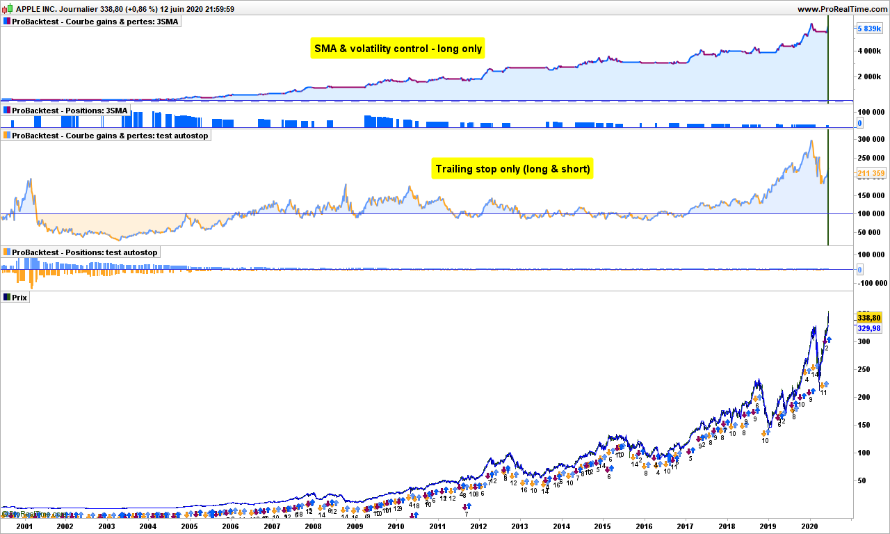
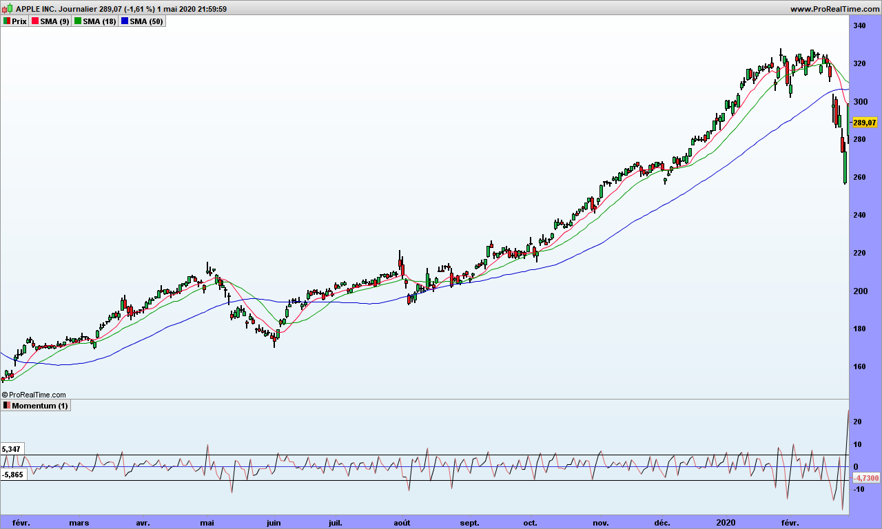
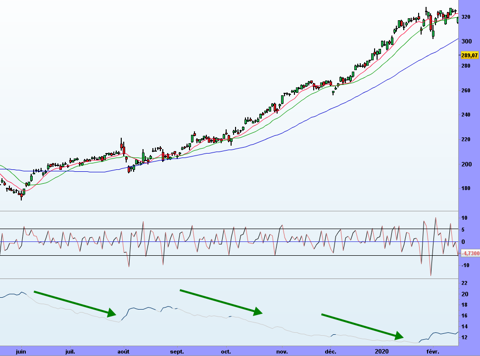
DEMA – Double Exponential Moving Average – is for those traders interested in taking the fast lane. I colored it green when going northward, and red when going southward. As you can see, we have a good indication of the trend!

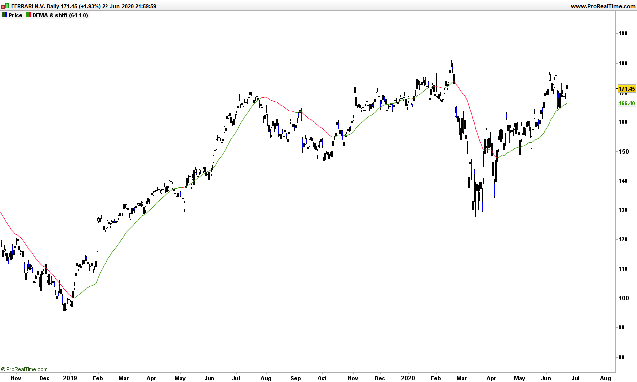
For those interested, the formula of DEMA is as follows. It is in short an EMA that is corrected for delay. So you can and MUST use long averages, don’t use 10-days DEMA, it doesn’t make sense!

DEMA = 2 x EMA – EMA(EMA)

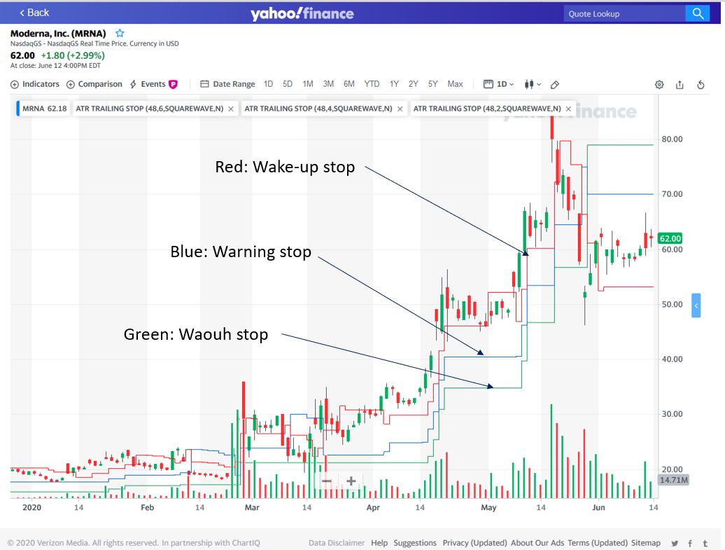
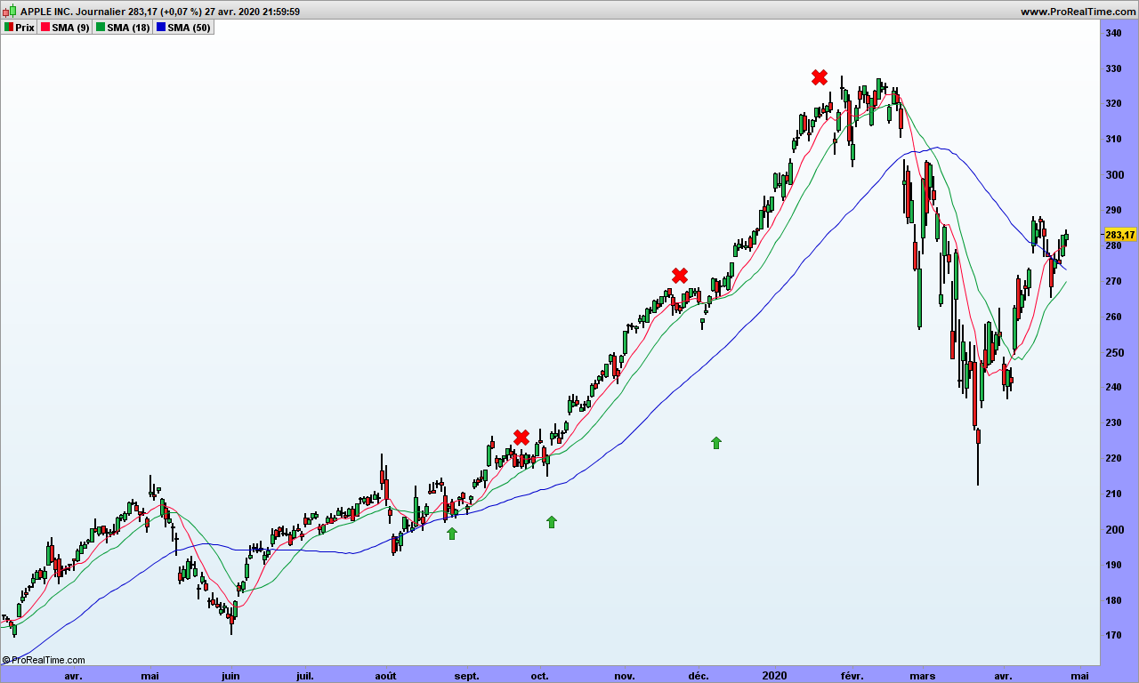
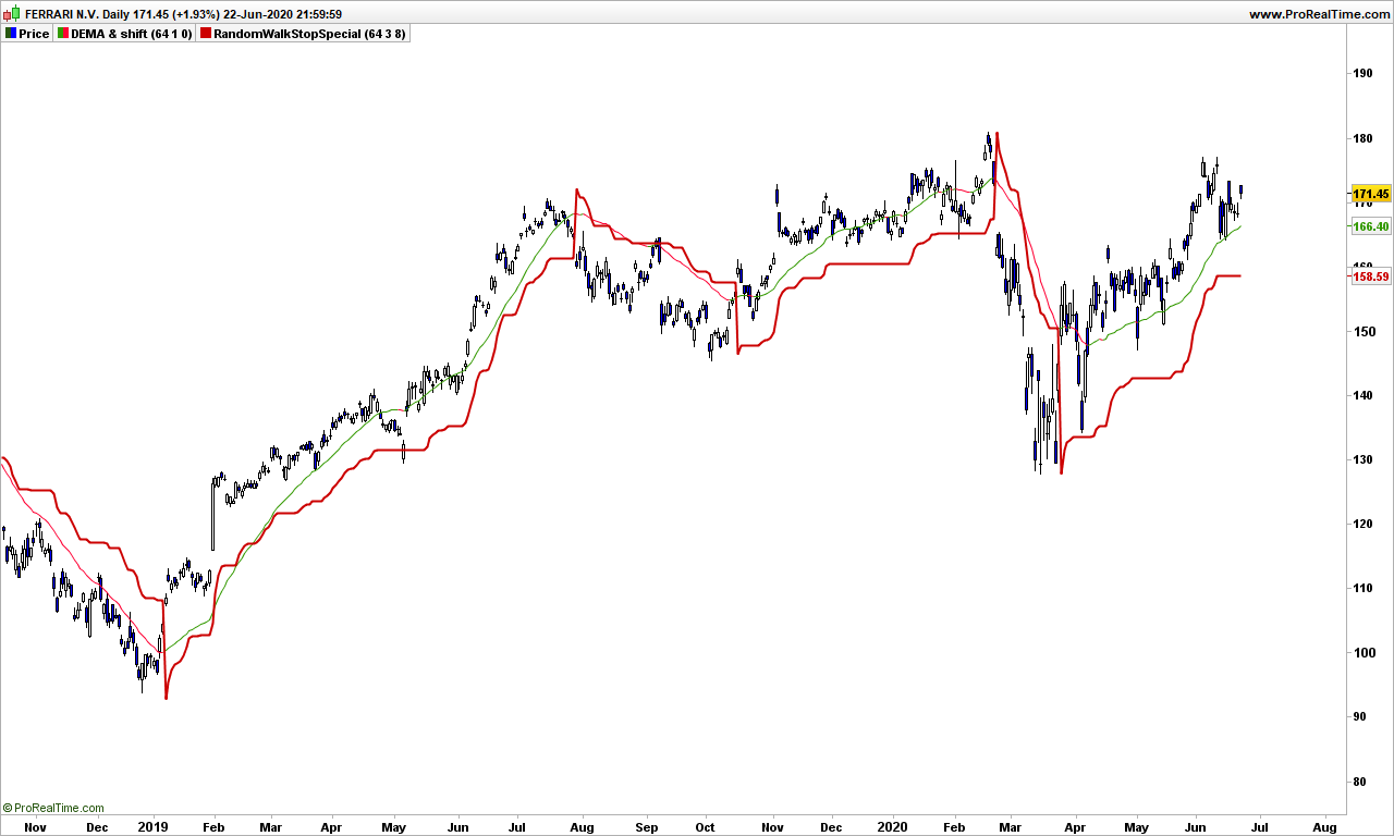
Using DEMA as a stop is not best idea you may have since prices may jump above and below the hood, so you need to add a bumper, sorry a stop! Here you go:

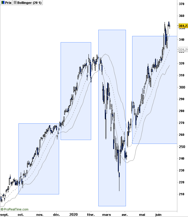
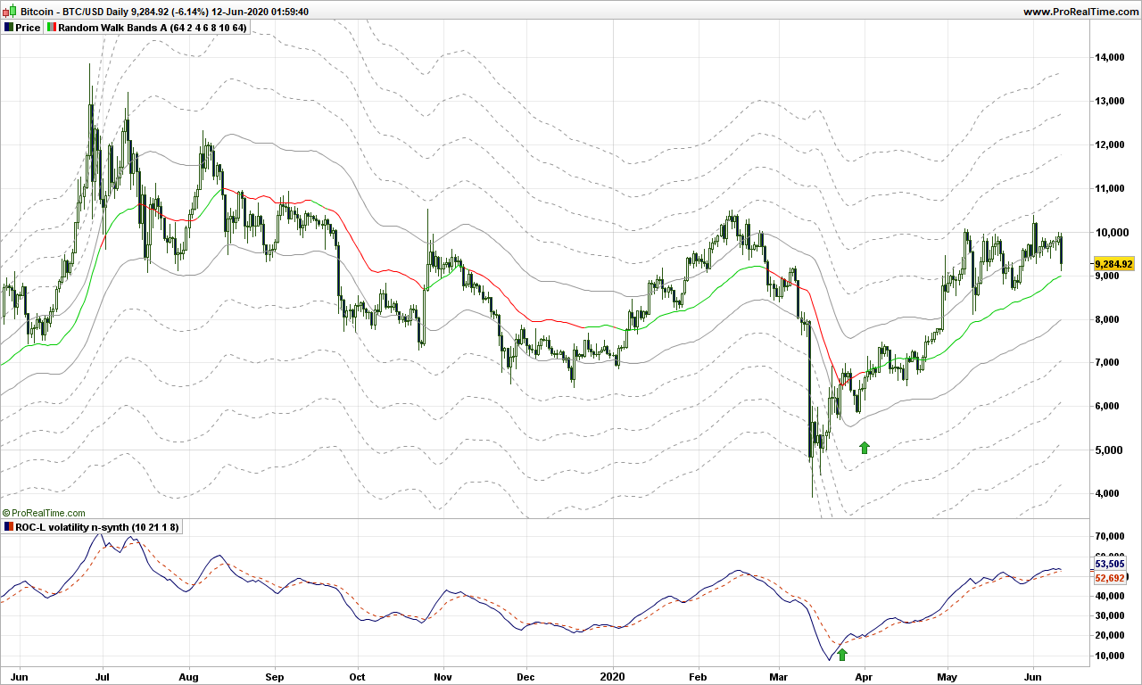
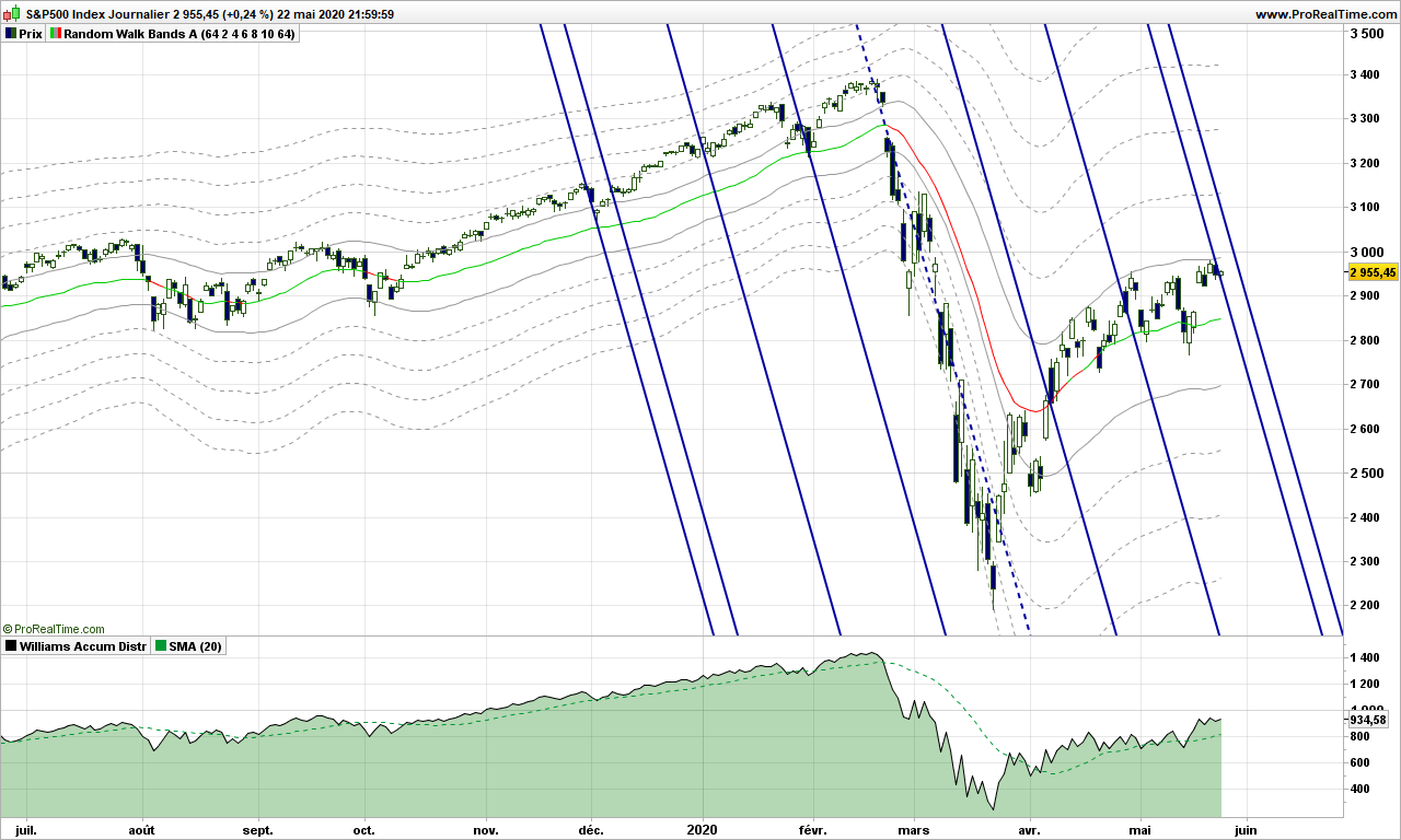
Last but not least, you do not want to enter too far away from DEMA. Remember my random walk path? DEMA is not the same of course, but let’s check if price are not going too far away from this path! For those who know, it is a Keltner channel with DEMA as central average!

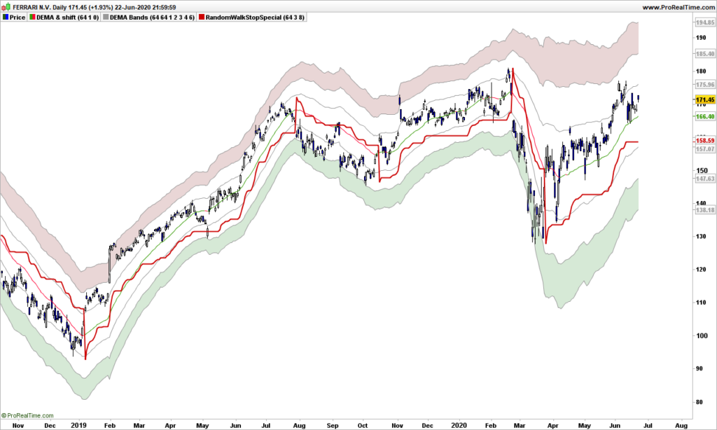
Wonderful! Prices are not going more than 8 ATR’s away from DEMA! I colored the zone between 6 and 8 ATR’s away from DEMA (don’t enter in red zone!) now the landscape is plain visible, provides a good idea of the direction, the stop prevents you from falling in ditches.

As previously said, do not use this Ferrari on small country roads, your portfolio will end up in a ravine sooner or later!

That’s it. Until next time, trade safely!

Have you been fooled by the bell curve?

I know you like some food for the mind for the week-end, this post is sure to make you think even it is simple mathematics! Of course, it will be fun to read too!

I have talked previously about how not use the Bollinger bands and I am going to kick even more on this concept.

As soon as you start talking about standard deviation (or sigma), you are assuming a bell curve, that is 62% of measurements (price) should be within one standard deviation of the average price. Let’s check that immediately, let’s display a Bollinger band with 1 sigma on Apple graph:

Apple Daily

Now look in each blue blox. There is almost ZERO price inside the band! The guy who sold the Gaussian curve to finance was the best salesman EVER!

Though attributed to Gauss, the bell curve was created by Abraham de Moivre in 18th century and then promoted furiously by an Adolphe Quételet in 19th century. Johann Carl Friedrich Gauss, one of best ever mathematician, published a book about normal distribution for astronomical data, and since then, we are talking the Gaussian or bell-shaped curve.

Gauss never studied the stock market random data! And standard deviation is only a ‘trick’ to locate 62% of the data around the average.

As shown on Apple graph, stock data is not consistent with normal distribution. Now what? When you have spotted a problem in trading, you got an edge!

You may remember from your years in high school the basic average deviation, sometimes called mean absolute deviation (MAD). In other words, it is the raw deviation measurement. Quoting Wikipedia:

MAD has been proposed to be used in place of standard deviation since it corresponds better to real life.[3] Because the MAD is a simpler measure of variability than the standard deviation, it can be useful in school teaching.[4][5]

School teaching? Hmmm… Most important part is first sentence: it corresponds better to real life! More on the difference between MAD and Gaussian distribution by fabulous Nassim Taleb here.

Stock price is not an industrial process measurement, it reflects the opinion of all people about the studied stock. If you are a car manufacturer and making 4.50m long cars, your production should make cars, say between 4.49 and 4.52, because otherwise the doors will not close properly is car is 4.78m long and you will need re-manufacturing with all associated costs! That is not the case for stock price, you are allowed to be excessively bullish or bearish!

Let’s give this theory a try. I am removing the Bollinger bands and adding a simple moving average, 34-days for the example, but you may change it.

Steven Nison, in his book introduced the Disparity indicator, created by Japanese traders, which is defined by:

Disparity = close – average over n days of close

It is very close to what we are looking for! We only need to add an average to get the Moving Averaged Disparity (MAD also just to add confusion!)

Apple Daily

The blue line is disparity and the MAD line is shown green when pointing up, red when pointing down.

As you can see, trading is almost straightforward. Buy when prices are over the 34-day average and disparity crosses over MAD (or when price cross over average and disparity is above MAD). Then get out when prices drop below average! Easy, isn’t it? You also get some nice divergence at the top, disparity has crossed below MAD end of January, far before the correction started!

From this introduction, there are plenty of ways you can improve this very basic but nonetheless very efficient indicator!

Here is a non commented graph of Nasdaq for you to play with:

That’s it! Until next time, trade safely!

Don’t get unduly stopped out by the markets

Here we go for another technical post. Let me start first by answering a question: no, I will not post videos because text and pictures make you think, you can even print them if you wish. Though video can be a very good tool to show something, if you can not write it down with simple words, then you just have no clear idea of what you are talking about. So read, read again, think, confirm and write down your ideas, progress! This is the way this blogs intends to help you, dear readers!

I am going to discuss today trader’s least understood tool: the trailing stops. Because it gives a false sense of security, trading apprentices may loose lots of money, and even go broke if not careful.

There are a few conditions to use a trailing stop:

  • A trend should already exist
  • The stock or selected security should have the capability to trend (refer to history)
  • you know what you are doing!

Let’s look first at the performance of a trailing stop used as standalone tool:

As you can see, the performance over 20 years for Apple is absolutely ridiculous, especially when compared to 3-SMA and volatility system!

Why is that? When the stock is not trending, prices hover over and sink below the stop very fast, causing losses each time. Even a good up move will have hard time to catch up for losses. Even if your stop is carefully engineered, the behavior will be quite bad in flat markets.

Fair enough, how am I supposed to use stops now? You need the WWW stop technology! Don’t worry, you can use this one even on Yahoo finance:

For the example, I used the Moderna stock which became known to public right at the top of the graph!

Now add not one but three ATR trailing stops!

  • The Red one: the Wake-up call (2 ATR’s below price here). As name implies, its goal is to wake you up from time to time and make you think! You have to decide whether you stay and do nothing, stay and increase your line (pyramiding), or take a partial gain or get out. It is YOUR DECISION!
  • The Blue one: the Warning stop! (4 ATR’s below price here) When prices go under this one, you should definitely consider stepping out before it hurts too much!
  • The Green one: the Waouh stop (6 ATR’s below price here). This one has 3 objectives:
    • it tells you about the trend: see how Moderna was above of the stop for most part of the graph
    • you are sizing your line based on this stop
    • It is your hard stop: exit! But your loss might be greater than expected! Enter it in the trading system if you can not monitor the market for some time.

You should always have an exit strategy and the exit is based on a sole parameter: the max pain level you can stand!

Say for instance that your pain threshold is 100$. Just buy a number of stock so that, if the green stop fails, you will loose 100$ (you might need to get a round number of stock). Simple mathematics: say stop is 20$, close is at 25$, so a risk of 5$ per stock, so invest no more than 100/5=20 stocks!

If prices close below the blue stop, you may get a loss but it won’t hurt (too much!) because you will loose less than 100$

Of course, as trend starts picking up, all stops will go up, which will void your risk and you can decide to increase line size, always carefully checking that you can’t loose more than you pain threshold!

Note that you replace the Waouh stop by anything you like, could be the low Bollinger band, the low band of a Keltner channel, … whatever makes you safe and will follow the trend at good enough distance so you are not missing major market moves!

Remember the rules for trailing stops:

  • Size the line according to bearable pain
  • Use stops only when a trend does exist
  • Make sure you get warnings from the market before the stop is hit

That’s it. Until next time, trade safely!

Volatility lovers: Crypto, what else?

Investing in crypto currencies might be something for geeks, many of you probably think, but for the pleasure of trading small amounts and and making big gains in percentage, this is worth a detour.

It is not because you hate some companies that you should not invest in them. Trading is about making profits, full stop. Yes, crypto may not environment friendly, and will be worth zero should a huge wordly power outage occurs but that is a risk you have to manage. Also crypto are showing the path to the future, nobody in maybe 10 years from now will pay with banknotes and coins. This is why you should be bullish on this technologies and why not trade of few them!

There is now a big number of cryptocurrencies to invest in, but please stick to major ones, as most of them are scams and will be worth zero far before our gigantic power outage! I do not wander beyond the big ones like Bitcoin, Etherum, Litecoin and a few others. Trading those is actually quite straightforward because of huge volatility, and remember volatility means also likeliness of emergence of trends. Use a Kagi graph to enter is easiest strategy, then use a candlestick graph to place stop!

Here we go with Bitcoin!

Bitcoin bottomed out by March 22nd, Kagi lines made a 2-level break, MACD is up. One day later, the double window bottom was also confirmed. I entered below 6000!

If the accumulation/distribution also showed a buy signal about the same time, it was not so obvious we should go! Skeptic bull, uh? As the trend lines then started going up beginning of April and price starting to hover the random walk path, it was second possible entry!

Where is Bitcoin headed now? As you can see on Kagi, the Bollinger bands are pointing upwards. A correction may or may not come, next objectives are 10700 and 12000. Out if closing below 8800 (as of today!). Just wait and see!

Note: major crypto currencies will not disappear tomorrow, unless this enormous power outage again! Using a stop based on volatility is fine. But price may zoom through the stop line, so be careful and make the line size much smaller than on a stock and you will be safe!

S&P500 market analysis May 25th 2020

I am sure you have noticed by now that this blog is totally original and I will not cover the basic indicators, their usage, … There are millions of sites that copy/paste from each other and you won’t learn from them anything but the basics. It is always a good idea to come back to basics, but profitable trading is about having an edge, so none of basic indicators work for very long, when too many traders are using one, market becomes sort of immune to it!

With this blog, I aim to help you kick some ideas down the road and if you wish you can share on this blog. Maybe it does not work for you as expected, but it may inspire others. Just drop me an email (see pinned message) and I will publish your article!

Let me share a story. For very long years, I made a few trades per year and had absolutely no idea how to get in or to get out. so I did some buy and hold based on randomly selected analysis, watching the stocks loose as much as 50% then going back up… And one morning I had an idea: imagine a very tall tree and there is a big coconut hanging from the top branches and a monkey happens to walk by and being thirsty. The easiest part of course is climbing, reaching the top, secure yourself to branches with feet and one hand while extending the other hand to take the fruit. Then suddenly, one branches cracks. You are still hanging from one branch with one hand but you are still safe, sort of! But for how long? The second branch is bending now and you must make a decision: free fall to the ground (not a good idea) or jump down other branches. This is how I started designing my first trailing stop! See? Let me know how you come up with trading strategies, fun to share and comment!

I still have plenty of ideas to share. I will not share publicly the details of my very best strategy because I am using it, but there is no problem sharing older research material that you can choose to improve on your side and share with the club! Just to give you an idea, we will look at in future posts:

  • EMA, DEMA, and the collection of moving averages
  • Accumulation / Distribution
  • The wonders of smoothed ROC
  • Kagi trading with volatility
  • 3-line-breaks trading with volatility
  • Others

So far I have demonstrated:

  • Markets follow a random path which can be drawn.
  • Markets can trend and this is due to their random nature. See here.
  • The randomness can be measured by volatility. The raw volatility (be it 1-day momentum, True Range, …) is the one to be analyzed and understood
  • You should not try to confirm stubbornly a strategy because cases where your strategy does not work surely exist and might even be the most profitable cases! Market’s got some sense of humor :-))

Now, as title implies, let’s look at S&P500 and where it is going!

As a continuation from previous post, I have left the random walk path and you can see that our drunken man does not seem capable to go more that 2 steps away from the main path.

If you have read my initial posts, you know I like a lot Action/Reaction lines because tops and bottoms are often building on those. Here we are precisely with 2 solid blue lines across the path. Unless S&500 goes through forcefully, we are in for a reversal. I have included Accumulation / Distribution at the bottom, which is a good indicator when you have nothing better, just add a 20-days simple moving average. There is not much energy: look at the slope of price versus indicator! We need some very good news to move up now! So yes, I would wait a few more days to see where we are going and go short if confirmed for an objective at 2400. This is absolutely no advice!!!

Until next time, trade safely!

A deep dive into volatility trading – part 2

Everyone has different ideas about what volatility is, what it measures and how to use it (when it is known!). Volatility is a measure of speed, a measure of risk, a measure of objective (see my posts about random walk), a measure of noise, a measure of whatever your imagination lets you think of providing you can link it to some facts. Remember that volatility is just a number and trying to fit in a box will lead to misunderstanding of other boxes that the number may fit in an other dimension.

Volatility is usually calculated by means of variance and standard deviation, but this assumes market is a Gaussian distribution and prices almost never err beyond 3 standard deviations (once every 34 years to be accurate) but THAT IS NOT THE CASE! Price goes beyond 3 standard deviations at least 3 times a year on indexes and individual stocks. The model is wrong but all financial tools (options, warrants, …) are based on that and, as surprising as it may seem, it gives us an edge to play against finance.

If you have observed the 1-day momentum in part 1, some bells should have started to ring. Let’s look at an other one:

Look at momentum value! Most of the time they are contained within a specific range. Exceptions are results announcements or market corrections. Don’t you find it strange?

Think about this. You want to buy a small flat, 35 square meters, seller wants 40k€. You being budget conscious, you may propose 39.5k€, saving some money to refresh the kitchen. You propose 500€ below the asked price. It may work!

Second situation: you are now buy a condominium 800 square meters, seller wants 4.7M$. Now you make a bid at 4 699 500$, or 500$ below the asked price. This is mean (in the sense of contemptible!). Now only will the seller think you are kind of psycho or moronic psycho, but you are clearly at risk of not getting the flat, which is pretty bad if you think flat price may go up 30% in next 10 years!

Now look at Apple graph again. Negotiations are in the same range, whether Apple is priced at the 200$ or 300$!

Once you have observed this, you know YOU HAVE AN EDGE!

There are many reasons why this happens. Sure enough HFT (High Frequency Traders) are playing with 0.01€ variations and they have volumes to play with. But think also about a call warrant: price goes up if price of associated stock goes up, but it is driven down by expiration time AND lower volatility. Get it? Finance has an edge!

The rules for volatility trading are thus this simple:

  • Buy when volatility is high and going down
  • Short when volatility is low and going up

Without disclosing the (smoothing) formula, let’s look at a volatility indicator that makes sense (bottom of the graph). Volatility goes down when prices climb up and volatility increases when the market hiccups giving opportunity to buy with very good timing!

That’s it! Because I am not using a predefined model to fit in the data, the data speaks back to me! Until next time, trade safely!

Volatility Trading System superior performance

I wrote in some previous posts that volatility trading improves the performance of any trading system. Is it the case? Really? How better is it?

The goal of volatility analysis is to get rid of loosing trades as much as possible, so if you go from 30% winning rate to 60%, then number of consecutive loosing trades will be narrowed down, the overall profitability will increase.

Let’s start this demonstration with a simple yet very interesting trading system:

  1. Buy when close > SMA(9)(close) > SMA(18)(close) > SMA(50)(close)
  2. Get out of the market when close is crossing under the SMA9

Close is today’s closing price, so you buy at the opening the next day. SMA(x) are x days simple moving averages. I am not taking short positions for this exercice, the rules would be exactly opposite.

Here is the graph of Apple over last few months. The 3 moving averages are shown by red (9 days), green (18 days) and blue (50 days) color. Some entries are shown with green arrows and selling the position by red crosses.

Looks good, doesn’t it? As long as the stock is capable to trend and Apple perfectly fits this criteria, this trend trading system should be ok.

Let’s now run a systematic simulation for a portfolio (10k$) with only one line and re-invest 100% of the profits. Here is the result:

Over 20 years, you multiplied your capital by 8! Great 🙂

But a few considerations are needed:

  • A buy&hold strategy would have yielded much more (x18)
  • you get 35% winning trades, a win/loss ratio of 1.67, biggest gain is 14257$, largest loss is 6226$
  • As expected from calculation in previous post, we can get a series 12 loosing trades in a row

Psychologically it is tough to handle, but could be worse. If you traded Cisco instead of Apple, the result is negative! That is because volatility is not big enough!

Now if you traded Bitcoin with this system, you are a billionaire! See the graph and report just below! Notice an almost 300M$ loosing trade, that is undoubtedly hard on the psychology!

Now I am adding volatility control on Apple, on top of previous one:

See? Now we multiply our initial capital by 41 (started from 100k$), beating by far buy&hold strategy! Now we get 68% winning trades, a win/loss ratio of 3.77, max 7 consecutive loosing trades but 16 long series winning trades 🙂

That’s it for today! Until next time, trade safely!