Three-Line-Break or the integrated trend-volatility tool

I have been a fan of Three-Line-Break (TLB) trading for long time because it is a KISS (Keep it Simple Stupid) methodology and takes no time to make decisions, which is mandatory when you have an other full time job! As long as I did not have any backtesting tool and was working only small caps which are trending usually for longer period of time, then the feeling was there was a positive expectancy. However, from time to time, I experienced losses more than I liked, and felt like missing trend departures.

Once again I assume you are already knowledgeable about the basic topic. For more details on TLB, please refer to here

Backtesting becomes possible when you can actually display the TLB back on daily chart. On the following chart, you can see on the right the TLB chart, with red and green lines; these appear on the left candlestick chart as red and green boxes.
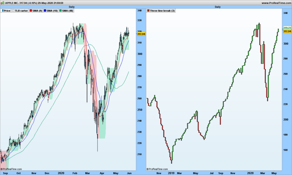
There are signals from TLB that you would obviously not take after adding our usual 3 single Moving Averages for instance.

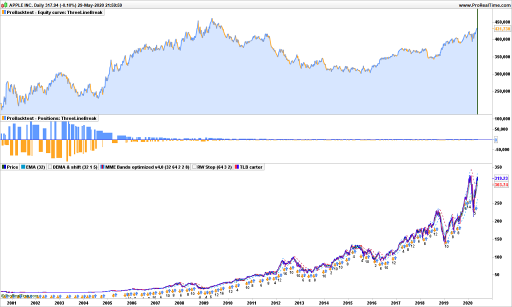
When we backtest over long period of time the TLB strategy on standalone only, we surely are disappointed.

Let’s look at Apple. First with TLB, taking buy and short signals, 300%
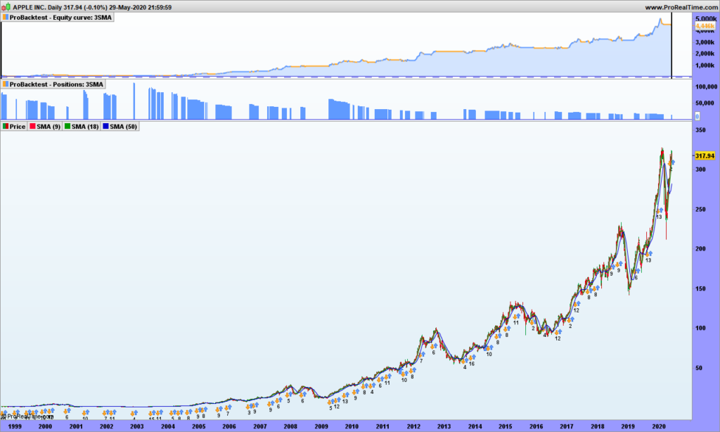
Taking our 3-moving averages on the long side only, we fare far better!
So if you hate candlestick charts, then you need to put those 2 technologies together. First add the 9 and 18 averages on on your TLB chart.

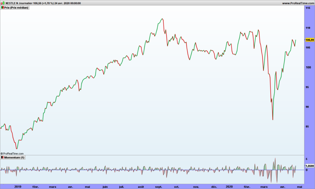
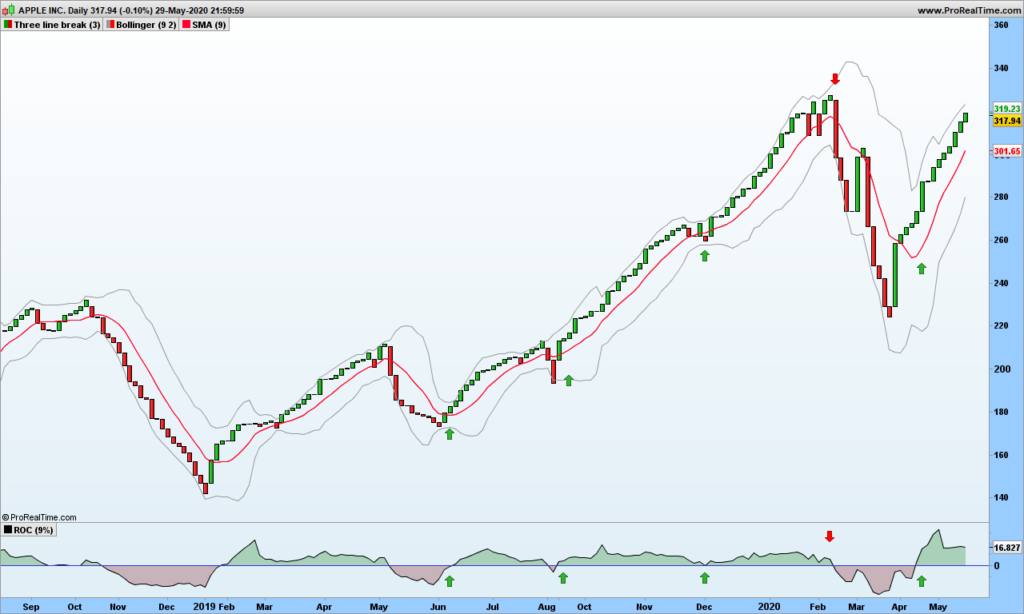
The size of each TLB line represents also the volatility, though you don’t know how long it took to have this volatility increment. Fair enough, the daily volatility is filtered out to show the trend volatility. The ROC indicator should be very talkative. I am displaying the ROC 9 days on this chart:
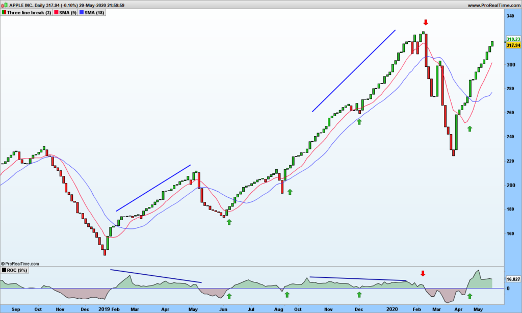
Any time, ROC crosses 0, or just touch down 0 and goes back up are good entry points. When ROC is positive, just filter out the short signals. An other confirmation is SMA9 is above the SMA18. And there are also divergences to help anticipate trend change!

You may also look at the volatility of 3LB, this time using Bollinger bands, because TLB lines stick to 2 standard deviations!
I tried to move back these good-looking curves to candlestick charts for back-testing but to no avail. So I can not show you the backtesting result.

As a conclusion, if you are not after option trading where time does matter, these TLB chart are a very good tool. Overall trend is given by a single moving average, which allows easy filtering of false signals.

That’s it. Until next time, trade safely!

S&P500 market analysis May 25th 2020

I am sure you have noticed by now that this blog is totally original and I will not cover the basic indicators, their usage, … There are millions of sites that copy/paste from each other and you won’t learn from them anything but the basics. It is always a good idea to come back to basics, but profitable trading is about having an edge, so none of basic indicators work for very long, when too many traders are using one, market becomes sort of immune to it!

With this blog, I aim to help you kick some ideas down the road and if you wish you can share on this blog. Maybe it does not work for you as expected, but it may inspire others. Just drop me an email (see pinned message) and I will publish your article!

Let me share a story. For very long years, I made a few trades per year and had absolutely no idea how to get in or to get out. so I did some buy and hold based on randomly selected analysis, watching the stocks loose as much as 50% then going back up… And one morning I had an idea: imagine a very tall tree and there is a big coconut hanging from the top branches and a monkey happens to walk by and being thirsty. The easiest part of course is climbing, reaching the top, secure yourself to branches with feet and one hand while extending the other hand to take the fruit. Then suddenly, one branches cracks. You are still hanging from one branch with one hand but you are still safe, sort of! But for how long? The second branch is bending now and you must make a decision: free fall to the ground (not a good idea) or jump down other branches. This is how I started designing my first trailing stop! See? Let me know how you come up with trading strategies, fun to share and comment!

I still have plenty of ideas to share. I will not share publicly the details of my very best strategy because I am using it, but there is no problem sharing older research material that you can choose to improve on your side and share with the club! Just to give you an idea, we will look at in future posts:

  • EMA, DEMA, and the collection of moving averages
  • Accumulation / Distribution
  • The wonders of smoothed ROC
  • Kagi trading with volatility
  • 3-line-breaks trading with volatility
  • Others

So far I have demonstrated:

  • Markets follow a random path which can be drawn.
  • Markets can trend and this is due to their random nature. See here.
  • The randomness can be measured by volatility. The raw volatility (be it 1-day momentum, True Range, …) is the one to be analyzed and understood
  • You should not try to confirm stubbornly a strategy because cases where your strategy does not work surely exist and might even be the most profitable cases! Market’s got some sense of humor :-))

Now, as title implies, let’s look at S&P500 and where it is going!

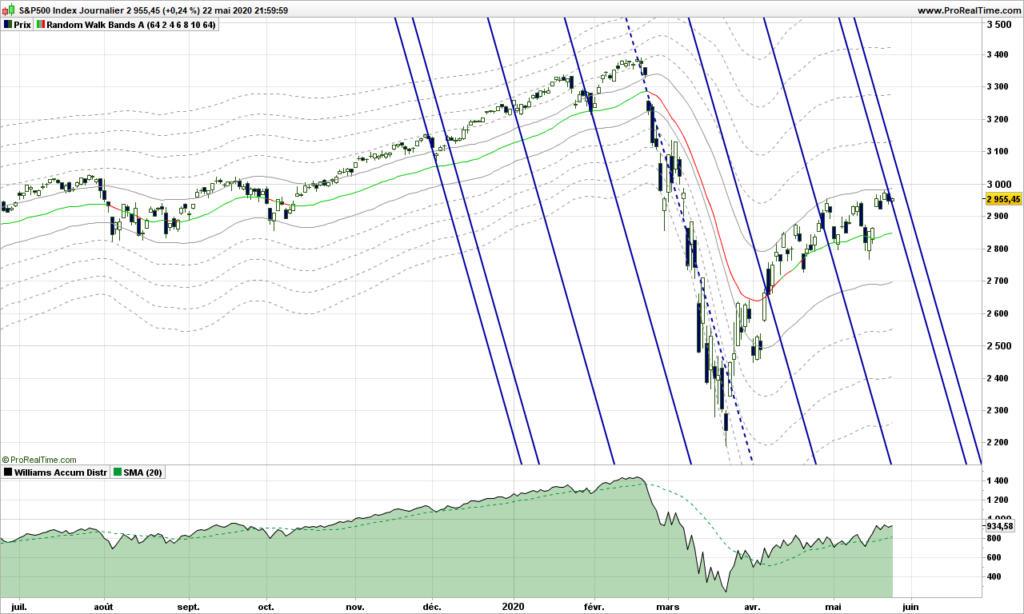
As a continuation from previous post, I have left the random walk path and you can see that our drunken man does not seem capable to go more that 2 steps away from the main path.

If you have read my initial posts, you know I like a lot Action/Reaction lines because tops and bottoms are often building on those. Here we are precisely with 2 solid blue lines across the path. Unless S&500 goes through forcefully, we are in for a reversal. I have included Accumulation / Distribution at the bottom, which is a good indicator when you have nothing better, just add a 20-days simple moving average. There is not much energy: look at the slope of price versus indicator! We need some very good news to move up now! So yes, I would wait a few more days to see where we are going and go short if confirmed for an objective at 2400. This is absolutely no advice!!!

Until next time, trade safely!

Spotting and trading the Random Walk path!

After discussing raw volatility, standard deviations, no way we don’t have a discussion about ATR aka the Average True Range. This post will definitely blow you mind, I am going to demonstrate that markets are REALLY following a random walk path, pushing from one side to the other in a precise manner.

For introduction, please read again my previous post about drunkard’s walk.

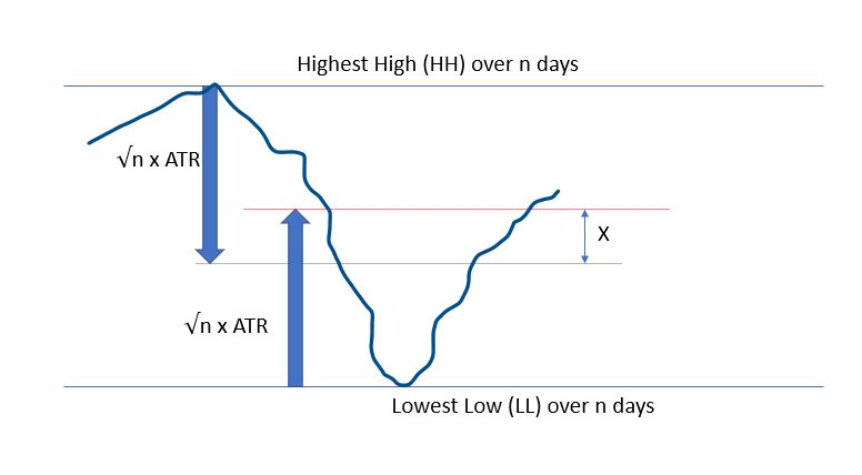
Let’s consider an observation period of n days. The Highest High (HH) and Lowest Low (LL) may be considered as lamp post from which our drunken guy is walking. We know that on average we should be able to find him at a location situated at square root of n multiplied by average stride length or the Average True Range over n days to use financial wording.

Here is how it looks:

The red line is where Bulls expect price to be, whereas the Bears are waiting for the prices to reach the green lines. These are all average expectations of course, and these objective can be reached any time during the observation period. Please remember that down markets are usually twice faster that up markets.

What if we consider the middle price between these 2 expectations??

Let’s do a bit of maths:

  • Today’s high (H) is expected at LL + 2 * √n * ATR(n)
  • Today’s low (L) is expected at HH – + 2 * √n * ATR(n)

So the middle point can be defined as:

MP = .5 * ((H+L)/2 +(HH + LL)/2)

Of course price will not be there, X does NOT mark the spot, but it is a fair expectation about where prices should be, if there were no other information.

Let’s display it on a real chart!

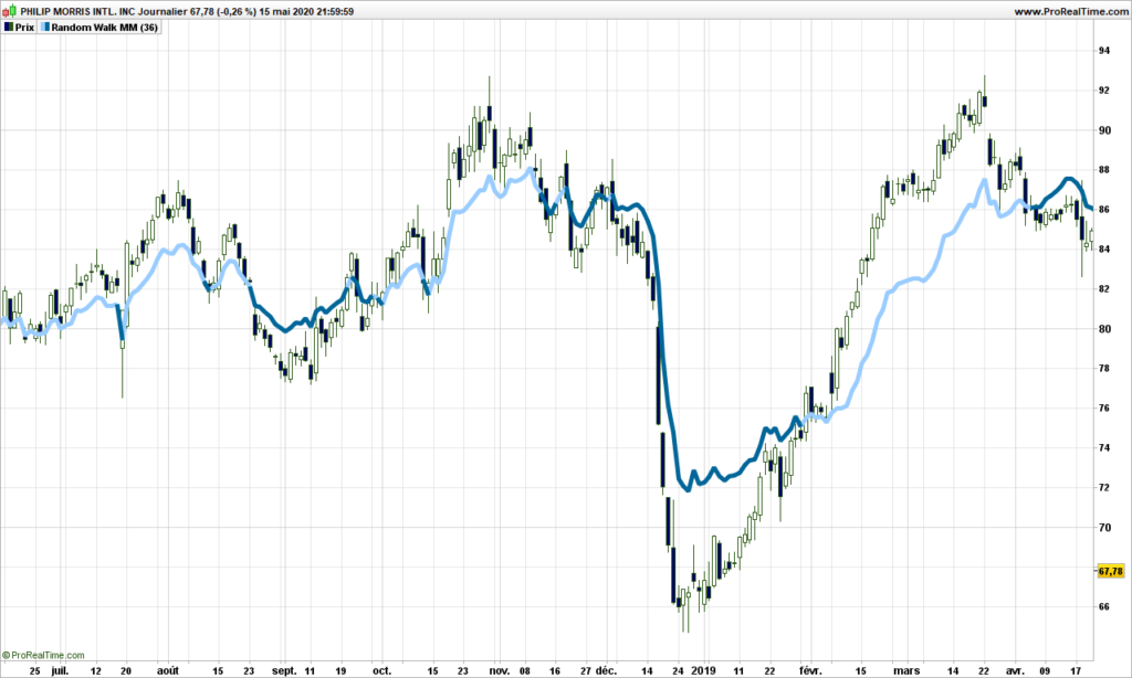
We are going to use n = 36 in this post, you can use anything between 4 and 100, but make sure the square root is an integer for what will be following.

Ouch! It hurts the eyes. But you need to think of it differently. It is not a simple moving average, it is always using the most significant average of the day, between 1 and 36. Anyway you can already see that, when prices are above the path (light blue color),then trend is up. The path leaves a chance to prices to retrace and tends to be closer to them before a reversal.

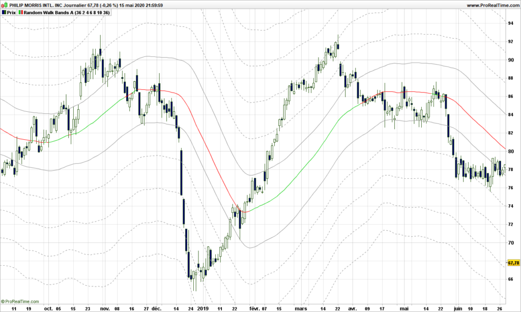
Let’s not stop there and use a standard average of this path to smooth things out. Now follow my reasoning!

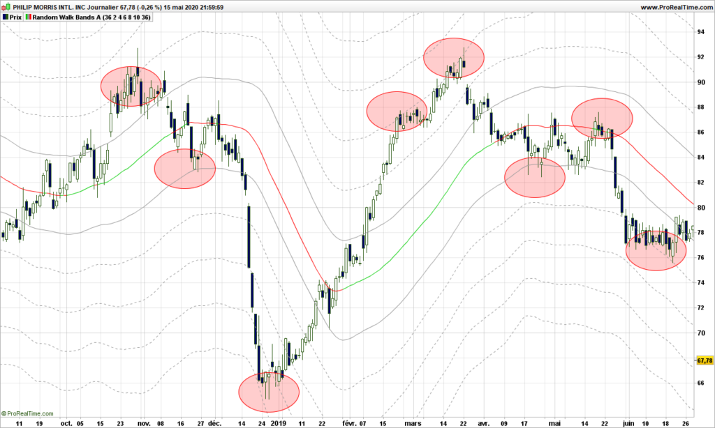
If the random walk theory holds, then the path we have spotted may very well be a lamp post so the actual prices should hover at exactly a number of strides from the lamp post, not 3.7 strides, 4 really! Let’s do it and display some lines at exactly every 2 steps (2 ATR’s) from the middle path.

Whaouh!!!!!!!!

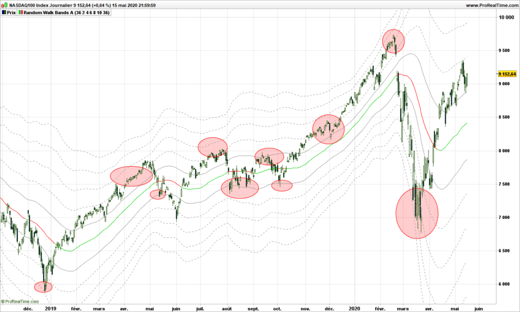
The red/green line is the smoothed out path. Prices are pushing along the lines, see only a few examples highlighted in red circles here:

Just amazing.

One way to see it is to consider the middle path as the median line if you were using an Andrew pitchfork, first lines above and below are the MLH (median line high) and the other lines are warning lines!

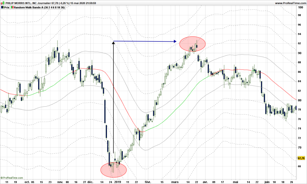
Even better, if you are looking for warning lines above a major bottom, each represent a price objective. In the case below, the price identified on first warning line is reached a the top second red circle within .30$! (97.70 vs 97.42!)

Trading strategies are quite straightforward from then on:

  • From a warning line far below median path, play return to the path
  • From middle path that is going, play the trend and put a stop on a visible line below the price
  • If price is ‘in the central pitchfork’, most likely there is no trend!

Now, you will tell, this is an example, sure it does not work with last market conditions? Yes it does!

Here is Nasdaq recent price action, stopped on a warning line!

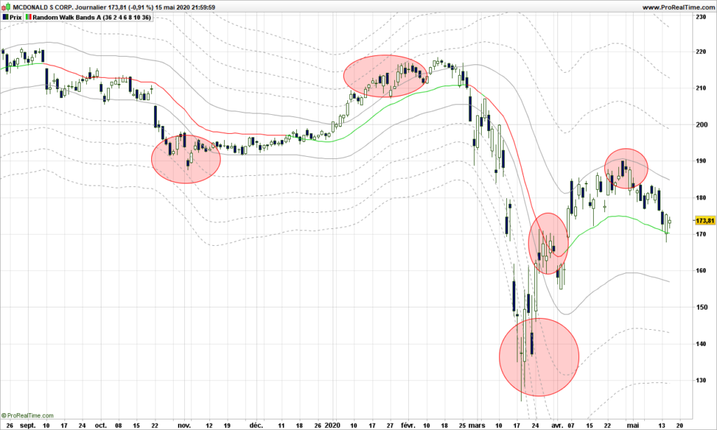
Or McDonald. Doing quite well!

Final thoughts: Market is moved by demand and offer. Behind these are drivers are humans or robots programmed by humans who can change their mind any time, giving the market a random outlook. This post would be worth many more investigations. Dr Andrew and his pitchfork really had a hint, but without computer, it was definitely more difficult for him. This is maybe the first explanation why Andrew Pitchfork are working and why it is so difficult to identify the right pivots to draw the pitchforks! Anyway, the random walk proves to a very good model, again because we are not trying to fit the data into a specific model or data distribution!

Feel free to comment or send email.

Until next time, trade safely!
Bollinger bands from a different perpective

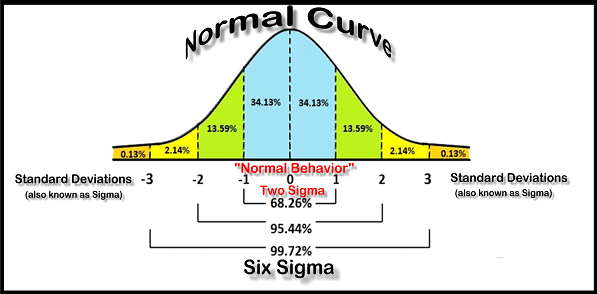
As a blog about volatility, of course, there must be a post about Bollinger bands, which is the most common way to assess volatility. More especially, finance have based all their systems, assuming that prices are a Gaussian distribution (aka bell curve).

If this statement was true, then only 2.14% of prices should be outside the 2 standard deviations (aka sigmas). For one year, say 200 days, 4 days should be oversold or overbought, as commonly said!

Fair enough, let’s work a quick indicator that tells us how many sigmas the prices are from the average. We are taking John Bollinger’s definition.

Indicator = (close – 20-days average of closing prices) / Standard deviation 20 days

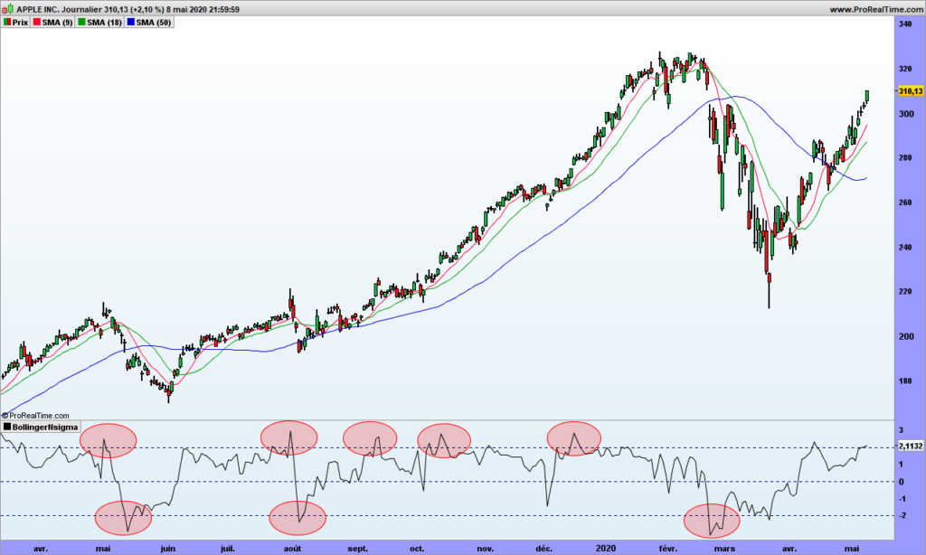
Let’s look again at Apple graph over last few months!

We have gone beyond the 2 standard deviation at least 8 times, sometimes for a few days. It is not looking good! If you are looking at S&P500, it reaches -3 sigmas once a year at least, when it should be the case more or less once every 8 years. Of course, it is probabilities, and this can happen more often. Correct, but there should be also long years without this far reaching. Which is not the case!

Now that you have spotted this interesting paradox, you have a new edge for trading! The best to trade Bollinger bands is just to NOT draw them. Remember that bubbles and parallels pointed by by Bollinger specialists are mere illusions!

Instead use our small indicator!

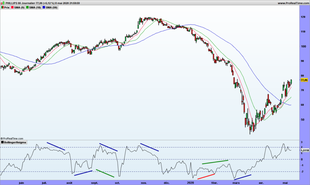
The indicator displays many divergences:

  • Blue ones are standard divergences with the price to spot reversal
  • Green ones show hidden divergences in the direction of the trend

I have highlighted a red one to show one that did not work. Be careful, if the trend is strong, wait for a signal to profit by the divergence, at least let the price go over the short moving average.

See, it is easy! For standard divergences, make sure first point is in oversold or overbought area, as indicated by the 2 sigmas lines.

One you are in, don’t get out of your trade at the 20-days moving average (strategy called ‘return to mean’), use a trailing stop, the green average for instance.

That’s it. Some people would charge you 5000$ per year to then send you the signals by email. If you do sell this service, please remember my commission!

A deep dive into volatility trading – part 2

Everyone has different ideas about what volatility is, what it measures and how to use it (when it is known!). Volatility is a measure of speed, a measure of risk, a measure of objective (see my posts about random walk), a measure of noise, a measure of whatever your imagination lets you think of providing you can link it to some facts. Remember that volatility is just a number and trying to fit in a box will lead to misunderstanding of other boxes that the number may fit in an other dimension.

Volatility is usually calculated by means of variance and standard deviation, but this assumes market is a Gaussian distribution and prices almost never err beyond 3 standard deviations (once every 34 years to be accurate) but THAT IS NOT THE CASE! Price goes beyond 3 standard deviations at least 3 times a year on indexes and individual stocks. The model is wrong but all financial tools (options, warrants, …) are based on that and, as surprising as it may seem, it gives us an edge to play against finance.

If you have observed the 1-day momentum in part 1, some bells should have started to ring. Let’s look at an other one:

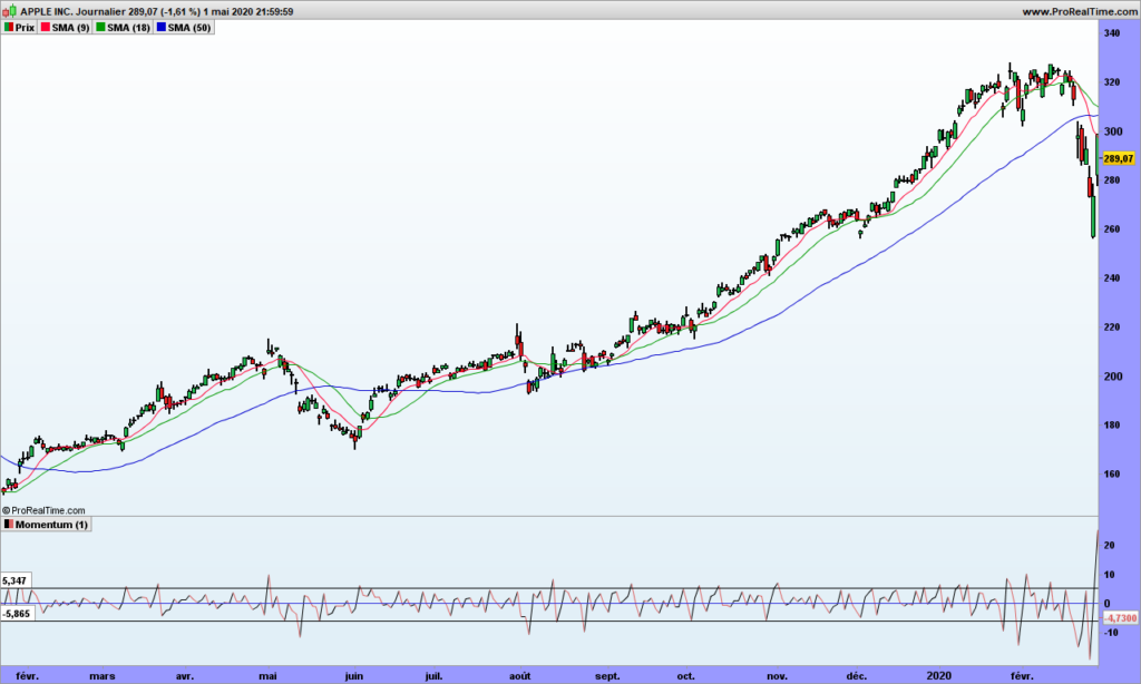
Look at momentum value! Most of the time they are contained within a specific range. Exceptions are results announcements or market corrections. Don’t you find it strange?

Think about this. You want to buy a small flat, 35 square meters, seller wants 40k€. You being budget conscious, you may propose 39.5k€, saving some money to refresh the kitchen. You propose 500€ below the asked price. It may work!

Second situation: you are now buy a condominium 800 square meters, seller wants 4.7M$. Now you make a bid at 4 699 500$, or 500$ below the asked price. This is mean (in the sense of contemptible!). Now only will the seller think you are kind of psycho or moronic psycho, but you are clearly at risk of not getting the flat, which is pretty bad if you think flat price may go up 30% in next 10 years!

Now look at Apple graph again. Negotiations are in the same range, whether Apple is priced at the 200$ or 300$!

Once you have observed this, you know YOU HAVE AN EDGE!

There are many reasons why this happens. Sure enough HFT (High Frequency Traders) are playing with 0.01€ variations and they have volumes to play with. But think also about a call warrant: price goes up if price of associated stock goes up, but it is driven down by expiration time AND lower volatility. Get it? Finance has an edge!

The rules for volatility trading are thus this simple:

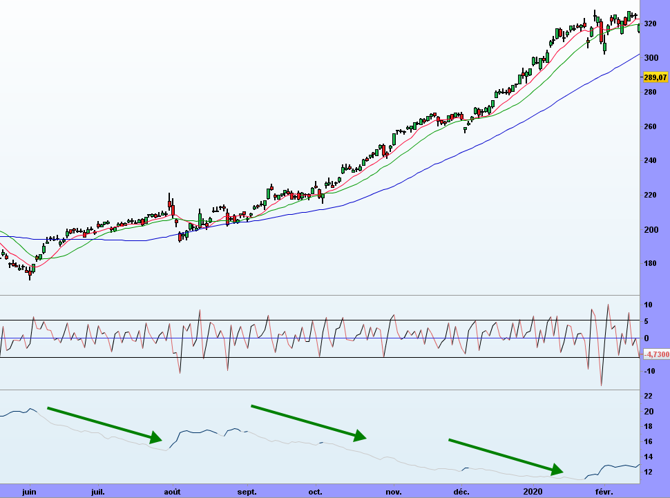
  • Buy when volatility is high and going down
  • Short when volatility is low and going up

Without disclosing the (smoothing) formula, let’s look at a volatility indicator that makes sense (bottom of the graph). Volatility goes down when prices climb up and volatility increases when the market hiccups giving opportunity to buy with very good timing!

That’s it! Because I am not using a predefined model to fit in the data, the data speaks back to me! Until next time, trade safely!
Volatility Trading System superior performance

I wrote in some previous posts that volatility trading improves the performance of any trading system. Is it the case? Really? How better is it?

The goal of volatility analysis is to get rid of loosing trades as much as possible, so if you go from 30% winning rate to 60%, then number of consecutive loosing trades will be narrowed down, the overall profitability will increase.

Let’s start this demonstration with a simple yet very interesting trading system:

  1. Buy when close > SMA(9)(close) > SMA(18)(close) > SMA(50)(close)
  2. Get out of the market when close is crossing under the SMA9

Close is today’s closing price, so you buy at the opening the next day. SMA(x) are x days simple moving averages. I am not taking short positions for this exercice, the rules would be exactly opposite.

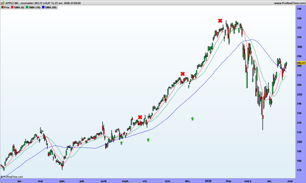
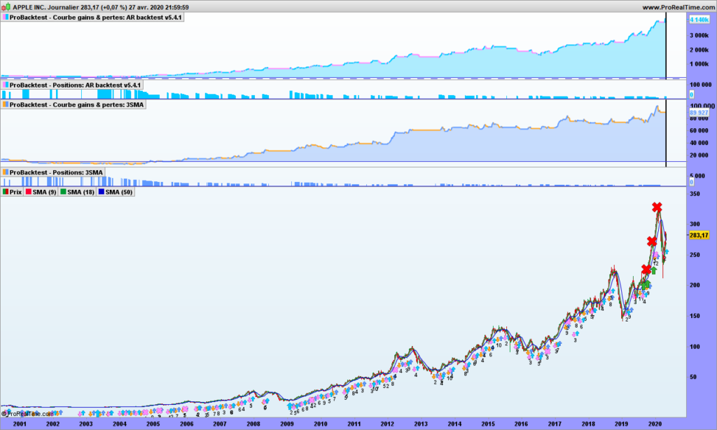
Here is the graph of Apple over last few months. The 3 moving averages are shown by red (9 days), green (18 days) and blue (50 days) color. Some entries are shown with green arrows and selling the position by red crosses.

Looks good, doesn’t it? As long as the stock is capable to trend and Apple perfectly fits this criteria, this trend trading system should be ok.

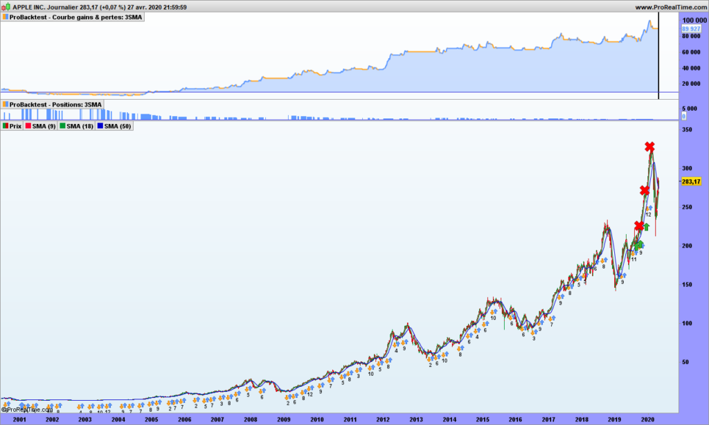
Let’s now run a systematic simulation for a portfolio (10k$) with only one line and re-invest 100% of the profits. Here is the result:

Over 20 years, you multiplied your capital by 8! Great 🙂

But a few considerations are needed:

  • A buy&hold strategy would have yielded much more (x18)
  • you get 35% winning trades, a win/loss ratio of 1.67, biggest gain is 14257$, largest loss is 6226$
  • As expected from calculation in previous post, we can get a series 12 loosing trades in a row

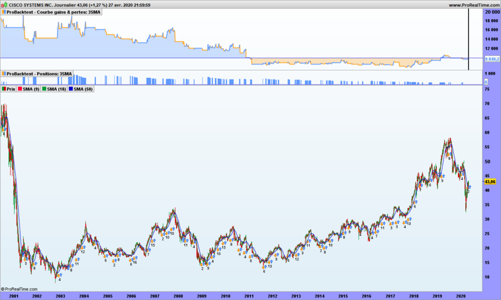
Psychologically it is tough to handle, but could be worse. If you traded Cisco instead of Apple, the result is negative! That is because volatility is not big enough!

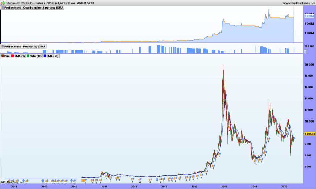
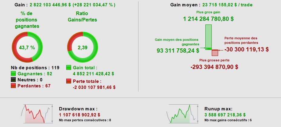
Now if you traded Bitcoin with this system, you are a billionaire! See the graph and report just below! Notice an almost 300M$ loosing trade, that is undoubtedly hard on the psychology!

Now I am adding volatility control on Apple, on top of previous one:

See? Now we multiply our initial capital by 41 (started from 100k$), beating by far buy&hold strategy! Now we get 68% winning trades, a win/loss ratio of 3.77, max 7 consecutive loosing trades but 16 long series winning trades 🙂

That’s it for today! Until next time, trade safely!
Should you want to share your ideas…

Hi all,

I hope you enjoy reading this blog. Volatility trading is like being a dragon slayer, you are fighting the mythical chinese beast that is unpredicatable. This is emulated in some chinese martial arts school where unpredictability is key to win your fights!

If you feel comfortable presenting and exchanging ideas, write articles on this blog, you are welcome to contact me: dragontrader at vivaldi.net or randomerrance on twitter. Spammers will be barred immediately! I may have only a few years thinking advance but I believe we can make a killing on the markets. As title indicates, it is a club, free to join, free to leave, …

It is NOT allowed to post very detailed advice on which stock to buy or short. I will only post market analysis from time to time. As they say in WallStreet and in China, there are those who know and those who tell, and these are not the same. We want to be those who know and enlighten the path of knowledge to others.

Talk to you very soon!

A deep dive into volatility trading – part 1

Volatility trading is not:

  • Price action trading (between support and resistance)
  • Trend trading
  • Fundamental analysis

Volatility is hidden behind all these techniques but it frightens most people because we talk about noise, probability, leptokurtic distributions, and many more abstruse words.

Volatility is very easy to understand:

P(t) = P(t-1) + e

Where P(T) is today’s price, P(t-1) is yesterday’s price and ‘e’ is the delta between the 2. ‘e’ is the raw volatility!

About price, we usually use median price of the day instead of closing price, to smooth a bit the volatility 😉

‘e’ can also be seen as the 1-day momentum. If ‘e’ is positive than momentum (speed) is up; if negative, momentum is down. This is the beginning of a trading strategy. Don’t throw away your other indicators just yet, because this not usable as such! (At the very least, consider the weekly 1-week momentum and take only signals in the same direction, but the signals can unfortunately be used only in intra-day type of trading)

Interestingly enough, should you program the formula above on a computer using random function with ‘e’ representing anything between 1% and 2% variation up or down, and run 10000 loops at least, and display the results, you will see a graph that is looking very much like the graph above. You will notice support and resistance lines, head and shoulder patterns, triangles, … because you have learned to recognize them but these are mere illusions! Because these patterns can be generated by a very simple program, the conclusion is that they have no predictive power! Or in other words, it just means that if a supposed target is reached, it is purely by chance.

So you are now left with ‘e’ and you can do whatever makes sense to you. You can average, look at standard deviations, look for hidden frequencies with Fourier transforms, …. Remember to keep it simple. When some big pocket start to sell, everyone sells; when price start going up, nothing happens until the hiking is obvious, so there must be some linear component. Which we will see in an other post!

Selected books for your perusal

Hi! With on-going containment, that may come back a few times in the next year or so, I thought I would recommend some good books to read. This blog will not teach you everything you need to know!

Let’s be clear, there are many good books out there but authors usually make their living out of selling books rather than trading, justification always being having more regular revenues… or just revenues? 😉

Anyway, most books do not cover more than basics, giving only very basic information about RSI, stochastic, … Hidden divergences are almost never covered, not talking changing default parameters!

So here are a few good books with in-depth reliable information.

First one will teach you the basics. Dr Elder is quite good about explaining how to do trading and provides very advanced trading strategy. His 3 steps screening strategy is brilliant.

If you are looking at creating your own indicators, Larry Williams shows his creativity. The indicators he developed may or may not work any more, but he finds the words to kick-start imagination.

Pitchforks and Action-Reaction are the ONLY tools I know of that allow easy and reliable prediction of where prices are going and when. Don’t get me wrong, these are not crystal balls, they allow knowledge of potential targets, one or more of them are very often hit by the market. P. Mikula provides a very good starting knowledge on Andrew’s pitchforks and action-reaction. He doesn’t say how to select the pivots points however but as A. Andrew supposedly said, each 3-points sets have a story to tell. This will lead you to sound meditation for sure!

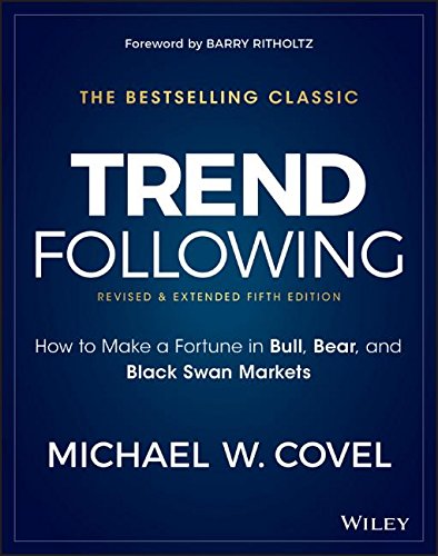
Even if we are not doing trend trading the way described in this book, M. Covel is a fantastic writer who explains in detail the automated systematic trading, explains what it is to have an edge in the market, how to demonstrate it. Your challenge is to do better than trend followers, which you can possibly do after thinking deeply with book just above.

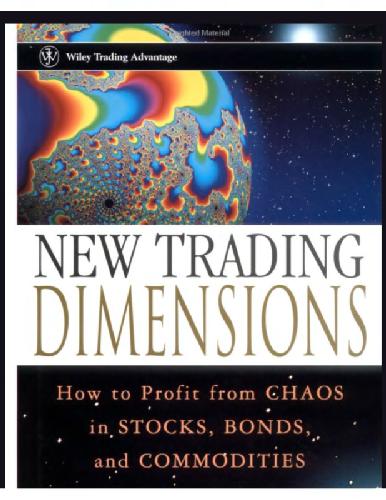
Fractals are a way to trade with the trend, represented by an Alligator in Bill Williams book. Providing you spent some time understanding his concept, fractal trading is a very good trading system. We are missing statistics but the programming should be easy.

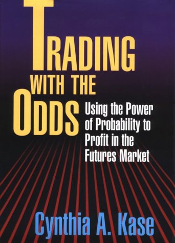
‘Trading with the odds’ was the first book I read that took a deep dive into the probabilistic side of trading. C. Kase explains it all in simple terms, the weekly synthetic bars are a must-have trading tool. Kase Peak Oscillator is also fascinating in its concept.

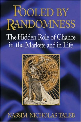
Last book, bot not least, is not about trading per se but it is a must-read. Nassim Taleb makes the case about luck: even W. Buffet may have been lucky because probability of having someone so successful at trading among billions of humans is not zero! And handling of randomness in trading precisely the core of the system!

That’s all folks. Enjoy these books and trade safely.

The holy grail of indicators

With that title, I am sure you are going to read this post to the end! If you have no time, the summary is: the holy grail just does not exist but it is worth searching for it, for the path is more important than the actual indicator!

If you are looking for the best ever indicator, you can hardly start from a blank page. You need inspiration, you need to get your brain on invention steroids! So, the first thing to do is to consider what is available on trading platforms and make a strength / weakness analysis. you need to get a deep understanding about how the indicator is built, how it behaves under different market conditions, play with parameters and multiple securities like index, stocks, trackers, …

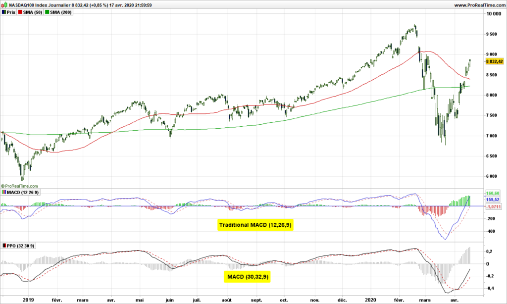
Let’s look at MACD or Moving Averages Convergence /Divergence. I will not explain here the background, but show one graph with 2 different parameter settings.

See? One is smoother than the other. The timing of signals is the same but the eye likes second one much better. Meaning also, if you make it part of trading system fully automated, you will have less noise to manage!

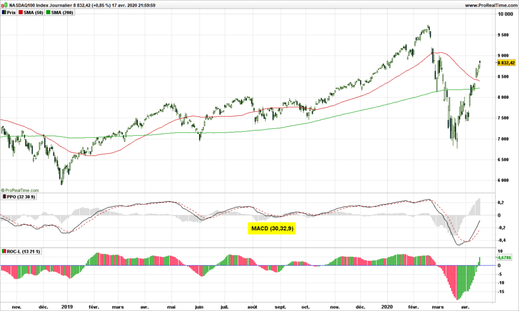
MACD is a trend indicator, therefore it performs quite poorly in horizontal markets. What about a momentum indicator?

This one tells you you are in an uptrend when positive and when it goes green below 0, it may be a counter-trend trade opportunity. It looks good to the eye, not perfect as there are false signal, but looks fairly good. Of course, some back testing would be needed to validate the impressions!

Now if you are looking for the grail of indicators, here is what it should do:

  • It should tell you what is going up in higher time frame (e.g. in weekly for a daily chart). Because it means you have some good move on-going, it is not just noise in current time frame
  • It should be capable to anticipate market turns, through divergences or hidden divergences (in direction of the trend)
  • Signal should be timely, not too early and definitely not too late
  • You should be able to see and professional are doing versus all other market participants
  • It should be smooth and easy to read
  • The number of false signals should be reasonable
  • The signal should be profitable as often as possible. Refer to previous article about winning streaks.
  • Please add here you own requirement: …………………………………………..

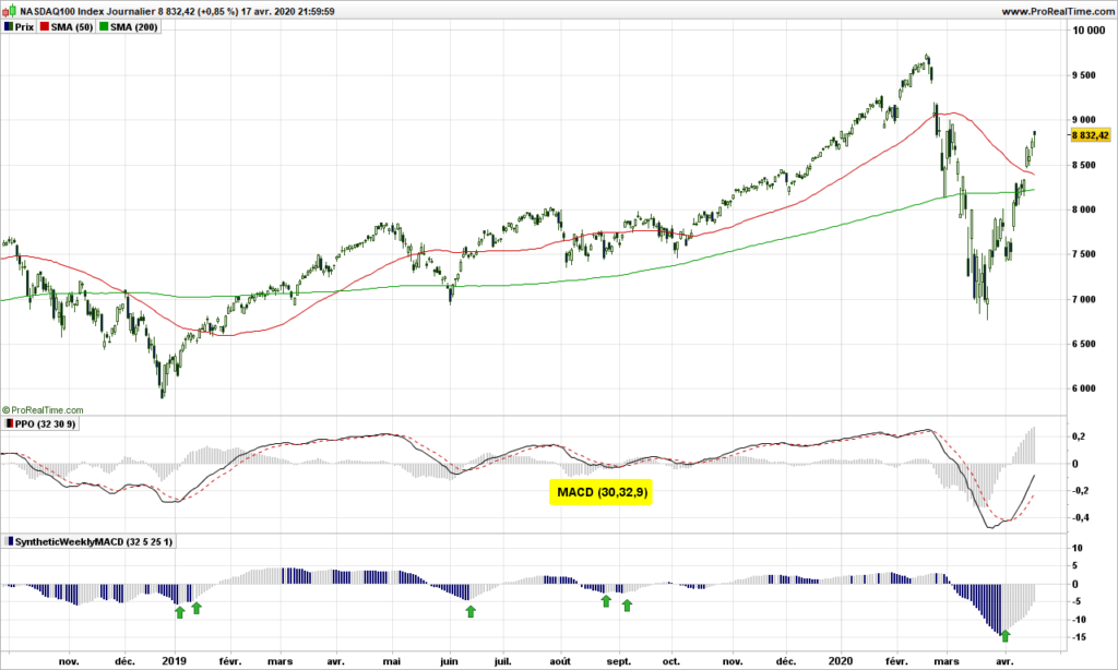
A way to look at higher timeframe in a single chart (holy grail surely means only one chart!) is to use synthetic bars. This has been introduced by Cynthia Kase in her book: ‘Trading with the odds’ https://www.amazon.com/Trading-Odds-Probability-Profit-Futures/dp/155738911X

The idea is to to calculate MACD as if on a weekly chart but we do the calculation each day, so we have the information we want before the week is closing. MACD on weekly chart is usually used as one-bar indicator on histogram: when it changes color (goes up after going down in negative territory), it is signal to buy. Just look! Green arrows point to buying opportunities in weekly chart, sometime 3-4 days before end of the week!

There are hundreds of indicators available on the markets. Try to make sense about the most common ones, discards those that are complete nonsense, consider those that work as promised by their author (I have not found any divergence for long time on accumulation/distribution) and continue your trip! It gives food to your mind!

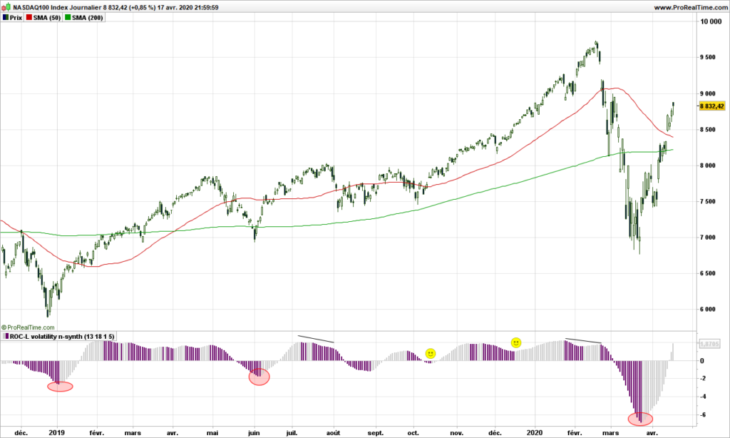
Your next question is of course: did I find the holy grail? I wished! Please remember we are trading prices, not the indicator! My indicator tells me where professionals enter after market bottom (red circles in counter trade), has plenty of divergences, has zero crossings or bumps (smileys) to indicate entries in direction of trend. But it is not perfect, get some false signals from time to time (because the professionals are wrong ;-), jsut kidding of course)

Of course there remains the need for risk analysis (volatility and position sizing, price objectives).

Until next time, trade safely and don’t take useless risks with virus!