Kagi charts: when time does not matter … too much!

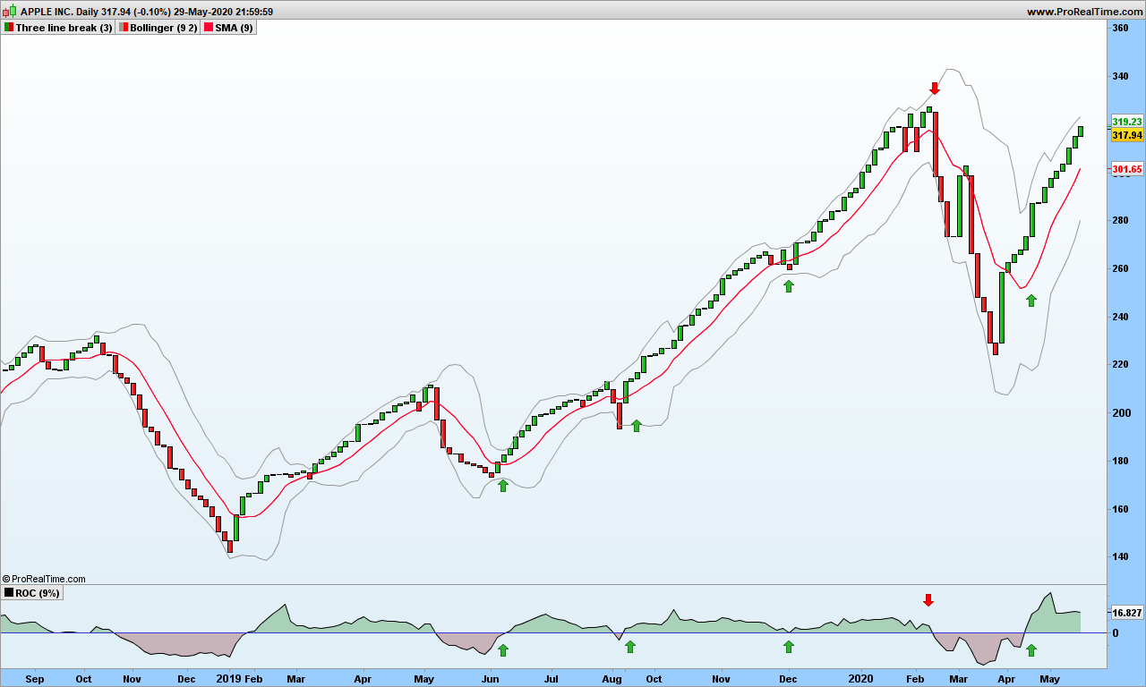
This post is for those of you that want longer term approach, many weeks at least, and don’t mind their portfolio swinging up and down with larges waves. Maybe it will make you appear very clever if you can decipher and explain the chart to someone unaware of this technique!

For an in-depth introduction, please refer to Steve Nison’s book:

You may also refer to these sites: stockcharts or Colibri Trader.

I do not agree to use ATR as reversal amount as your chart will change over time, and you will loose track of why you entered the market. Just use the 3% reversal, it will do a perfect job!

Again, I am assuming you already know about Kagi charts which look like this one for Marvell. See last green arrow shows a positive and undoubted profitable signal!

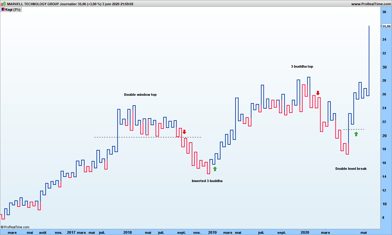
Kagi charts filter out the daily noise and we are left with raw trend. Remember that people may change opinion at any time, so the charts may look convoluted from time to time.

There are interesting traditional figures mentioned in Steve Nison’s book that do appear from time to time. It does not hurt to pinpoint those patterns!

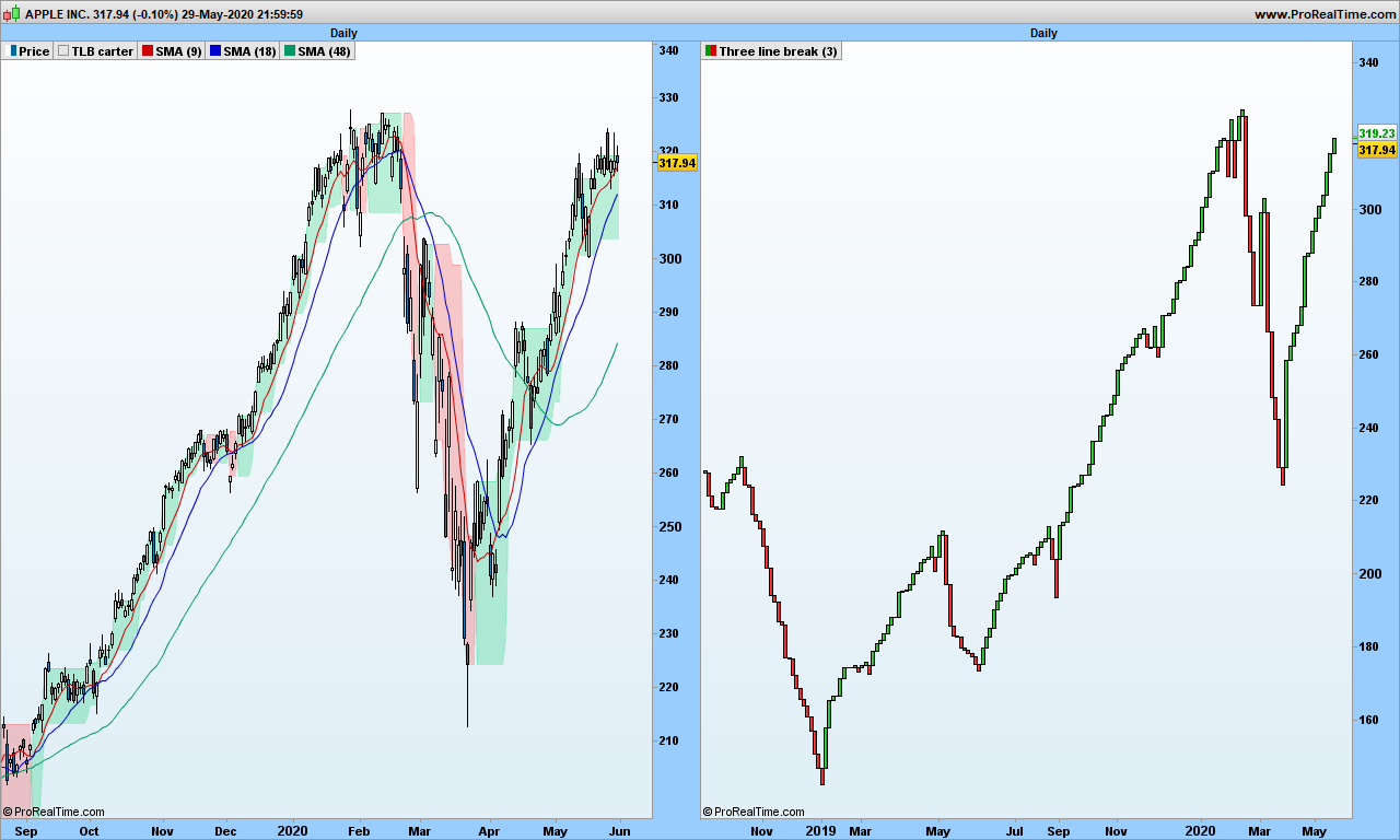
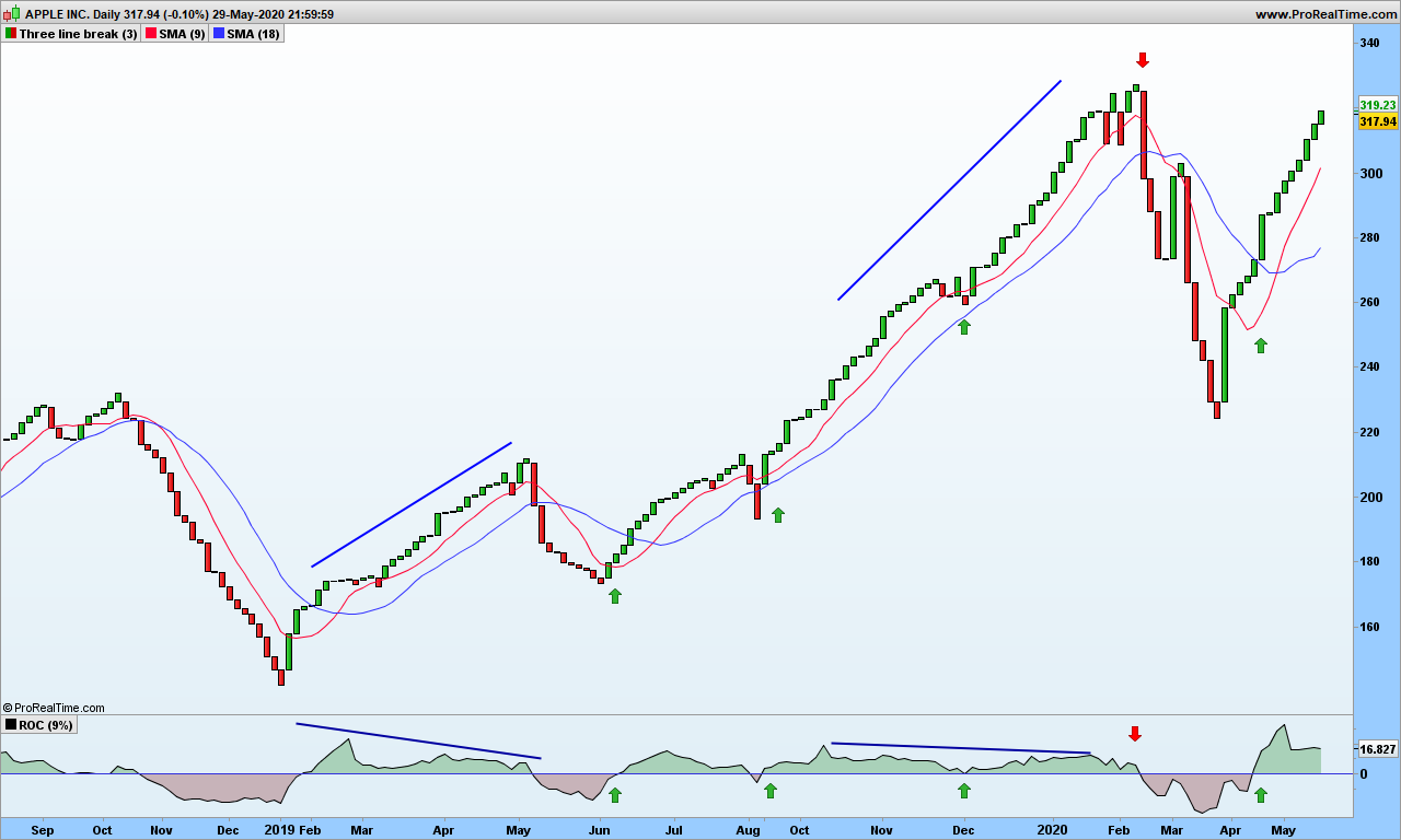
The basic buy signals, when kagi line goes from red to blue, appear quite often but obviously there are many false signals! Pretty much like the TLB charts (previous post), we need some tools to filter them out.

For each vertical segment, between 2 u-turns, we consider high and low to be top and bottom of each segment, open is the low for up moving lines and close is the top (opposite for down moving lines). Easy, isn’t it?

Bollinger bands are again useful, fantastic! Even the good old MACD feels more comfortable with this kind of charts. Let’s look at Gilead chart:

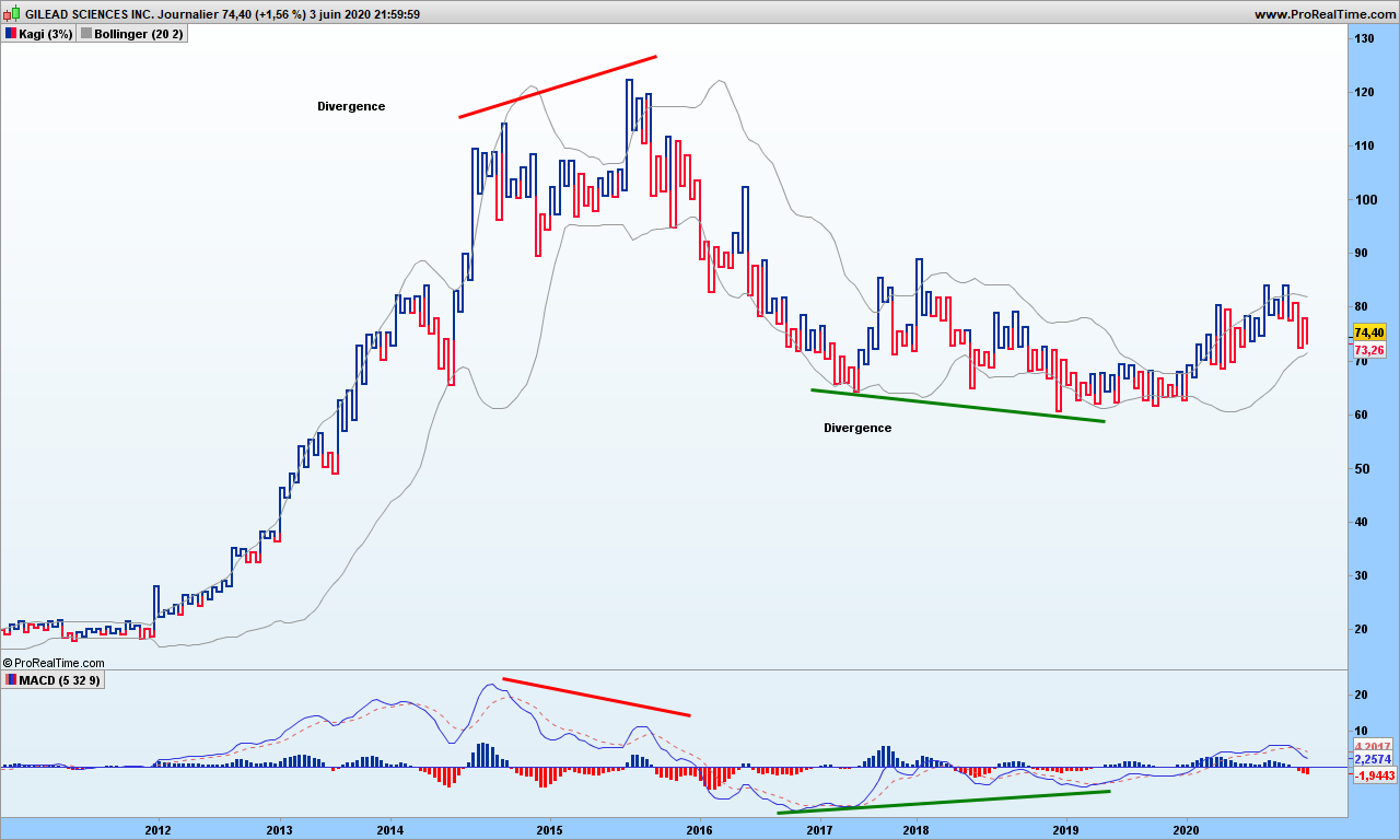
MACD divergences warn you about upcoming changes. Bollinger bands are clearly closing on on prices during consolidation and breakouts are solid confirmations. We can use the %B indicator to tell us when the bands are moving away from each other. Here is Tesla chart:

Tesla

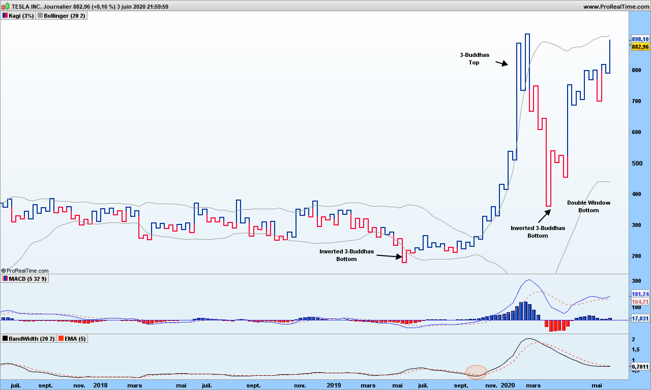
As you can see, in May 2020, an inverted 3-buddha bottom appeared, was soon confirmed my MACD crossover. Then in October, the %B has crossed its signal line (a 5 candles exponential moving average). We are on board! On March 5th, we get a 3-buddha top, we are out with a cool 162% gain. We are not playing the down move from there since the overall trend is still up, and Bollinger bands are contracting. Beginning of April, we are again getting again a buy-signal (2-level break following inverted 3-buddha bottom confirmed by MACD), up to you to play it or not! Note how those Bollinger bands are quite flat from 2017 till end middle of 2019, they tell you not not to play any signal in any direction!

A word of caution must be mentioned here! Back to probabilities!

The probability of a trend change given the fact that you see a reversal patter (double window for instance) AND Bollinger bands expanding AND MACD greater than signal does ONLY mean potential reversal. We are improving the odds in our favor but I can not give you figures because backtesting on those charts in not possible. I tested manually over maybe two hundreds of charts, about 50% of trades should be profitable. The fact is you don’t know how far will the trend go. This is why, should you have time, it is good to revert back to old candlestick charts and draw the fabulous action-reaction lines to find out the potential!

That’s it! Those of you wanting material for week-end perusal, you get it!

Until next time, trade safely!

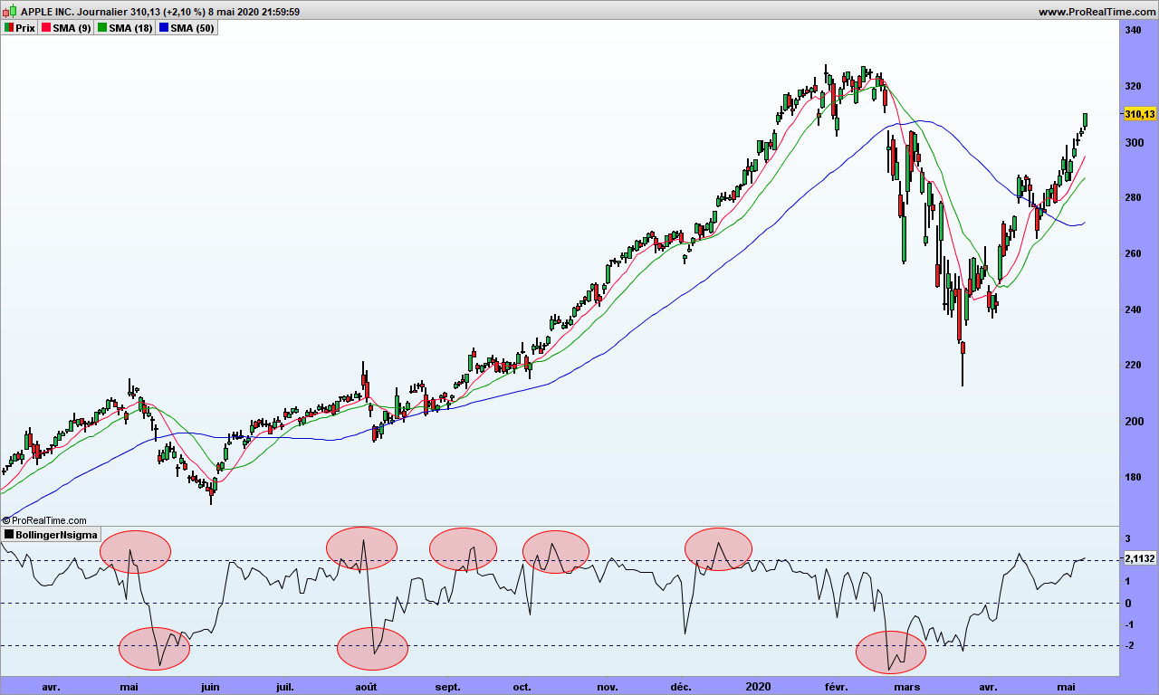
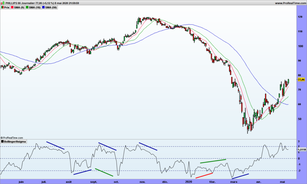
Note: if you wonder why I am using Bollinger bands here, it is because prices are filtered out of the daily noise. These are ‘trend’ graphics. The bands often prove to be decent prices objectives. This is of course to be taken lightly and cross-checked by more serious methodologies!

Three-Line-Break or the integrated trend-volatility tool

I have been a fan of Three-Line-Break (TLB) trading for long time because it is a KISS (Keep it Simple Stupid) methodology and takes no time to make decisions, which is mandatory when you have an other full time job! As long as I did not have any backtesting tool and was working only small caps which are trending usually for longer period of time, then the feeling was there was a positive expectancy. However, from time to time, I experienced losses more than I liked, and felt like missing trend departures.

Once again I assume you are already knowledgeable about the basic topic. For more details on TLB, please refer to here

Backtesting becomes possible when you can actually display the TLB back on daily chart. On the following chart, you can see on the right the TLB chart, with red and green lines; these appear on the left candlestick chart as red and green boxes.

There are signals from TLB that you would obviously not take after adding our usual 3 single Moving Averages for instance.

When we backtest over long period of time the TLB strategy on standalone only, we surely are disappointed.

Let’s look at Apple. First with TLB, taking buy and short signals, 300%

Taking our 3-moving averages on the long side only, we fare far better!

So if you hate candlestick charts, then you need to put those 2 technologies together. First add the 9 and 18 averages on on your TLB chart.

The size of each TLB line represents also the volatility, though you don’t know how long it took to have this volatility increment. Fair enough, the daily volatility is filtered out to show the trend volatility. The ROC indicator should be very talkative. I am displaying the ROC 9 days on this chart:

Any time, ROC crosses 0, or just touch down 0 and goes back up are good entry points. When ROC is positive, just filter out the short signals. An other confirmation is SMA9 is above the SMA18. And there are also divergences to help anticipate trend change!

You may also look at the volatility of 3LB, this time using Bollinger bands, because TLB lines stick to 2 standard deviations!

I tried to move back these good-looking curves to candlestick charts for back-testing but to no avail. So I can not show you the backtesting result.

As a conclusion, if you are not after option trading where time does matter, these TLB chart are a very good tool. Overall trend is given by a single moving average, which allows easy filtering of false signals.

That’s it. Until next time, trade safely!

Bollinger bands from a different perpective

As a blog about volatility, of course, there must be a post about Bollinger bands, which is the most common way to assess volatility. More especially, finance have based all their systems, assuming that prices are a Gaussian distribution (aka bell curve).

If this statement was true, then only 2.14% of prices should be outside the 2 standard deviations (aka sigmas). For one year, say 200 days, 4 days should be oversold or overbought, as commonly said!

Fair enough, let’s work a quick indicator that tells us how many sigmas the prices are from the average. We are taking John Bollinger’s definition.

Indicator = (close – 20-days average of closing prices) / Standard deviation 20 days

Let’s look again at Apple graph over last few months!

We have gone beyond the 2 standard deviation at least 8 times, sometimes for a few days. It is not looking good! If you are looking at S&P500, it reaches -3 sigmas once a year at least, when it should be the case more or less once every 8 years. Of course, it is probabilities, and this can happen more often. Correct, but there should be also long years without this far reaching. Which is not the case!

Now that you have spotted this interesting paradox, you have a new edge for trading! The best to trade Bollinger bands is just to NOT draw them. Remember that bubbles and parallels pointed by by Bollinger specialists are mere illusions!

Instead use our small indicator!

The indicator displays many divergences:

  • Blue ones are standard divergences with the price to spot reversal
  • Green ones show hidden divergences in the direction of the trend

I have highlighted a red one to show one that did not work. Be careful, if the trend is strong, wait for a signal to profit by the divergence, at least let the price go over the short moving average.

See, it is easy! For standard divergences, make sure first point is in oversold or overbought area, as indicated by the 2 sigmas lines.

One you are in, don’t get out of your trade at the 20-days moving average (strategy called ‘return to mean’), use a trailing stop, the green average for instance.

That’s it. Some people would charge you 5000$ per year to then send you the signals by email. If you do sell this service, please remember my commission!