I know you like some food for the mind for the week-end, this post is sure to make you think even it is simple mathematics! Of course, it will be fun to read too!
I have talked previously about how not use the Bollinger bands and I am going to kick even more on this concept.
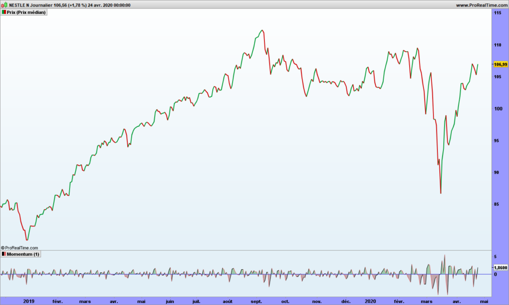
As soon as you start talking about standard deviation (or sigma), you are assuming a bell curve, that is 62% of measurements (price) should be within one standard deviation of the average price. Let’s check that immediately, let’s display a Bollinger band with 1 sigma on Apple graph:
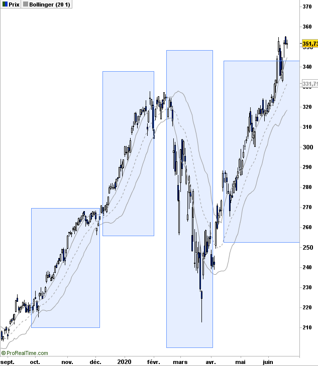
Now look in each blue blox. There is almost ZERO price inside the band! The guy who sold the Gaussian curve to finance was the best salesman EVER!
Though attributed to Gauss, the bell curve was created by Abraham de Moivre in 18th century and then promoted furiously by an Adolphe Quételet in 19th century. Johann Carl Friedrich Gauss, one of best ever mathematician, published a book about normal distribution for astronomical data, and since then, we are talking the Gaussian or bell-shaped curve.
Gauss never studied the stock market random data! And standard deviation is only a ‘trick’ to locate 62% of the data around the average.
As shown on Apple graph, stock data is not consistent with normal distribution. Now what? When you have spotted a problem in trading, you got an edge!
You may remember from your years in high school the basic average deviation, sometimes called mean absolute deviation (MAD). In other words, it is the raw deviation measurement. Quoting Wikipedia:
MAD has been proposed to be used in place of standard deviation since it corresponds better to real life.[3] Because the MAD is a simpler measure of variability than the standard deviation, it can be useful in school teaching.[4][5]
School teaching? Hmmm… Most important part is first sentence: it corresponds better to real life! More on the difference between MAD and Gaussian distribution by fabulous Nassim Taleb here.
Stock price is not an industrial process measurement, it reflects the opinion of all people about the studied stock. If you are a car manufacturer and making 4.50m long cars, your production should make cars, say between 4.49 and 4.52, because otherwise the doors will not close properly is car is 4.78m long and you will need re-manufacturing with all associated costs! That is not the case for stock price, you are allowed to be excessively bullish or bearish!
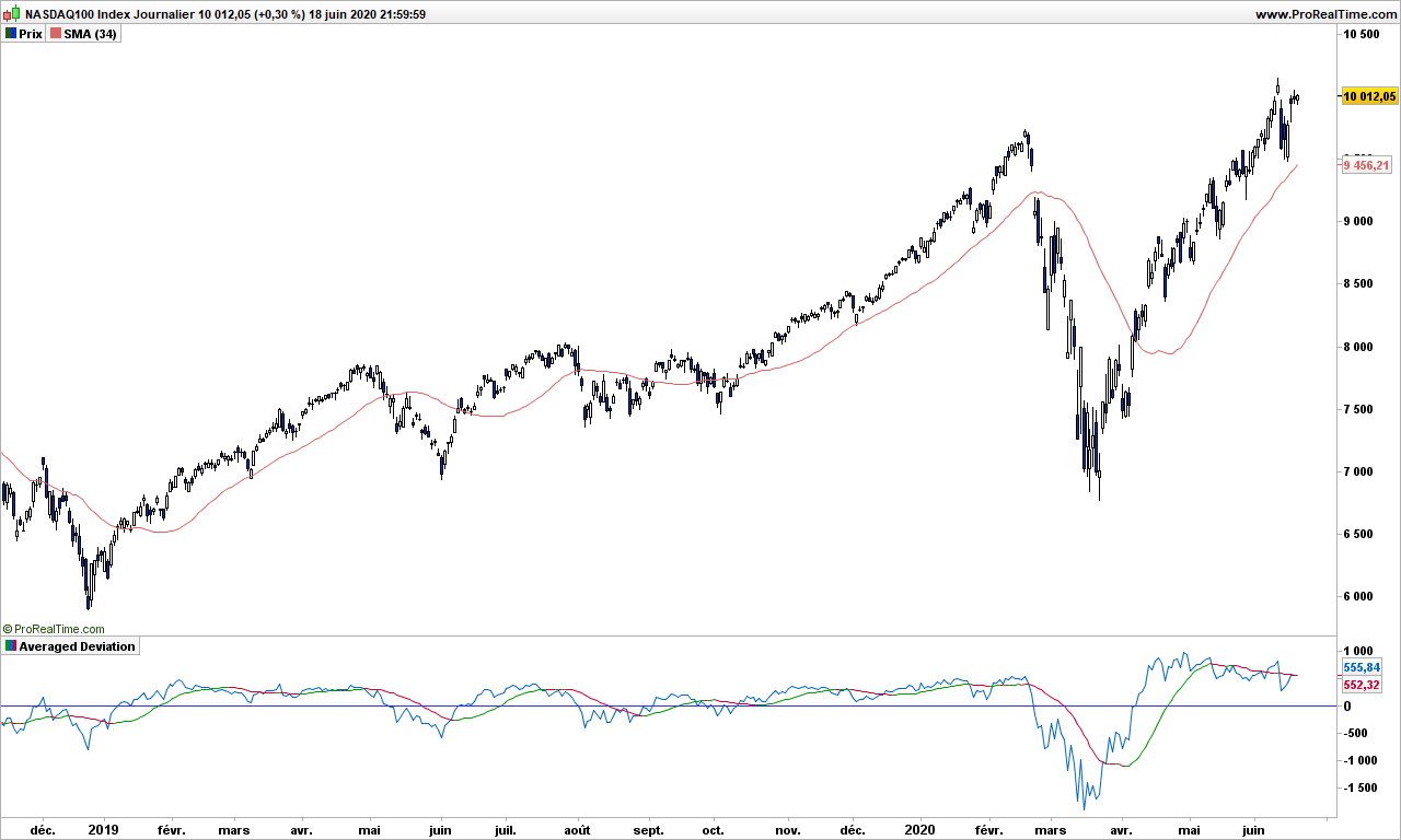
Let’s give this theory a try. I am removing the Bollinger bands and adding a simple moving average, 34-days for the example, but you may change it.
Steven Nison, in his book introduced the Disparity indicator, created by Japanese traders, which is defined by:
Disparity = close – average over n days of close
It is very close to what we are looking for! We only need to add an average to get the Moving Averaged Disparity (MAD also just to add confusion!)

The blue line is disparity and the MAD line is shown green when pointing up, red when pointing down.
As you can see, trading is almost straightforward. Buy when prices are over the 34-day average and disparity crosses over MAD (or when price cross over average and disparity is above MAD). Then get out when prices drop below average! Easy, isn’t it? You also get some nice divergence at the top, disparity has crossed below MAD end of January, far before the correction started!
From this introduction, there are plenty of ways you can improve this very basic but nonetheless very efficient indicator!
Here is a non commented graph of Nasdaq for you to play with:
That’s it! Until next time, trade safely!