How to refresh an old indicator and extract its essence?

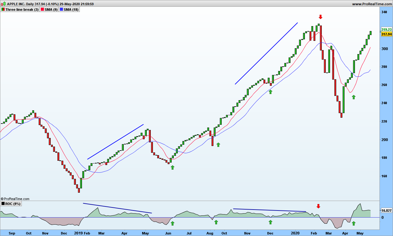
Now that most of you have read all the blog, your neurons are ready for experimenting new sensations! The indicators from the old world, such as RSI or MACD, have plenty of issues but are nonetheless used by professional traders, because if you can trade with candlesticks, RSI and 2 simple moving averages, then indeed it requires lots of training and experience to become profitable. They call it price action analysis!

If you don’t have 10 years to dedicate to training, then consider any old indicator and how it could be improved to give you less false signals! That’s it!

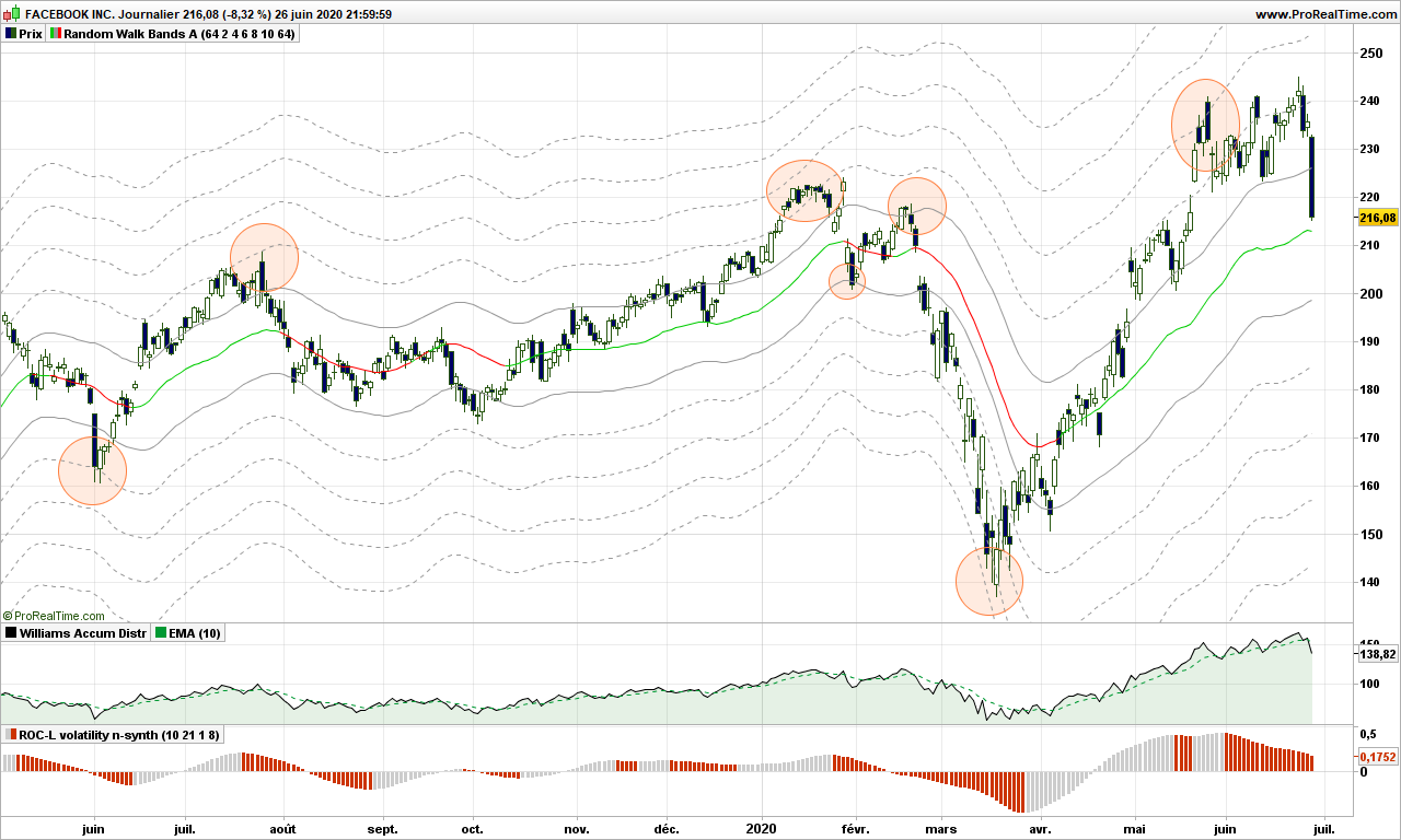
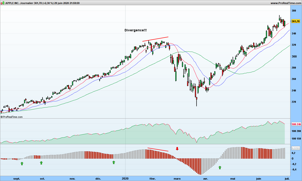
Let’s take the example of Williams Accumulation Distribution. It is supposed to be traded with divergences, but those do not appear quite often. Let’s have a look at formula:

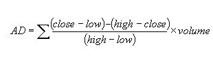
This is the original formula defined by L. Williams. It contains volume information. First problem is that volume information is not always available (e.g. for cryptos) and second one is that many transactions take place outside the stock market, so we get only a partial view!

Steve Achelis improved this formula with this adaptation:

1. Calculate True High (TRH) and True Low (TRL)
TRH = Current bar high or precious bar close, whatever is higher
TRL = Current bar low or previous close, whatever is lower

2. Calculate current bar Accumulation/Distribution:
if Current close is above previous close then
AD = Current Close – TRL
if current close is below previous close
AD = Current close -TRH
if current close = previous close then
AD = 0

3. Calculate Williams Accumulation Distribution which is calculated as cumulative total sum of AD values
WAD = Previous WAD + AD

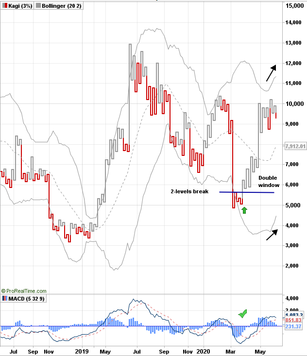
Here is how it looks:

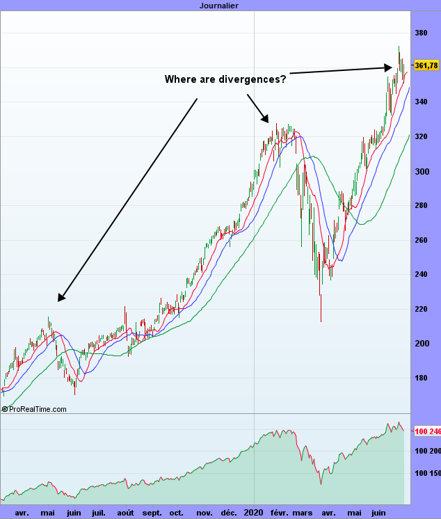
Without divergences, the indicator is useless, or is it?

The point is that most indicators stop to work when too many people are using it. Market likes to play with your nerves! And if you want to program the ups and downs in automatic trading, well, good luck!

There are surely multiple ways to improve this and here is one!

First thing is to smooth this indicator, but not with an average! C. Kase (see here) has introduced the concept of synthetic weekly indicator. The change in the formula above is straightforward and we are going to use n days instead of just 5 days as implied by the word ‘weekly’

Just make the following changes:

  • Close is unchanged
  • Open is the opening price of n days ago
  • High is the highest of last n days
  • Low is the lowest of last n days

See how much smoother it is? You don’t have to worry about using 5 or 8 days as in the graph above, because indicator is evaluated every day! On a 8-days chart, you would have to wait 8 days to get a new candlestick, but here you might get a signal as early as there is something significant!

OK sir, but we still see no divergence? That’s right so let’s go one step further and calculate the smoothed ROC of synthetic n-days WAD!

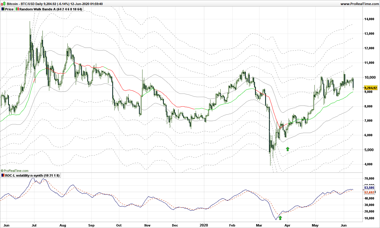
The smoothed ROC is simply the Rate of Change applied to an average instead of raw indicator. I have considered a 10-day EMA of the WAD and 21-days ROC. Here is the fabulous totally refreshed indicator:

I colored the SROCSynthNWAD (or more simply WAD2.0) in grey when going up, and red when going down. As you can see, indicator is above 0 when trend is up, you have additional entry point by color change if needed and (some) divergences appear from time to time! It is so smooth that you can program it easily in automatic trading system!

Your task is of course to evaluate it over many stocks or securities, over long periods of time, over multiple time frames, ….

This is of course just one way to do it. Maybe you can work out an RSI2.0?

That’s it for today. During next 2 months, I will only post markets commentaries from time to time. Enjoy summer time and stay away from harmful viruses!

Until next time, trade safely!

Facebook will make you rich. Or not…

In 2012, Facebook IPO price was about 40$. Just 3 months later, it was trading at 18$ but if you bought at that time, then you would be enjoying today about 1000% performance just by holding the stock and not caring what might happen on the stock market. That was a bet at the time, that I have not taken!

I personally hate Facebook because it prevents its users from thinking by themselves, promoting subliminally some herd thinking that is supposed to facilitate your life. And people are so gullible they are buying the invisible marketing message.

Imagine I want to buy this electric car from eMoon Motors. I look on Facebook if any of my friends, real or virtual, have bought any and what they think about it. I have found 5, 1 is very angry because his wife dislikes it very much, 3 are complaining and 1 has no opinion. What happens is that people who are not happy are writing it to let out their bad energy, and others that had a little problem are going to confirm, hugely amplifying that scratch on the door made by a dog passing by. People who are happy don’t take the time to comment. What can you deduce then? Well, nothing!

Who has become rich with Facebook? The founders of course, and stock owners. Any users? No! All users have given for free all their data to a monster that is selling this (free!) data to advertisers – wonderful business case, thereby also preventing serious newspapers with real content from getting advertisement, among other consequences. World would probably be better off without Facebook, users already have many alternatives but ignore them out of convenience or laziness. Of course, if your (potential) customers are all using Facebook, you have to use it!.

Facebook stock is a stock real hard to play, because it tends to gap every once in a while, causing automatic trading algorithms to go nauseous. Don’t let that prevent you from making a trade or two when visibility is fine.

The stock follows a random path, too flat most of the time to make substantial gains, but as you can see, the price wanders along the warning lines, like invisible resistances, then suddenly end of last week, a black Friday!

What is happening? Tier-1 corporations propose to boycott FB through November election if Zuckerberg does not take action to control hate speech, that is everywhere on this media! Companies include Unilever, Verizon, Honda, The North Face, Ben & Jerry’s, Patagonia, Mozilla, Birchbox Dashlane, TalkSpace, LendingClub, and Coca-Cola , just to quote a few. See how good I am also at advertising, but I do it very smoothly, not disturbing the casual reader!

What to do now? At very least, as a trader, you should be out and you can come back later. No, stay with me, I am not finished yet! The indicators at the bottom are the Accumulation/Distribution (A/D) and one derivative. The money during last 2 months was still going in, but not so fast (divergence), and now A/D has also crossed its average indicating money is flowing out of FB. The random walk path is still green (going up), so I do not advice a short position in this time frame. The objective for this down move is 186$ but could be stopped before. Don’t think that Zuckerberg is going to sit around seeing the money vanishing , sure we are going to see some Facebook message stating that situation is under control, and he will invite his announcers to a party (not a virtual one) to celebrate this. If it fails, prepare for a plunge to 130$! Have fun!

That’s it. Until next time, trade safely!

S&P500 Market analysis June 23rd 2020

Some say that markets are not allowed to go down any more. Many PMI figures will be published today, as well as new houses selling numbers. As usual, there will be plenty of comments about how markets have gone up or down by a tiny 0.x% because investors like or disliked the numbers. Which is absolutely ridiculous, it is just noise commenting! You should always look at wider charts and understand the underlying movements!

S&P kagi line is still yang so it is no surprise we are still in up market.

There is a divergence between Williams A&D and its momentum just below, but it is just a warning, no action needed for now. Your stop should be around 2960 and you would better go out and enjoy the sunshine!

Would you mind buying yourself a Ferrari?

Even if you are not interested in car business, there is a good chance that you have seen at least once a Ferrari drive by, and because of its specific engine noise and design, you wished to be able to drive it even for a few minutes. I had the chance to drive one for 20 minutes once, it was an incredible experience!

Anyway, let’s go to today’s topic, and see if there is any Ferrari like tool for trading, and to add for the fun, we will look at Ferrari graph! Think about their business: when you order a Ferrari, you will not be delivered before end of 2021 and you need to pay … now! Those interested in fundamentals should be looking on this stock! And so should you… and get a little piece of Ferrari!

Before we continue, remember that a Ferrari works fine in nice long roads, but it will be a painful drive if the road is bumpy with dangerous bends every quarter of mile!

DEMA – Double Exponential Moving Average – is for those traders interested in taking the fast lane. I colored it green when going northward, and red when going southward. As you can see, we have a good indication of the trend!

For those interested, the formula of DEMA is as follows. It is in short an EMA that is corrected for delay. So you can and MUST use long averages, don’t use 10-days DEMA, it doesn’t make sense!

DEMA = 2 x EMA – EMA(EMA)

Using DEMA as a stop is not best idea you may have since prices may jump above and below the hood, so you need to add a bumper, sorry a stop! Here you go:

Last but not least, you do not want to enter too far away from DEMA. Remember my random walk path? DEMA is not the same of course, but let’s check if price are not going too far away from this path! For those who know, it is a Keltner channel with DEMA as central average!

Wonderful! Prices are not going more than 8 ATR’s away from DEMA! I colored the zone between 6 and 8 ATR’s away from DEMA (don’t enter in red zone!) now the landscape is plain visible, provides a good idea of the direction, the stop prevents you from falling in ditches.

As previously said, do not use this Ferrari on small country roads, your portfolio will end up in a ravine sooner or later!

That’s it. Until next time, trade safely!

Have you been fooled by the bell curve?

I know you like some food for the mind for the week-end, this post is sure to make you think even it is simple mathematics! Of course, it will be fun to read too!

I have talked previously about how not use the Bollinger bands and I am going to kick even more on this concept.

As soon as you start talking about standard deviation (or sigma), you are assuming a bell curve, that is 62% of measurements (price) should be within one standard deviation of the average price. Let’s check that immediately, let’s display a Bollinger band with 1 sigma on Apple graph:

Apple Daily

Now look in each blue blox. There is almost ZERO price inside the band! The guy who sold the Gaussian curve to finance was the best salesman EVER!

Though attributed to Gauss, the bell curve was created by Abraham de Moivre in 18th century and then promoted furiously by an Adolphe Quételet in 19th century. Johann Carl Friedrich Gauss, one of best ever mathematician, published a book about normal distribution for astronomical data, and since then, we are talking the Gaussian or bell-shaped curve.

Gauss never studied the stock market random data! And standard deviation is only a ‘trick’ to locate 62% of the data around the average.

As shown on Apple graph, stock data is not consistent with normal distribution. Now what? When you have spotted a problem in trading, you got an edge!

You may remember from your years in high school the basic average deviation, sometimes called mean absolute deviation (MAD). In other words, it is the raw deviation measurement. Quoting Wikipedia:

MAD has been proposed to be used in place of standard deviation since it corresponds better to real life.[3] Because the MAD is a simpler measure of variability than the standard deviation, it can be useful in school teaching.[4][5]

School teaching? Hmmm… Most important part is first sentence: it corresponds better to real life! More on the difference between MAD and Gaussian distribution by fabulous Nassim Taleb here.

Stock price is not an industrial process measurement, it reflects the opinion of all people about the studied stock. If you are a car manufacturer and making 4.50m long cars, your production should make cars, say between 4.49 and 4.52, because otherwise the doors will not close properly is car is 4.78m long and you will need re-manufacturing with all associated costs! That is not the case for stock price, you are allowed to be excessively bullish or bearish!

Let’s give this theory a try. I am removing the Bollinger bands and adding a simple moving average, 34-days for the example, but you may change it.

Steven Nison, in his book introduced the Disparity indicator, created by Japanese traders, which is defined by:

Disparity = close – average over n days of close

It is very close to what we are looking for! We only need to add an average to get the Moving Averaged Disparity (MAD also just to add confusion!)

Apple Daily

The blue line is disparity and the MAD line is shown green when pointing up, red when pointing down.

As you can see, trading is almost straightforward. Buy when prices are over the 34-day average and disparity crosses over MAD (or when price cross over average and disparity is above MAD). Then get out when prices drop below average! Easy, isn’t it? You also get some nice divergence at the top, disparity has crossed below MAD end of January, far before the correction started!

From this introduction, there are plenty of ways you can improve this very basic but nonetheless very efficient indicator!

Here is a non commented graph of Nasdaq for you to play with:

That’s it! Until next time, trade safely!

S&P500 market analysis June 15th 2020

S&P500 seems to continue sliding along reaction line but, as you can see, the 3 moving averages are still up, more or less for the red one.Markets may decide to move up again, we will see. A bit too early to to say markets are resuming the down trend. Objective 2680 unchanged but unlikely for now!

What is happening? It is all about COVID-19 again. The epidemic is more or less, rather less than more, under control. There are still hundreds of new cases in most countries every day, even those who have completely stopped the containment measures. If people wear a mask, of course, odds are in their favor they will not catch it. But what about all these demonstration throughout the world? Nothing is really under control, safe vaccine is long way before being available. It is likely markets are going to jump up and down a few times along pandemic making trends or moving sideways!

Don’t get unduly stopped out by the markets

Here we go for another technical post. Let me start first by answering a question: no, I will not post videos because text and pictures make you think, you can even print them if you wish. Though video can be a very good tool to show something, if you can not write it down with simple words, then you just have no clear idea of what you are talking about. So read, read again, think, confirm and write down your ideas, progress! This is the way this blogs intends to help you, dear readers!

I am going to discuss today trader’s least understood tool: the trailing stops. Because it gives a false sense of security, trading apprentices may loose lots of money, and even go broke if not careful.

There are a few conditions to use a trailing stop:

  • A trend should already exist
  • The stock or selected security should have the capability to trend (refer to history)
  • you know what you are doing!

Let’s look first at the performance of a trailing stop used as standalone tool:

As you can see, the performance over 20 years for Apple is absolutely ridiculous, especially when compared to 3-SMA and volatility system!

Why is that? When the stock is not trending, prices hover over and sink below the stop very fast, causing losses each time. Even a good up move will have hard time to catch up for losses. Even if your stop is carefully engineered, the behavior will be quite bad in flat markets.

Fair enough, how am I supposed to use stops now? You need the WWW stop technology! Don’t worry, you can use this one even on Yahoo finance:

For the example, I used the Moderna stock which became known to public right at the top of the graph!

Now add not one but three ATR trailing stops!

  • The Red one: the Wake-up call (2 ATR’s below price here). As name implies, its goal is to wake you up from time to time and make you think! You have to decide whether you stay and do nothing, stay and increase your line (pyramiding), or take a partial gain or get out. It is YOUR DECISION!
  • The Blue one: the Warning stop! (4 ATR’s below price here) When prices go under this one, you should definitely consider stepping out before it hurts too much!
  • The Green one: the Waouh stop (6 ATR’s below price here). This one has 3 objectives:
    • it tells you about the trend: see how Moderna was above of the stop for most part of the graph
    • you are sizing your line based on this stop
    • It is your hard stop: exit! But your loss might be greater than expected! Enter it in the trading system if you can not monitor the market for some time.

You should always have an exit strategy and the exit is based on a sole parameter: the max pain level you can stand!

Say for instance that your pain threshold is 100$. Just buy a number of stock so that, if the green stop fails, you will loose 100$ (you might need to get a round number of stock). Simple mathematics: say stop is 20$, close is at 25$, so a risk of 5$ per stock, so invest no more than 100/5=20 stocks!

If prices close below the blue stop, you may get a loss but it won’t hurt (too much!) because you will loose less than 100$

Of course, as trend starts picking up, all stops will go up, which will void your risk and you can decide to increase line size, always carefully checking that you can’t loose more than you pain threshold!

Note that you replace the Waouh stop by anything you like, could be the low Bollinger band, the low band of a Keltner channel, … whatever makes you safe and will follow the trend at good enough distance so you are not missing major market moves!

Remember the rules for trailing stops:

  • Size the line according to bearable pain
  • Use stops only when a trend does exist
  • Make sure you get warnings from the market before the stop is hit

That’s it. Until next time, trade safely!

Volatility lovers: Crypto, what else?

Investing in crypto currencies might be something for geeks, many of you probably think, but for the pleasure of trading small amounts and and making big gains in percentage, this is worth a detour.

It is not because you hate some companies that you should not invest in them. Trading is about making profits, full stop. Yes, crypto may not environment friendly, and will be worth zero should a huge wordly power outage occurs but that is a risk you have to manage. Also crypto are showing the path to the future, nobody in maybe 10 years from now will pay with banknotes and coins. This is why you should be bullish on this technologies and why not trade of few them!

There is now a big number of cryptocurrencies to invest in, but please stick to major ones, as most of them are scams and will be worth zero far before our gigantic power outage! I do not wander beyond the big ones like Bitcoin, Etherum, Litecoin and a few others. Trading those is actually quite straightforward because of huge volatility, and remember volatility means also likeliness of emergence of trends. Use a Kagi graph to enter is easiest strategy, then use a candlestick graph to place stop!

Here we go with Bitcoin!

Bitcoin bottomed out by March 22nd, Kagi lines made a 2-level break, MACD is up. One day later, the double window bottom was also confirmed. I entered below 6000!

If the accumulation/distribution also showed a buy signal about the same time, it was not so obvious we should go! Skeptic bull, uh? As the trend lines then started going up beginning of April and price starting to hover the random walk path, it was second possible entry!

Where is Bitcoin headed now? As you can see on Kagi, the Bollinger bands are pointing upwards. A correction may or may not come, next objectives are 10700 and 12000. Out if closing below 8800 (as of today!). Just wait and see!

Note: major crypto currencies will not disappear tomorrow, unless this enormous power outage again! Using a stop based on volatility is fine. But price may zoom through the stop line, so be careful and make the line size much smaller than on a stock and you will be safe!

Three-Line-Break or the integrated trend-volatility tool

I have been a fan of Three-Line-Break (TLB) trading for long time because it is a KISS (Keep it Simple Stupid) methodology and takes no time to make decisions, which is mandatory when you have an other full time job! As long as I did not have any backtesting tool and was working only small caps which are trending usually for longer period of time, then the feeling was there was a positive expectancy. However, from time to time, I experienced losses more than I liked, and felt like missing trend departures.

Once again I assume you are already knowledgeable about the basic topic. For more details on TLB, please refer to here

Backtesting becomes possible when you can actually display the TLB back on daily chart. On the following chart, you can see on the right the TLB chart, with red and green lines; these appear on the left candlestick chart as red and green boxes.

There are signals from TLB that you would obviously not take after adding our usual 3 single Moving Averages for instance.

When we backtest over long period of time the TLB strategy on standalone only, we surely are disappointed.

Let’s look at Apple. First with TLB, taking buy and short signals, 300%

Taking our 3-moving averages on the long side only, we fare far better!

So if you hate candlestick charts, then you need to put those 2 technologies together. First add the 9 and 18 averages on on your TLB chart.

The size of each TLB line represents also the volatility, though you don’t know how long it took to have this volatility increment. Fair enough, the daily volatility is filtered out to show the trend volatility. The ROC indicator should be very talkative. I am displaying the ROC 9 days on this chart:

Any time, ROC crosses 0, or just touch down 0 and goes back up are good entry points. When ROC is positive, just filter out the short signals. An other confirmation is SMA9 is above the SMA18. And there are also divergences to help anticipate trend change!

You may also look at the volatility of 3LB, this time using Bollinger bands, because TLB lines stick to 2 standard deviations!

I tried to move back these good-looking curves to candlestick charts for back-testing but to no avail. So I can not show you the backtesting result.

As a conclusion, if you are not after option trading where time does matter, these TLB chart are a very good tool. Overall trend is given by a single moving average, which allows easy filtering of false signals.

That’s it. Until next time, trade safely!

Random comments, some answers, and other random thoughts…

Thank you all of you for writing supportive comments. This blog is, as far I know, absolutely unique, I have no competition! Maybe I should charge a few hundred bucks just for viewing,… just kidding!

I am going to answer here in bulk manner to the comments.

The blog platform

The blog is powered by WordPress but is an offshoot provided by https://vivaldi.net/ Vivaldi is an awesome browser, but they also offer a free web-mail, a very good alternative more privacy focused that Gmail and similar, plus a free blog. You can have your blog up and running in less than 10 minutes. Should you start your own blog on a related subject, let me know and I will reference here. You are also welcome as guest writer on this blog.

The blog is surely working with latest navigators such as Firefox or Vivaldi, but you may experience problems with old Internet Explorer.

Starting a new blog

I am no guru about blogging, I am sure you can find good material on the web. I started out with same idea as the posts I write: Keep It Simple Stupid (KISS). After a few months of writing, I see audience is increasing through number of real comments (not spam), so great!

Pretty much you can revive your old desktop with a new wallpaper, you need a good picture so that your blog looks good. I recommend your browsing Deviant Art, they have plenty of original pictures and web art.

About comments

I don’t know how WordPress behaves when you leave a comment and if you get many annoying emails. If you come back often here, use a disposable email for entering public comments, e.g. this service or that one

Captcha for plug-ins: I do not know.

If you want more in-depth exchange, you are welcome to email me: dragon trader at vivaldi.net. Or @ randomerrance on Twitter.

RSS

I understand you can use this link: https://dragontrader.vivaldi.net/feed/

About statistics and probability

There is a big difference between these two notions and you must understand it. As finance often says “past performance is not indicative of future performance”. We may hate to say it, but they are right. You can calculate statistics of past performance, e.g the number of winning trades over last 10 years, the average performance, … and thus the overall expectation of the strategy. If the expectation was negative over the last 10 years, why do you believe it will work in the future?

Also as discussed in some posts, the probability of winning does not tell you anything else than, on average, you should win x% of the time and so you can experience long loosing streaks based on that probability. Also having a good probability of winning (say 51%) does not mean a positive expectation, you need to control the losses and make sure the gains fare much better than losses, at least 2x. Stock picking comes into play here: small volatility also means low risk of course but low gains, most often not good enough to have positive expectation. Trading is playing with stocks or securities that have the capability to land you big gains! Do not look too far: Apple is such one, as well as Microsoft or even Visa. Of course, many Nasdaq stocks such as Tesla are far better choices to push your expectations skywards!

Investment publications often boast about their past wonderful performances, they even sometime annualize the figures (e.g 1400% based on 1 trade that made 20% in 10 days!) but they never report publicly about their failed trades, their overall performance and expectation. Some may be quite good a stock picking, but you should always wonder whether the writer is not somehow the market maker, especially with small caps, so he needs many subscribers not only to have a very profitable newsletter but also moving the market in author’s intended direction! The folks are Sock Gumshoe do a wonderful work deciphering the teasing of such newsletters, so a good source to find trade-able stocks!

That’s it! until next time, trade safely!