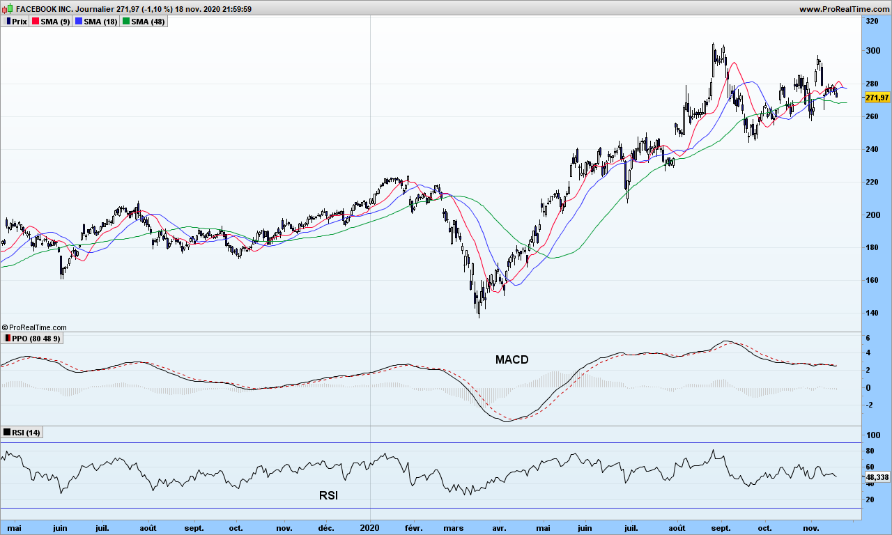
Today we will take a quick look at most popular, most used indicator, but I have never understood why traders give it such value! Let me give you some tips to make it interesting. We are going to use Facebook for our study!
On the graph, you can see RSI indicator at the bottom, just below our customized MACD. It looks very noisy especially with default parameter 14, but since it is an oscillator (as opposed to trend indicator that MACD is), you may spot better synchronization with market tops and bottoms. If you can’t see, move your seat away from your screen, a bit more, even more… can see now? Good… The blue lines indicate the overbought and oversold levels, which, as you can see, are not reached very often!
So what’s wrong? The problem lies in RSI formula:
RSI = U / (U + D) where U is average of up moves in last n days, and D average of down moves over same period.
As I have previously demonstrated, market is a random and existence of trends is the proof of its randomness. So where is the link between this formula and random nature of market? The calculation could give similar results whether all the up days are consecutive or not, so with totally different market configurations. So, yes, it may work if you are very short term trader (a few days at most) and work out the divergences, market tops and bottoms, and decide what to do about it.
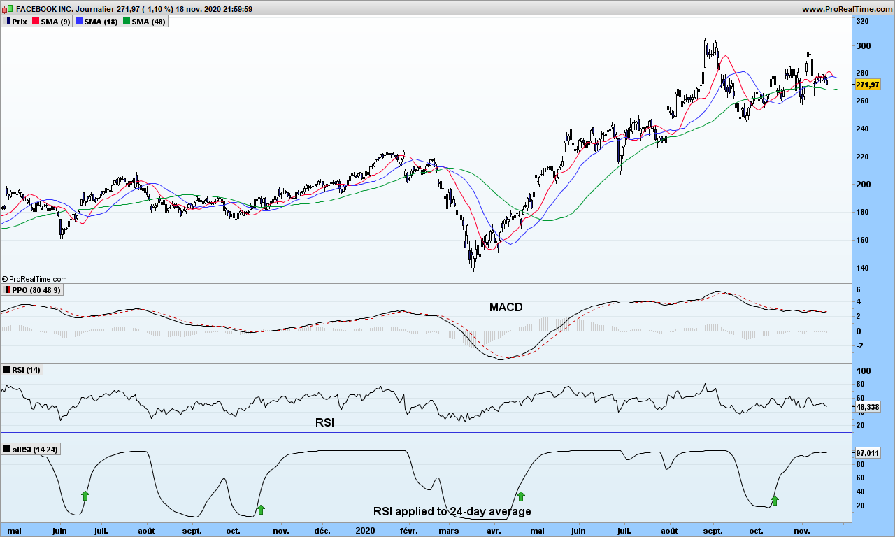
Could we modify it for more interesting usage? Of course! We can even use it for trend trading. Just replace delta between today’s and yesterday’s close by the delta measurement on your favorite moving average!
Now look at this new indicator. Buy signal is generated when improved RSI (iRSI) crosses above 50. You will notice it goes straight to 100 and stays then there until exit time. Easy, isn’t it?
As usual, use a stop to secure your gains. You may also define overbought and oversold areas at +30 and +70 if you want to stay with the trend as long as possible. False signal do exist of course, and there are 2 on the graph; the moving averages tell you not to go!
When it comes to teasing potential subscribers for a newsletter, whether free or not, authors always mention a secret new indicator which detects the 10-baggers, stocks that can multiply by 10 in next few months. How disappointing when you find out it is about crossing the 1-year high! Such indicator indeed just does not exist, because stocks prices are moving because people are buying aggressively and not the opposite. We can predict with some accuracy where market has chance to make tops and bottoms in the near future based on volatility but exponential growth predictions can not be relied upon! Be cautious!
Brought to you by Cozy Dragon Trading Research Labs is a single new indicator that provides a sense of direction and timing never seen so far. It does not have any name so let’s call it Secret Indicator (SI). Let’s take a look at it!
Overlaid on price is our random walk path and just below the SI. If you are looking from the buy arrows, SI goes up keeps going up until the very day of trend reversal. Zero crossings of SI or its histogram can be used to trigger the buy action. There are a few finer rules to make the analysis fully reliable.
Please compare with RSI or STC indicators just below, causing many buy and sells orders because of whipsaws….
We can not disclose the formula behind this indicator. But we will use it in background for our market analysis!
That’s it for this back-from-vacations message. Until next time, trade safely.
I have plenty of subjects to discuss in September and later. I want to spend three weeks far from Internet, the worldly (bad) news, … I will monitor my open positions, but not much more. I will not validate the hundreds of comments that I have undoubtedly when I come back!
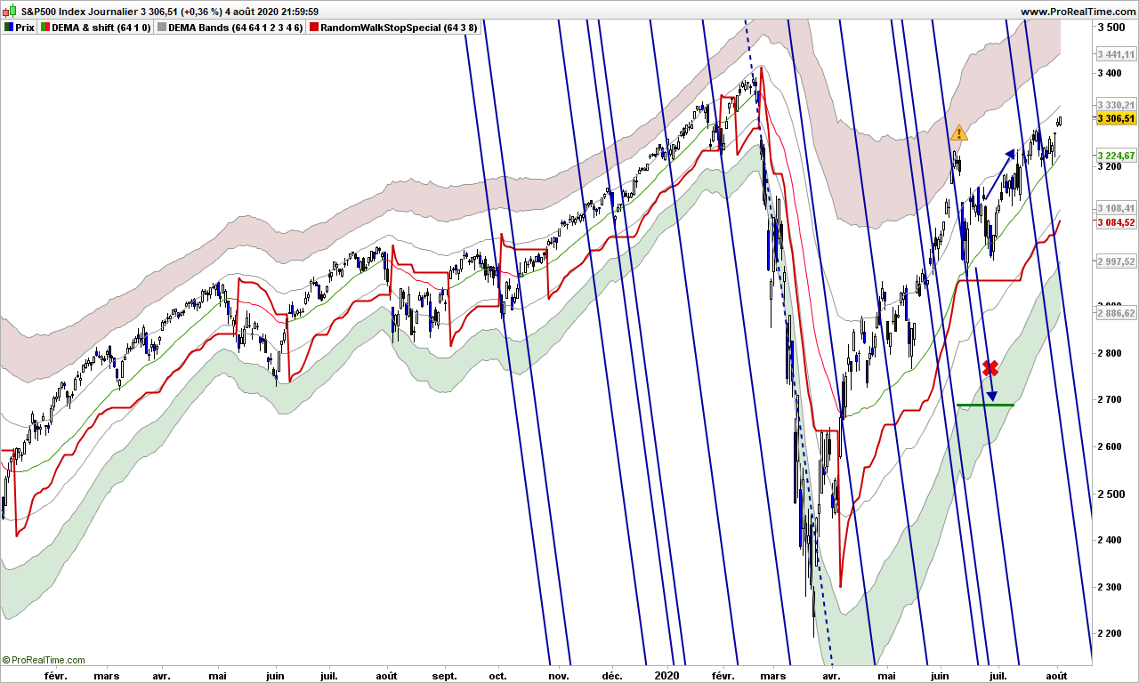
S&P has gone through the last reaction lines quite harmlessly. Next one is not drawn yet but is much further away. This rally can continue for a while, unless something wrong happens! Your stop should be around 3100.
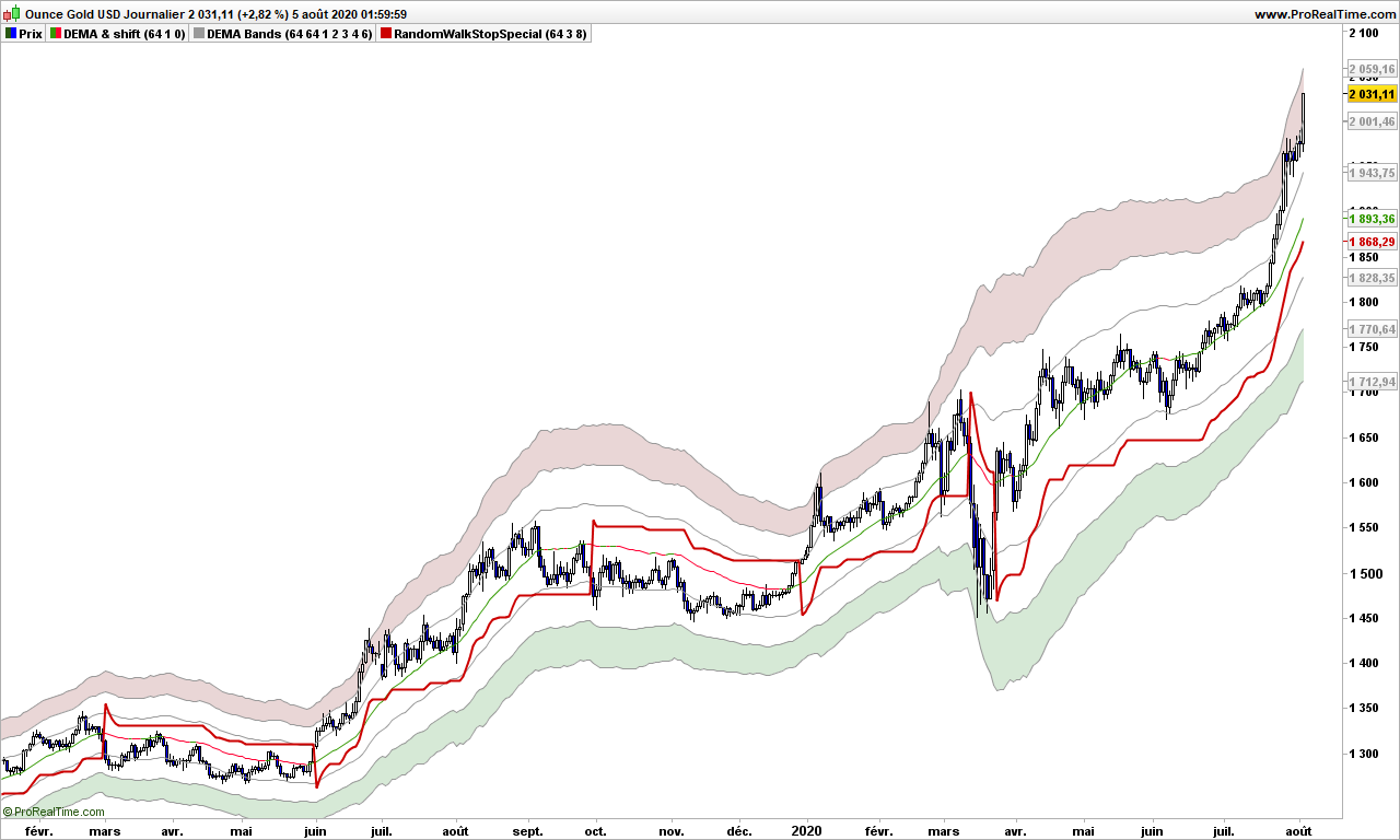
As written some time ago, you ought to have gold. Dollars and euros are printed faster than trucks can transport them where needed, so their value to the good old Gold is going down, so Gold goes up. Turbo has even been clenched for the pleasure of traders and investors alike.
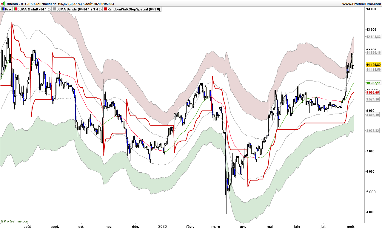
If there is something that has been very pleasant these last days, it is the post-halving Bitcoin rally that has started. At last! Many other cryptos either anticipated (Etherum) or are following (Litecoin, Ripple). My portfolio shows massive gains in just a few days, and it is very likely that the rally will extend for a long time.. for the same reason as Gold!
You need to monitor the progress of virus and countermeasure applied in each country to anticipate a possible slowdown on stock market. Gold and cryptos may or may not correlate with stock market like during containment. Each needs specific attention.
That’s it. Until September, trade safely. Stay away from virus and wear a mask if needed: it is only a matter of probability, you are decreasing the chances to get sick. So be bullish on masks and bearish on the virus!
I know you like some food for the mind for the week-end, this post is sure to make you think even it is simple mathematics! Of course, it will be fun to read too!
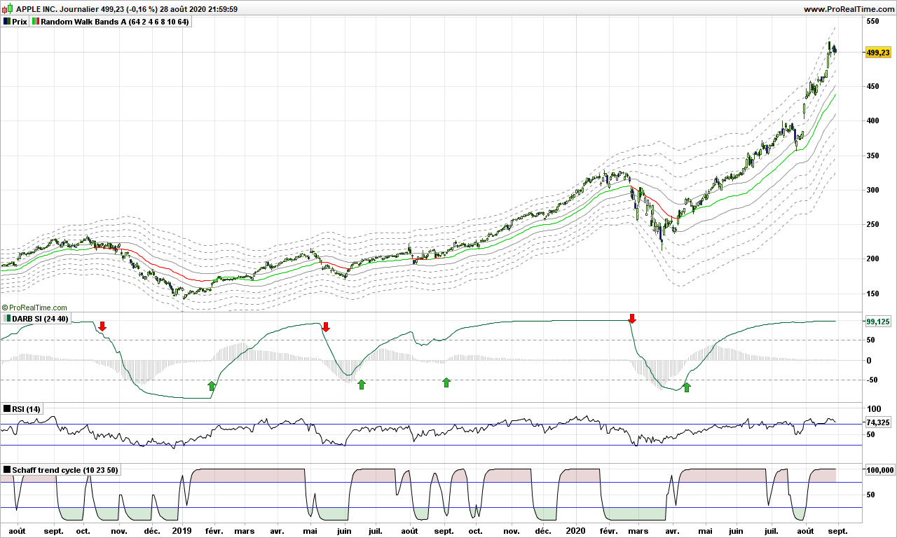
I have talked previously about how not use the Bollinger bands and I am going to kick even more on this concept.
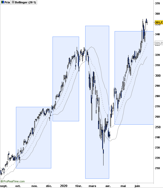
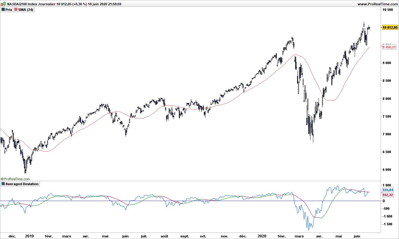
As soon as you start talking about standard deviation (or sigma), you are assuming a bell curve, that is 62% of measurements (price) should be within one standard deviation of the average price. Let’s check that immediately, let’s display a Bollinger band with 1 sigma on Apple graph:
Apple Daily
Now look in each blue blox. There is almost ZERO price inside the band! The guy who sold the Gaussian curve to finance was the best salesman EVER!
Though attributed to Gauss, the bell curve was created by Abraham de Moivre in 18th century and then promoted furiously by an Adolphe Quételet in 19th century. Johann Carl Friedrich Gauss, one of best ever mathematician, published a book about normal distribution for astronomical data, and since then, we are talking the Gaussian or bell-shaped curve.
Gauss never studied the stock market random data! And standard deviation is only a ‘trick’ to locate 62% of the data around the average.
As shown on Apple graph, stock data is not consistent with normal distribution. Now what? When you have spotted a problem in trading, you got an edge!
You may remember from your years in high school the basic average deviation, sometimes called mean absolute deviation (MAD). In other words, it is the raw deviation measurement. Quoting Wikipedia:
MAD has been proposed to be used in place of standard deviation since it corresponds better to real life.[3] Because the MAD is a simpler measure of variability than the standard deviation, it can be useful in school teaching.[4][5]
School teaching? Hmmm… Most important part is first sentence: it corresponds better to real life! More on the difference between MAD and Gaussian distribution by fabulous Nassim Taleb here.
Stock price is not an industrial process measurement, it reflects the opinion of all people about the studied stock. If you are a car manufacturer and making 4.50m long cars, your production should make cars, say between 4.49 and 4.52, because otherwise the doors will not close properly is car is 4.78m long and you will need re-manufacturing with all associated costs! That is not the case for stock price, you are allowed to be excessively bullish or bearish!
Let’s give this theory a try. I am removing the Bollinger bands and adding a simple moving average, 34-days for the example, but you may change it.
Steven Nison, in his book introduced the Disparity indicator, created by Japanese traders, which is defined by:
Disparity = close – average over n days of close
It is very close to what we are looking for! We only need to add an average to get the Moving Averaged Disparity (MAD also just to add confusion!)
Apple Daily
The blue line is disparity and the MAD line is shown green when pointing up, red when pointing down.
As you can see, trading is almost straightforward. Buy when prices are over the 34-day average and disparity crosses over MAD (or when price cross over average and disparity is above MAD). Then get out when prices drop below average! Easy, isn’t it? You also get some nice divergence at the top, disparity has crossed below MAD end of January, far before the correction started!
From this introduction, there are plenty of ways you can improve this very basic but nonetheless very efficient indicator!
Here is a non commented graph of Nasdaq for you to play with:
After discussing raw volatility, standard deviations, no way we don’t have a discussion about ATR aka the Average True Range. This post will definitely blow you mind, I am going to demonstrate that markets are REALLY following a random walk path, pushing from one side to the other in a precise manner.
For introduction, please read again my previous post about drunkard’s walk.
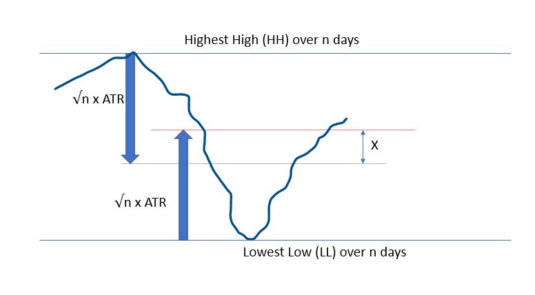
Let’s consider an observation period of n days. The Highest High (HH) and Lowest Low (LL) may be considered as lamp post from which our drunken guy is walking. We know that on average we should be able to find him at a location situated at square root of n multiplied by average stride length or the Average True Range over n days to use financial wording.
Here is how it looks:
The red line is where Bulls expect price to be, whereas the Bears are waiting for the prices to reach the green lines. These are all average expectations of course, and these objective can be reached any time during the observation period. Please remember that down markets are usually twice faster that up markets.
What if we consider the middle price between these 2 expectations??
Let’s do a bit of maths:
Today’s high (H) is expected at LL + 2 * √n * ATR(n)
Today’s low (L) is expected at HH – + 2 * √n * ATR(n)
So the middle point can be defined as:
MP = .5 * ((H+L)/2 +(HH + LL)/2)
Of course price will not be there, X does NOT mark the spot, but it is a fair expectation about where prices should be, if there were no other information.
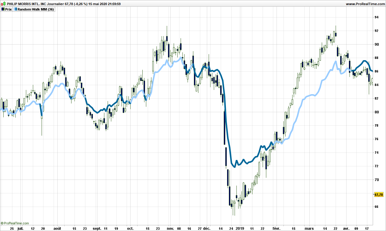
Let’s display it on a real chart!
We are going to use n = 36 in this post, you can use anything between 4 and 100, but make sure the square root is an integer for what will be following.
Ouch! It hurts the eyes. But you need to think of it differently. It is not a simple moving average, it is always using the most significant average of the day, between 1 and 36. Anyway you can already see that, when prices are above the path (light blue color),then trend is up. The path leaves a chance to prices to retrace and tends to be closer to them before a reversal.
Let’s not stop there and use a standard average of this path to smooth things out. Now follow my reasoning!
If the random walk theory holds, then the path we have spotted may very well be a lamp post so the actual prices should hover at exactly a number of strides from the lamp post, not 3.7 strides, 4 really! Let’s do it and display some lines at exactly every 2 steps (2 ATR’s) from the middle path.
Whaouh!!!!!!!!
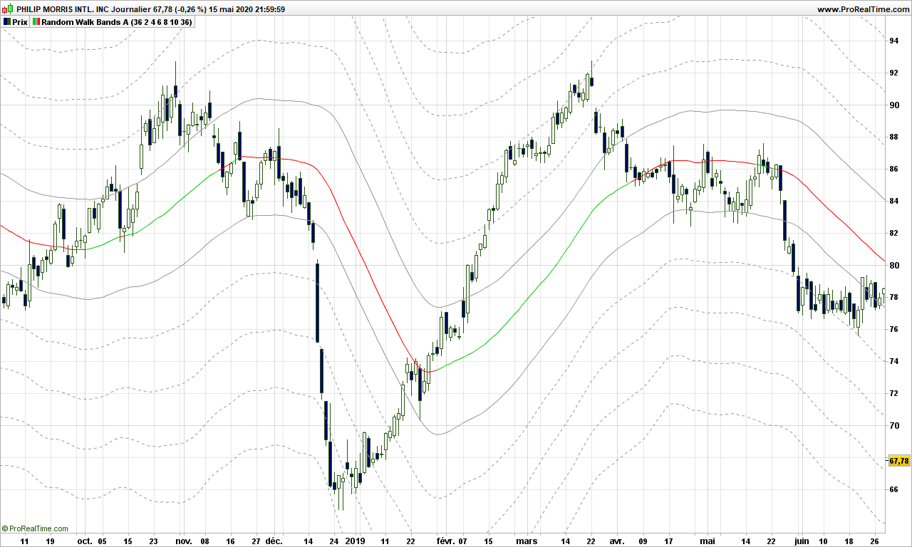
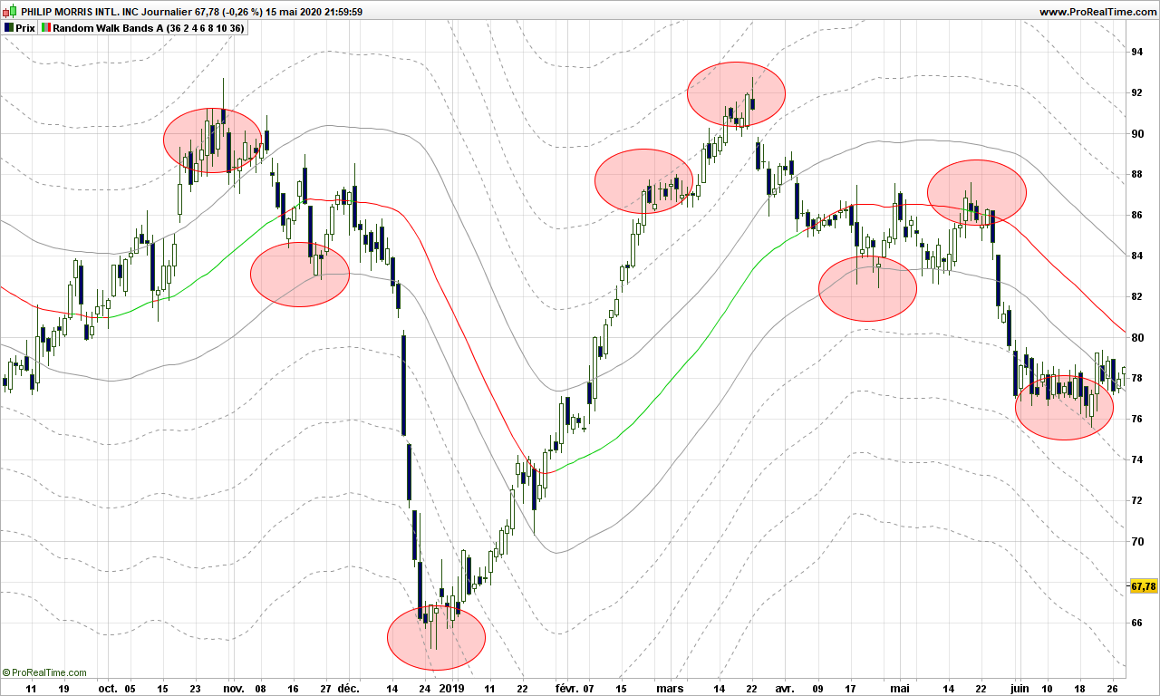
The red/green line is the smoothed out path. Prices are pushing along the lines, see only a few examples highlighted in red circles here:
Just amazing.
One way to see it is to consider the middle path as the median line if you were using an Andrew pitchfork, first lines above and below are the MLH (median line high) and the other lines are warning lines!
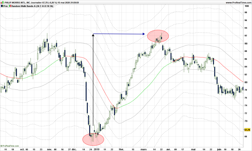
Even better, if you are looking for warning lines above a major bottom, each represent a price objective. In the case below, the price identified on first warning line is reached a the top second red circle within .30$! (97.70 vs 97.42!)
Trading strategies are quite straightforward from then on:
From a warning line far below median path, play return to the path
From middle path that is going, play the trend and put a stop on a visible line below the price
If price is ‘in the central pitchfork’, most likely there is no trend!
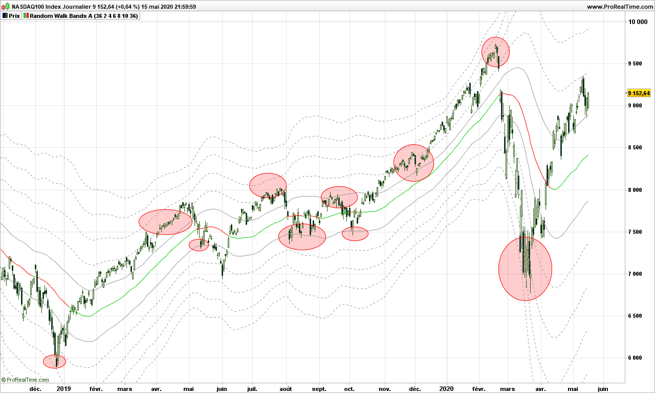
Now, you will tell, this is an example, sure it does not work with last market conditions? Yes it does!
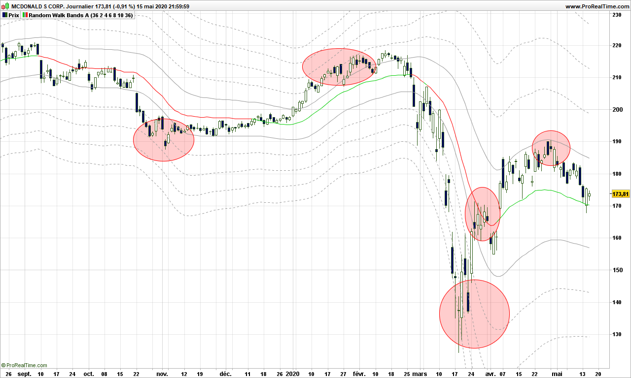
Here is Nasdaq recent price action, stopped on a warning line!
Or McDonald. Doing quite well!
Final thoughts: Market is moved by demand and offer. Behind these are drivers are humans or robots programmed by humans who can change their mind any time, giving the market a random outlook. This post would be worth many more investigations. Dr Andrew and his pitchfork really had a hint, but without computer, it was definitely more difficult for him. This is maybe the first explanation why Andrew Pitchfork are working and why it is so difficult to identify the right pivots to draw the pitchforks! Anyway, the random walk proves to a very good model, again because we are not trying to fit the data into a specific model or data distribution!
Price action trading (between support and resistance)
Trend trading
Fundamental analysis
Volatility is hidden behind all these techniques but it frightens most people because we talk about noise, probability, leptokurtic distributions, and many more abstruse words.
Volatility is very easy to understand:
P(t) = P(t-1) + e
Where P(T) is today’s price, P(t-1) is yesterday’s price and ‘e’ is the delta between the 2. ‘e’ is the raw volatility!
About price, we usually use median price of the day instead of closing price, to smooth a bit the volatility 😉
‘e’ can also be seen as the 1-day momentum. If ‘e’ is positive than momentum (speed) is up; if negative, momentum is down. This is the beginning of a trading strategy. Don’t throw away your other indicators just yet, because this not usable as such! (At the very least, consider the weekly 1-week momentum and take only signals in the same direction, but the signals can unfortunately be used only in intra-day type of trading)
Interestingly enough, should you program the formula above on a computer using random function with ‘e’ representing anything between 1% and 2% variation up or down, and run 10000 loops at least, and display the results, you will see a graph that is looking very much like the graph above. You will notice support and resistance lines, head and shoulder patterns, triangles, … because you have learned to recognize them but these are mere illusions! Because these patterns can be generated by a very simple program, the conclusion is that they have no predictive power! Or in other words, it just means that if a supposed target is reached, it is purely by chance.
So you are now left with ‘e’ and you can do whatever makes sense to you. You can average, look at standard deviations, look for hidden frequencies with Fourier transforms, …. Remember to keep it simple. When some big pocket start to sell, everyone sells; when price start going up, nothing happens until the hiking is obvious, so there must be some linear component. Which we will see in an other post!
Hi! With on-going containment, that may come back a few times in the next year or so, I thought I would recommend some good books to read. This blog will not teach you everything you need to know!
Let’s be clear, there are many good books out there but authors usually make their living out of selling books rather than trading, justification always being having more regular revenues… or just revenues? 😉
Anyway, most books do not cover more than basics, giving only very basic information about RSI, stochastic, … Hidden divergences are almost never covered, not talking changing default parameters!
So here are a few good books with in-depth reliable information.
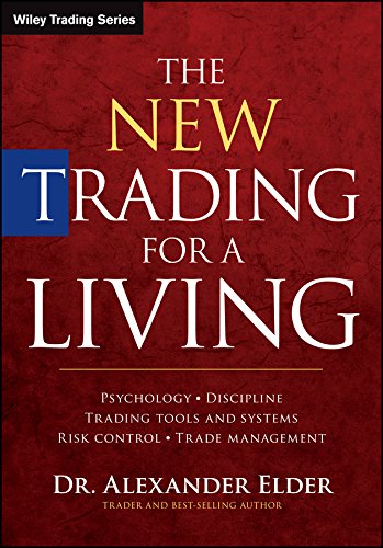
First one will teach you the basics. Dr Elder is quite good about explaining how to do trading and provides very advanced trading strategy. His 3 steps screening strategy is brilliant.
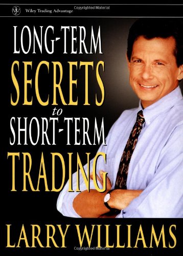
If you are looking at creating your own indicators, Larry Williams shows his creativity. The indicators he developed may or may not work any more, but he finds the words to kick-start imagination.
Pitchforks and Action-Reaction are the ONLY tools I know of that allow easy and reliable prediction of where prices are going and when. Don’t get me wrong, these are not crystal balls, they allow knowledge of potential targets, one or more of them are very often hit by the market. P. Mikula provides a very good starting knowledge on Andrew’s pitchforks and action-reaction. He doesn’t say how to select the pivots points however but as A. Andrew supposedly said, each 3-points sets have a story to tell. This will lead you to sound meditation for sure!
Even if we are not doing trend trading the way described in this book, M. Covel is a fantastic writer who explains in detail the automated systematic trading, explains what it is to have an edge in the market, how to demonstrate it. Your challenge is to do better than trend followers, which you can possibly do after thinking deeply with book just above.
Fractals are a way to trade with the trend, represented by an Alligator in Bill Williams book. Providing you spent some time understanding his concept, fractal trading is a very good trading system. We are missing statistics but the programming should be easy.
‘Trading with the odds’ was the first book I read that took a deep dive into the probabilistic side of trading. C. Kase explains it all in simple terms, the weekly synthetic bars are a must-have trading tool. Kase Peak Oscillator is also fascinating in its concept.
Last book, bot not least, is not about trading per se but it is a must-read. Nassim Taleb makes the case about luck: even W. Buffet may have been lucky because probability of having someone so successful at trading among billions of humans is not zero! And handling of randomness in trading precisely the core of the system!
That’s all folks. Enjoy these books and trade safely.
With that title, I am sure you are going to read this post to the end! If you have no time, the summary is: the holy grail just does not exist but it is worth searching for it, for the path is more important than the actual indicator!
If you are looking for the best ever indicator, you can hardly start from a blank page. You need inspiration, you need to get your brain on invention steroids! So, the first thing to do is to consider what is available on trading platforms and make a strength / weakness analysis. you need to get a deep understanding about how the indicator is built, how it behaves under different market conditions, play with parameters and multiple securities like index, stocks, trackers, …
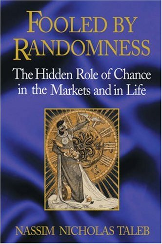
Let’s look at MACD or Moving Averages Convergence /Divergence. I will not explain here the background, but show one graph with 2 different parameter settings.
See? One is smoother than the other. The timing of signals is the same but the eye likes second one much better. Meaning also, if you make it part of trading system fully automated, you will have less noise to manage!
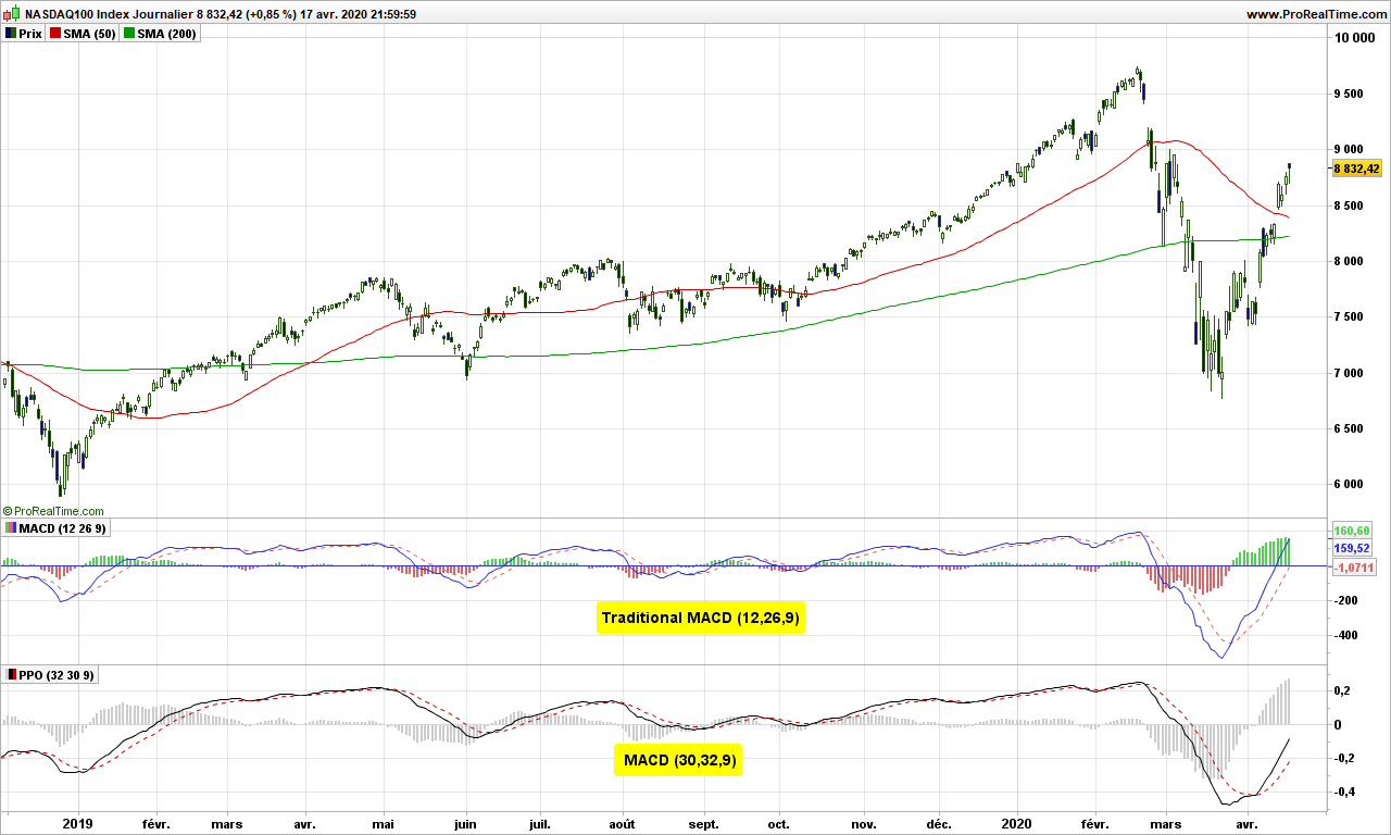
MACD is a trend indicator, therefore it performs quite poorly in horizontal markets. What about a momentum indicator?
This one tells you you are in an uptrend when positive and when it goes green below 0, it may be a counter-trend trade opportunity. It looks good to the eye, not perfect as there are false signal, but looks fairly good. Of course, some back testing would be needed to validate the impressions!
Now if you are looking for the grail of indicators, here is what it should do:
It should tell you what is going up in higher time frame (e.g. in weekly for a daily chart). Because it means you have some good move on-going, it is not just noise in current time frame
It should be capable to anticipate market turns, through divergences or hidden divergences (in direction of the trend)
Signal should be timely, not too early and definitely not too late
You should be able to see and professional are doing versus all other market participants
It should be smooth and easy to read
The number of false signals should be reasonable
The signal should be profitable as often as possible. Refer to previous article about winning streaks.
Please add here you own requirement: …………………………………………..
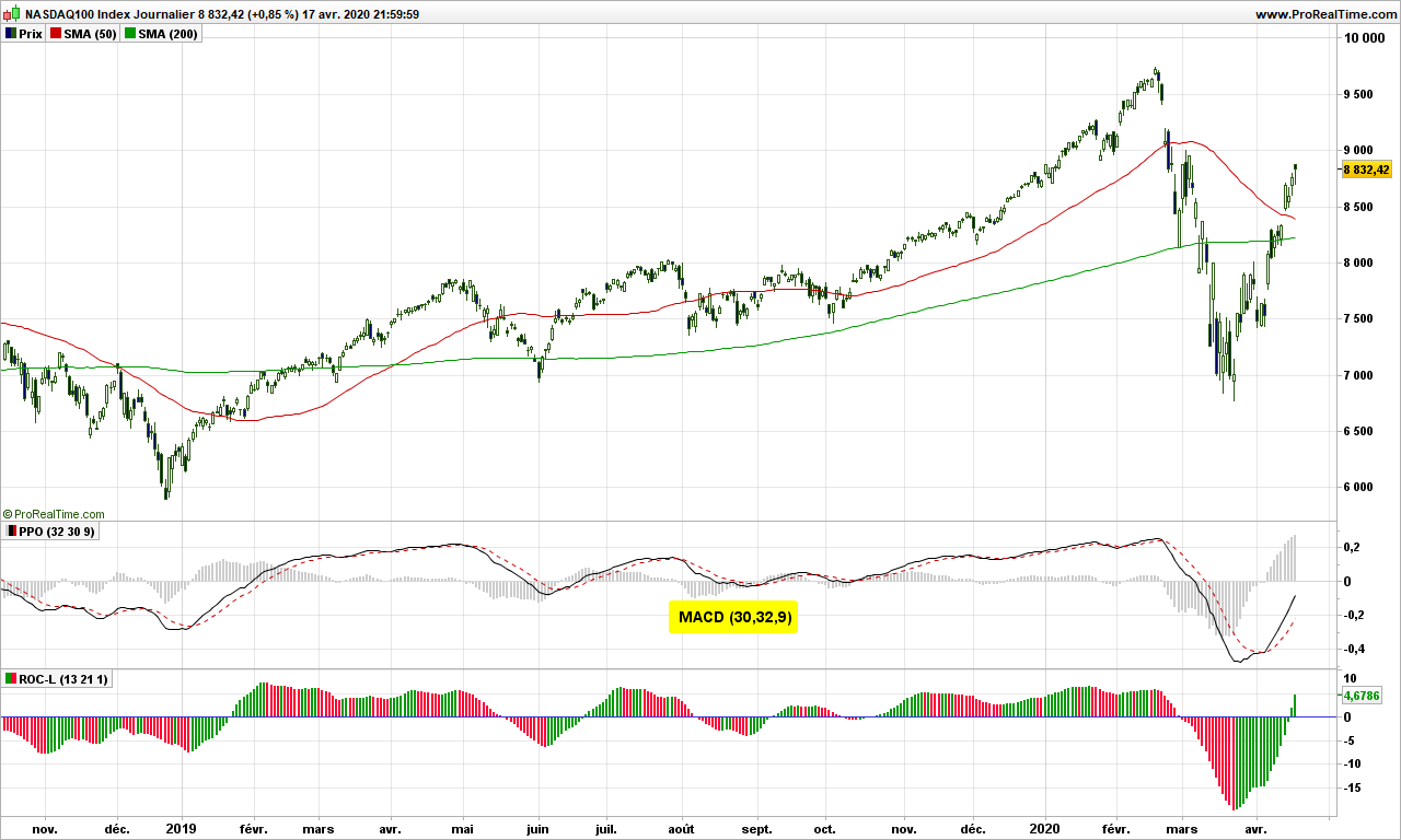
The idea is to to calculate MACD as if on a weekly chart but we do the calculation each day, so we have the information we want before the week is closing. MACD on weekly chart is usually used as one-bar indicator on histogram: when it changes color (goes up after going down in negative territory), it is signal to buy. Just look! Green arrows point to buying opportunities in weekly chart, sometime 3-4 days before end of the week!
There are hundreds of indicators available on the markets. Try to make sense about the most common ones, discards those that are complete nonsense, consider those that work as promised by their author (I have not found any divergence for long time on accumulation/distribution) and continue your trip! It gives food to your mind!
Your next question is of course: did I find the holy grail? I wished! Please remember we are trading prices, not the indicator! My indicator tells me where professionals enter after market bottom (red circles in counter trade), has plenty of divergences, has zero crossings or bumps (smileys) to indicate entries in direction of trend. But it is not perfect, get some false signals from time to time (because the professionals are wrong ;-), jsut kidding of course)
Of course there remains the need for risk analysis (volatility and position sizing, price objectives).
Until next time, trade safely and don’t take useless risks with virus!
All the content on this website will be original. No lessons about Bollinger bands or how Average True Range is calculated. This first post will reposition volatility trading with respect to other kinds of trading.
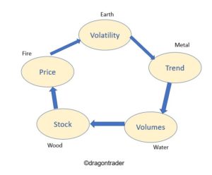
For this purpose, let’s travel east to reach China. They have theories like Yin and Yang but the one that interests us more here is the 5 elements theory. According to it, plants, humans, animals are all driven by a cycle including 5 elements: wood, fire, earth, metal and water. There are 2 cycles actually, one for creation and one for destruction. The market being driven by humans, and robots are programmed by humans so are no exceptions, this cycle to market themselves!
A stock has been issued by a company, this is the wood. Then wood generates fire, price is matter of hot arguments we need lots of computer to finalize. The way prices go and up and down each is volatility, it is earth, it is linked to muscles, so the market is shaping up. Then from the volatility appear trends, which is kind of illusion that prices are going in one direction. Once trend appear, volumes change; volumes are like water of the river, they make the market. When price goes up in a trend, then volumes go down as nobody wants to sell before the trend is over. Volumes in turn change the company; if lots of money flows in, then they have capability to invest and this in turn will change the price of the company. Cycle is over!
From a trading perspective, you can position yourself wherever you want:
At stock level, traders carry out fundamental analysis. Their strategy is usually buy & hold and they want to catch dividends for the money you invest in. They don’t usually care too much about the actual price, saying it doesn’t matter. They come up with funny price objectives by comparing with other companies in same sector and when the stock plummets, they say they keep it for long term!
At price level, traders are usually day traders, order book traders, robots… They draw lines which they call support or resistance. They of course totally disagree with one another, given they are not looking at the same chart with same time frame.
At volatility level, there is … almost nobody. Nobody is pure volatility trader. People hate volatility (subject of another future article). Bollinger himself agreed his bands are far from perfect. Keltner also paved some way. This area is still not much explored. The point is you need to ‘see’ things in all this random data that is the market. It gets lots of convoluted mathematics to play here. But the rewards are great
At trend trading level, one will meet sour guys. Why? Because they are blamed any time the market plummets, as they openly say they play both upside and downsides of the markets. They may have low success rate but when they win, they win big, and so an overall positive expectancy
At volume level, traders have lots of money to manage. So they can call the company’s CEO and advise on the strategy or the volumes might just die, right?
That’s it. There are times when you need to trade price level (sideways markets), other times when trend is a better choice , or dividend playing at some other time. We need to get an edge to enter the market and to exit.
Until next time, trade safely from the right perspective.