Facebook will make you rich. Or not…

In 2012, Facebook IPO price was about 40$. Just 3 months later, it was trading at 18$ but if you bought at that time, then you would be enjoying today about 1000% performance just by holding the stock and not caring what might happen on the stock market. That was a bet at the time, that I have not taken!

I personally hate Facebook because it prevents its users from thinking by themselves, promoting subliminally some herd thinking that is supposed to facilitate your life. And people are so gullible they are buying the invisible marketing message.

Imagine I want to buy this electric car from eMoon Motors. I look on Facebook if any of my friends, real or virtual, have bought any and what they think about it. I have found 5, 1 is very angry because his wife dislikes it very much, 3 are complaining and 1 has no opinion. What happens is that people who are not happy are writing it to let out their bad energy, and others that had a little problem are going to confirm, hugely amplifying that scratch on the door made by a dog passing by. People who are happy don’t take the time to comment. What can you deduce then? Well, nothing!

Who has become rich with Facebook? The founders of course, and stock owners. Any users? No! All users have given for free all their data to a monster that is selling this (free!) data to advertisers – wonderful business case, thereby also preventing serious newspapers with real content from getting advertisement, among other consequences. World would probably be better off without Facebook, users already have many alternatives but ignore them out of convenience or laziness. Of course, if your (potential) customers are all using Facebook, you have to use it!.

Facebook stock is a stock real hard to play, because it tends to gap every once in a while, causing automatic trading algorithms to go nauseous. Don’t let that prevent you from making a trade or two when visibility is fine.
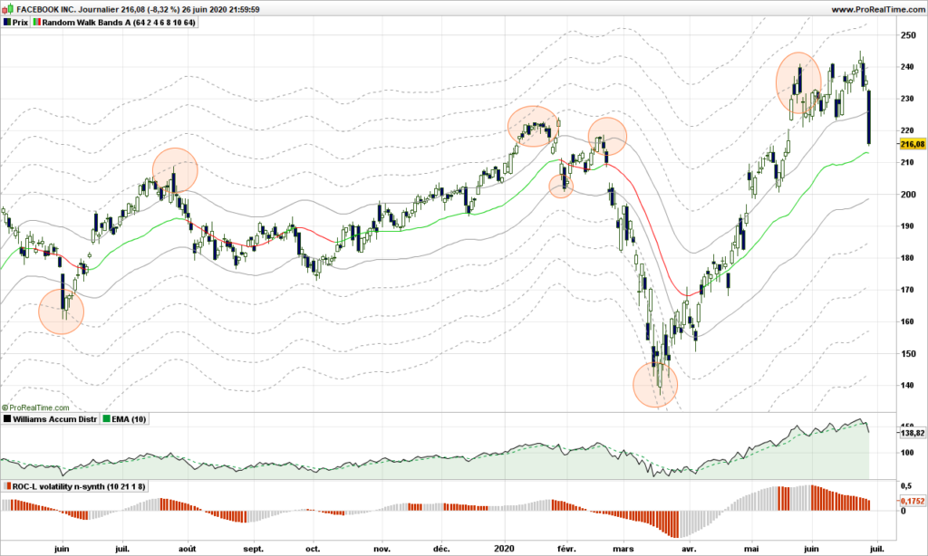
The stock follows a random path, too flat most of the time to make substantial gains, but as you can see, the price wanders along the warning lines, like invisible resistances, then suddenly end of last week, a black Friday!

What is happening? Tier-1 corporations propose to boycott FB through November election if Zuckerberg does not take action to control hate speech, that is everywhere on this media! Companies include Unilever, Verizon, Honda, The North Face, Ben & Jerry’s, Patagonia, Mozilla, Birchbox Dashlane, TalkSpace, LendingClub, and Coca-Cola , just to quote a few. See how good I am also at advertising, but I do it very smoothly, not disturbing the casual reader!

What to do now? At very least, as a trader, you should be out and you can come back later. No, stay with me, I am not finished yet! The indicators at the bottom are the Accumulation/Distribution (A/D) and one derivative. The money during last 2 months was still going in, but not so fast (divergence), and now A/D has also crossed its average indicating money is flowing out of FB. The random walk path is still green (going up), so I do not advice a short position in this time frame. The objective for this down move is 186$ but could be stopped before. Don’t think that Zuckerberg is going to sit around seeing the money vanishing , sure we are going to see some Facebook message stating that situation is under control, and he will invite his announcers to a party (not a virtual one) to celebrate this. If it fails, prepare for a plunge to 130$! Have fun!

That’s it. Until next time, trade safely!

S&P500 market analysis May 25th 2020

I am sure you have noticed by now that this blog is totally original and I will not cover the basic indicators, their usage, … There are millions of sites that copy/paste from each other and you won’t learn from them anything but the basics. It is always a good idea to come back to basics, but profitable trading is about having an edge, so none of basic indicators work for very long, when too many traders are using one, market becomes sort of immune to it!

With this blog, I aim to help you kick some ideas down the road and if you wish you can share on this blog. Maybe it does not work for you as expected, but it may inspire others. Just drop me an email (see pinned message) and I will publish your article!

Let me share a story. For very long years, I made a few trades per year and had absolutely no idea how to get in or to get out. so I did some buy and hold based on randomly selected analysis, watching the stocks loose as much as 50% then going back up… And one morning I had an idea: imagine a very tall tree and there is a big coconut hanging from the top branches and a monkey happens to walk by and being thirsty. The easiest part of course is climbing, reaching the top, secure yourself to branches with feet and one hand while extending the other hand to take the fruit. Then suddenly, one branches cracks. You are still hanging from one branch with one hand but you are still safe, sort of! But for how long? The second branch is bending now and you must make a decision: free fall to the ground (not a good idea) or jump down other branches. This is how I started designing my first trailing stop! See? Let me know how you come up with trading strategies, fun to share and comment!

I still have plenty of ideas to share. I will not share publicly the details of my very best strategy because I am using it, but there is no problem sharing older research material that you can choose to improve on your side and share with the club! Just to give you an idea, we will look at in future posts:

  • EMA, DEMA, and the collection of moving averages
  • Accumulation / Distribution
  • The wonders of smoothed ROC
  • Kagi trading with volatility
  • 3-line-breaks trading with volatility
  • Others

So far I have demonstrated:

  • Markets follow a random path which can be drawn.
  • Markets can trend and this is due to their random nature. See here.
  • The randomness can be measured by volatility. The raw volatility (be it 1-day momentum, True Range, …) is the one to be analyzed and understood
  • You should not try to confirm stubbornly a strategy because cases where your strategy does not work surely exist and might even be the most profitable cases! Market’s got some sense of humor :-))

Now, as title implies, let’s look at S&P500 and where it is going!

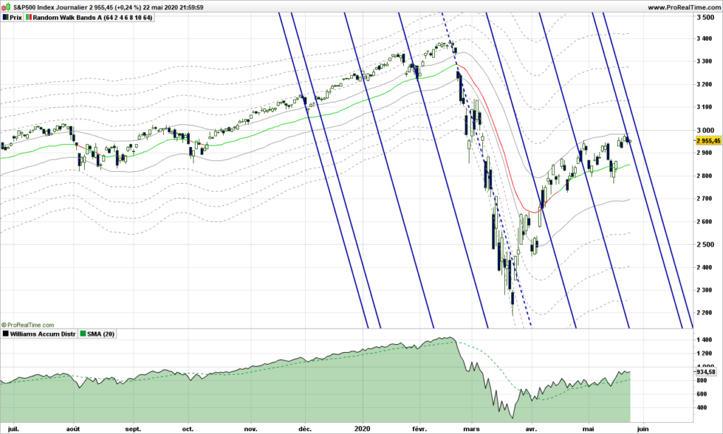
As a continuation from previous post, I have left the random walk path and you can see that our drunken man does not seem capable to go more that 2 steps away from the main path.

If you have read my initial posts, you know I like a lot Action/Reaction lines because tops and bottoms are often building on those. Here we are precisely with 2 solid blue lines across the path. Unless S&500 goes through forcefully, we are in for a reversal. I have included Accumulation / Distribution at the bottom, which is a good indicator when you have nothing better, just add a 20-days simple moving average. There is not much energy: look at the slope of price versus indicator! We need some very good news to move up now! So yes, I would wait a few more days to see where we are going and go short if confirmed for an objective at 2400. This is absolutely no advice!!!

Until next time, trade safely!
Spotting and trading the Random Walk path!

After discussing raw volatility, standard deviations, no way we don’t have a discussion about ATR aka the Average True Range. This post will definitely blow you mind, I am going to demonstrate that markets are REALLY following a random walk path, pushing from one side to the other in a precise manner.

For introduction, please read again my previous post about drunkard’s walk.

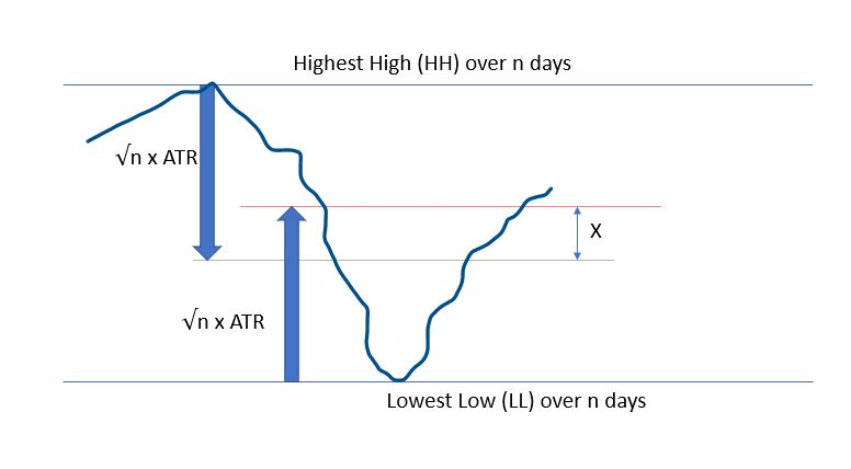
Let’s consider an observation period of n days. The Highest High (HH) and Lowest Low (LL) may be considered as lamp post from which our drunken guy is walking. We know that on average we should be able to find him at a location situated at square root of n multiplied by average stride length or the Average True Range over n days to use financial wording.

Here is how it looks:

The red line is where Bulls expect price to be, whereas the Bears are waiting for the prices to reach the green lines. These are all average expectations of course, and these objective can be reached any time during the observation period. Please remember that down markets are usually twice faster that up markets.

What if we consider the middle price between these 2 expectations??

Let’s do a bit of maths:

  • Today’s high (H) is expected at LL + 2 * √n * ATR(n)
  • Today’s low (L) is expected at HH – + 2 * √n * ATR(n)

So the middle point can be defined as:

MP = .5 * ((H+L)/2 +(HH + LL)/2)

Of course price will not be there, X does NOT mark the spot, but it is a fair expectation about where prices should be, if there were no other information.

Let’s display it on a real chart!

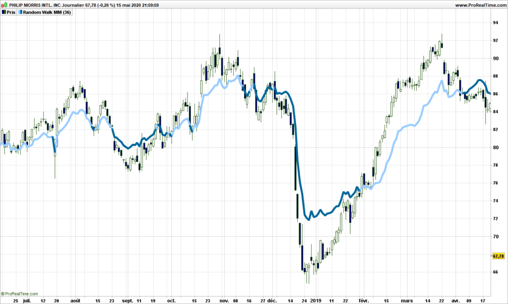
We are going to use n = 36 in this post, you can use anything between 4 and 100, but make sure the square root is an integer for what will be following.

Ouch! It hurts the eyes. But you need to think of it differently. It is not a simple moving average, it is always using the most significant average of the day, between 1 and 36. Anyway you can already see that, when prices are above the path (light blue color),then trend is up. The path leaves a chance to prices to retrace and tends to be closer to them before a reversal.

Let’s not stop there and use a standard average of this path to smooth things out. Now follow my reasoning!

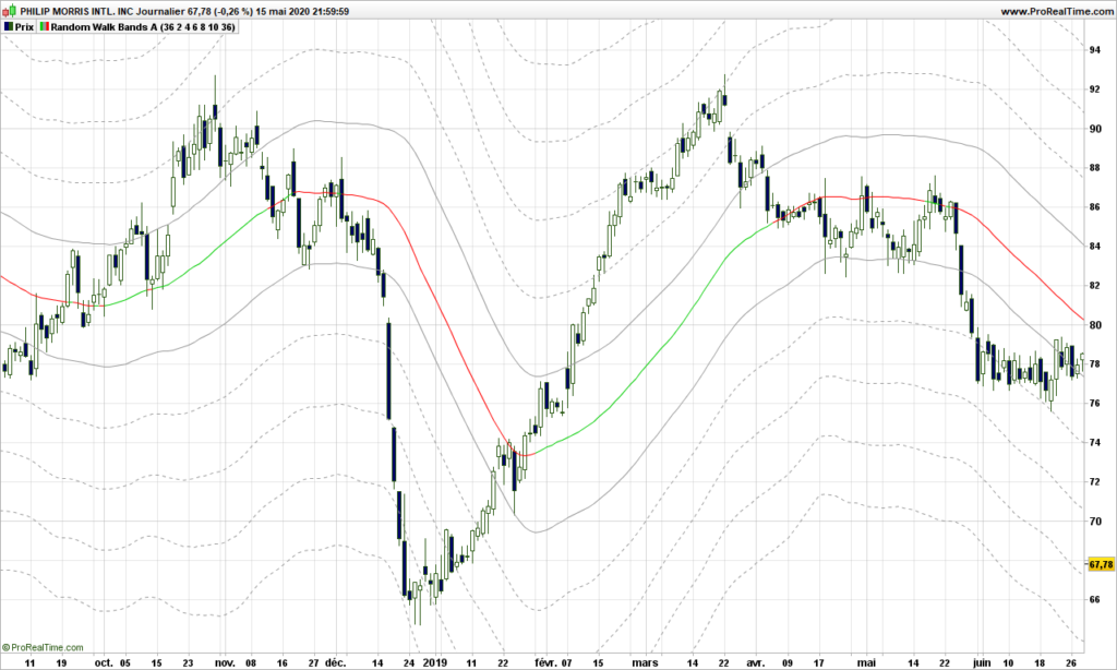
If the random walk theory holds, then the path we have spotted may very well be a lamp post so the actual prices should hover at exactly a number of strides from the lamp post, not 3.7 strides, 4 really! Let’s do it and display some lines at exactly every 2 steps (2 ATR’s) from the middle path.

Whaouh!!!!!!!!

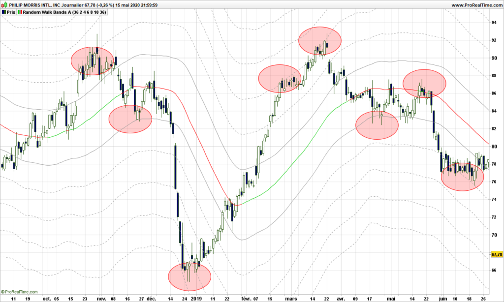
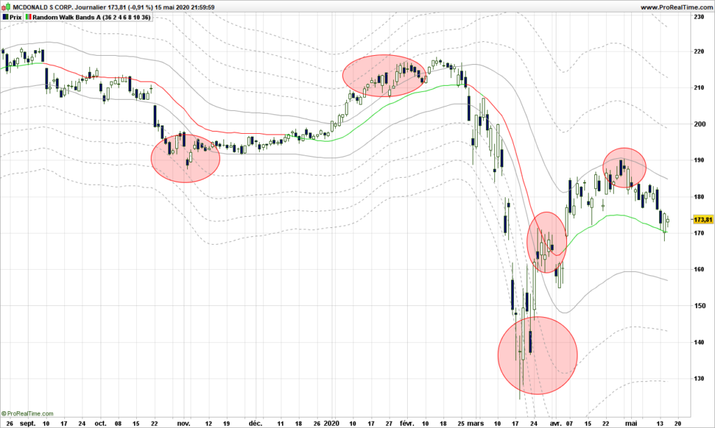
The red/green line is the smoothed out path. Prices are pushing along the lines, see only a few examples highlighted in red circles here:

Just amazing.

One way to see it is to consider the middle path as the median line if you were using an Andrew pitchfork, first lines above and below are the MLH (median line high) and the other lines are warning lines!

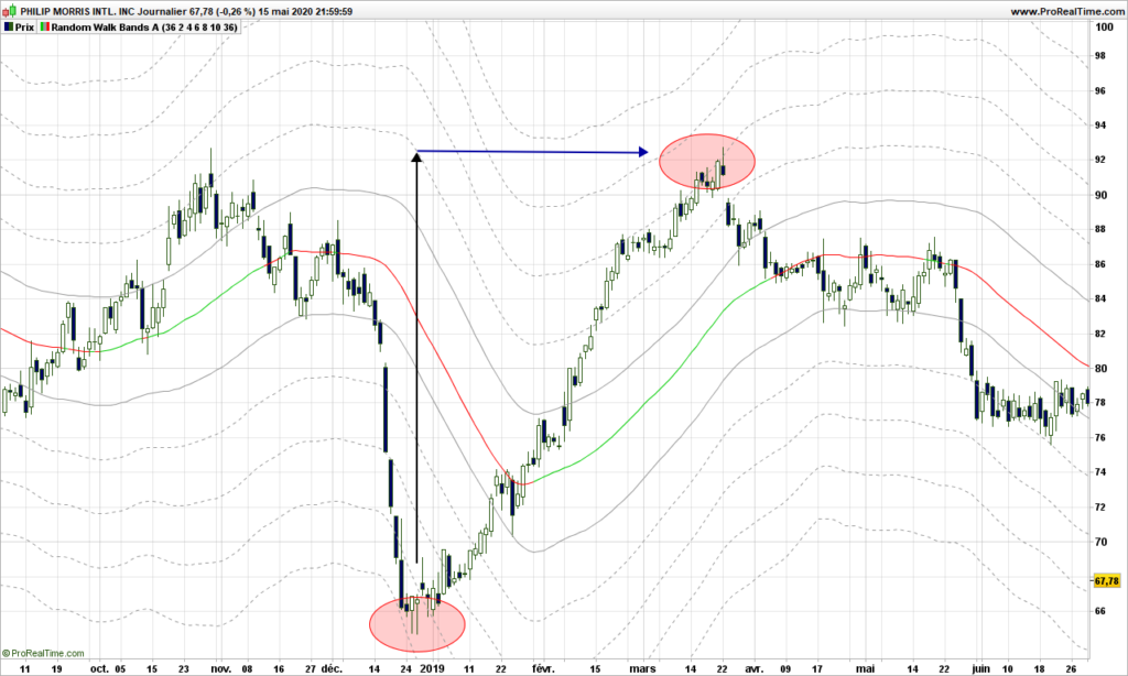
Even better, if you are looking for warning lines above a major bottom, each represent a price objective. In the case below, the price identified on first warning line is reached a the top second red circle within .30$! (97.70 vs 97.42!)

Trading strategies are quite straightforward from then on:

  • From a warning line far below median path, play return to the path
  • From middle path that is going, play the trend and put a stop on a visible line below the price
  • If price is ‘in the central pitchfork’, most likely there is no trend!

Now, you will tell, this is an example, sure it does not work with last market conditions? Yes it does!

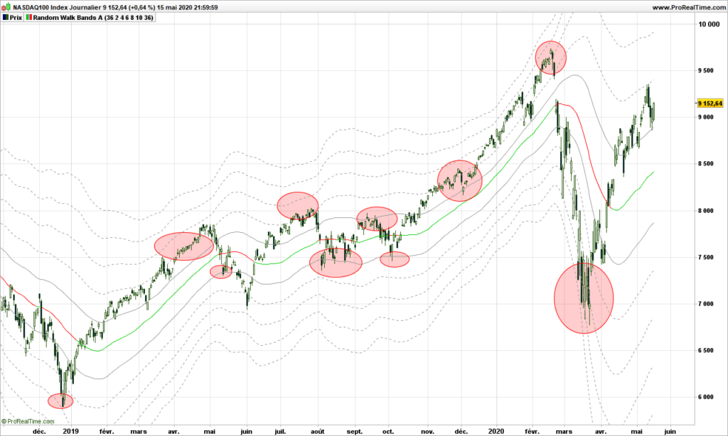
Here is Nasdaq recent price action, stopped on a warning line!

Or McDonald. Doing quite well!

Final thoughts: Market is moved by demand and offer. Behind these are drivers are humans or robots programmed by humans who can change their mind any time, giving the market a random outlook. This post would be worth many more investigations. Dr Andrew and his pitchfork really had a hint, but without computer, it was definitely more difficult for him. This is maybe the first explanation why Andrew Pitchfork are working and why it is so difficult to identify the right pivots to draw the pitchforks! Anyway, the random walk proves to a very good model, again because we are not trying to fit the data into a specific model or data distribution!

Feel free to comment or send email.

Until next time, trade safely!